
A wayzgoose is the delightful term applied to a gathering of printers for merriment, display and exchange of wares, education and discussion. Regular readers may recall that I made the trip to Kentville, Nova Scotia in 2010, accompanied by Erin Bateman, for the Wayzgoose at Gaspereau Press. It was a grand event, and primed the pump for similar opportunities thereafter.
In this spirit, thus, this trip to Europe was arranged with two bookends: at the start was [[Olle]] and [[Luisa]]’s 10th anniverary in Malmö, on the other end was today’s St Bride Foundation Wayzgoose here in London.
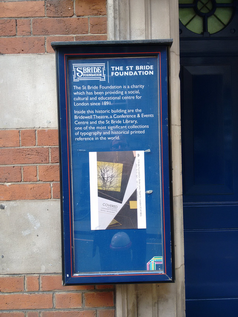
St Bride Foundation has a special place in the printing heavens: for 125 years it’s been the self-described “social, cultural and recreational centre for London’s Fleet Street and its burgeoning print and publishing trade.” If London is the epicenter of English-language publishing in the world, Fleet Street was, at least at one point, the epicenter of the epicenter, and St Bride Foundation was its clubhouse; a sort of mechanics’ institute cum community centre for the printing trades.
While the newspapers of Fleet Street have all departed and the printing trades have been gutted by technology, St Bride Foundation remains: it shepherds one of the world’s foremost collection of books on printing; it holds regular printing workshops in its well-appointed print shop; it even has a bar in the basement.
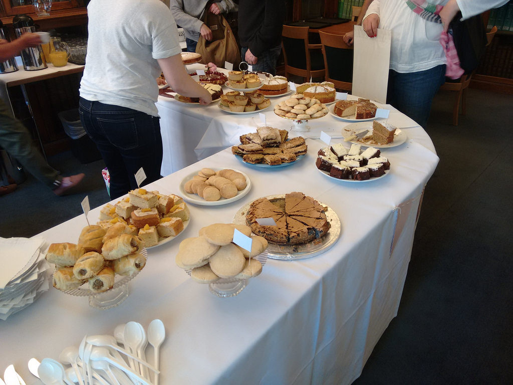
The annual Wayzgoose is something of an old home week for St Bride: the space is given over to exhibitors of equipment, prints, type, paper and books. There are cakes, tea and coffee. The workshop is full of demonstrations. And there’s lots of opportunity to chat.
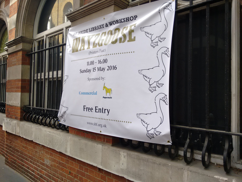
I arrived as the clock struck 11:00 a.m. and the doors opened; I departed nearly 3 hours later.
My first conversation was with the owner of Caslon Limited (yes, that Caslon). The company acquired the Adana line of platen presses in the 1990s and continues to make, service and sell parts for them today. My first press, via my friend Joan Sinclair, was an Adana Eight Five, and I purchased rollers for the press from Caslon soon after it came into my possession. So meeting Mr. Caslon was both an honour and an opportunity to learn more about both the history of the company and what parts they have available to replace those on my press that need it.
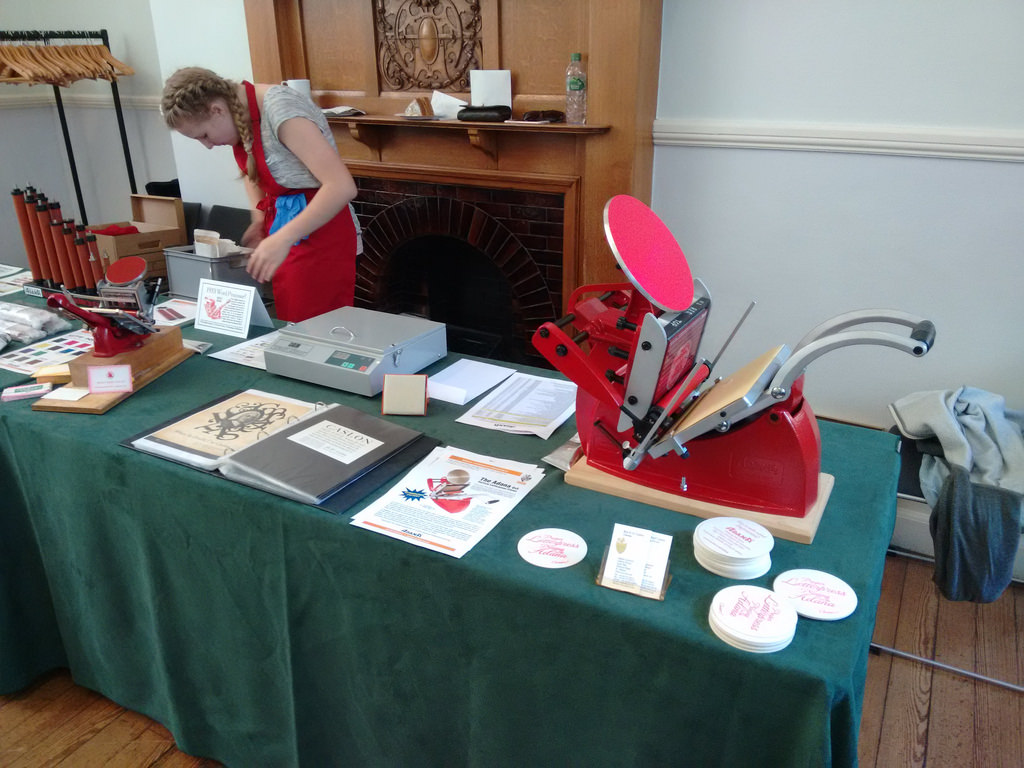
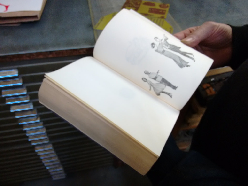
Space in my compact luggage is at a premium, so there was lots I would have liked to acquire but could not. But I did come away with tiny letterpress-printed books from a variety of small presses, and each purchase provided an chance to chat and learn.
I also purchased a container full of type-high solid squares, something I’ve been looking for since I started printing; I hope to use them to print QR codes on my press, analog style.
And it was hard to resist a book, on sale for only 50 pence, that contains, among other things, the rules for the printing trade chapels circa 1900.
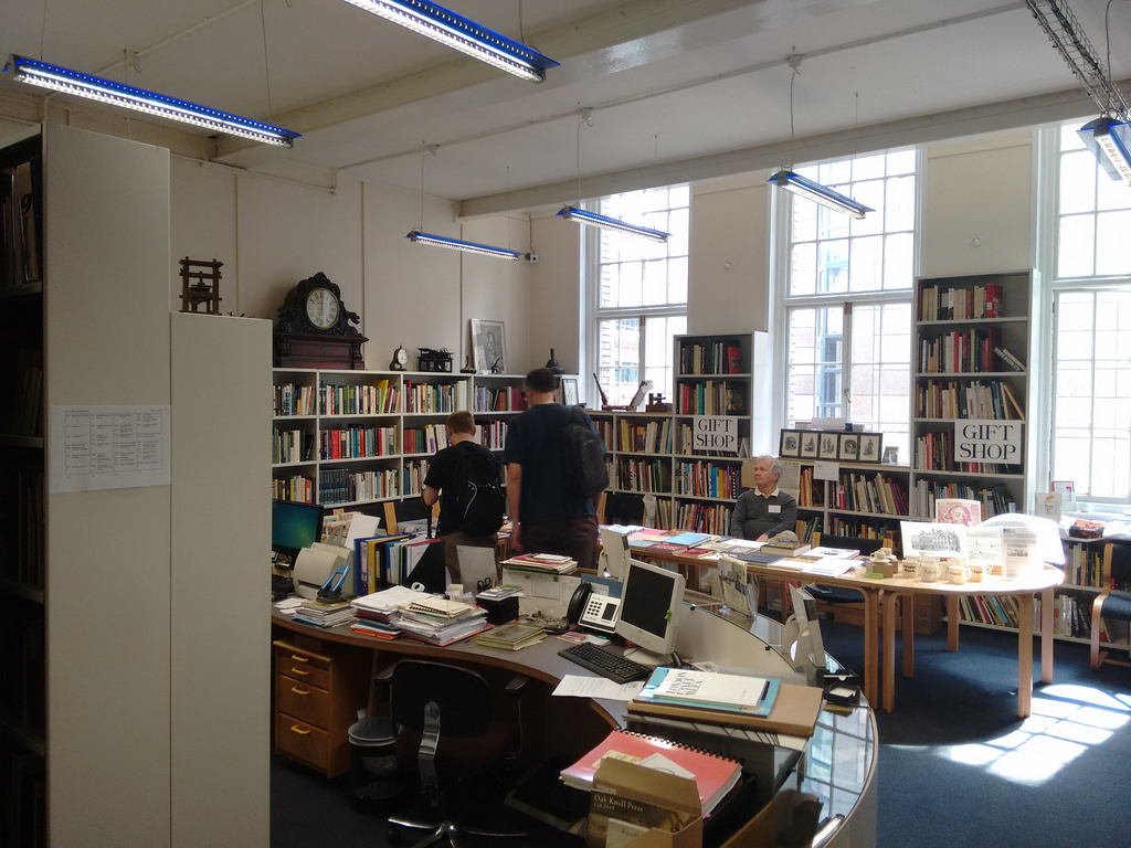
The St Bride Foundation Library was used as a gift shop for the day, so wasn’t available for exploring, but even just the collection of books on offer there for sale could have kept me going for hours:
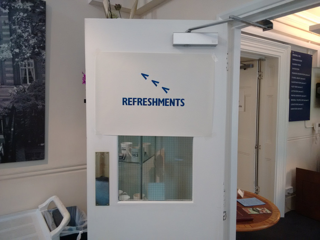
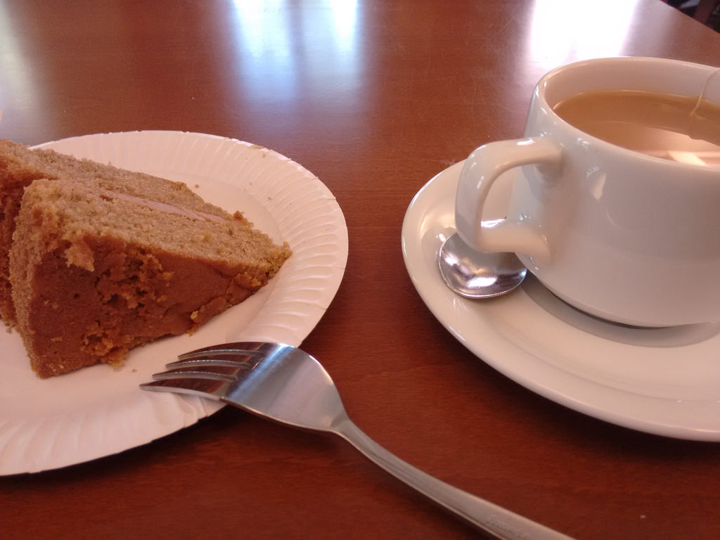
The refreshments table, set up upstairs, was equally impressive, and though I’m not a regular consumer of cake, how could I but not partake, so I had a strong cup of English Breakfast tea and a slice of very nice coffee cake:
By far and away the highlight of the Wayzgoose for me, though, was the opportunity to talk shop and share war stories with retired Fleet Street printers.
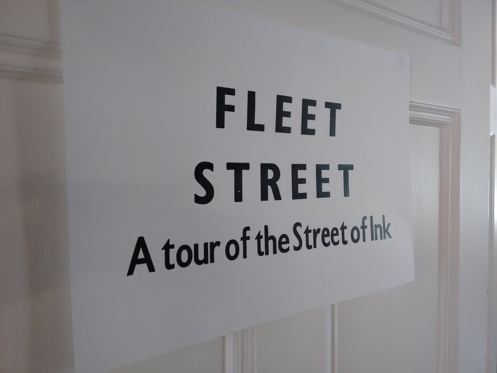
The “Tour of the Street of Ink” room saw printers telling the technological tale of how metal was turned into moulds and then turned into plates for the presses.
In that room and elsewhere I got a good chance to talk shop, swapping my own humble tales of working as a compositor (albeit one generation of technology on) for their stories of unions and work rates and newspaper barons. I found ready agreement for my suggestion that the removal of compositors from the process of daily newspaper production meant that reporters and editors were left without daily contact with members of the working class and that journalism suffered as a result. My apprenticeship continues to pay dividends as a key that opens of a treasure trove of printing lore.
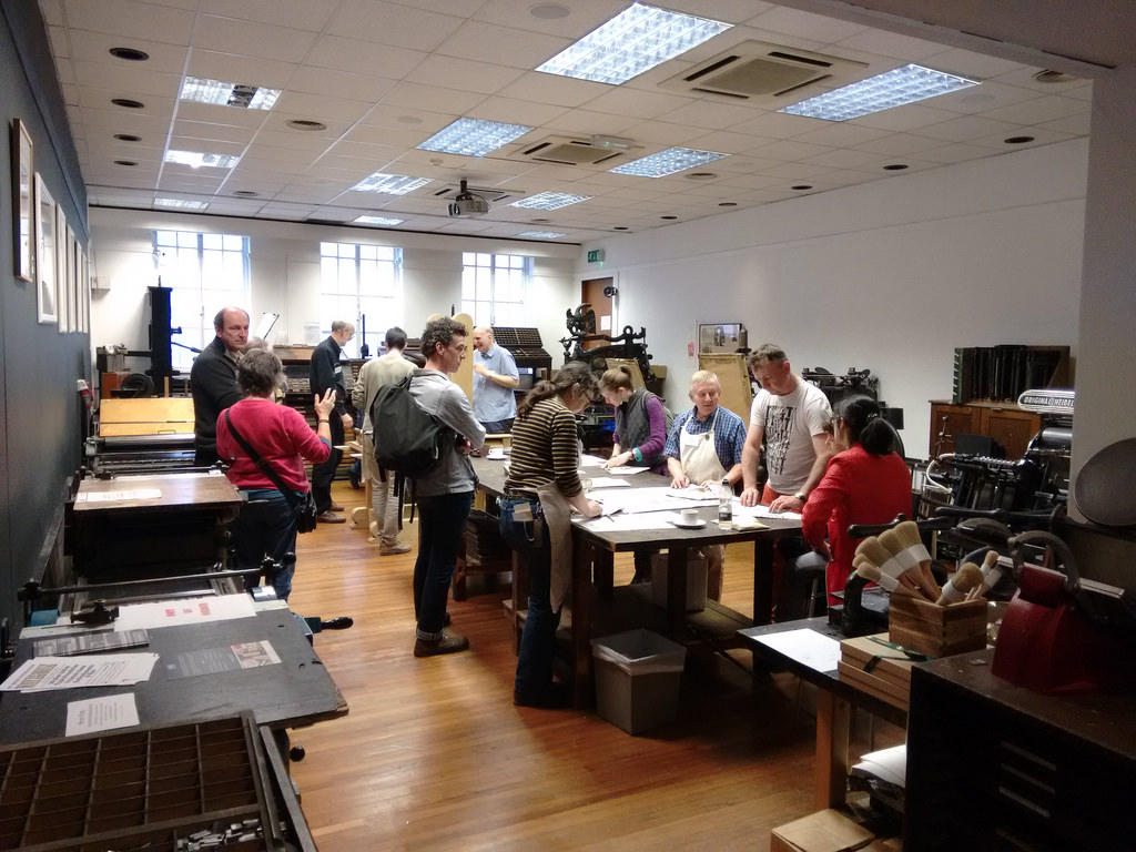
One floor below, the printing workshop was set up with several demonstrations: you could learn how to fold a printer’s hat out of newspaper, watch a new-built Gutenberg-style press in action, and print bookmarks and other keepsakes on the small platen presses in the shop.
The world is so much better for having institutions like St Bride Foundation keeping knowledge of and fraternity within traditional trades alive; I’m so glad I made the effort to attend.
The spirit of the day, and the compact size of the letterpress community, was driven home for me while I was waiting in St Bride’s Passage for the Wayzgoose to start.
A fellow sat down beside me to tie his shoes.
“Are you one of them,” I asked, motioning at the St Bride building.
“Yes I am,” he replied. “Where are you from?”
“Canada,” I answered.
“Oh, do you know Don Black?”, he asked.
Don Black sold me my first drawer of type. And I’ve returned several times to purchase everything from leading to a solvent can.
And so I wrote down his name, and he mine, so we could share the news of our meeting the next time we talk to Don.
I love typography. I love setting type. I love printing what I’ve set. I love the physicality, the hard limitations, the history and the tradition. But more than anything else I love feeling part of a small, open, collegial, community of printers. All of whom know Don Black.
When on missions from the home world such as this, special rules apply.
One of those rules is “if interesting experiences present that would otherwise, in the course of regular everyday Island life, be unattainable, seize them.”
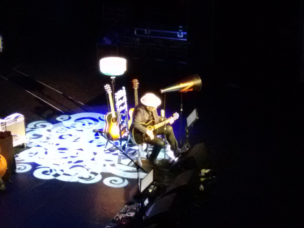
Which is to say “if Elvis Costello is performing 20 minutes away, you’re allowed to spend $100 on a ticket.”
Which is what I did last night.
I am an Elvis Costello fan in the way that most everyone is an Elvis Costello fan, supplemented my some additional old-girlfriend-was-a-big-fan enhancement, and an appreciation for his television program Spectacle.
I emerged with a steely new appreciation for the man and his music.
Yes, there’s Alison.
But there’s so much more. He’s got a deep songbook, is a talented piano player, can use the guitar in about 100 different ways, and a witty and sometimes profound stage presence. With no break, he played for more than two and a half hours, including a set of encores that I lost count of.
He belted out his own hits, he picked out standards, he told stories, and, the highlight of the evening, he joined his talented opening act, Larkin Poe, in an extended collaboration; both Costello and the sisters of Larkin Poe were elevated by the joining.
Because I’m a seating-choice-obsessive, I ended up booking a private box seat (EE1, to be specific). It was no more expensive than a regular seat. And because like I said, “if interesting experiences present…”
This added an interesting element to the experience, especially as I had the box all to myself (presumably because, well, who else would sit by themselves in a private box beside a stranger – other than me). While I didn’t benefit from the optimal sound mix as a result of my unusual seating, my seat was nonetheless excellent, a perch right beside the stage with a close-up view of everything. Had I been so-inclined, I’m pretty sure I could have jumped from the box onto Costello’s piano without injury.
I’m so, so happy I went; if you have the chance to see Elvis Costello play live, take it!
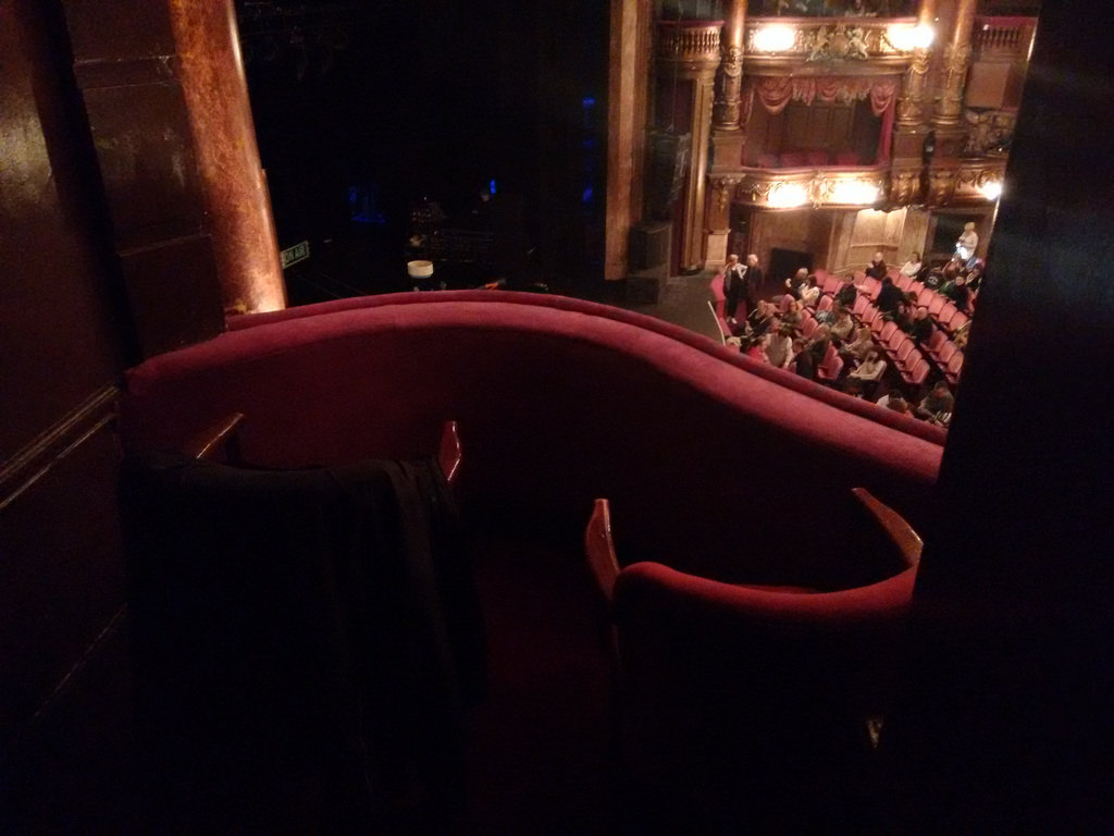
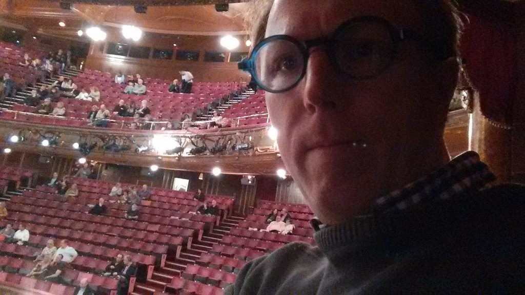
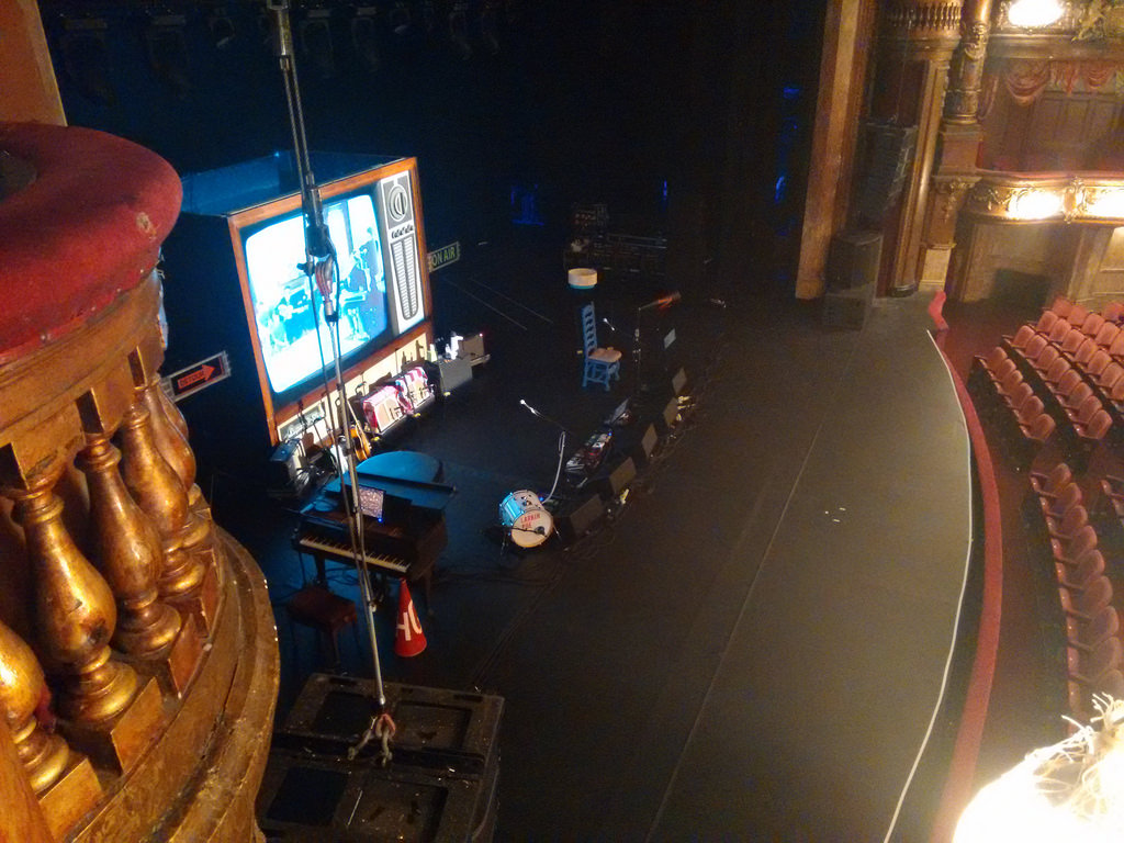
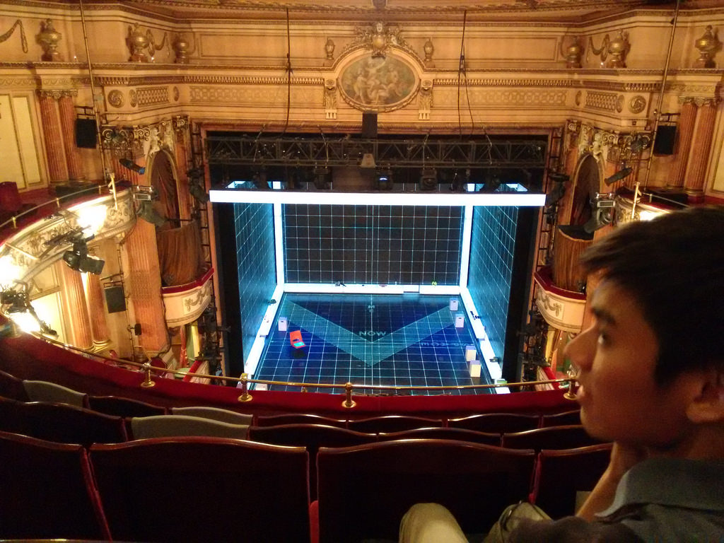
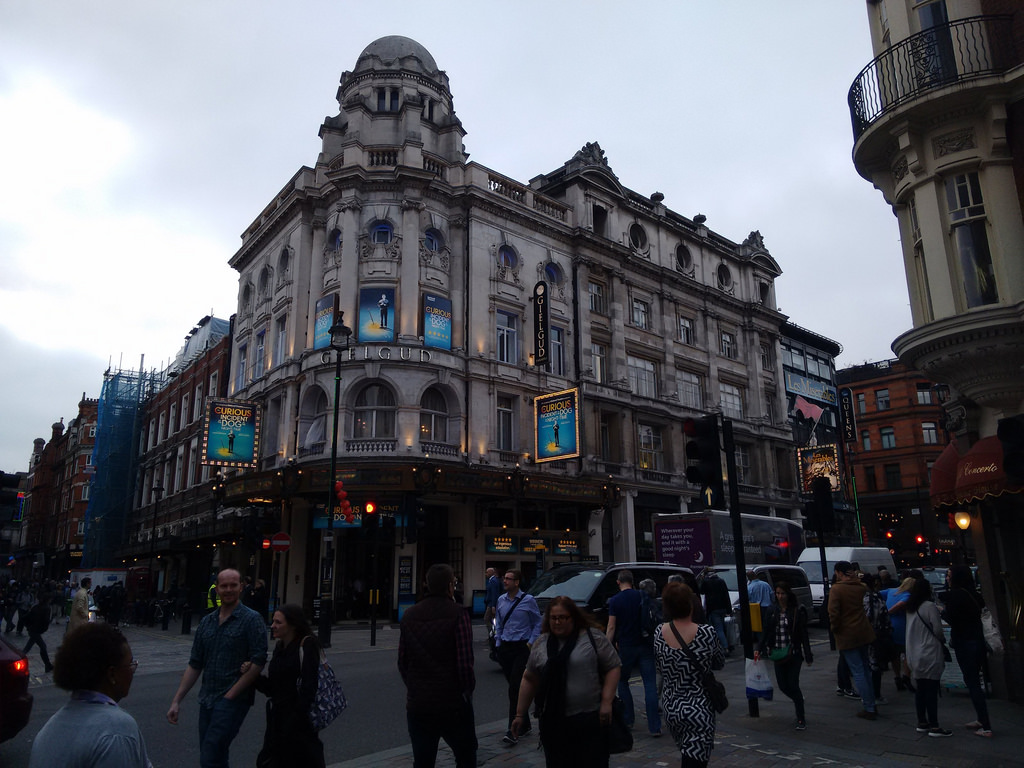
On my opening night here in London, last Friday, I saw a performance of The Curious Incident of the Dog in the Night-Time at the Gielgud Theatre.
It was my first experience of the London theatre, and I enjoyed it: the Gielgud is a lovely old theatre, and I was in an inexpensive (£29) seat in the rafters that, despite its distance from the stage, provided me with a clear view of all the action.
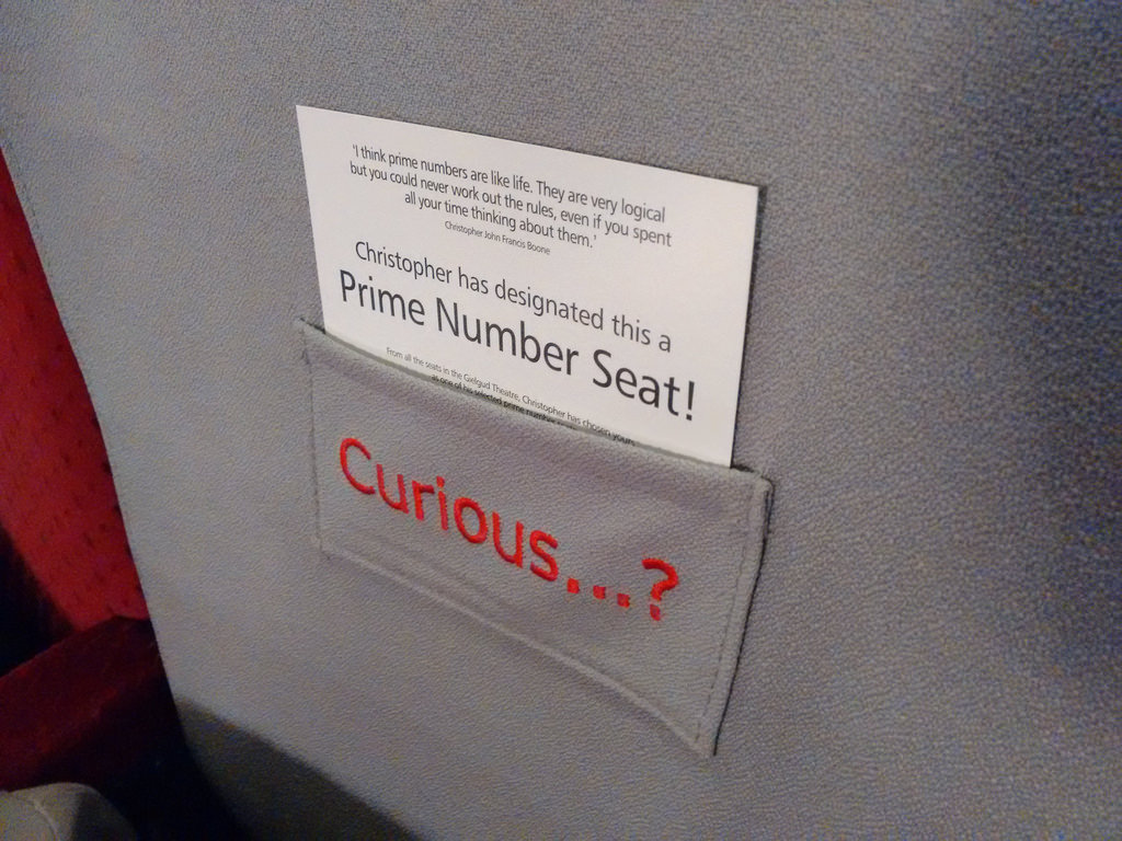
I’d already read the novel, at the recommendation of my mother, and so I was anxious to see how it would be translated into play, as it’s essentially a monologue. I was not disappointed: the set is inventive, using projection, trap doors and drawers, and LEDs to create a malleable environment in what is otherwise an empty black box. Through a combination of narration, sollioquoy, and action, the story was told in a way that amplified the message of the book.
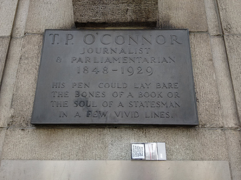
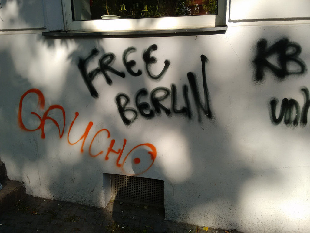
A plaque on Fleet Street dedicated to T.P. O’Connor:
His pen could lay bare the bones of a book or the soul of a statesman in a few vivid lines.
What a way to be remembered.
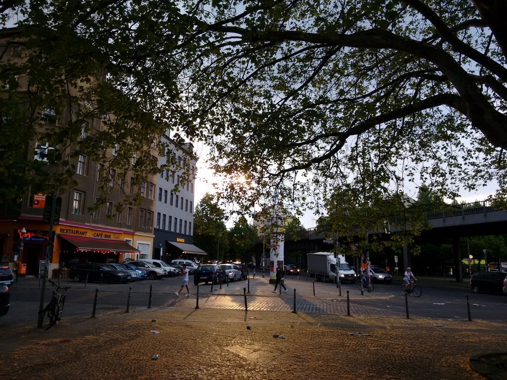
I’ve spent a very pleasant week here in Berlin. It’s been sunny and warm, but not too much so. I’ve had many enlivening conversations with friends new and old. My soul is fed. Off to London for the weekend for the St. Bride Foundation Wayzgoose, and then home to Prince Edward Island on Monday.
Thanks to Peter Bihr and Michelle Thorne for generously loaning me their Kreuzberg flat for my stay here: it’s in my favourite part of my favourite neighbourhood in Berlin, on a quiet, leafy street that’s nonetheless near anything and everything the heart might desire from the city.
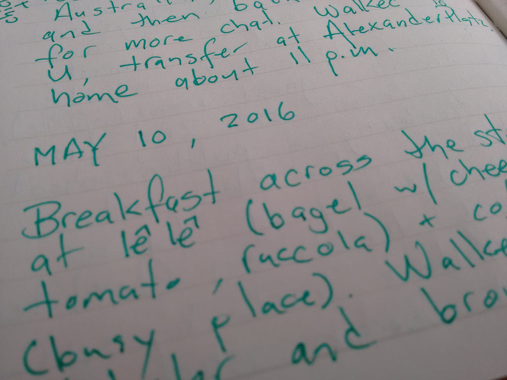
In 2009 when [[Oliver]] and I landed in Kosice, Slovakia, we spent a good amount of time seeking out the components of a diarizing system with which we could, in analog form, document our trip. We sought a notebook. A pen. A glue stick (for affixing receipts and other paper evidence to the notebook). This was one of a long line of such assemblaging adventures, and something that we’ve come to rely on as an important part of travel.
There’s a lot to recommend it.
First, the process of gathering the required materials takes us into all manner of places that we’d never go otherwise: stationery stores, pen shops, the glue stick aisle of the grocery store. It’s a tour of the local paper goods aesthetic. And the tour often results on spin-off benefits — the restaurant found down an unlikely alley, the conversation with the pen shop owner.
Second, having a formally acquired tool set for making a diary ups the ante with regards to actually writing diary entries: we’ve already invested all this time, we must make best use of it.
Third, the process of writing the diary entries is both a useful way of processing the day’s events and a useful reference for the future when trying to remember the name of the smoky restaurant in Kosice (Amir) or when it was that you lost your temper and wanted to go back to the hotel forever (Phitsanulok). It’s a counterpoint to the digital diarizing that happens in this space (or this one), but includes things too mundane, too personal, or too salacious for public consumption. It’s point-form notes, the detailed plot of the adventure before it’s distilled into story form.
And, finally, writing in a diary is a slow process best done outside and over coffee. It’s completely unlike sitting in the wifi-enabled Airbnb and tapping away at a keyboard. It’s a contemplative, public, social act. And that’s something that every trip needs more of.
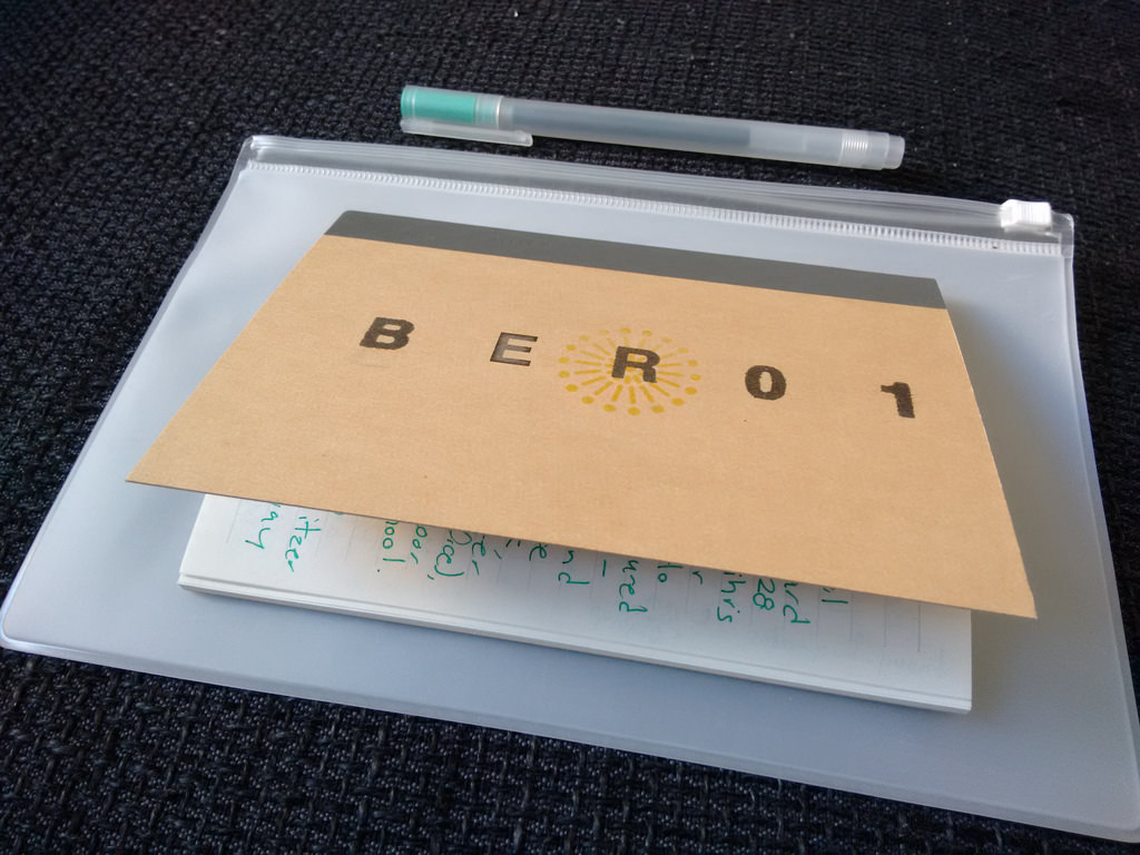
I’ve found it useful, recently, to add one item to the kit: a holder. Conveniently for this trip, I happened to visit MUJI, which specializes in such things. So the Berlin assemblage looked like this:
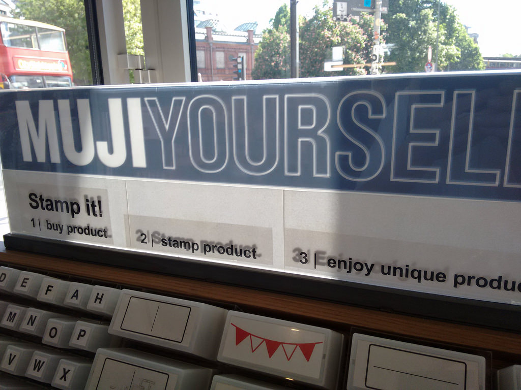
The MUJI here in Berlin includes a “MUJI YOURSELF” station near the exit, with a collection of self-inking rubber stamps you’re free to use to customize products you’ve purchased (and MUJI products, branding-free as they are, are perfect for this):
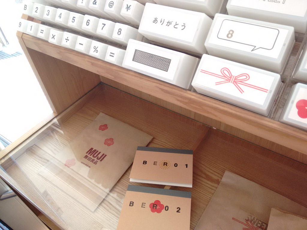
I left BER02, the second of the notebooks, as a gift for Peter and Michelle, who generously loaned me their flat while I’ve been in Berlin.
My friend [[Christina]], upon learning that I am in Berlin this week, assigned me a special mission:
I was just reading about Berlin in a Bon Appétit magazine this morning, apparently there is a street food night there on Thursdays - looks tasty!
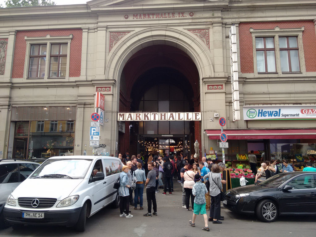
Christina helpfully sent this on a Thursday. And I helpfully read it while sitting 700 m from Markthalle Neun where Street Food Thursday is held. Every Thursday.
I immediately dropped everything and headed toward the food. Ten minutes later, there I was. I didn’t need a map, as there were teaming hordes of hungry people headed from the Görlitzer U-Bahn leading the way. Here was the scene I encountered:
Inside was the regular market hall – what you might expect from Charlottetown or Saint John or Halifax or Toronto – amped up with a collection of itinerant street food stalls offering all manner of interesting food. As the market’s website describes the event (translated by Google):
It is a platform for all those who dedicate themselves without own restaurant and big investments but with even more creativity to their passion: cooking! The appeal of the matter is, of course, to taste many details from various corners of the world for little money.
And so it was.
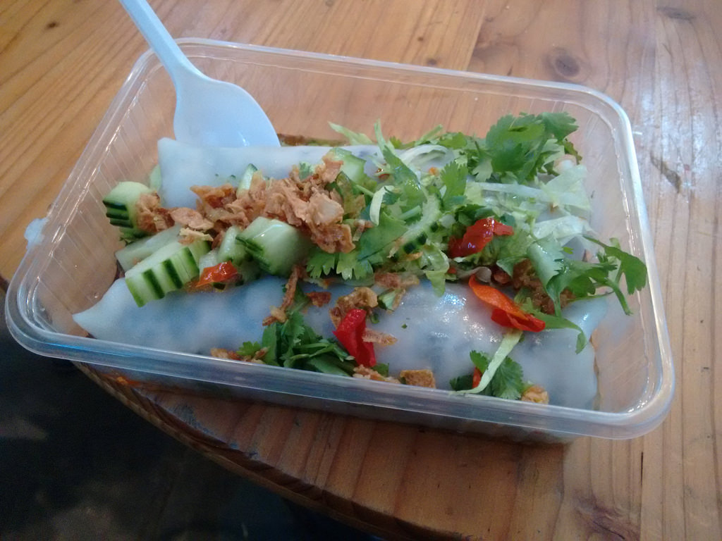
I started near the entrance, on the left, at a stall offering rice rolls filled with tofu and topped with cucumber, cilantro and hot sauce. They were fantastic. 5 euro.
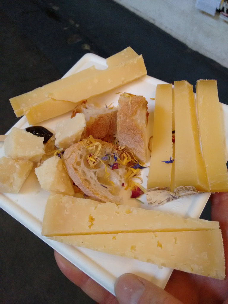
Directly to the left of the rice roll stand was a stall offering a plate of 4 raw milk cheeses and bread. The plate came with a careful explanation of the origin and nature of each cheese, and a special instruction to use the compote provided while eating the aged gouda, as this is tradition. A. Lot. Of. Cheese. But what cheese it was. 6 euro.
At this stage I tagged out for a moment for a mint iced tea to clear the cheese fog from my palette and then tagged back in for something I remember being called a “Kimchi Slam” but which likely had a different name; I found it about a third of the way back on the right. Steamed bun, tofu, cabbage slaw, kimchi and hot sauce. The highlight of the night. 4 euro.

I would have kept eating had I not been stuffed by this point: there was plenty additional to consider. Vegan burgers. Tapas. Burritos. Waffles. Taiwanese snacks. Raw chocolate. But full I was, and it was getting hot and humid, so I bowed my head and headed out into the Kreuzberg twilight.
Christina deserves some sort of award for “right place, right time,” something she seems particularly adept at. I await further instructions.
Five years ago I spent each Tuesday in August here in Berlin – just up the street from where I type this, in fact – conceiving, designing, setting and printing a letterpress broadside. It was tremendous creative fun: having only 8 hours for the entire process focused my mind in a way that it hasn’t been focused since.
The manager of the print studio at Druckwerkstatt, where I was printing, was a man named Frank, who I introduced here at the time like this:
Fortunately at this point Frank turned up. Frank is the amiable manager of the print studio, and he sprang into action suggesting that although it would be nigh unto impossible to set smaller metal type, we could use the partially-functioning proof press – a Grafix-brand press and operates much like a Vandercook – with larger wooden type, manually inked with a brayer, to get me going (he also referred me to the neighbourhood Linotype shop; is there nothing that Kreuzberg cannot provide?).
Frank couldn’t tell me exactly where the Linotype shop was – “somewhere on Weiner Strasse” was the best he could do – and I never did find it.
On this trip I’m staying in the same neighbourhood, and I set out on Monday afternoon down Weiner Strasse to see if I could solve that problem And, sure enough, after 5 minutes I found this:
I copied down the email address and telephone and when I returned to my flat I sent a note of inquiry, a note that ultimately resulted in an invitation to visit the shop this morning.
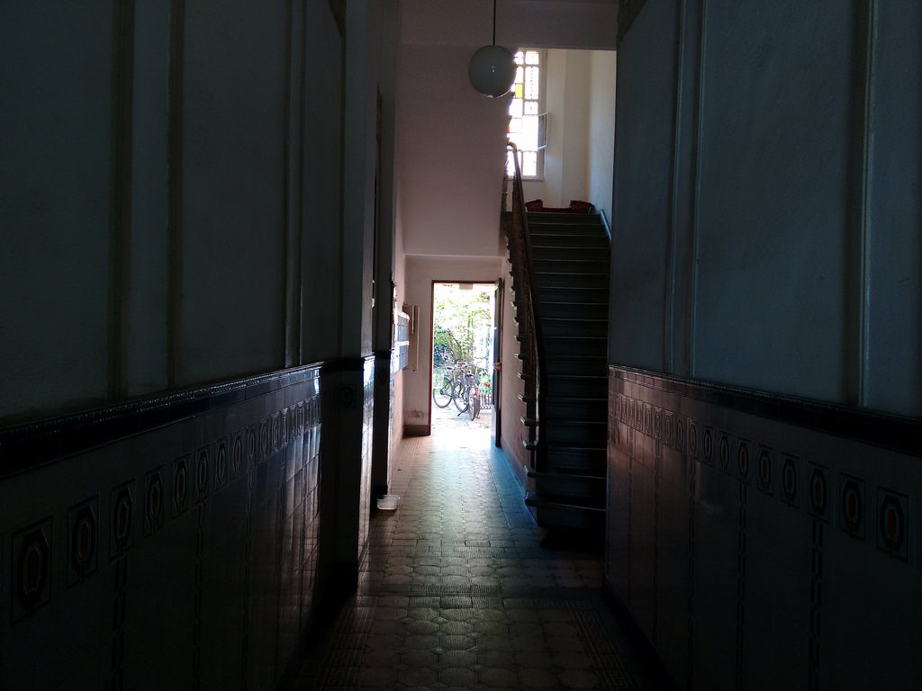
And so shortly after 9:30 I headed through the front building:
and into the courtyard:
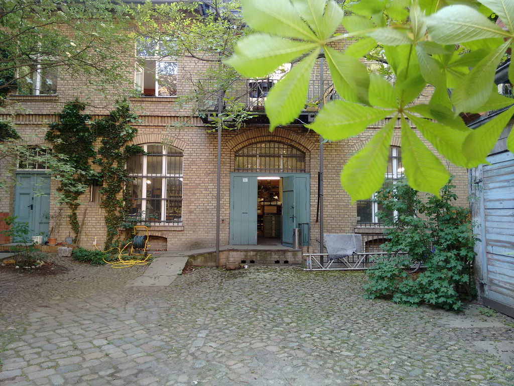
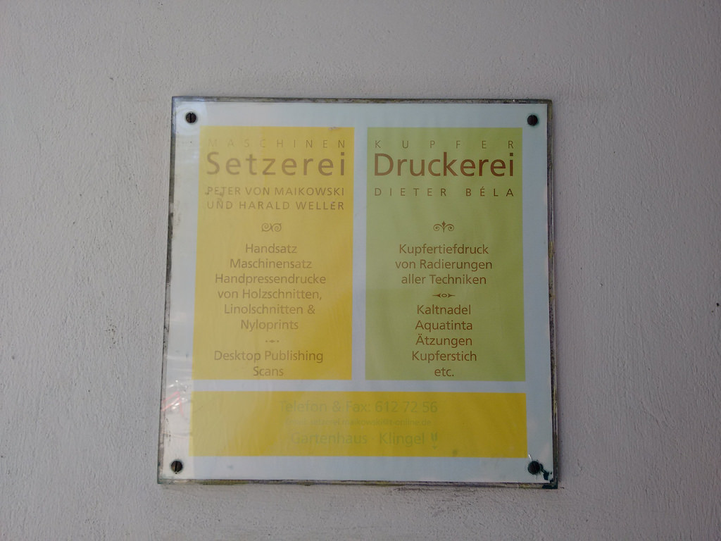
to find Setzerei Peter von Maikowski und Harald Weller:
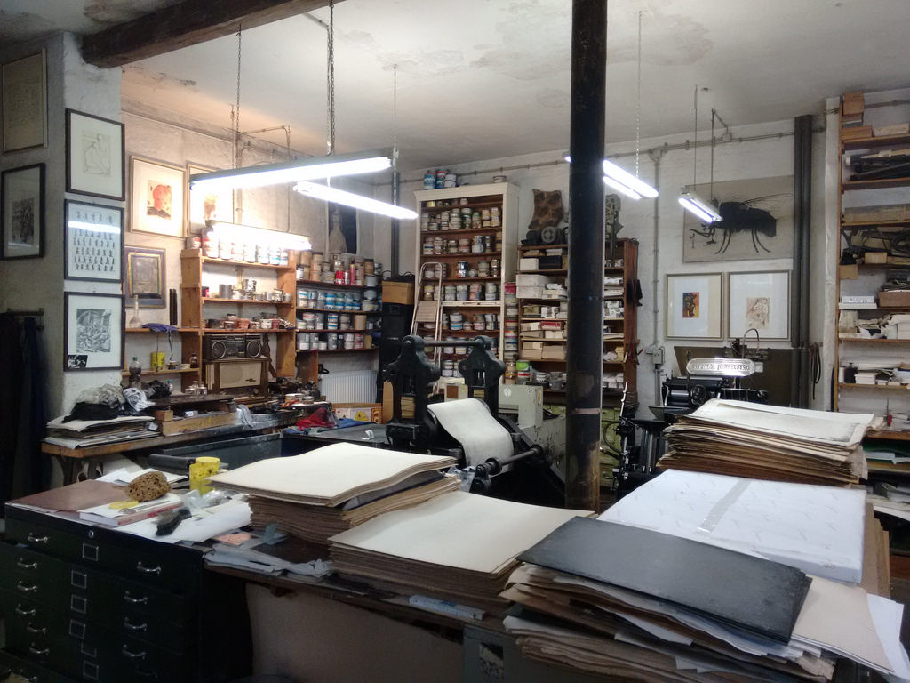
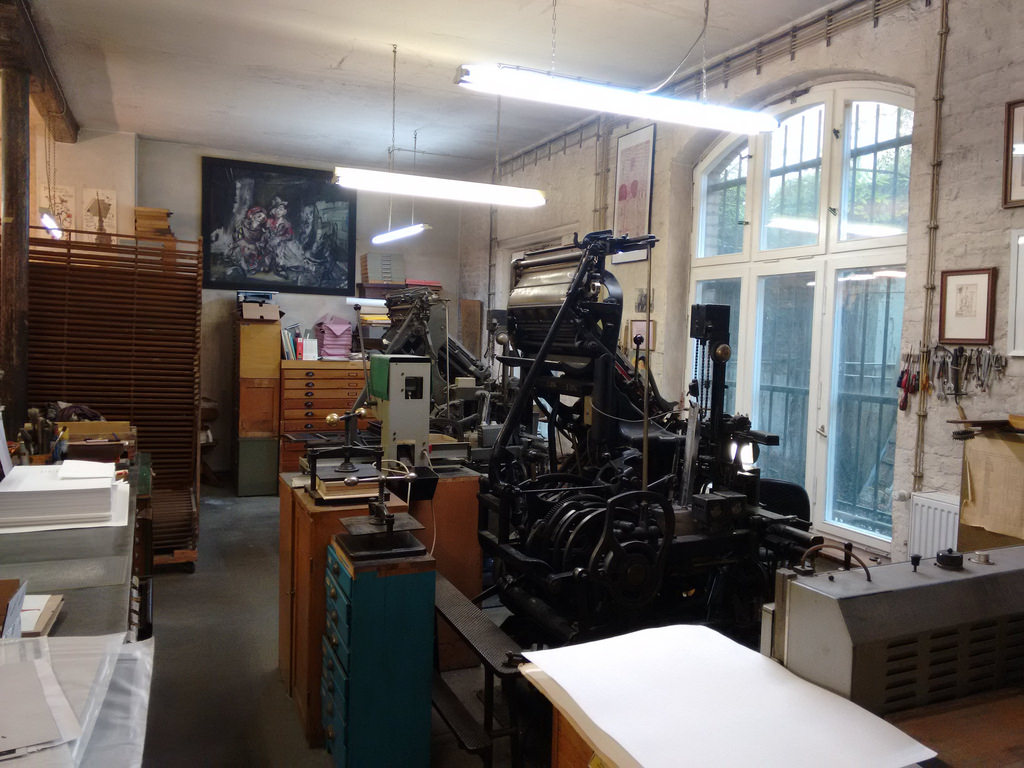
Harald greeted me warmly at the door, and gave me a tour of his shop — two Linotype machines, a Heidelberg letterpress, an etching press, a plate maker – and showed me some of the beautiful work the shop has produced (their specialty is art books).
We ended up chatting about type and printing and related matters for a bit, and the topic of klischees came up (printing plates of ornamental material like logos and illustrations). I mentioned the large collection that Ian Scott loaned me, and how I needed to organize them better, perhaps producing some sort of index. At which point Harald pulled a book off the shelf showing me that he had done exactly that for his own collection:
I am now inspired to return to my shop and do the same, especially as Ian has continued to feed the collection and I’ve supplemented it myself, to the point where I may have two or three hundred examples to index.
It was a lovely visit, especially as it was yet another node in a long journey that started with my trip to the Cognitive Cities conference in February 2011, after which followed a casual mention by my friend Luisa about a print shop she noticed out of the corner of her eye, which led me to a plan to spend part of that summer in the city, spending Tuesdays printing, which led me to Frank, which led me to seek out Harald, finding him five years later (and, full circle, I first met Peter Bihr, in whose flat I type this, at Cognitive Cities).
Follow your curiousity.
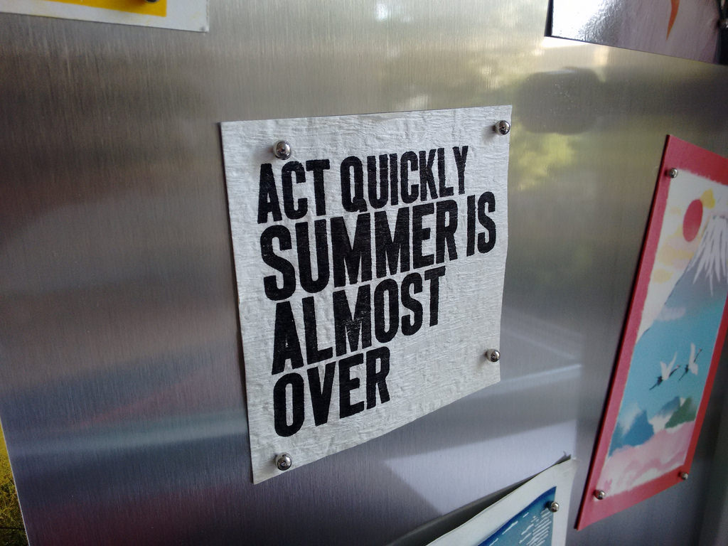
What a feeling it is, going to the fridge of an overseas friend to retrieve the morning yogurt, to find a piece of your own craft work affixed thereto. Such a feeling washed over me this morning in the flat of Peter Bihr and Michelle Thorne, on loan to me this week I’m in Berlin: upon their fridge I found Act Quickly Summer Is Almost Over, a reminder I created, to myself and to others, three summers ago. The discovery was sweeter still as the flat is in the same neighbourhood where I spent August 2011 printing.
Michelle and Peter were very generous to loan me their lovely flat: truth be told, we’ve only met face-to-face a few times, the rest of our relationship mediated by a shared love of travel and readership of each other’s blogs.
As it happens, summer has just arrived in Berlin this very week: every single person I’ve encountered has mentioned that I’ve come at exactly the right time, as the weather turned from cold and grey to warm and sunny just this past weekend. I’ve been a great beneficiary of this turn, having spent many lunches, suppers and drinks outside in the sunshine this week.
Berlin and the people I know here are a great tonic for the mind and the soul; it’s a good way to start the summer season.
About This Blog
 I am Peter Rukavina and this is my blog. I am a writer, letterpress printer, and a curious person.
To learn more about me, read my /now, look at my bio, listen to audio I’ve posted, read presentations and speeches I’ve written, or get in touch (peter@rukavina.net is the quickest way).
I have been writing here since May 1999: you can explore the 25+ years of blog posts in the archive.
You can subscribe to an RSS feed of posts, an RSS feed of comments, or a podcast RSS feed that just contains audio posts. You can also receive a daily digests of posts by email.