Yesterday was my last of five Tuesdays this summer I’ve spent printing in Druckwerkstatt, the magical printing workshop in Kreuzberg 15 minutes walk from our apartment in Berlin. While it’s sometimes been a logistical challenge to carve out time from work and family to spend 8 hours in the letterpress shop, it was worth the effort: I was able to learn to print using an entirely different press (an old Grafix proof press), with an entirely different collection of type, mostly wood, from anything I’d experienced before, and with an excellent colour palette of inks.
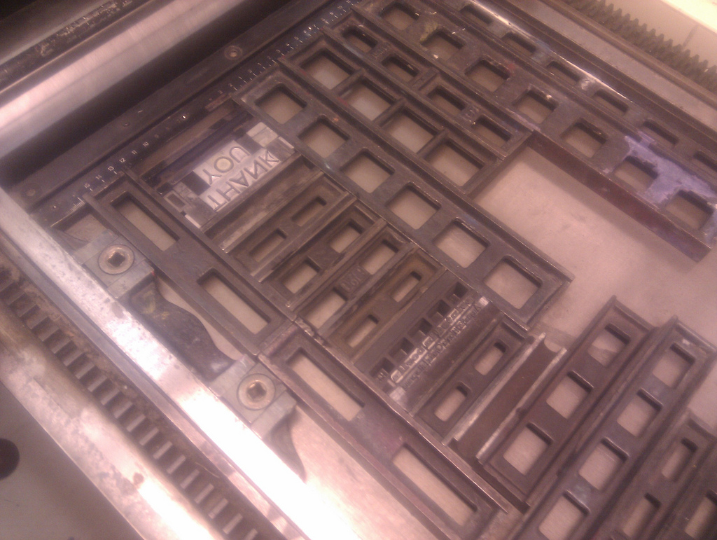
Druckwerkstatt is an amazing facility and its collection of type is the largest I’ve ever seen. Alas, as the bent of the facility is art rather than trade, most of the metal type goes unused, sitting lonely in its drawers. On my first week there the studio manager, Frank, advised against trying to print with smaller sizes of metal type on the proof press because it would be difficult to manage them on the press; and, true enough, without composing sticks or any of the usual “type management” appliances a letterpress shop would have, it was. And so I focused my efforts on wood type.
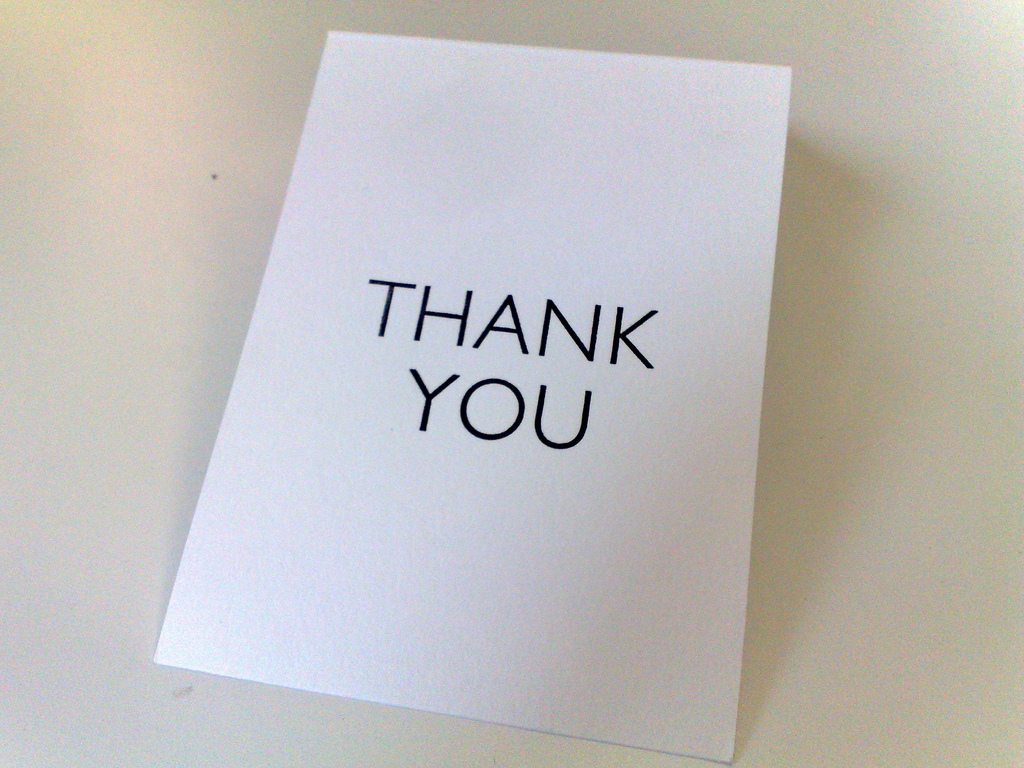
But yesterday, with Frank safely on vacation and therefor unable to protest, and the metal type crying out to me, I decided that I had to awaken it at least once. And so I set up a “thank you” card for my 40 subscribers, intended both as an actual thank you for their support and encouragement, and also as a card they could then turn around and use as an actual card for someone else.
For the front of the card, the “Thank You,” I choose Gill Sans; it’s a classic face, and although it’s one I have in smaller sizes at home, I welcomed the change to use the 48 point font I found:

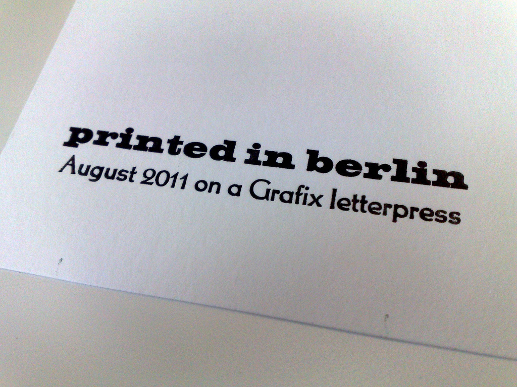
For the “credit” on the back of the card I went with Volta (“fett,” which is “bold”) and Thannhaeuser.
Volta is a German-designed typeface from1957 designed by Konrad F. Bauer; it’s pleasantly substantial, and I’m particularly fond of its lowercase “i”. As I could only find Volta in lower case, I set the “printed in berlin” in all lowercase.
Thannhaeuser is a self-titled face from the East German designer Herbert Thannhaeuser, director of the state-owned VEB Typoart foundry. It’s a peculiar face that seems both old and modern to my eye; it’s got a lovely lowercase “e” and “x”, a fantastic uppercase “G” and numerals that aren’t of the style I generally like, but that seem to work here.

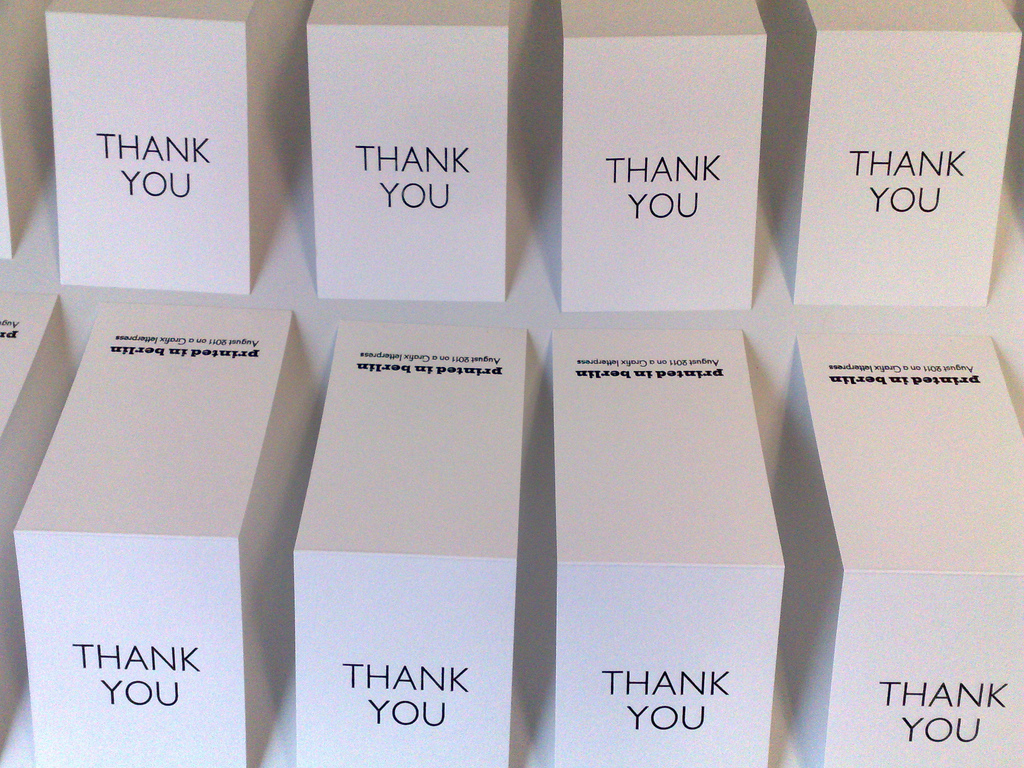
Here’s the final result, off in the mail today, with thanks, to destinations around the world:


 I am
I am
Add new comment