
One of the items on the wall at the Victoria Schoolhouse that catches my eye, every week as we go there for acting class, is a list of all the teachers who taught at the school, over the 101 years from 1872 to 1973:

For no other reason that “somebody is going to be looking for this list at some point in the future,” I’ve transcribed the list, and I’m pasting it here for posterity.
(If you ever have a chance to pop into the school—it’s a community hall now, and home to the village office—it’s worth poking your head into the main hall to look at the collection of artifacts related to the school’s past.)
Years | Teacher(s) |
|---|---|
1873-73 | John M. Campbell |
1873-74 | E.A. Donelly |
1874-75 | vacant |
1875-78 | Charles Darrach |
1878-79 | Charles Darrach |
1879-80 | Fulton J. Clay / Ambrose Baker |
1880-81 | Ambrose Baker (Prin) / Kate MacQuarrie |
1881-82 | J.N. Schurman (Prin) / Kate MacQuarrie |
1882-83 | Norman Leard / Edith Webster |
1883-84 | Alex Campbell / Edith Webster |
1884-85 | Alex Campbell / Edith Webster |
1885-86 | Alex Campbell / Augusta Newson |
1886-87 | Alex Campbell |
1887-89 | Alex Campbell / Janie Dawson |
1889-90 | Alex Campbell / Lula E. Myers |
1890-92 | Alex Campbell (Prin) / Jessie J. Clark |
1892-93 | Lauchlin MacDonald / Nina Robertson |
1893-94 | Lauchlin MacDonald / Bertha M. Tuplin |
1894-95 | N.E. Carruthers / Bertha M. Tuplin |
1895-96 | N.E. Carruthers / Bertha M. Tuplin / Birdie Leard |
1896-97 | N.E. Carruthers / A.P. Trowsdale / Birdie Leard |
1897-1901 | A.P. Trowsdale / Birdie Leard |
1901-03 | J.E. Robertson / Birdie Leard |
1903-04 | J.E. Robertson / H.B. Hazel Myers |
1907-08 | W.J. Fraser / Hazel Myers |
1908-09 | Wentworth MacDonald / Hazel Myers |
1909-10 | E. Matheson / Hazel Myers |
1910-11 | C. Braden Jelly / Phoebe MacDonald |
1911-12 | C. Braden Jelly / Gertrude Matheson |
1912-15 | C. Braden Jelly / Ruth Boulter |
1916-16 | Haddon MacLeod / Elma Inman |
1916-17 | Nelson MacEwen / Ruth Boulter |
1917-18 | Nelson MacEwen (Prin) / Mildred Howatt |
1918-19 | Annie Fraser / M. Katherine Trainor |
1919-20 | Ruth MacGregor / Annie Fraser / M. Katherine Trainor / Ruth Boulter |
1920-21 | Norman MacKenzie / Euphemia MacPhail |
1921-23 | George E. Webster / Euphemia MacPhail |
1923-24 | Henry Moyse / Euphemia MacPhail |
1924-27 | George Boulter / Euphemia MacPhail |
1927-28 | Arthur Brooks |
1928-29 | Malcolm MacKenzie / Euphemia MacPhail |
1929-30 | Malcolm MacKenzie / Marjorie Leard |
1930-31 | Heber Mathews / Bertha Thompson |
1931-35 | Charles Howatt / Bertha Thompson |
1935-36 | Richard McQuarrie/ Bertha Thompson |
1936-37 | Eva MacLeod / Bertha Thompson |
1937-40 | Eva MacLeod / Marion Raynor |
1940-41 | Heath McQuarrie / Eva MacLeod |
1941-42 | Annie Gordon / Heslip MacQuarrie / Eva MacLeod |
1942-43 | Peter MacPhail / Isabel Inman / Eva MacLeod |
1943-44 | Isabel Inman / Mary MacDonald |
1945-46 | Jean Boswell / Annie MacQuarrie |
1946-47 | Jean Boswell / Christine MacLeod |
1947-48 | Freda Howatt / Christine MacLeod |
1948-49 | Florence MacDougall / Christine MacLeod |
1949-50 | Florence MacDougall / Kathleen Pickers |
1950-51 | Florence MacDougall / Phyllis Stewart |
1951-52 | Florence MacDougall / Adelaide Inman |
1952-54 | Florence MacDougall / Inez Cass |
1954-55 | Mrs Doris Thompson / Sylva Boulter |
1955-56 | Mrs Doris Thompson / Gladys Villett Wright |
1956-57 | Mrs Doris Thompson / Gladys Villett Wright |
1957-61 | Marion MacQuarrie / Jean Boswell |
1961-61 | Jean B. Howatt / Marion MacQuarrie |
1962-63 | Harry MacDonald / Marion MacQuarrie |
1963-65 | Gloria Jean Grant / Marion MacQuarrie |
1965-72 | Addie Kougergou / Marion MacQuarrie |
1972-73 | Marion MacQuarrie (Sep-Feb) |
1973 | Mary Masters (Feb-June) |
I’ve also produced a CSV of the same information, as well as another CSV that lists each teacher, sorted alphabetically, and the period(s) they served.
From a list of ten Instructions for Myself by James A. Reeves, No. 10 is:
Artificial intelligence cannot make cool shit, but it can help me learn how to make cool shit.
Brilliant.
I lied: there was one more print shop upgrade today. I installed my father’s Boston KS pencil sharpener. See also The Museum of Norm.

Our final print shop upgrade of the weekend: we hung a metal rack, inherited from architect Bill Chandler, and formerly used to display material samples, on the wall, with an eye to using it to displaying “tiny things that can be hung from pegs.”
Those in the photo are some tests.

I feel like I’ve become mid-level accomplished at drilling into concrete (key: patience).
Another studio update today: we hung a print by Martin Rutte on the wall behind the press. An excellent wellspring for creative inspiration.

We made two nice updates to the print shop today.
First, we recycled a shelf that had outlived its usefulness at home to become printmaking ink storage. This required, among other things, drilling into concrete mortar (slow, dusty).
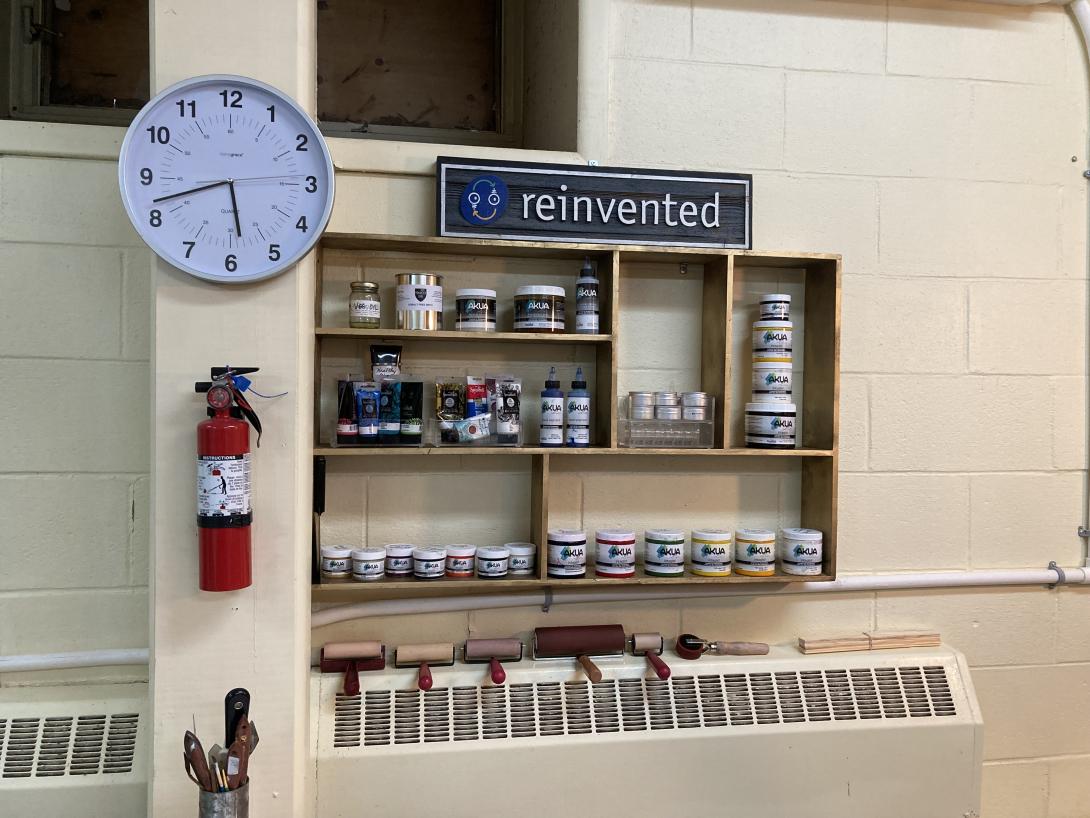
Second, we came up with a way of displaying our inventory of prints for a planned series of pop-up sales. We ended up using vinyl gutters for this, which was inexpensive ($22, all-in) and easy to install.
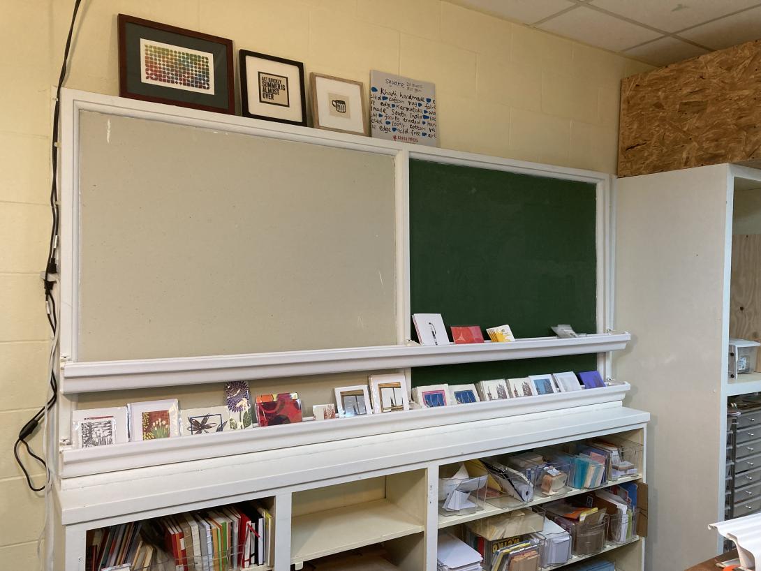
Stay tuned for announcements of our pop-ups, where you’ll get to see both in person.
Jon Udell, whose words I’ve been reading for years, back to his days at BYTE, writes about his personal connection to USAID:
The great adventure of my birth family was the fifteen months we lived in New Delhi, from June of 1961, on a USAID-sponsored educational mission. So the destruction of USAID feels personal. I’m only now realizing that we were there at the very beginning of USAID, during what Jackie Kennedy later mythologized as the Camelot era. On a tour of India, at a meet-and-greet in New Delhi, she appears in this family photo.
We must have been at the embassy, she’s surrounded by Americans. You can see a few South Asian faces in the background. The young boy at the center of the photo, gazing up at the queen of Camelot, is five-year-old me.
It could have been a Life Magazine cover: “A vision in white, Jackie represents America’s commitment to be of service to the world.” As corny as that sounds, though, the commitment was real. Our nation upheld it for sixty years and then, a few months ago, fed it to the wood chipper and set in motion a Holocaust-scale massacre.
See also Hundreds of Thousands Will Die, an interview of Atul Gawande by The New Yorker editor David Remnick, which finishes:
But this is not just an event. This is not just something that happened. This is a process, and its absence will make things worse and worse and have repercussions, including the loss of many, many, maybe countless, lives. Is it irreparable? Is this damage done and done forever?
This damage has created effects that will be forever. Let’s say they turned everything back on again, and said, “Whoops, I’m sorry.” I had a discussion with a minister of health just today, and he said, “I’ve never been treated so much like a second-class human being.” He was so grateful for what America did. “And for decades, America was there. I never imagined America could be indifferent, could simply abandon people in the midst of treatments, in the midst of clinical trials, in the midst of partnership—and not even talk to me, not even have a discussion so that we could plan together: O.K., you are going to have big cuts to make. We will work together and figure out how to solve it.”
That’s not what happened. He will never trust the U.S. again. We are entering a different state of relations. We are seeing lots of other countries stand up around the world—our friends, Canada, Mexico. But African countries, too, Europe. Everybody’s taking on the lesson that America cannot be trusted. That has enormous costs.
It’s tragic and outrageous, no?
That is beautifully put. What I say is—I’m a little stronger. It’s shameful and evil.
Ira Tries Stand-up Comedy (For Real), wherein Ira gets stand-up advice from Mike Birbilgia, is pure joy to listen to.
Of all the physical relationships I’ve had in my life, among the most intimate is the one I have with my Golding Jobber № 8 letterpress. When I’m running the press, we are dancing, my rhythm matching its rhythm, making something beautiful together. On a good day, when we’re working well together, there is no better feeling.
The Jobber is, if not exactly inanimate, at least very predictable, always turning at the same speed, meeting me in the same spaces. If there is a dance partner that needs to bob and weave, it’s me, only me.
Of course I have a much deeper—and human—relationship with Lisa.
While “on a good day, when we’re working well together, there is no better feeling,” can also be said of us, our shared humanity means that we’re both bobbing, both weaving, listening, responding, feeling, sensing, all the time. It’s a dance that’s alive, and wild, and I wouldn’t have it any other way.
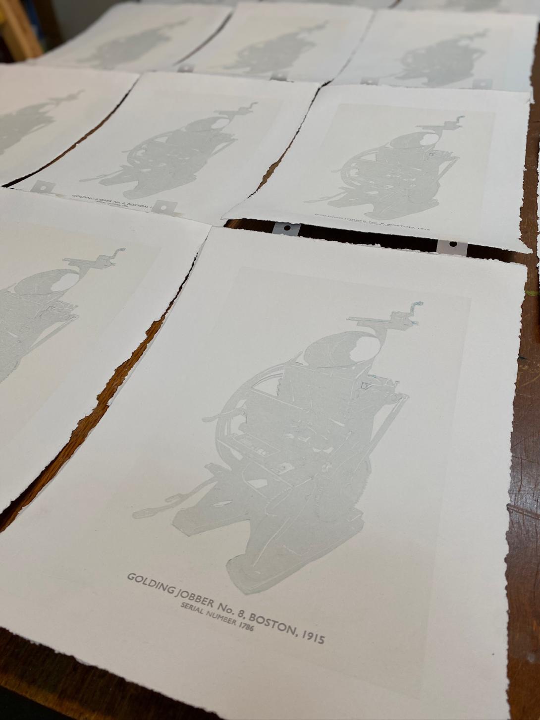
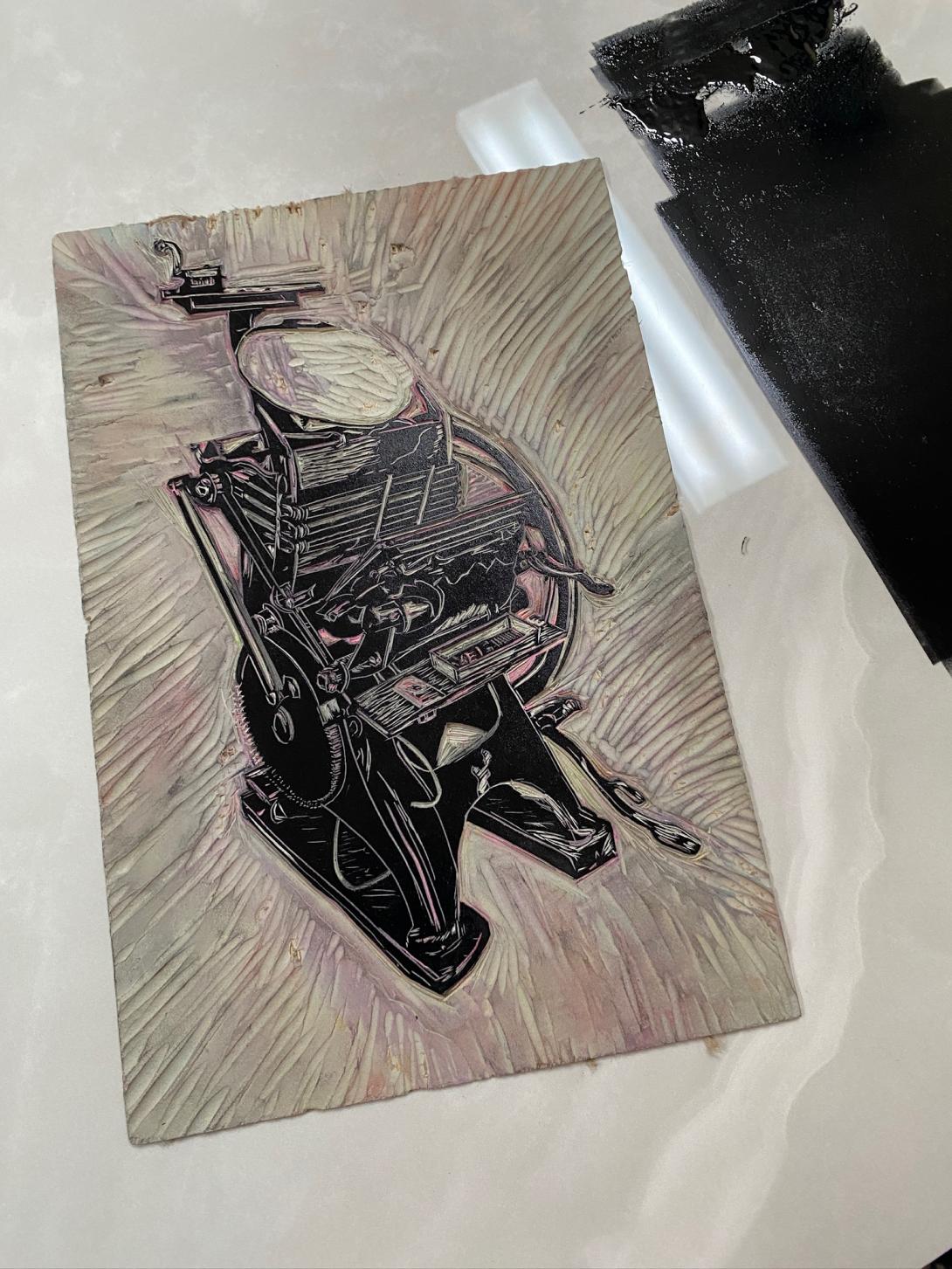
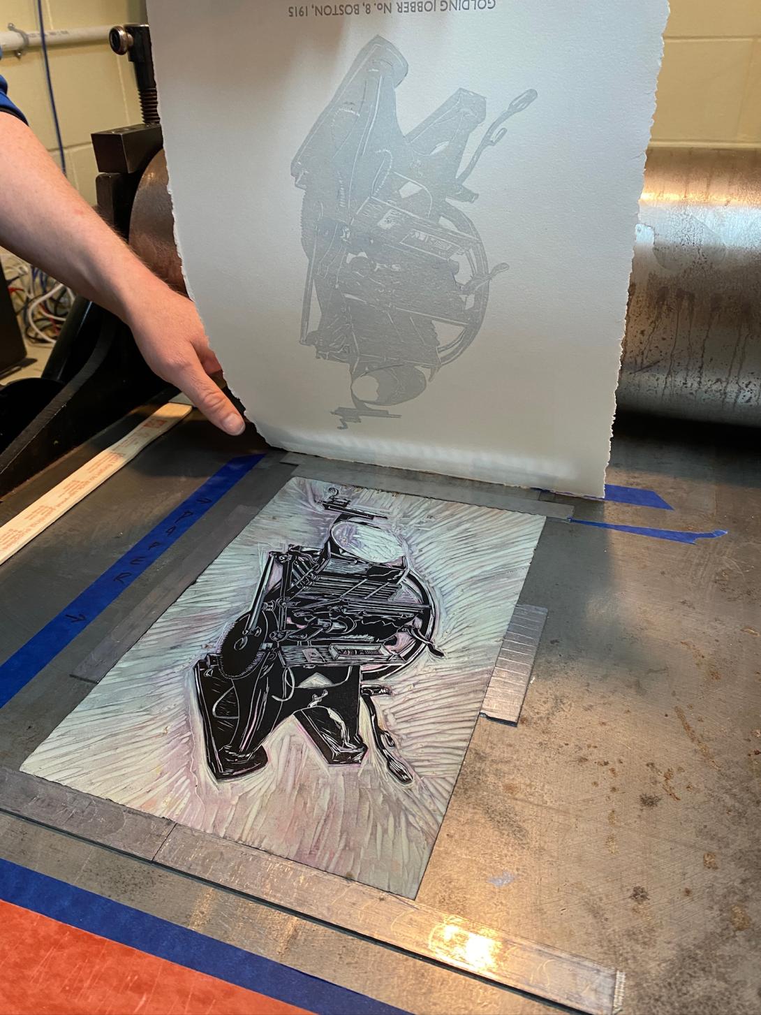
There’s something poignant, in light of all this, that my birthday gift from Lisa was this stunning relief print of the selfsame Golding Jobber:
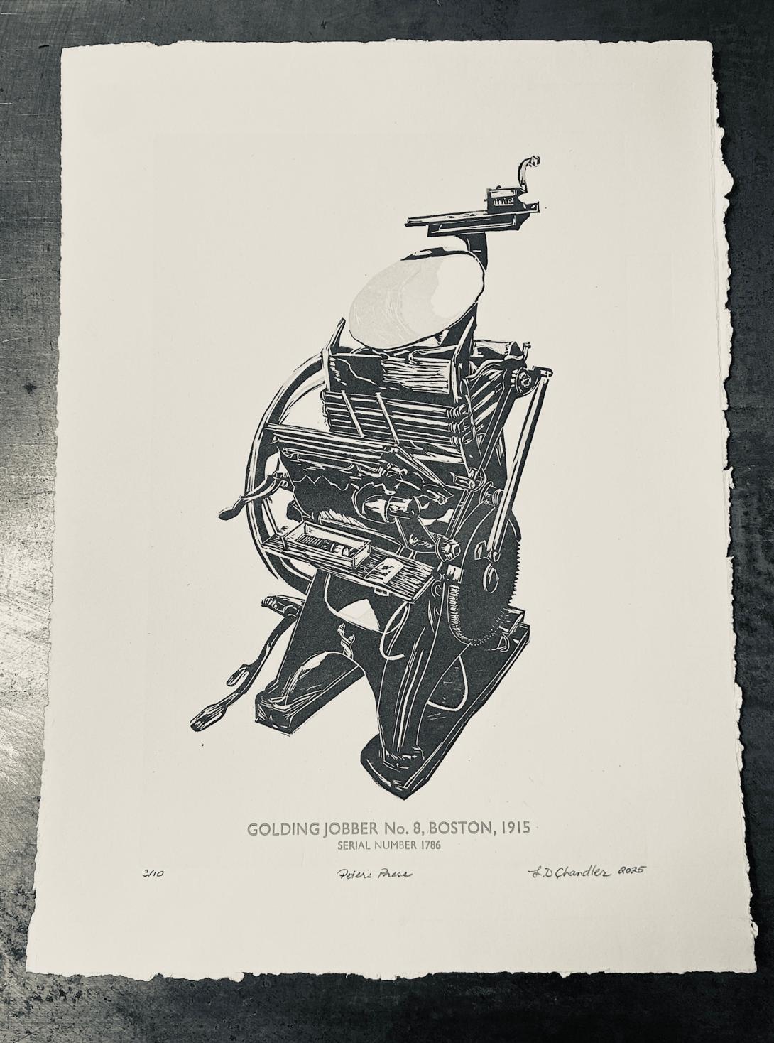
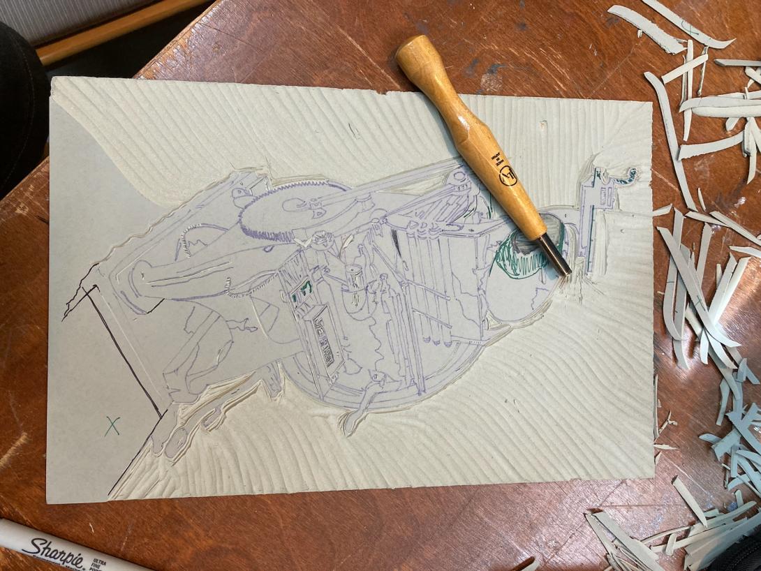
To produce the print meant that Lisa had to become intimate with the geography of the press; not a dance, like mine, but a portrait-sitting that lasted for days.
The final print itself doesn’t do justice to the painstaking work that went into creating it: carving into a linoleum block, printing, carving more, printing, over multiple layers.

It’s only now, a month after I received the gift, after the enormity of the love, and sheer effort, behind the gift has sunk in, that I can sink into feeling the details of the print, and truly feel that it is, indeed, an intimate portrait of my longtime dance partner.
–––
There is something that happens sometimes in the print shop after the job is done, but the shop not yet cleaned up: you can end up with surplus creativity hanging in the air.
Lisa and I both know the feeling; it’s when some of the most lively things can happen.
One such instance, for me, came in 2014, when the printing of pieces for Brenda Whiteway’s Confederation Country Cabinet was completed. I had the words of Island poet Frank Ledwell still ringing in my ears, having just set and printed his poem Charlottetown Conference.
I spent an extra hour in the shop and printed a broadside of a single line:
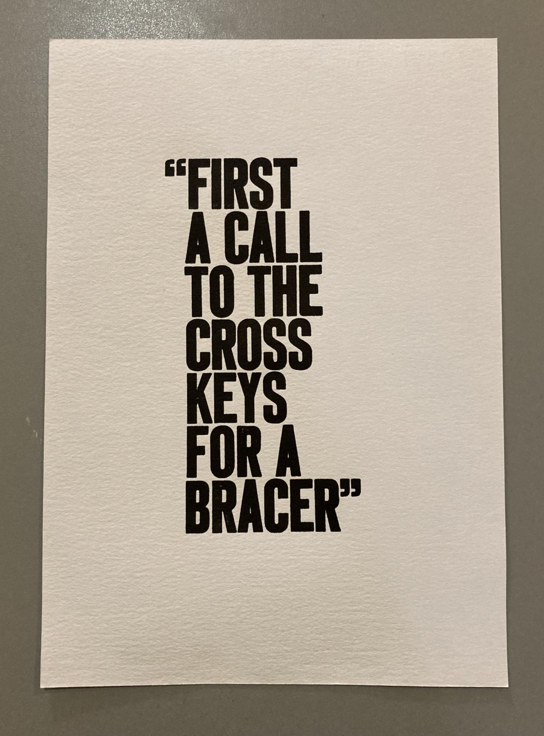
The piece remains among my favourites, in part because, rather than being the result of a careful and deliberate plan, it was conceived and born in the blink of an eye, in the “done” time.
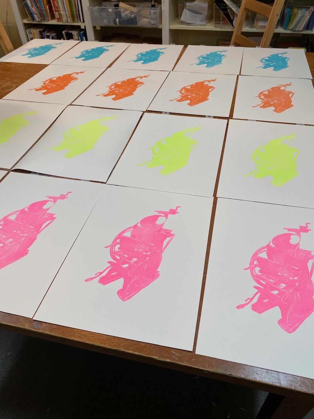
Lisa’s Peter’s Press piece afforded her a similar gift, an edition-following-the-edition, she’s titled &Colour.
The notion arose from a desire to see the original rendered in different colours (the original having been printed in combinations of white, silver, blue, and black).
She started with four: Hot Pink, Lime Green, Turquoise, and Pyrrolle Orange.
After some additional carving, she overprinted a different set of four colours—Prussian Blue, Hansa Yellow, Crimson Red, and Quinacridone Magenta—to produce 16 unique combinations:
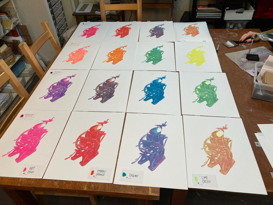
The effect is striking, and the piece becomes something else again, as a collection of 16, each member of which plays off the other.
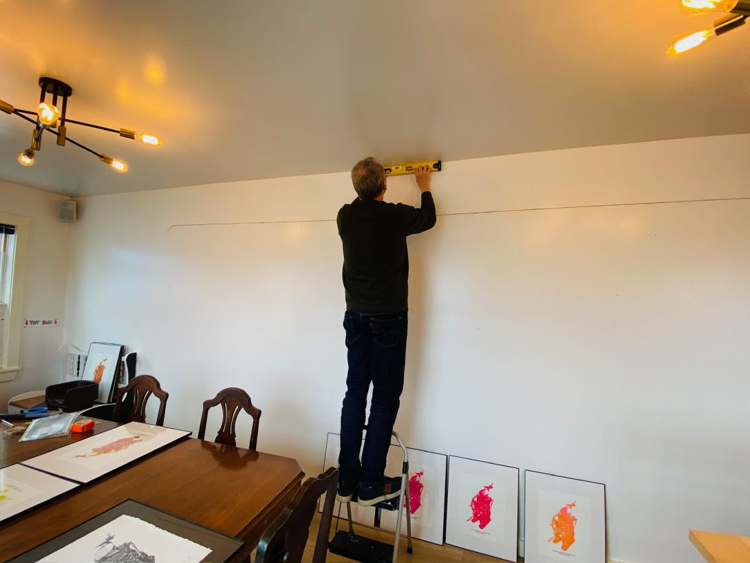
A month ago we gave our friend Jessica Fritz a tour of the print shop while we were producing the colourful edition of the prints (her handiwork is infused into the Turquoise layer); from that experience came an offer to exhibit the entire edition on the walls of the Black & White in St. Peters Bay, the café she co-owns.
Which is how Lisa and I found ourselves, yesterday, hammer and nails and measuring tape in hand, carefully hanging 16 framed prints on a large wall at the back of the café.
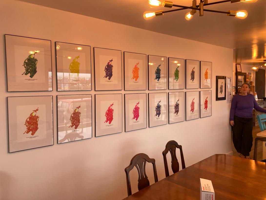
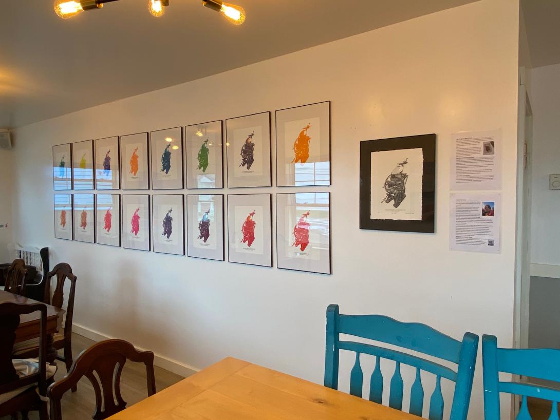
Seen mounted together as a framed edition, the prints truly are “something else again,” rooted in Lisa’s original design, but, with the colourful combinations, also a study in colour.
I love it.
It’s a special bonus round for what was already as heartfelt a birthday gift as I can imagine receiving.
(It also happens to be the first public exhibition of Lisa’s work as a printmaker!)
You can see &Colour—and the original print—at the Black & White Café and Bistro, 5549 St. Peters Road, St. Peters Bay, from now through summer.
I first became aware of the Sweden city of Göteborg (believe me, you want to pronounce it in the lyrical Swedish, rather than in the mealy English Gothenburg) when I met Olle 20 years ago (!), and learned it’s his home-city.
So, there’s one great thing that came outta Göteborg.
Here are some more.
Earlier this year, at a family pizza supper at Lisa’s aunt and uncle’s place, we were having a chat with her cousin A. about what she was watching on TV.
“Oh, Married At First Sight: Australia,” she exclaimed with infectious enthusiasm (of the sort that she is uniquely capable of).
Of course we had to seek it out.
“We’ll just watch one episode, just to see what she’s on about,” Lisa and I agreed.
That didn’t work out.
We got hooked.
While we were able to find most episodes on YouTube, using Dailymotion and sketchy grey sites when that didn’t work, eventually we realized that we needed a more reliable way to stream (there were, after all, multiple episodes every week).
A., who has her own Göteborg stories to share, suggested we use a VPN to pose as Australians and watch it directly from the source.
She pointed us to Mullvad.
Which is made in Göteborg.
From their website:
A free and open society is a society where people have the right to privacy. That’s why we fight for a free internet.
Free from mass surveillance and censorship. Free from personal data collection and business models where your online behavior is treated as commodity. Free from authorities mass monitoring entire populations. Free from big tech and data brokers mapping your life.
I signed up. I even paid with Bitcoin (residue from $20 I put into an ATM in Saskatoon a decade ago). Set things up on my phone. Set myself up in Sydney. Signed up for a Nine network account. And streamed away. (Ryan! Jacqui!).
So there’s another great thing outta Göteborg.
I always thought myself fully immune to Internet advertising. Indeed, I don’t see most of it, running my browsers with ad blockers turned up to 11.
But Instagram (of course) quickly figured me out, and started promoting me sneakers. As it learned more about me, it knew not just any sneaker would do: I needed European sneakers. Preferably ones with a light carbon footprint.
Which led me to Icebug.
From its Owners’ Directives:
While most private companies put the shareholders’ interest solidly first – Icebug choose to highlight Nature, Society, Customers, Employees, Suppliers and People involved in the supply chain. Of course, the shareholders have an important stake, but since Icebug’s business has great impact on so many other groups, all those interests are balanced. With a clear priority: Nature and Society are Icebug’s most important stakeholders.
The vision for Icebug is to be a changemaker for a society where people can thrive on a planet in balance.
This is our North Star on the horizon. It is a moral obligation to guide us in our daily work and our view of what the World needs.
I could get behind that. And I loved the look of their shoes.
Especially the Eide ReWool Biosole.

So I ordered a pair (with regular cash, not Bitcoin), and they arrived from the Icebug Canadian warehouse this morning.
I am wearing them as I type.
I love them.
Where is Icebug based?
In Göteborg of course.
An essential step towards creating this was taken in 2016 when we moved from downtown Gothenburg to the old factories in Jonsered. We work next to a nature reserve, only 11 minutes by commuter train from Gothenburg Central Station.
Our office is where creativity and well-being are given space and time. We have a yoga studio, changing rooms with shower and sauna, and miles and miles of forest, trails, and lakes. We also have flexible working hours and a very generous wellness allowance. We are alone in Sweden (as far as we know?) with three hours of mandatory weekly exercise during work hours. But don’t worry! There is no pressure or requirement for performance. Fresh air and a little movement in your chosen form always make you better and more alert.
Otherwise? We light a fire in our fireplace, argue about which coffee we should have, play table tennis, run, walk, eat a lot of snacks - and work hard but smart. Since 2018, our work has been conducted according to an Icebug version of the Scrum model. Cross-functional teams work together. Agile and dynamic, always focusing on the highest possible value for Icebug.
Icebug is a privately owned company where it’s never far between people or roles. If someone in our customer service needs to know something about a specific shoe model, they can walk a few meters to the person who designed the shoe and ask.
Forget about the shoes: if I was looking for work, I’d signup right now.
Another great thing outta Göteborg.
I’m keeping my eyes out for more.
About This Blog
 I am Peter Rukavina and this is my blog. I am a writer, letterpress printer, and a curious person.
To learn more about me, read my /now, look at my bio, listen to audio I’ve posted, read presentations and speeches I’ve written, or get in touch (peter@rukavina.net is the quickest way).
I have been writing here since May 1999: you can explore the 25+ years of blog posts in the archive.
You can subscribe to an RSS feed of posts, an RSS feed of comments, or a podcast RSS feed that just contains audio posts. You can also receive a daily digests of posts by email.