
While our crocuses emerge tentatively in mid-March, it’s not until mid-April that they achieve full brilliance. This is that time.
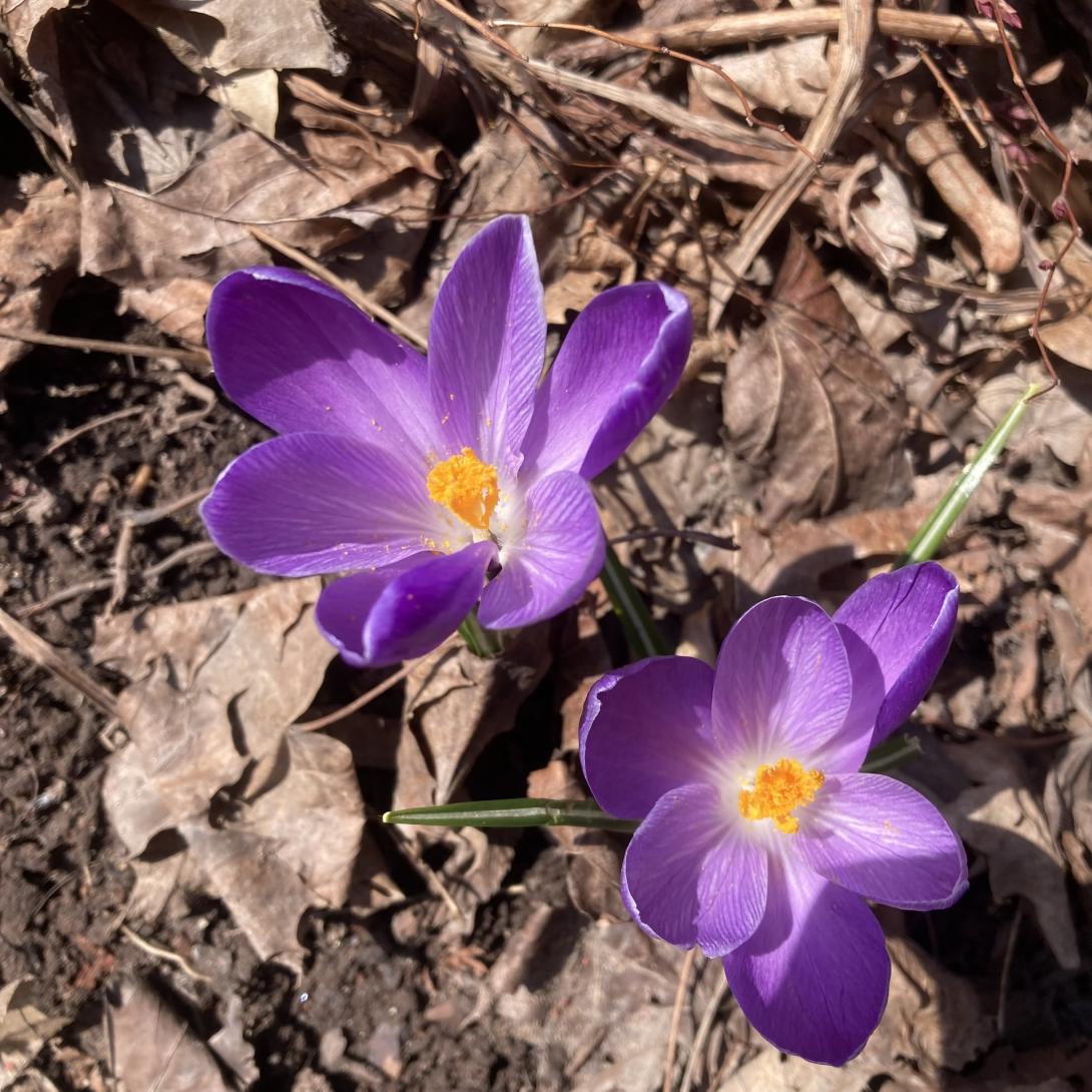
In another month we will have tulips. And then ferns.
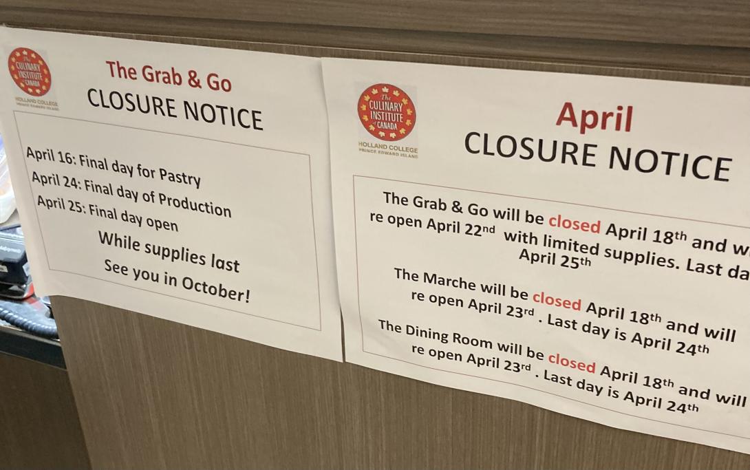
A repeating pattern in my life: one day every year, during the last few weeks of the spring semester at The Culinary Institute of Canada, I remember it offers both a great deal on lunch every weekday, and a grab & go market where they sell all manner of delights.
Yesterday was that day.
Lisa and I shared an excellent lunch, and we picked up everything from chocolates to meatballs to fresh baked bread.
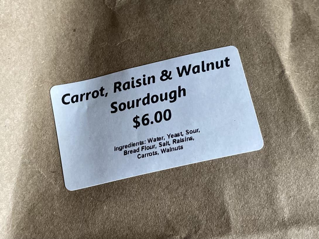
By far and away the tastiest thing we purchased was a loaf of Carrot, Raisin, & Walnut Sourdough bread. It is truly amazing.
The problem now is that the semester draws to a close next week, and neither lunch nor market returns until October. To deal with this, I’m going to put a reminder in my calendar for October, with hopes that I’ll be able to enjoy both more than just one week a year.
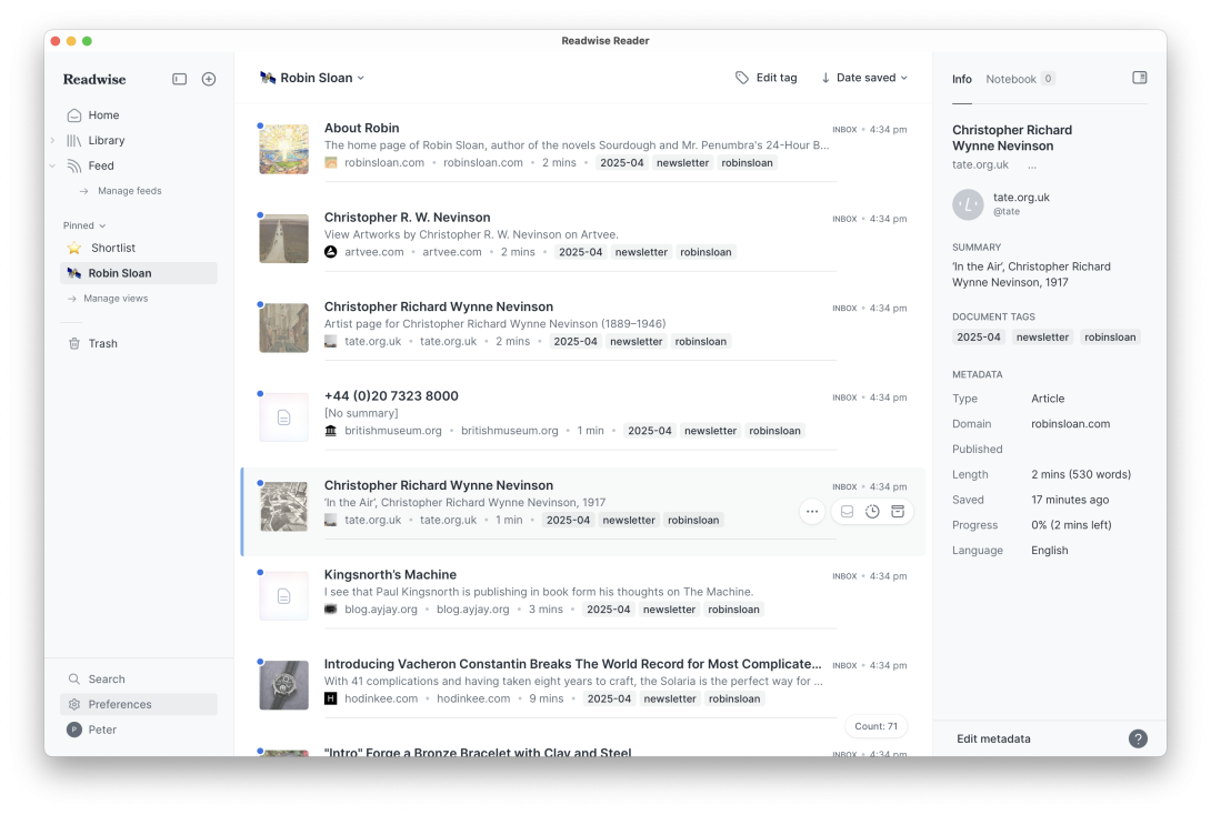
The Venn of “links in Robin Sloan’s email newsletters” and “things that interest me” is incredibly high. I noticed this especially with the April Edition: I read the newsletter in Readwise Reader, and I was adding almost every link to the queue for reading later in Reader.
So I decided that I needed a Robin Sloan Machine: a bit of code that would take all the links in the public URL for the newsletter and add them to Reader for later reading.
My ask to ChatGPT:
I have a URL that I want to extract all the links from, and then feed each link to the Readwise Reader API, adding each URL, with title, and tags of my choosing, as Readwise items. Please provide me with a PHP script that will do that. Make the original URL an argument for the script, and make the tag(s) an argument to the script, so that I can pass these as parameters and feed other URLs in a similar way.
The first pass at this was fully functional. I tinkered a little in subsequent prompts.
Anticipating that I might want to call this as an API endpoint on my own server at some point:
Please modify the PHP script so that it will accept EITHER parameters passed on the command link, OR the URL query parameters “url” and “tags.”
Tweaking the Reader API to clean up the HTML, and realizing that my script doesn’t need to figure out the title, as Reader will do that itself:
Modify the script so that it doesn’t need to pass the “Title” parameter to the Readwise API — the API will calculate this on its own when it reads the URL. Also, add the API parameter “should_clean_html” when calling the Readwise Reader API, and set it to “true”.
And, finally:
Modify the script so that multiple links found that are different only because they have a hash tag at the end are not sent — just send ONE to Readwise. And, finally, add code to pay attention to the note in the API about rate limiting.
Here’s the final script:
<?php
$isCli = php_sapi_name() === 'cli';
if ($isCli) {
   if ($argc < 3) {
       echo "Usage: php index.php <source_url> <tag1,tag2,...>\n";
       exit(1);
   }
   $sourceUrl = $argv[1];
   $tagsInput = $argv[2];
} else {
   if (!isset($_GET['url']) || !isset($_GET['tags'])) {
       header("HTTP/1.1 400 Bad Request");
       echo "Missing 'url' or 'tags' query parameter.";
       exit;
   }
   $sourceUrl = $_GET['url'];
   $tagsInput = $_GET['tags'];
}
$tags = array_map('trim', explode(',', $tagsInput));
$readwiseToken = 'YOUR_READWISE_API_TOKEN'; // Replace with your actual token
function fetchHtml($url) {
   $context = stream_context_create([
       'http' => ['header' => "User-Agent: PHP script\r\n"]
   ]);
   return @file_get_contents($url, false, $context);
}
function normalizeUrl($url) {
   $parsed = parse_url($url);
   if (!$parsed) return $url;
   // Remove fragment
   unset($parsed['fragment']);
   // Rebuild URL without fragment
   $normalized = '';
   if (isset($parsed['scheme'])) $normalized .= $parsed['scheme'] . '://';
   if (isset($parsed['user'])) {
       $normalized .= $parsed['user'];
       if (isset($parsed['pass'])) $normalized .= ':' . $parsed['pass'];
       $normalized .= '@';
   }
   if (isset($parsed['host'])) $normalized .= $parsed['host'];
   if (isset($parsed['port'])) $normalized .= ':' . $parsed['port'];
   if (isset($parsed['path'])) $normalized .= $parsed['path'];
   if (isset($parsed['query'])) $normalized .= '?' . $parsed['query'];
   return $normalized;
}
function extractLinks($html, $baseUrl) {
   libxml_use_internal_errors(true);
   $dom = new DOMDocument;
   $dom->loadHTML($html);
   $xpath = new DOMXPath($dom);
   $links = [];
   foreach ($xpath->query('//a[@href]') as $node) {
       $href = trim($node->getAttribute('href'));
       if (!$href || strpos($href, 'javascript:') === 0) continue;
       // Convert to absolute URL if needed
       if (parse_url($href, PHP_URL_SCHEME) === null) {
           $href = rtrim($baseUrl, '/') . '/' . ltrim($href, '/');
       }
       $normalized = normalizeUrl($href);
       $links[$normalized] = true; // use keys for uniqueness
   }
   return array_keys($links);
}
function sendToReadwise($url, $tags, $token) {
   $payload = [
       'url' => $url,
       'tags' => $tags,
       'should_clean_html' => true
   ];
   $ch = curl_init('https://readwise.io/api/v3/save/');
   curl_setopt($ch, CURLOPT_RETURNTRANSFER, true);
   curl_setopt($ch, CURLOPT_HEADER, true);
   curl_setopt($ch, CURLOPT_HTTPHEADER, [
       'Authorization: Token ' . $token,
       'Content-Type: application/json'
   ]);
   curl_setopt($ch, CURLOPT_POSTFIELDS, json_encode($payload));
   $response = curl_exec($ch);
   $headerSize = curl_getinfo($ch, CURLINFO_HEADER_SIZE);
   $header = substr($response, 0, $headerSize);
   $body = substr($response, $headerSize);
   $httpCode = curl_getinfo($ch, CURLINFO_HTTP_CODE);
   if (curl_errno($ch)) {
       echo "cURL error for $url: " . curl_error($ch) . "\n";
   } elseif ($httpCode == 429) {
       echo "Rate limit hit for $url. ";
       preg_match('/Retry-After: (\d+)/i', $header, $matches);
       $retryAfter = isset($matches[1]) ? (int)$matches[1] : 60;
       echo "Waiting for $retryAfter seconds...\n";
       sleep($retryAfter);
       sendToReadwise($url, $tags, $token); // Retry
   } elseif ($httpCode >= 200 && $httpCode < 300) {
       echo "Sent: $url\n";
   } else {
       echo "Failed to send $url. HTTP $httpCode\n";
       echo $body . "\n";
   }
   curl_close($ch);
}
// MAIN
$html = fetchHtml($sourceUrl);
if (!$html) {
   echo "Failed to fetch source URL: $sourceUrl\n";
   exit(1);
}
$links = extractLinks($html, $sourceUrl);
echo "Found " . count($links) . " unique normalized links on $sourceUrl\n";
foreach ($links as $link) {
   sendToReadwise($link, $tags, $readwiseToken);
   sleep(1); // basic pacing
}
I ran this on my Mac with:
php index.php https://www.robinsloan.com/newsletters/golden-sardine/ "robinsloan,newsletter,2025-04"I set it to run, and ended up with 85 new links in my Reader for browsing. I created a View in Reader to segregate them into their own handy area (tag:robinsloan):
From start to finish this took about 35 minutes to create and refine. It would have been possible without ChatGPT sitting on my shoulder whispering code in my ear, but it would have taken a lot longer.
If you have ever looked up a recipe online, you will know that the standard format that’s emerged, in this SEO-dominated world, is like this:
- Title
- Brief Description
- Hundreds of words of SEO-targeted useless drivel
- The recipe
This recipe for shrimp stir-fry, for example, has 792 words of filler material before you get to the actual recipe, filled with “content” like “What People Are Saying.”
I just want the recipe!
Somewhat helpfully, also part of the standard format is a link, sometimes subtle and near-hidden, “Jump to Recipe,” that lets you skip the fluff (because the fluff, after all, isn’t intended for humans, it’s fodder for robots).
Meanwhile, AI.
Tired of the everyday fizzy water, I asked ChatGPT:
Give me a recipe for a fresh Sodastream non-alcoholic cocktail using common kitchen ingredients.
To which it replied:
Here’s a simple, refreshing non-alcoholic cocktail you can make with a SodaStream and common kitchen ingredients. It’s got a little zing, a little sweetness, and plenty of sparkle.
Citrus-Ginger Fizz
Ingredients:
- 1/2 lemon (or lime), juiced
- 1–2 tsp honey or maple syrup (to taste)
- 1/2 tsp grated fresh ginger (or a pinch of ground ginger)
- Sparkling water from your SodaStream
- A few fresh mint leaves (optional but great)
- Ice cubes
Instructions:
- In a glass or small jug, combine the lemon juice, honey or syrup, and ginger. Stir well until the sweetener dissolves.
- Add a few mint leaves and gently muddle them with the back of a spoon (optional).
- Fill a glass with ice cubes.
- Pour the citrus-ginger mixture over the ice.
- Top with fresh SodaStream sparkling water.
- Give it a gentle stir. Taste and adjust with more honey or lemon if needed.
- Garnish with a mint sprig or a citrus wedge if you’re feeling fancy.
Sure, hallucinations, intellectual property theft, lack of sourcing–all completely valid concerns as we move toward an AI-driven Internet.
Say what you will about all that, though: I now have a machine that I can ask for a recipe and that will give me a recipe. That’s hard to resist, and makes the old “Google, wade through advertising, pick a search result and hope for the best, click Jump to Recipe” pattern seem inane.
The “Citrus Ginger Fizz,” by the way, was delightful.
Lilly Ashton writes about Hiroshima:
Hiroshima, I think, could be the greatest place on Earth. It has this one, big, wide road running down its centre – Heiwadori, or “peace street” – and you can see big, endless hills in three directions. There’s something captivating about it. It’s the perfect city, full of restaurants and boutiques and 7/11s as needed, but with such vast expanses of greenery. Heiwadori is decorated with tons of flowers, and the parks are big and luscious.
Although I’ve known that Hiroshima is a place people live and visit–the main character in the 2024 movie Touch visits there, for but one example–it nonetheless came as a surprise to read a blogger talking about drinking matcha latte there.
“What about the radiation?”, I asked myself.
The City of Hiroshima, understandably, covers this on its website:
Q. Is there still radiation in Hiroshima and Nagasaki?
The radiation in Hiroshima and Nagasaki today is on a par with the extremely low levels of background radiation (natural radioactivity) present anywhere on Earth. It has no effect on human bodies.
Atomic bombs differ from conventional bombs in emitting explosive energy on an entirely different order of magnitude and radiation. Of the emitted energy, 5% was initial radiation and 10% was residual radiation.
The initial radiation emitted at the moment of detonation inflicted great damage to human bodies. Most of those exposed to direct radiation within a one-kilometer radius died. Residual radiation was emitted later. Roughly 80% of all residual radiation was emitted within 24 hours. Research has indicated that 24 hours after the bombing the quantity of residual radiation a person would receive at the hypocenter would be 1/1000th of the quantity received immediately following the explosion. A week later, it would be 1/1,000,000th. Thus, residual radiation declined rapidly.
As an aside, you should really watch the movie Touch–it’s really good, and perhaps the best COVID-adjacent movie I’ve seen so far.
And Lilly Ashton’s blog is a good read too.
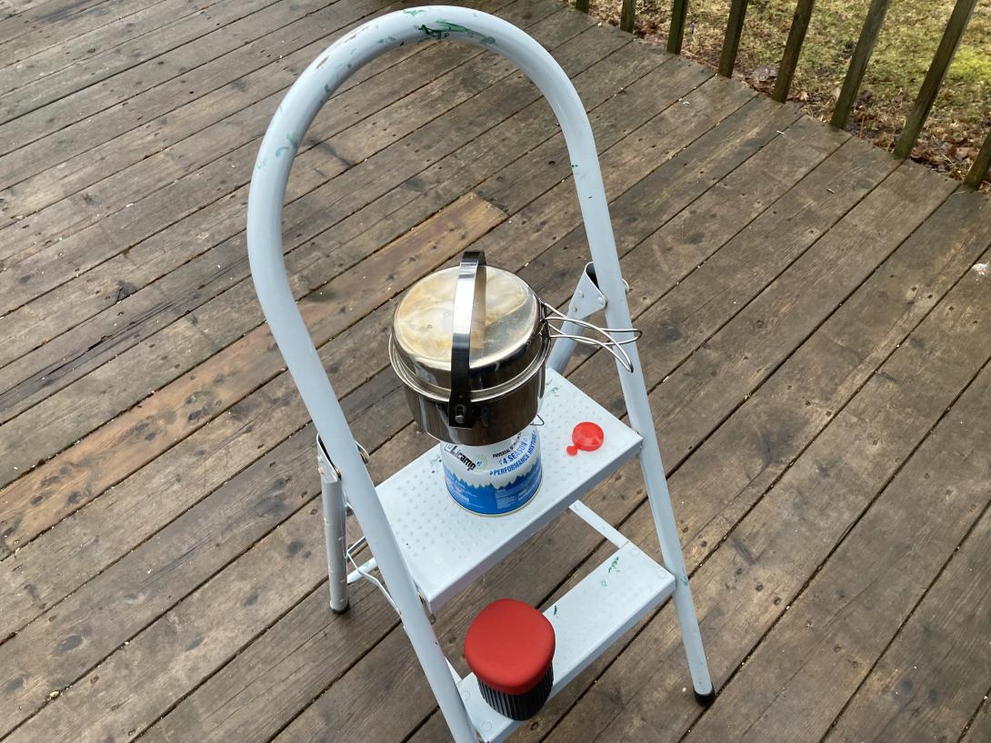
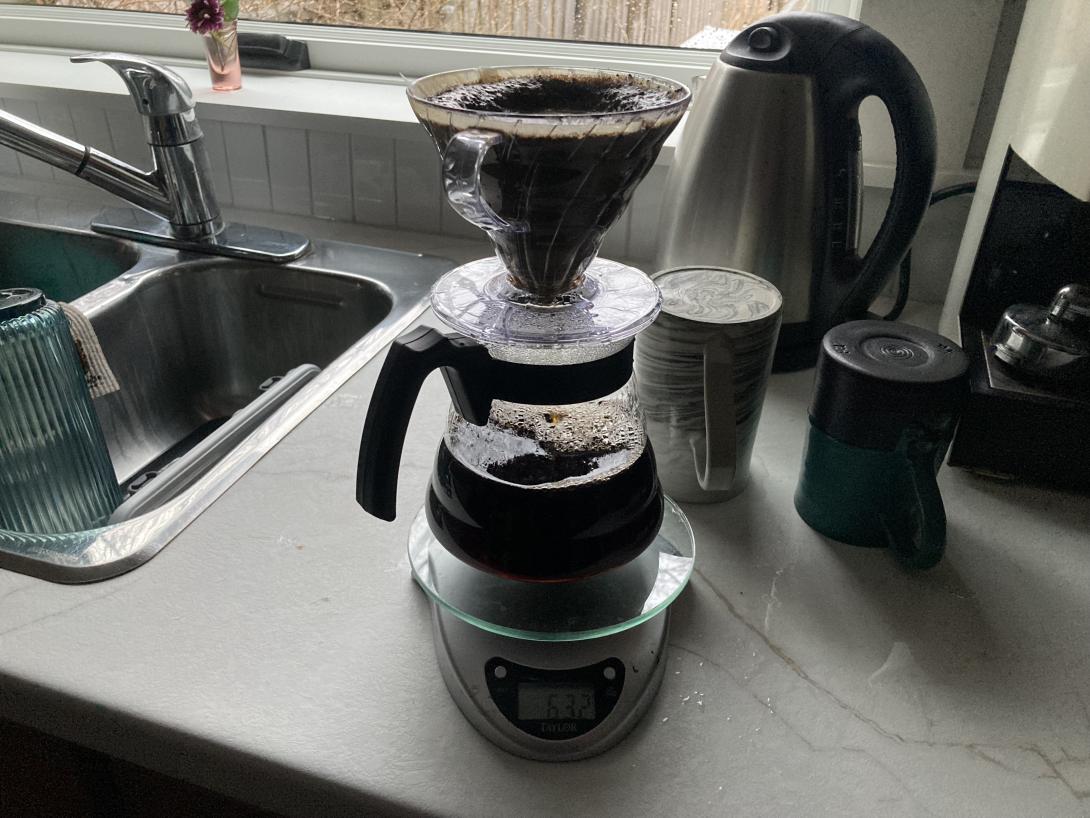
We woke up to a house without power—turns out that a section of our street lost power at 4:00 a.m.—and thus without coffee.
Fortunately Hurricane Fiona prepared us for this, and the emergency backup coffee system deployed.
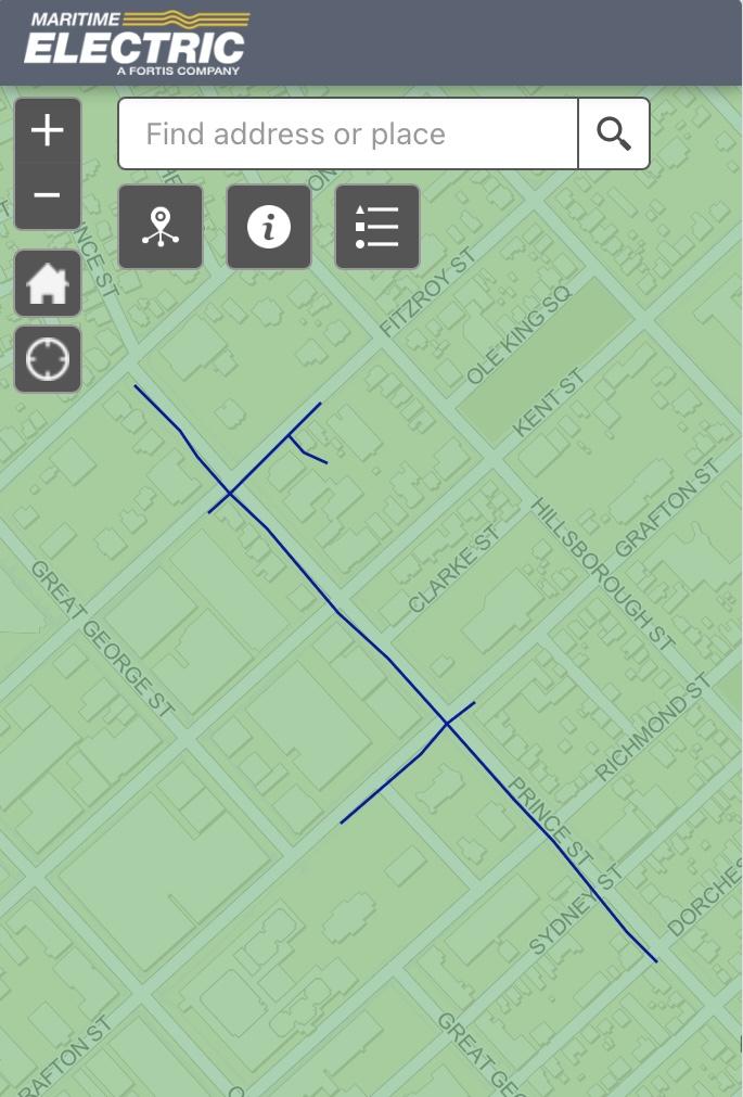
As we were drinking coffee, we noticed Maritime Electric workers replacing a transformer on a nearby pole:
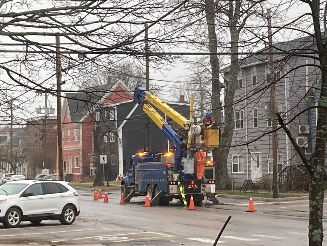
This explains the big bang we heard while we were asleep.
I happened to have my head out the window just before 8:00 when the line worker flipped the transformer on with a long orange pole: the power came on instantly. It was like watching God’s lightswitch.
From a recent People & Blogs with Matt Webb:
Given your experience, if you were to start a blog today, would you do anything differently?
If I were to start a blog today, I would start an email newsletter. And that would be a mistake.
I agree.
Although I published a tiny email newsletter for 6 years, and it was helpful in innumerable ways, my instrument is the blog, not the newsletter.
And yet I realize that not everyone (relatively speaking, let’s be honest, very few) have a toolchain set up to read blogs by RSS, as god intended.
And so, as a service to the travelling public, I’ve long supported subscribing to this blog by email, via a daily digest received on days when there are posts.
I originally did that using Feedburner, then MailChimp, and now, starting a few weeks ago, Buttondown.
The switch to Buttondown was triggered by MailChimp just, one, day breaking down and giving up, with no clear path to a diagnosis. I’d been reading the blog of Buttondown’s founder for awhile, and liked the cut of his jib, so I exported my 100-odd subscribers from MailChimp, imported them into Buttondown, and setup an RSS-to-Email pipeline. It was pretty painless.
Things haven’t been all rosy since then: after a day of successful operation, my Buttondown digest stopped sending, with items piling up in the queue. Support was friendly, but the path to a solution was slower than I would have liked. They worked hard to repair our relationship—harder, I imagine, than my $9/month fee warrants—and things seem to be working fine now (although there was a mysterious empty email that went out a few days ago that I’m waiting to hear about from support).
This is all to say: if you want to read the blog, but prefer the convenience of receiving it by email, feel free: subscribe right here.
In the season 7 episode of Billions, Original Sin, political consultant Bradford Luke walks into (billionaire and possible presidential candidate) Mike Prince’s office:
Prince: How do you have Leo McGarry-like walk in privileges before you’ve even taken the job?
Luke: Walk with a true sense of purpose. No one ever stops you.
The Leo McGarry reference is, of course, to The West Wing—another fictional universe—where Leo McGarry was President Bartlett’s Chief of Staff, and often walked in with exactly the same demeanour:
I love the fiction-to-fiction reference; Billions is rife with pop culture references, to an often absurd extend, but this one I love.
One of Charlottetown’s oldest businesses is set to close shortly. Taylor’s Jewellers, in Confederation Court Mall, has this sign up in its windows:
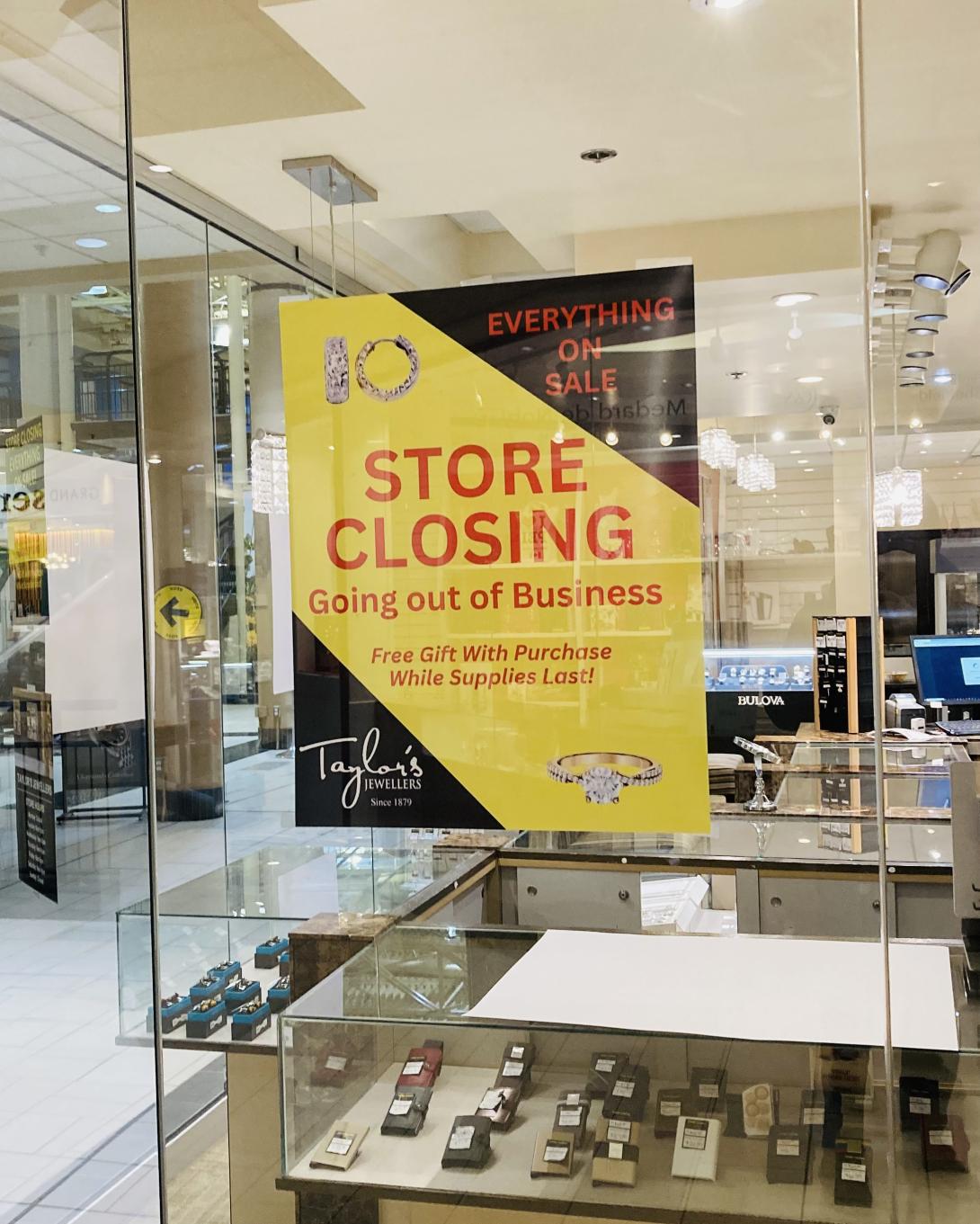
The business was founded in 1879, 146 years ago:
In 1879, jeweller, J.F. MacKay would sell his stock to G.H. Taylor. Taylor, who had recently arrived in Prince Edward Island from England, took over the building at 119-121 Grafton Street and divided it into two sections. Taylor operated a jewellery store from the eastern section and W.R. Boreham ran a shoe store from the western section. Taylor’s Jewellers would remain in the building for over 100 years. The business would move further into the Confederation Court Mall in the 1990s and continues to sell jewelry to this day.
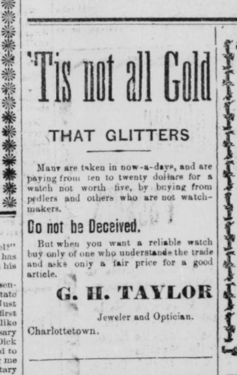
Here’s an ad from the March 1, 1898 Guardian for the business:
Posted earlier today on their Facebook page:
It is with a heavy heart that we announce our store will be closing its doors for the final time on May 15th.
After being part of this community since 1879, it’s hard to say goodbye.
We want to extend a heartfelt thank you to all our loyal customers who have supported us through the years. Your patronage has meant the world to us, and we’re truly grateful for the memories we’ve shared.
As we prepare for this next chapter, we’ll be offering special discounts and deals, so please stop by before we close. We hope to see you one last time.
Thank you for being part of our journey.
Meanwhile, just a hundred feet away, Blank Canvas, our local art supplies shop, is set to relocate from the corner of Prince and Water into the space in the mall last occupied by a party supply store, in the hallway that leads to Great George Street:
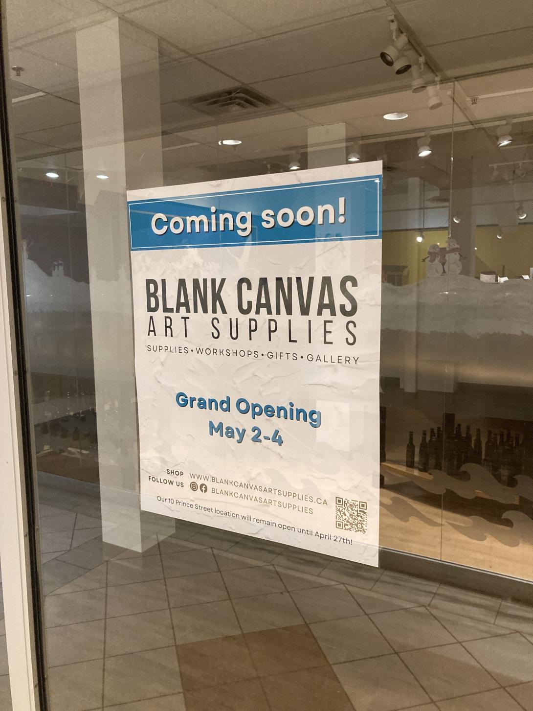
We’re regular customers at the shop; it’s so lovely to have a well-stocked shop like hers in the neighbourhood. It’s heartening that she’s found a secure new space, and it’s great for us that it’s still in the neighbourhood (40 m and one minutes walk farther from the current location, but we’re not complaining).
It is a CrossFit tradition to do burpees on your birthday, one for every year you’ve lived.
I got out of this last year, but today, working out with Lisa in Matt Cormier’s garage, it somehow came to pass that burpees-in-great-number were already on the docket, before my Saturday birthday was revealed to Matt.
So we did burpees-in-great-number, a 7 minute AMRAP. Both Lisa and I completed 64.
Mine were of various styles, relative to the reference burpee Matt performed, but I fell down, and got back up again, by whatever method, 64 times.
And I’m only turning 59!
About This Blog
 I am Peter Rukavina and this is my blog. I am a writer, letterpress printer, and a curious person.
To learn more about me, read my /now, look at my bio, listen to audio I’ve posted, read presentations and speeches I’ve written, or get in touch (peter@rukavina.net is the quickest way).
I have been writing here since May 1999: you can explore the 25+ years of blog posts in the archive.
You can subscribe to an RSS feed of posts, an RSS feed of comments, or a podcast RSS feed that just contains audio posts. You can also receive a daily digests of posts by email.