It seems that I cannot escape the theatre: I move, and the theatre follows.
It all started with a sewer backup.
As the CBC reported in mid-June, the Mackenzie Theatre, an annex of the Confederation Centre of the Arts, experienced a sewer backup that forced the closure of a basement rehearsal hall. The spill-over effect of this was that the Confederation Players needed a new home for at least part of the summer and, St. Paul’s Anglican Church Parish Hall, being only a block a way, proved to be a convenient emergency base.
The Confederation Players are a Confederation Centre side-hustle wherein “history comes alive when you stroll down Charlottetown’s historic district … a troupe of costumed, young Canadians, trained as the Fathers and Ladies of Confederation.”
Said troupe of the costumed young now occupy the former Sunday School classroom beside my office here in the Parish Hall basement, and their youthful exuberance has spread over the land. At this very moment, for example, their voices are joined in harmony with a modern take on Total Eclipse of the Heart, Bonnie Tyler’s seminal 1983 power ballad.
Indeed this is but one example of what amounts to being the only fly in the ointment of this arrangement, that being that when the members of the troupe are here in the basement they are in their down time.
And so while they may be dressed like J.C. Pope, they are also talking about socialism, merengue, varieties of scotch, and the ins and outs of southern BBQ1. The effect is quite disconcerting, and effectively ruins the theatricality of the troupe for me when I encounter them playing croquet or holding forth on Maritime Union, as they are inclined to do outside these basement walls, when they are on the job (a job, I should add, that all evidence suggests they all take very seriously, with great concern for both historical nuance and theatricality).
It’s hard to believe the Disney magic when you’ve seen Mickey Mouse smoking out behind the castle.
Nonetheless, aside from the occasional theatrical outburst outside my door that disrupts my flow, I’m happy to have the young Canadians next door: if it weren’t for them, many days I wouldn’t lay eyes on a single soul outside my family, and the life they breathe into these hallowed halls is welcome.
1. My impression of what young adults talk about; this impression may be influenced by the fact that I can’t really here what they’re talking about.
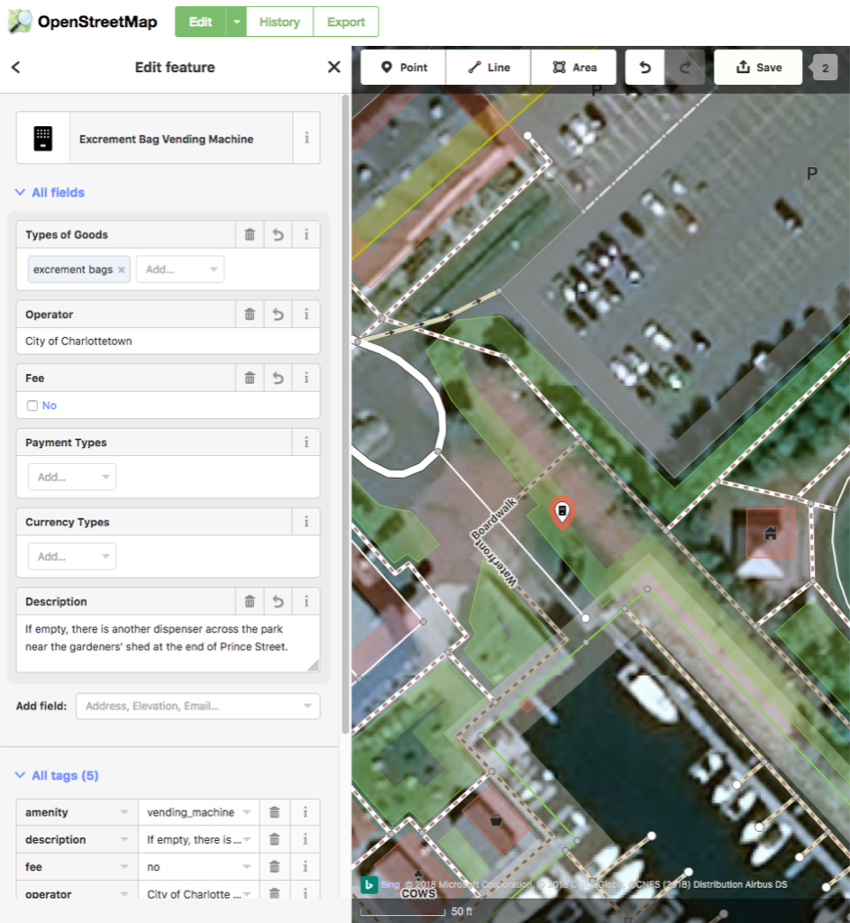
Metadata at its highest expression: OpenStreetMap has a feature for excrement bag vending machine that I discovered by accident today whilst supplementing the map around Confederation Landing Park.
I added the two (free) dispensers in the park, and the one at the PEI Humane Society Dog Park; are there others in town?
After a three week delay due illness, I was back at Canadian Blood Services in Charlottetown this afternoon for my monthly plasma donation.
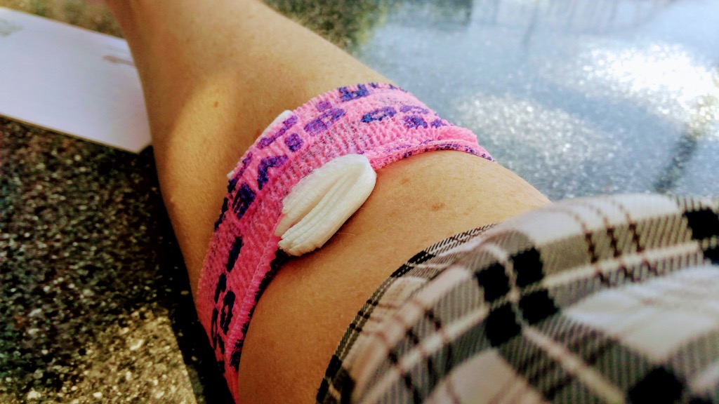
Since I started on this round of donating, after a 10 year gap, today was my first time back wearing summertime clothing, meaning that the bright pink wrap, with “Give Blood” printed on it, looped around my donation site, was in full view. Making me appear to be a member of a militant band of pro-blood-donating rebels. Which, in a way, I am.
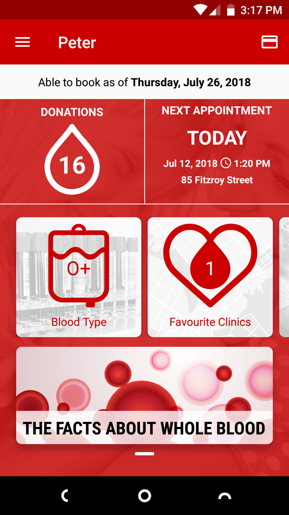
While I was having my blood pressure taken, during the pre-donation screening interview, I noticed a poster advertising Canadian Blood Services’ Give Blood mobile app, and I took advantage of the free donor wifi to install it on my phone while I was donating. It’s a slick, well-designed, helpful app packed with useful functionality, like calendar integration, notifications, a digital donor card, the ability to see (and reschedule, if needed) upcoming appointments, and a lifetime donation total (mine is 16; today’s will make it 17).
As I’ve mentioned in this space before, Canadian Blood Services has really upped its game in recent years: the plasma donation time is now down to about an hour (from the time you walk in the door until the time you walk out the door), the pre-screening questionnaire can be filled out online before you arrive, the call centre is religious about calling with appointment reminders; and the nursing staff are as friendly and accommodating as they’ve always been (my nurse, looking at my plasma through the microscope during the screening, told me that I have “beautiful plasma”).
If you’ve a spare hour every month–or every two months, or once a year–and don’t mind being poked in the arm (by some of the best arm pokers you’ll meet)–I encourage you to make an appointment: just call 1-888-2-DONATE.
Until I took a bookbinding workshop from Jennifer Brown in 2013, the craft of making books by sewing together sheets of paper seemed impossibly arcane, beyond the realm of something I might ever consider. Jennifer’s patient instruction proved that this isn’t the case, and I enjoyed the workshop so much that I took another variation of it in 2017.
One area that Jennifer’s workshop didn’t tread into was sewing together books with multiple signatures; she alluded to this being too complex a task to take on in a single day workshop, thus fixing it in my mind as the new impossibly complex thing.
This week, though, I busted through my preconceived notions about that, with the help of some YouTube how-to videos, and made myself a hardcover sketchbook.
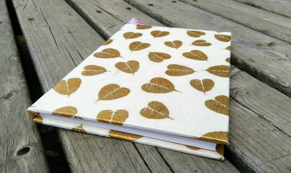
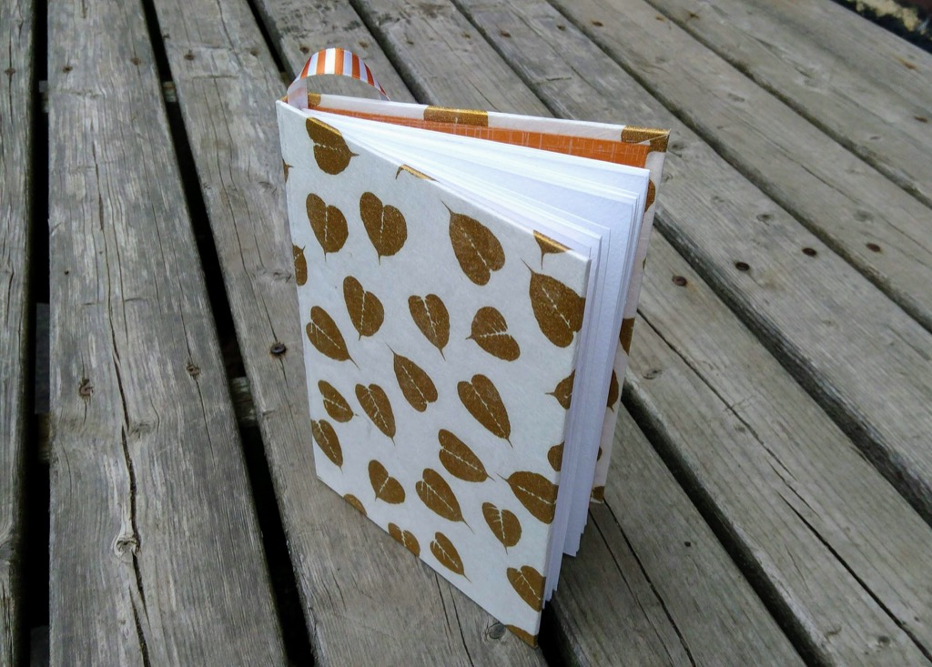
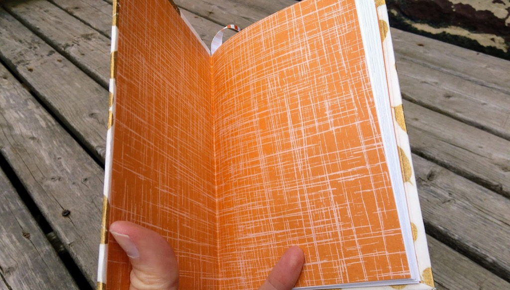
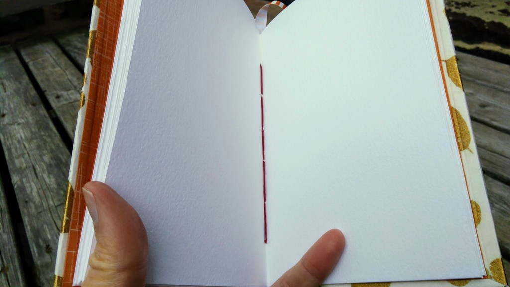
I started out by making the text block, following the sewing instructions in this video. I used paper from La papeterie Saint-Armand that was leftover from the Confederation Country Cabinet project, and some red linen cord that I picked up somewhere along the way; for the endpapers I used two sheets of orange Japanese paper from an odds-and-sods pack I picked up in Halifax earlier this year from The Ikebana Shop. The orange bookmark-ribbon is something I found in a notions store (and something I should have made about 3 inches longer, so that it would loop through the book and out the bottom).
The linen cord was overkill–and a little knotty to wrangle–but it did the job. I managed to get the stitches in the right place in all but one instance, where the first signature was left flapping in the wind on one end, but I threw in a single stitch and a knot to secure it.
Next, I made the cover, combining the instructions from this video and this video. I purchased a sheet of “display board” from The Bookmark for the hardcover and spine and used a lovely sheet of heavy paper decorated with gold leaves that was a gift from Catherine.
There was a seemingly endless amount of PVA glue–purchased from Michael’s, Aleene’s Tacky Glue–involved in binding everything together, and my “not getting glue on everything” technique needs some work.
Each step of the process was aided by the book press that I found in a closet many years ago, a heavy cast iron beast that does an excellent job at holding things together and flat as the glue dries.
The final product isn’t perfect: there are air bubbles and glue bubbles in annoying little places, and it’s not completely square. But it’s much more than I thought mere mortals like me were capable of, and has stoked my thirst for making more books.
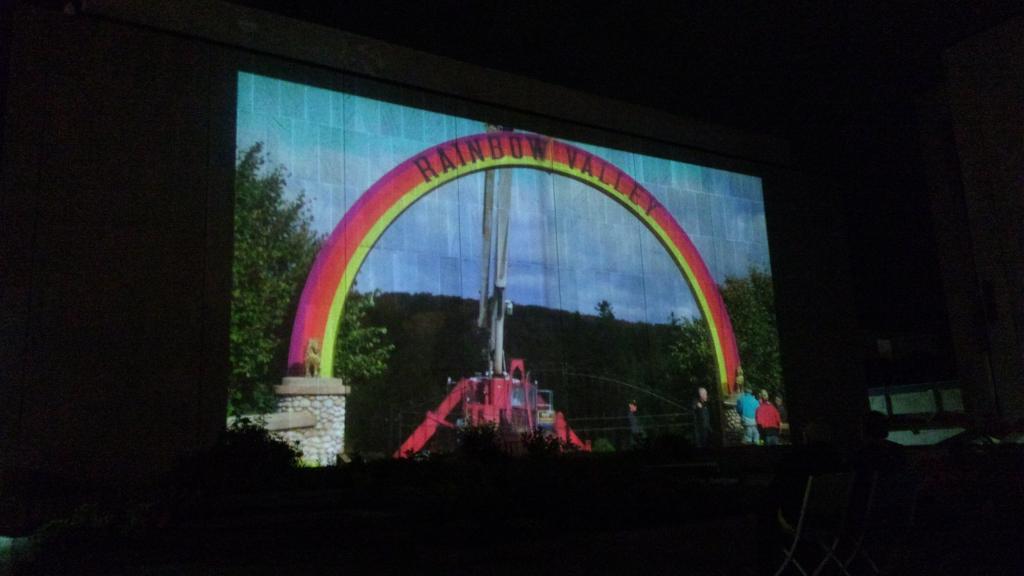
The Rainbow Valley film is playing every Wednesday night this summer on the plaza at the Confederation Centre; Oliver and I were there for tonight’s showing.
It’s such a great film, and I was happy to see it again; I was reminded what a masterful story Patrick and Alexis crafted, one that so wonderfully captures the essence of what Rainbow Valley meant to so many of us.
The Google Home Mini is on sale for $39.99 until July 12, 2018 at The Source (née Radio Shack). I picked up an extra one, for Oliver’s room, to allow him to listen to music at bedtime.
It replaces a complex system involving his MacBook Air, an old Moto G and a Bluetooth speaker, a system that was prone to failure and a nightly source of angst for both of us.
If you’re okay with the “allow Google to listen to everything I say and do,” the Home Mini is a very capable device, with surprisingly good sound for such a tiny speaker.

In 2013 the City of Charlottetown offered free “low flow” shower heads to residents with shower heads rated more than 2.5 gallons per minute (gpm). Ours was exactly 2.5 gpm, so we weren’t eligible, but I took the opportunity to live up to the spirit of the program, and replaced our shower head with a 1.6 gpm model, a simple Waterpik head that I bought at Walmart for $18.
As a result of the change, if I take a 5 minute shower, the savings of 0.9 gallons per minute translates into 4.5 gallons of water saved; over the course of a year that’s 1642 gallons (6215 litres or 6.215 m3), saved.
That’s a lot of water. About 5% of our yearly household water consumption.
Oddly, though, it’s not much of a cost savings: the city bills water usage at 26.4 cents/m3 and sewer usage at 58 cents/m3, so our yearly cost savings is only $5.25; usage-based billing amounts to only 23% or so of my quarterly water bill, the remainder coming from flat-rate daily charges. So, even though we cut our consumption by 5%, we save only about 1% on our water bill over the course of the year from the switch (of course I’m not accounting for the 6215 litres of water we don’t have to heat up every year, which has its own cost saving attached to it).
But, still, saving water is good, no matter the financial pay-off.
I didn’t suffer from the decreased flow; the Waterpik unit does a good job at maximizing power even with less water. The only negative side-effect of the switch is that, because there’s less water running through the shower head, it takes the cold water all that much longer to flush out of the system when I start up the shower in the morning. It’s not that there’s any more cold water to be flushed out, but the increased time means that I’m far more inclined to start up the shower and then go and do something else.
Like shave, for example. Or empty the washer. Or fold up the towels.
And that something else often takes longer than the cold water takes to flush out, meaning that the water is needlessly running, hot, while I’m distracted otherwise.
The Evolve ShowerStart TSV is a technical solution to this very problem:
Behavioral waste occurs when bathers use their time comfortably and efficiently while waiting for hot water to reach the shower. Instead of patiently waiting for cold water to exit the shower head most people leave to do something else. Typical activities include brushing teeth, using the washroom and picking out clothes. Because bathing only begins after the tasks have been completed, countless gallons of hot water are unintentionally wasted at the start of every shower.
I came across a mention of it via Cool Tools, and sent a note to Charlottetown Water & Sewer about it to see if they’d had any experience with it. They hadn’t. So they went out and bought one, and offered to loan it to me to beta test.
I picked it up today and did just that.
It’s an easy device to install: you just unscrew the existing shower head, screw on the ShowerStart, and then screw the shower head into the ShowerStart.
It works like this: you turn on the water as you normally would, and the cold water flushes out; as soon as 95ºF water starts to flow, the water slows to a trickle, leaving me free to shave or whatever else occupies me. When I’m ready to shower, I simply pull on the pull-cord, and the hot water starts to flow.
Here’s the beta test on video:
The water slows to a trickle after 41 seconds, meaning that, at 1.6 gpm, it’s flushing out about 4.1 litres of cold water.
Assuming that it takes me 4 minutes to shave, that means that, with the ShowerStart in place, I’m saving 3 minutes and 20 seconds in hot water needlessly running, or 20 litres of water.
Over the course of the year then, ballpark, I’ll save 7300 litres of water using this device. Which is more than I saved by switching to a low-flow showerhead.
I’ll use the ShowerStart for a couple of weeks and report back on how it works in day-to-day use.
Real World Test Results
| Date | Time to Hot | Time to Shave | Length of Shower | Water Consumption |
|---|---|---|---|---|
| July 11 | 1:14 | 2:12 | ||
| July 12 | 1:03 | 2:23 | 4:13 | 31.9 litres |
| July 13 | 1:30 | 2:30 | 4:50 | 38.3 litres |
| July 14 | 1:48 | 2:32 | 6:11 | 48.3 litres |
| July 15 | 0:59 | 2:42 | 5:54 | 41.6 litres |
I had the crazy idea last night that I should bundle Ethan the Dog into the bicycle trailer and ride out to the Dog Fun Park near the Queen Elizabeth Hospital so that he could get some exercise. This despite Ethan the Dog never having been in the bicycle trailer before, despite the 26ºC temperature, despite the Dog Fun Park seeming impossibly far from our house, and despite there being a chance that the Dog Fun Park wouldn’t actually be open, as it’s undergoing expansion.
Surprisingly, given all of this, it all went relatively smoothly. I did discover that a bicycle trailer is not a naturally comfortable place for dogs, at least on the first ride, so Ethan was a little ornery. Fortunately I was able to strap him in with his car seatbelt, so there was no danger of him leaping out of the trailer to chase a squirrel; he did, however, manage to nose his way through the mesh cover on the front of the trailer.
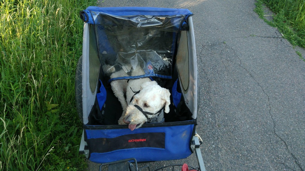
The highlight of the trip, for me at least, was discovering that it’s possible to cycle almost the entire distance from Joe Ghiz Park to the Dog Fun Park on a paved cycle trail that runs up Riverside Drive and then around the Queen Elizabeth Hospital along the Hillsborough River. The City of Charlottetown has a brochure that describes both trails:
11. Riverside Drive Path Distance 1.5 KM
The asphalt path begins at Park Street and runs along Riverside Drive and ends at Murchison Lane.
12. Hillsborough River Path Distance 1.2 KM
This asphalt path begins at the corner of Riverside Drive and Murchison Lane, and runs along the Hillsborough River, ending at Hillsborough Hospital.
I’d known about these two paths from many trips out to the hospital and to the dog park, but this was my first timing seeing them up close, so I turned on Google Fit for the cycle ride home and it made me a nice map of the route:
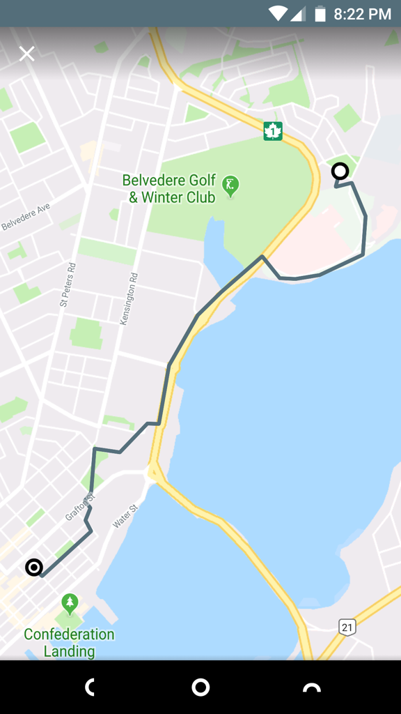
Google Fit has the distance from Dog Fun Park to home at 4.89 km, making the round trip 9.78 km. So, not “impossibly far,” but still longer than I’ve cycled in a long time.
Looking at OpenStreetMap this morning I discovered the both the path along Riverside Drive and the path along the Hillsborough River were missing; this is likely because they’re both difficult to make out from satellite imagery. I remembered that Google Takeout should allow me to export my ride from last night, which I should then be able to import as a trace into OpenStreetMap and use as a basis for adding the paths.
Sure enough, I found an option to export my Google Fit data in Takeout:

I choose “Include all Fit data” and, a couple of minutes later, I had an 8 MB ZIP file with every single data point from Google Fit I’ve accumulated since I installed it in 2015. In the “Activities” folder inside the ZIP file was a file named 2018-07-09T18_43_53-04_00_PT35M3S_Cycling.tcx that contain the log of my cycle trip back from the dog park. The “.tcx” file extension is a Garmin-originated file format called Training Center XML that’s like GPX, but formatted to represent activities rather than just points. Here’s how it starts out:
<?xml version="1.0" encoding="UTF-8"?>
<TrainingCenterDatabase
    xmlns="http://www.garmin.com/xmlschemas/TrainingCenterDatabase/v2"
    xmlns:ns2="http://www.garmin.com/xmlschemas/UserProfile/v2"
    xmlns:ns3="http://www.garmin.com/xmlschemas/ActivityExtension/v2"
    xmlns:ns4="http://www.garmin.com/xmlschemas/ProfileExtension/v1"
    xmlns:ns5="http://www.garmin.com/xmlschemas/ActivityGoals/v1"
    xmlns:xsi="http://www.w3.org/2001/XMLSchema-instance" xsi:schemaLocation="http://www.garmin.com/xmlschemas/TrainingCenterDatabase/v2 http://www.garmin.com/xmlschemas/TrainingCenterDatabasev2.xsd">
    <Activities>
        <Activity Sport="Biking">
            <Id>2018-07-09T22:43:53.636Z</Id>
            <Notes>Biking</Notes>
            <Lap StartTime="2018-07-09T22:43:53.636Z">
                <Track>
                    <Trackpoint>
                        <DistanceMeters>0.0</DistanceMeters>
                        <Time>2018-07-09T22:43:53.636Z</Time>
                    </Trackpoint>
                    <Trackpoint>
                        <DistanceMeters>29.938282012939453</DistanceMeters>
                        <Time>2018-07-09T22:43:54.000Z</Time>
                        <Position>
                            <LatitudeDegrees>46.26018524169922</LatitudeDegrees>
                            <LongitudeDegrees>-63.097129821777344</LongitudeDegrees>
                        </Position>
                        <AltitudeMeters>-6.199999809265137</AltitudeMeters>
                    </Trackpoint>
That first “Trackpoint” is the Dog Fun Park, and it continues with Trackpoints all the way home.
OpenStreetMap won’t read TCX files, but it will read GPX files, and GPSBabel will helpfully convert from one to the other:
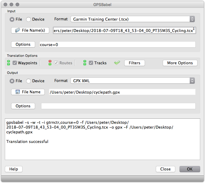
The result of the conversion was a file cyclepath.gpx, ready for import into OpenStreetMap.
From the OpenStreetMap Upload GPS Trace page, I uploaded the GPX file:
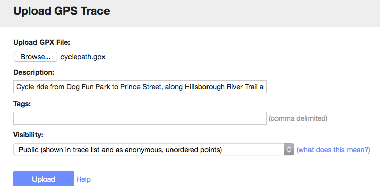
After a few minutes for processing, OpenStreetMap had the trace ready for use.
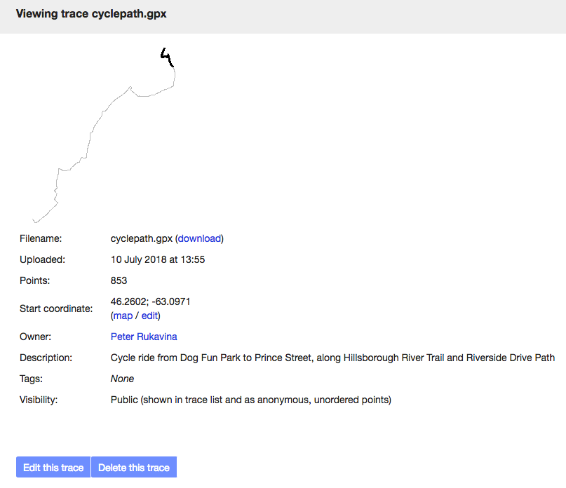
The Riverside Drive Path turned out to be easy to trace from satellite imagery, so I did that first, creating lines for parts of the path and for the crosswalks along the way, and adding them all to an OpenStreetMap Relation called Riverside Drive Path.
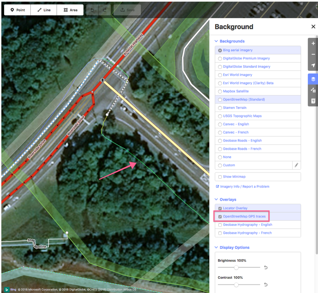
For the Hillsborough River Path, which is obscured by the tree canopy, I turned on the GPS Traces layer in the OpenStreetMap editor, and my cycle route appeared as a green line on the map:
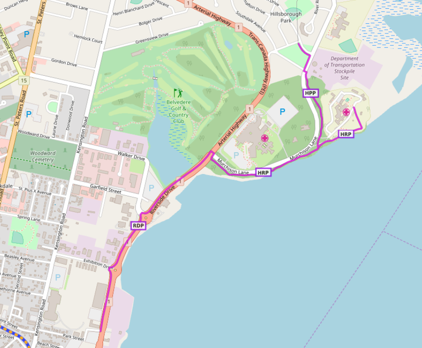
Once I started adding the cycle path I realized that there are actually two paths involved in the journey from the corner out to the dog park: along the river to Hillsborough Hospital is the Hillsborough River Path, but once you turn inland it becomes the Hillsborough Park Path, which the city describes as:
13. Hillsborough Park Path Distance 0.8 KM
This asphalt path connects to Hillsborough River Path and runs along Murchison Lane and turns left and runs along Patterson Drive, ending at Pioneer Avenue.
So I started by adding a new OSM Relation called Hillsborough Park Path, and added all the lines and crosswalks to the relation. I then created a Hillsborough River Path relation, and combined some existing lines near the hospital with new lines over my GPS traces, and some new crosswalks.
With all of this in place, all three paths appear not only on OpenStreetMap itself, but on derivative works like Waymarked Trails, where you can now see all three:
I’m happy that our night’s outing not only resulted in exercise for me, exercise for Ethan, but also some new open data for the community to profit from.
Following on from yesterday’s experiments, I did some exploring today in Gephi, an open source graph visualization program.
Gephi will load DOT language files, of the type I generated yesterday showing the interconnections between my blog posts, and has a dizzying array of options for configuring the resulting visualization.
What emerges is something considerably more usable than the images I generated yesterday in OmniGraffle.
For example, this one, which I created using a combination of the Fruchterman Reingold and ForceAtlas 2 layouts:
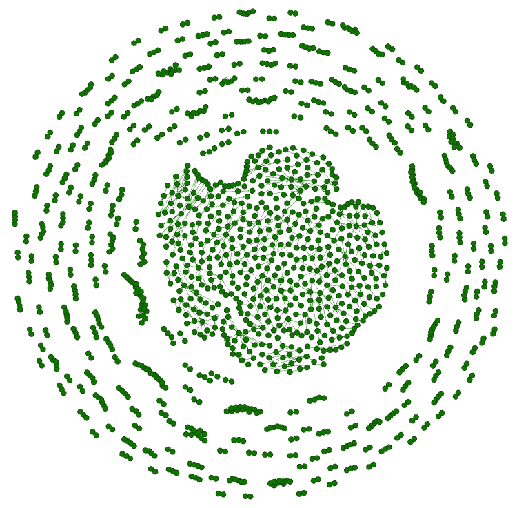
This visualization shows a bunch of smaller clusters of interlinked posts–anywhere from two posts that are linked to a dozen—gravitating around a large central cluster of posts that are all linked together.
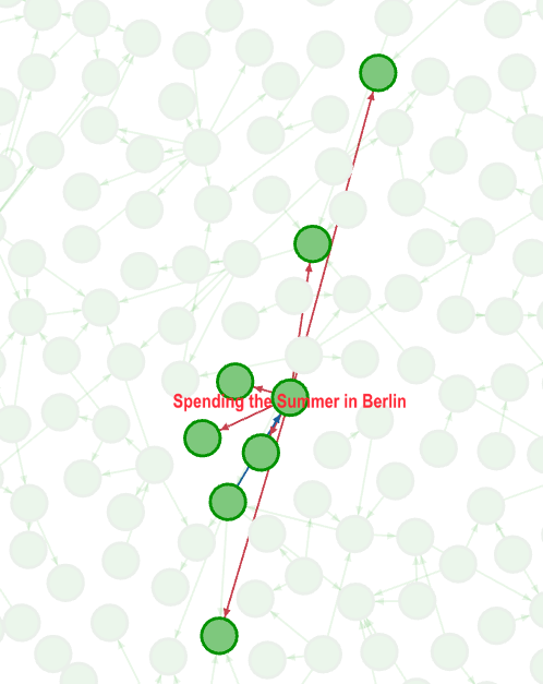
Exploring that dense central cluster I see that it consists almost entirely of posts about letterpress and travel; for example, here’s a detail showing links out from Spending the Summer in Berlin,
Here’s another detail, showing my post about Akzidenz Grotesk and its connections:
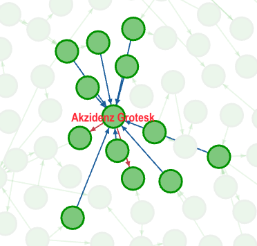
The linkfulness of posts about letterpress and travel makes sense: when I travel I visit people and places, often people and places I’ve visited before, and so I do a lot of linking; similarly, when I write about printing, I’ll refer to typefaces, or earlier projects, or the previous step in the current project.
In the outer reaches of the blog post galaxy are smaller, isolated, microclusters of posts: some of these are instances of a sudden interesting that quickly waned, like my interesting in Ruskin, PEI, which linked The Lost City of Ruskin to my post about the Ruskin Post Office. Others of these are simply times that I was writing in a less-linky way.
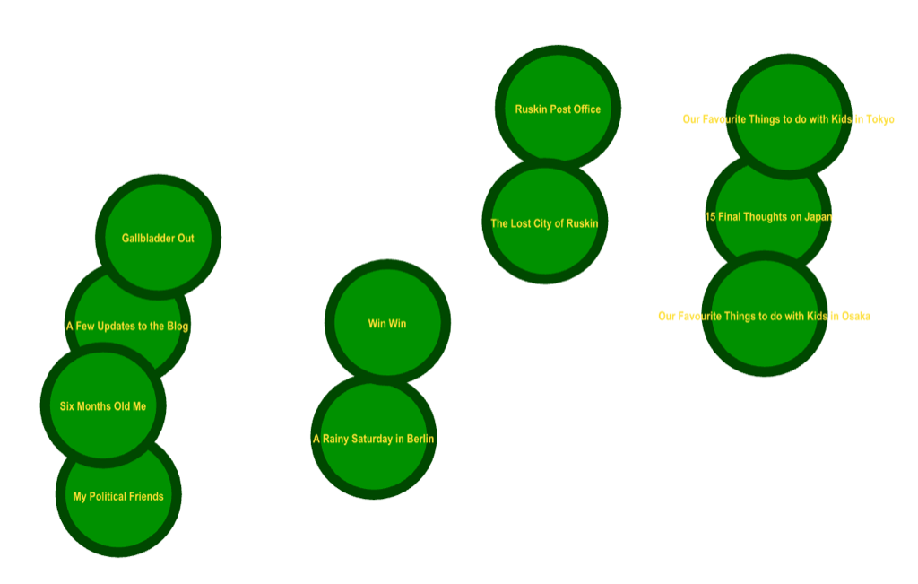
Note shown, of course, are the thousands of posts where I didn’t link to myself at all: a star system of lonely isolated posts disconnected from the rest.
Gephi is a tool that rewards experimentation, and so I’ve more experimenting to do. My next step, I think, is to look not at posts by the links between them, but rather by the tags I’ve applied to them.
Earlier today I mused about linking to myself:
Discovering that I refer back to earlier posts as often as I do makes me wish I had a way of visualizing the interconnections between my posts; now that I have the building blocks for this, I’ll see what I can do about this.
Then I remembered that I did some graph visualizing work 10 years ago, as part of the OpenCorporations.org project, that allow inter-corporate of Prince Edward Island corporations to be visualized by generating DOT language files.
So I did the same thing for the 8,110 blog posts I’ve written here since 1999.
I wrote a script to go through each post and extract the links from one ruk.ca post to another ruk.ca post: there were 1201 of them in total.
As a byproduct of the counting, I found the most popular posts (measured by how often I link to them):
- Welcome to The Reinventorium (12 links)
- Adana Eight Five (10 links)
- Akzidenz Grotesk (10 links)
- How to Levee (9 links)
- The Golding Jobber No. 8: It’s Alive! (7 links)
I then wrote this to a DOT file, and then visualized the DOT file in OmniGraffle, and the result looks like this in the “radial” rendering:
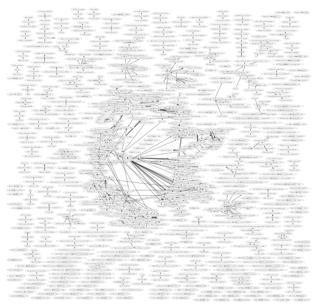
It’s hard to do justice to just a dense array of interconnections in such a small space as this, but you can get a sense of the nature of the forest even at this level.
Even less comprehensible, but still interesting, is the “hierarchical” rendering in OmniGraffle:

Here’s a detail of that rendering:
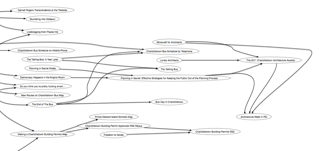
If you want to explore the rendering in more detail, I’ve exported a PDF file that you can zoom in and out of.
 I am
I am