The Visual Communications program at Holland College is essentially a digital program these days — when you visit their facilities in the basement of the downtown campus you find workstations and sophisticated printers — but there are vestiges of the program’s analog past still there, chief among which are the drawers of metal type tucked away in the corner. Thanks to the generosity of the program this is a resource that I’ve been able to borrow from over the last couple of years (I set my first business cards in type from their collection, and this Pecha Kucha poster).
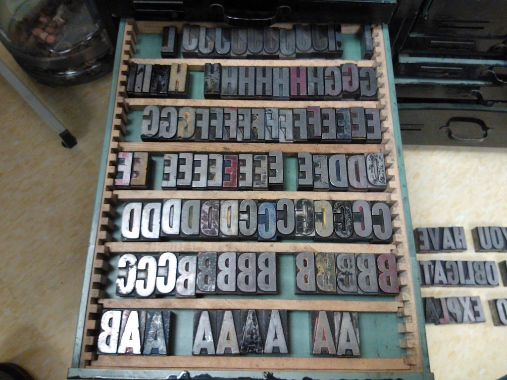
I returned to the well this afternoon, and decided to spend some time organizing the typeface that seemed to have the most promise of forming a complete alphabet, a face that I’m assuming is Akzidenz Grotesk after walking through the helpful typeface identification tool Identifont.
After an hour or so of shuffing letters around drawers and plumbing the depths of the drawers of odds and sods of type, I managed to assemble a good collection of the face in alphabetical order, with several of each letter:

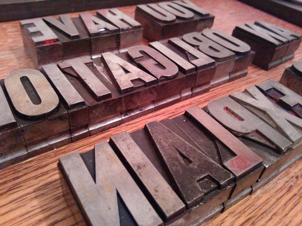
Once I’d organized things, I pulled out the letters in the best shape to use in a new project that’s been rattling around in my head for a while:

Watch for more on this project in this space in the days and weeks to come.
I was also lucky to meet another printer at Holland College this morning, a student who recently acquired an Adana Five Three, which is the junior of the Adana Eight Five I started out on. I’m hoping our paths cross again.
 I am
I am
Add new comment