
I’m helping to plan Prince Edward Island’s first “Pecha Kucha” event for June 17th – more on this shortly – and I’m using this as an opportunity to do some letterpress experimenting.
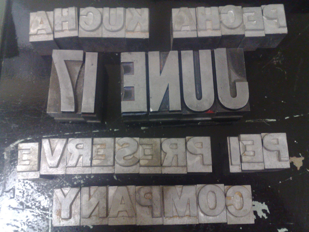
Nigel Roe from Holland College generously invited me over to see the graphic design program’s collection of metal and wood type this morning – a vestige of the days when the College had a letterpress of its own – and allowed me to borrow type to assembly into a Pecha Kucha poster. They have an eclectic but not particularly well-organized collection of type – midway from sorted to pied – and so my challenge was as much finding a typeface sufficiently complete for my purposes as anything else.
Here’s what I ended up with:
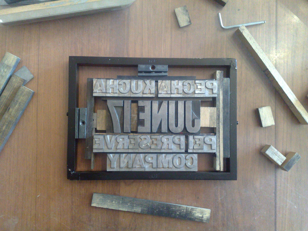
I brought this type home and locked it into the chase of my little Adana Eight Five letterpress – it just barely fit – using my meager collection of furniture as best I could (which was not well at all), to end up with this:
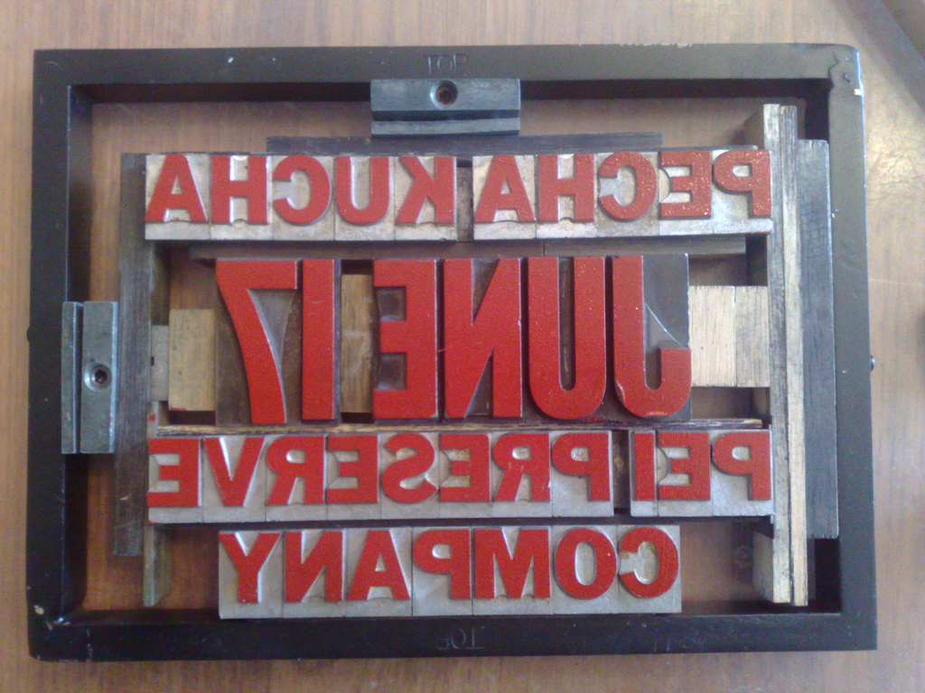
As I’m still awaiting the arrival of some rubber-based ink and some tympan sheets for the Adana press, I made a rough proof of the poster by simply rolling out some (very old) red Speedball water-based into onto a glass sheet and then inking up the type with the roller:
I then grabbed a sheet of paper – it happened to be a sheet of old cream-coloured H.B. Willis Company letterhead that’s got a little texture to it – and placed it over the type, put a paperback book over the type and then pressed down really hard. I removed the book, rolled the back of the sheet a little bit more with the (de-inked) rubber roller. When I pulled the sheet off the chase, the result was this:
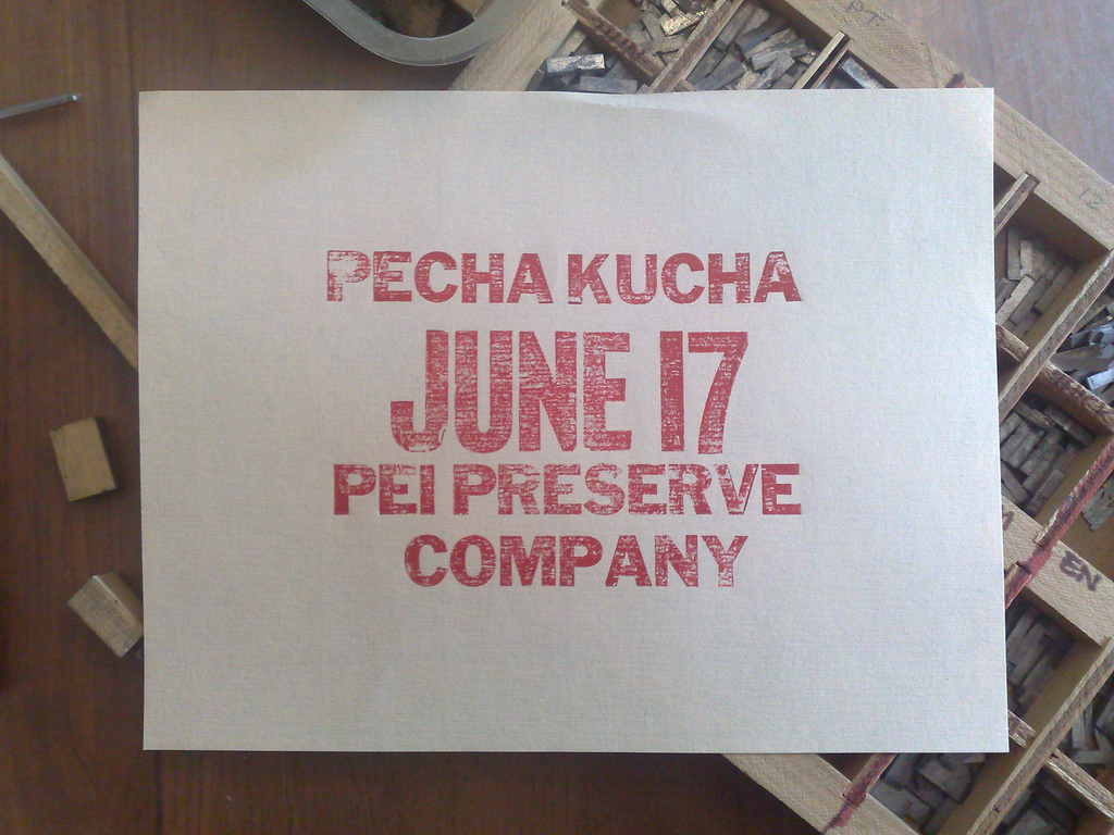
Which, actually, doesn’t look so bad if you’re going for a “distressed” effect. It did show me that I’ve ended up with a bum letter J, which, alas, is the only letter J in the typecase at the College, so I’ll have to accept it as humanizing element of the design.
I’m expecting ink and tympan later this week or early next, so the next step is to re-pack the chase so that it’s a little more secure, and then to fire up the letterpress and see what happens. You can watch this Flickr set to see how things develop.
About This Blog
 I am Peter Rukavina and this is my blog. I am a writer, letterpress printer, and a curious person.
To learn more about me, read my /now, look at my bio, listen to audio I’ve posted, read presentations and speeches I’ve written, see things I’ve favourited elsewhere, or get in touch (peter@rukavina.net is the quickest way).
I have been writing here since May 1999: you can explore the 25+ years of blog posts in the archive.
![]() You can subscribe to an RSS feed of posts, an RSS feed of comments, an RSS feed of favourites elsewhere, or a podcast RSS feed that just contains audio posts. You can also receive a daily digests of posts by email. I also publish an OPML blogroll.
You can subscribe to an RSS feed of posts, an RSS feed of comments, an RSS feed of favourites elsewhere, or a podcast RSS feed that just contains audio posts. You can also receive a daily digests of posts by email. I also publish an OPML blogroll.
Instagram • YouTube • Vimeo • ORCID • OpenStreetMap • Internet Archive • PEI.art • Drupal • Github.
Comments
Peter, little poster #1 is
Peter, little poster #1 is beautiful! I’m thrilled to see it. Yaaay!
Glad to see you met up with
Glad to see you met up with Nigel Peter. I remember the type cases being a bit loose when i took the course. Nevertheless very cool stuff. Great work.
Nice type work, first time it
Nice type work, first time it’s been used in a long time. Thanks for giving it a bit of exercise for a change, it’s been sitting idle for far too long and you know what that does.
I had to look up “Pecha Kucha
I had to look up “Pecha Kucha.” No concern that you might zap your PRAM?
Metal engraving company that
Metal engraving company that has over 100 years of services it is also award winning engraving company that have been awarded in Madrid, Spain. When I came across on your blog I saw that you contain relevant topic on metal engraving and the things that I needed is on your blog. Thank you! metal engraving
Add new comment