Both Catherine and I have a lot of miscellaneous gear to schlep around: Catherine has sewing machines, quilting fabric, and works of art; I have drawers of metal type, bankers boxes of files, and computers.
It’s never been enough schlepping to warrant purchase of assistive devices, but cancer has affected Catherine’s bones to the point where she can use a little help (and I’m not exactly Fred Astaire myself these days).
So, when Catherine was set to head up west for a Modern Quilters weekend, I was nominated to go to Canadian Tire to see what I could find.
There, amongst the more traditional hand trucks and dollies, I found exactly what we needed: a low-cost tool that, Transformers-like, could work both as hand truck and hand cart: the elaborately-named Cosco Shifter Multi-Position Heavy Duty Folding Hand Truck and Dolly.
Even better: it’s regular price at Canadian Tire was $104.99, but it was on sale for $64.99.
Sold.
It has three positions.
Folded up it’s about 16 inches by 32 inches and it looks like this:
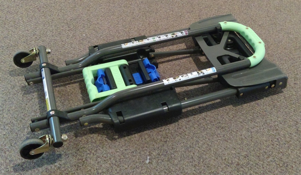
If you snap the green handle on the right out of its lock (it doesn’t seem, at first, like it will snap out, but it does), and pull up, then it transforms into a hand cart:
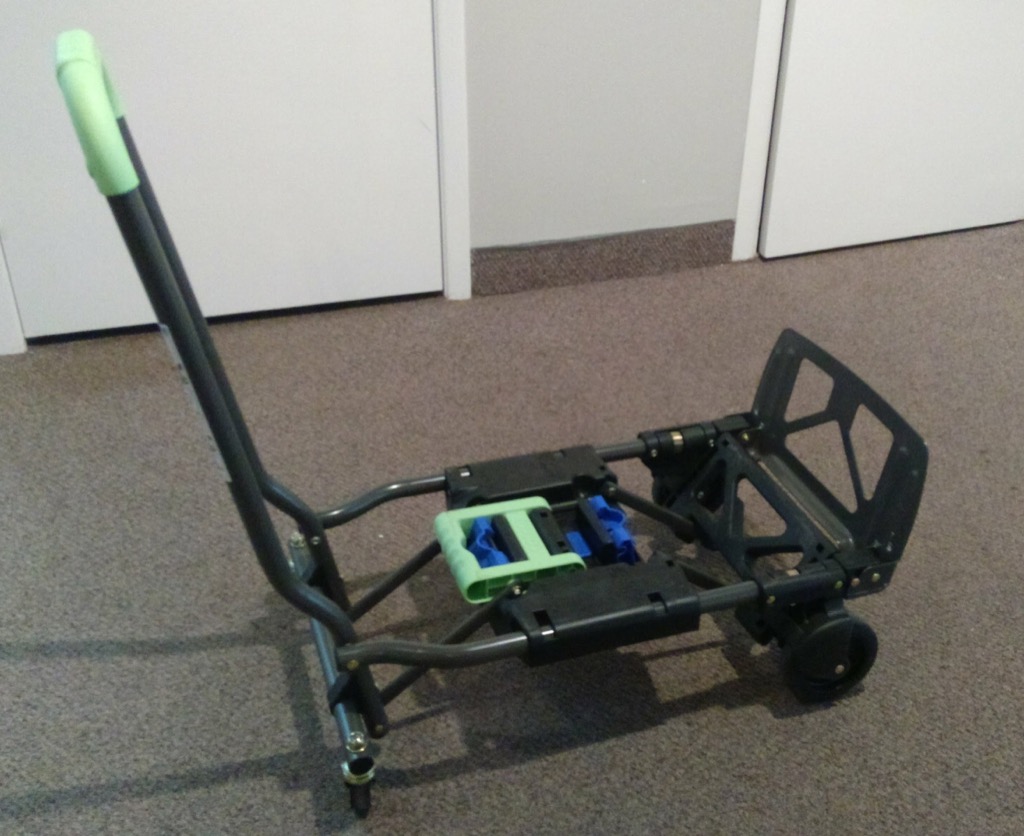
I just used it, in this position, to haul a big sewing machine, a piece of plexiglass, a bag of fabric, a basket of fabric, and a canvas bag of supplies from our house to Catherine’s studio; it worked well on the newly-paved street from our house to the end of Victoria Row and then rattled and shook (but kept its cool) once we hit the faux cobblestones for the rest of the roll.
Snap the blue switch on the left (in the middle of the green assembly) and move the green handle over to the right side, and it transforms into a stand-up hand truck:
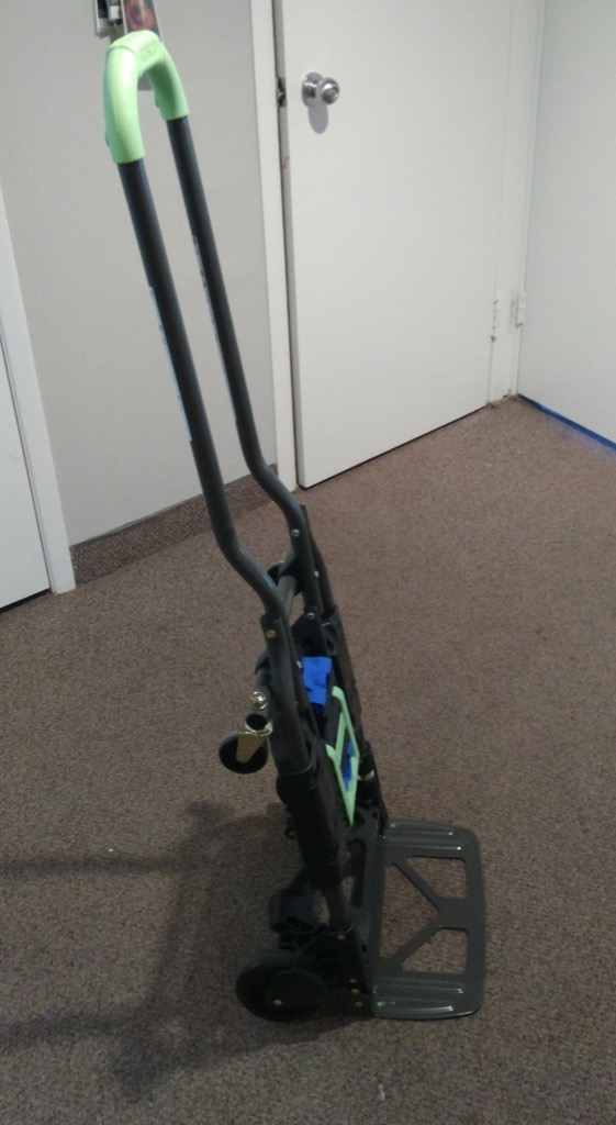
This position is good for moving boxes and similar rectangular-shaped things, and can benefit from the addition of a bungie cord to secure the load to the truck.
I wouldn’t want to use this for an Everest expedition, or even on a job site, but for light-duty household and shop work it’s just what we needed, and it’s small enough folded that we can tuck it in the closet for when we need it next.
- Drove to Murray River for the Block Party. Bought a used Daniel Libeskind book. Hoped there would be food. There was no food.
- Brake pad warning light came on in the Jetta. In Murray River. Miles from home.
- Googled “can I still drive my Jetta with the brake pad warning light on” and found the consensus was “yes, but only for a little while.”
- Found that there isn’t a single restaurant in Southern Kings County open after 8:00 p.m.
- Drove back to Charlottetown and finally got supper at 9:30 p.m., at home.
- Finally got all people and dogs to bed about 11:30 p.m.
- All people and dogs woke up very late this morning.
- Oliver decided he needed a Nyan Cat t-shirt and sign for the Pride Parade at 1:00 p.m. In two hours.
- Found old t-shirt transfer paper in the cupboard and made a t-shirt with Oliver. Not the 100% best T-shirt in the world, but enough to keep us moving forward.
- With no brakes on the car, took the bus to the market.
- Whirled through the market: bagel, coffee, smoothie, chocolate, iced tea.
- Hurried to catch the 12:20 p.m. bus back downtown; got to the bus on time, but was told by the bus driver that the bus was full and we had to wait 30 minutes for the next one (frustrated, but also filled with pride that our transit system is so well-used).
- Walked over to the Burger King and called a cab to get us home.
- Cab arrived in mere minutes. Nicest driver ever. And he skilfully managed traffic and lights to get us home in record time.
- Assigned Catherine the task of developing a Nyan Cat sign; decided it was best to do this on the white board. Catherine rose to the challenge.
- Applied sunscreen to all people.
- All people headed over to the Province House back yard to watch the Pride Parade.
- In the middle of the Pride Parade my mobile started alerting me about server issues.
- Did some triage from my chair at the Pride Parade, and found that the server issues were primarily with the alerting system, not the systems that were alerting.
- After the parade ferried all people and dogs home, and headed to the office; restarted the alerting system and affected services. All good.
What else will this day hold?
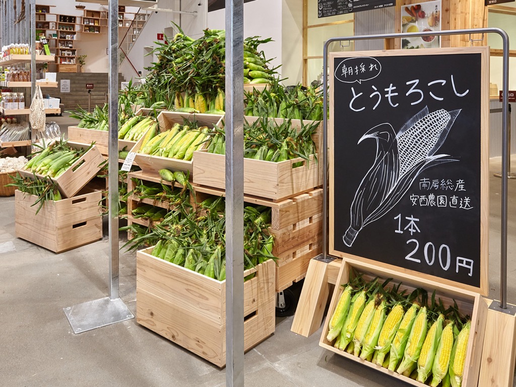
The flagship Yurakucho story of MUJI, Japan’s anti-brand brand, has undergone a transformation, and has a new food section.
Specifically, we will be offering basic foods such as vegetables and fruits, and other groceries. Vegetables are coming directly from the producers, who either do not use chemical pesticides and fertilizers at all, or use them sparingly. While we will not be offering a large variety, we will be offering seasonal items, and are planning to offer rare and interesting vegetables such as traditional vegetables of Tokyo. We will be offering vegetables with their inherent flavors, even if they do not meet the standards of shape and size. We plan on displaying a sign on each product, with a note from the producers and some seasonally-appropriate ways to eat them. In addition, about 300 pieces of stringently-selected grocery items will be offered, including seasonal fruits, seasonings that go well with vegetables, and snacks featuring vegetables.
Translated into 1970s folk music, this reads “Hey farmer farmer, put away that DDT now, give me spots on my apples, but leave me the birds and the bees, please!” To which I say: good on MUJI.
Here’s what it will look like, from MUJI’s website:
There is almost no chance that we’ll ever have a MUJI here in Charlottetown, but one can hope. I would happily shop there and only there for all my worldly goods.
Given that Oliver and I have made approximately 800 Saturday trips to the Charlottetown Farmers’ Market together, we’ve a pretty good finger on what gets thrown away there, both from looking at our own waste, and watching what’s in the bins.
Because we have a rigorous weekly routine, I can tell you exactly what we contribute to the pile every week:
- Two pieces of paper towel, about 18 inches long each, used to wrap our smoked salmon bagels (compost).
- One plastic cup for Oliver’s smoothie (recycled).
- Two plastic cups for our iced tea (recycled).
- Two small paper wrappers from Katlin’s chocolates (compost).
About 10 years ago I started leaving a coffee mug at the Caledonia House coffee booth instead of using a paper cup every week; I’d always thought this was for “regulars” only, and then I realized that it’s an opportunity open to everyone (and also that, after all these years, I’m probably ready to consider myself a regular). So that’s, say, four or five hundred paper cups with plastic lids that I haven’t had to throw away.
I know from our own behaviour that we pay more attention these days to recycling things at the market that can be recycled these days (obvious recycling bins were only introduced over the last couple of years).
But even as I type I realize that it’s absurd that Oliver uses one plastic cup for a smoothie, recycles it, and then uses another plastic cup 15 minutes later; we should do something about that.
I’ve had an interest over the last year in how successful the three-stream sorting (recyclables, compost, waste) that’s mandatory here in Prince Edward Island works in public venues like restaurants, parks and places like the market, what the Island Waste Management Corporation calls public waste.
The cooperative that runs the Farmers’ Market knows the challenges on a larger scale, for they need handle the disposal of everything that goes into the bins on a Saturday, and they’ve plans to step up their efforts to reduce materials in the waste stream, and to improve the sorting of the three streams at the source; here’s what’s going to happen starting tomorrow:
- There will be three new centralized sorting stations for patrons: one at the front entrance, one in the lower eating area and one at the coffee corner.
- Each sorting station will have a volunteer to assist the sorting process, and sorting information will also be posted beside each.
- Market vendors are reviewing their plateware that is fully compostable, and there will be a move to order this cooperatively.
In addition to these public-facing changes, there will be some behind-the-scenes changes that vendors will make to improve the sorting of their own materials, and the large black and green bins that used to sit inside the market are being moved out to the back.
These are all very positive moves, and I hope that we patrons can step up and do our part to make these new systems work.
Among other things, this all demonstrates the power of cooperative enterprises to do things that aren’t solely aligned with the financial bottom line; I applaud the market coop for taking this on.
One of the most powerful conversations I’ve had in memory took place in the food court of a mall beside the Gesundbrunnen station in Berlin three years ago.
I was in Berlin for PirateBox Camp, and my friend Martina was passing through the city and had a few hours to spend between trains, so we arranged to meet and catch up.
One of the things Martina and I talked about was my work with PEI Home and School Federation, and our work to engage parents and guardians in education, and we talked about the importance of the invitation: the how and the why and the who, and the tone and the spirit and the logistics. It was an all-too-quick conversation that could have continued for the rest of the day, but it was a conversation that’s raised my awareness in the years since in ways that have been quite helpful.
I thought of that conversation today when I was reviewing the results of a survey I emailed out this morning to people who were invited to come to a barbecue that we organized for those involved in education and learning.
One of the questions on the survey was “did you come?” and if someone checked “no,” we asked “why not?”
Here’s one response to that question:
I had planned to be there but our round baler broke down and we didn’t finish our silage till after the BBQ was over:(
and then, later, to the question “What could we do better?”:
It would be better to have it an hour or two later in the day. For farmers in the summer there are a lot of afternoons that we are busy doing hay so a 6 is easier to get to than a 4.
These are things that never occurred to us when we were planning the event and considering the invitation; I’m so glad we decided to follow up and ask, so that we can do better next time.
In the grander scheme of Prince Edward Island corporate patronage, my little Reinvented Inc. is small fry. We, after all, is just me. And so while your Credit Unions and Cavendish Farms and PEI Mutuals can keep entire festivals and arenas alive with their largess, I have to be tactical.
We (me) have been a sponsor of The Island Fringe Festival, on and off, since 2013. My friend Ann was the original route in: she’s been a strong supporter of the festival since day one, and made a compelling case for support; in more recent years Josh Coles has taken up the mantle.
As a member of the audience, I thoroughly enjoyed last year’s Fringe: Oliver and I tried to take in all the shows (Catherine was confined to a hospital bed at the Queen Elizabeth Hospital that week, so it was a dizzying week of alternating fringe theatre and hospital visits).
Fringe 2016 left such an impression on me, that I emailed Josh when it was all over:
As a sponsor and audience member both, I was very pleased with the way things went this year.
As such, I would be well predisposed to a fundraising solicitation for IFF No. 6 while the heady glow of IFF No. 5 is still in the air.
Two weeks later, just as the heady glow was at risk of fading below the horizon, I received an email from festival director Sarah Segal-Lazar:
Josh mentioned that you had expressed interest in sponsoring the 2017 festival while 2016 is still fresh. We’d love to help make that happen!
To which I quickly replied:
I’m happy to double my contribution this year to $500. Let me know where to send the cheque.
I wish all patronage relationships could be so effortless; I’ve often thought that if we removed the “at the Gold sponsorship level you’ll get 2 VIP tickets and a 3x4” logo on the brochure” from the equation we could save everyone a lot of time and effort on both ends (in this regard my friend Tim Banks is perhaps a model to follow; his philanthropy is, in addition to its public face, often of the quiet kind).
Which is all a long lead-up to reminding you that the 2017 edition of The Island Fringe Festival is next week, August 3 to 6, 2017, right here in downtown Charlottetown.
As last year, my contribution to the festival, other than financial support, has been to take the schedule and turn it into data. So in addition to the festival website and the printed schedule, you can get a Google Calendar view of the Fringe Schedule and load it up into your device of choice; or, better yet, load this iCal feed into the calendar app on your mobile and have portable access to the schedule as you ramble around the city next week.
I’ll see you at the Fringe.
I’ve been meaning to join in the Confederation Centre Art Gallery’s Artist Trading Cards event for several years, but the timing has never worked for me: I’ve always been away, or busy, or distracted.
This year I resolved to break the logjam–I do own a machine capable of printing many copies of things, after all–and I sent my name in to the Centre in June, and in early July I got the call to produce:
The count is in. We all have 40 cards to make for the August 3 exchange.
The idea being that 40 people make 40 cards and then leave the evening with 39 new ones from other artists. At least that’s how I think it works; for all I know there’s competitive bidding and lava pits. But it sounds like fun regardless.
Then I procrastinated for almost a month.
With the event coming up next week (it’s Thursday, August 3 at 7:00 p.m., and everyone is welcome, card-trader or not), I decided that I’d better start printing.
But what to print?
This morning in the shower the word “whimsy” came into my head.
What about if I created a new “seven deadly sins”–whimsy, pith, ambition, and so on.
I Googled “seven deadly sins” when I got to the office to see what I was dealing with, historically. And in doing so I learned that in addition to seven deadly sins there are also seven virtues, and, of those, four are cardinal virtues: temperance, fortitude, prudence and justice. Ever-mindful of feature-creep, I reasoned that printing four virtues would be a reasonable task to take on in the time available.
The technical requirements for participation in the event are as follows:
Cards can be produced in editions (a limited number of the same card), series (set of cards with a unifying theme), or as singular originals. The main requirement is the size: cards MUST be the same size as modern baseball cards or 2 1/2 x 3 1/2 inches (6 cm x 9 cm), small enough to fit inside standard card-collector pockets, sleeves or sheets. ATCs must be self-produced. The artist’s name and contact information, as well as the card title and the edition or series number is to be written on the back.
I decided to print 10 copies of each cardinal virtue, ending me up with a variety pack of 40 to go into the card pool.
And I decided to print the cards in Latin, what given that Saint Thomas Aquinas was their most recent canonizer.
And so was born the Quattuor Virtutes Cardinales project.
Prudentia, Temperantia, Iustitia and Fortitudo.
I couldn’t choose the size of the cards, but I could choose the type, and I opted to use a recent acquisition, a sans serif font left at my doorstep by Sarah Saunders:
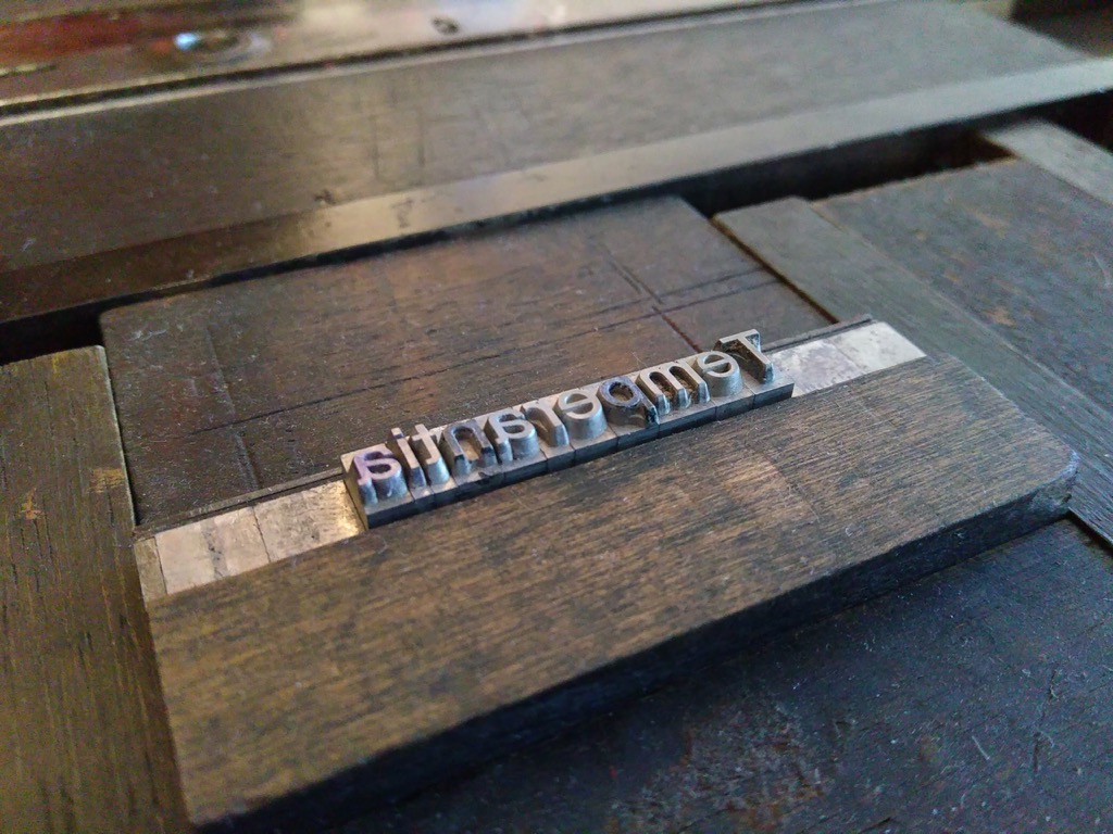
Also in the doorstep drop-off type surprise was a collection of various klischee, and I selected four, one for each virtue, to accompany the type.
I cut up 20 sheets of letter-size card stock into 9 baseball-card-sized pieces per sheet, to give me 180 cards in all (I only needed 40, but I know from experience that it’s always good to have lots of extras):
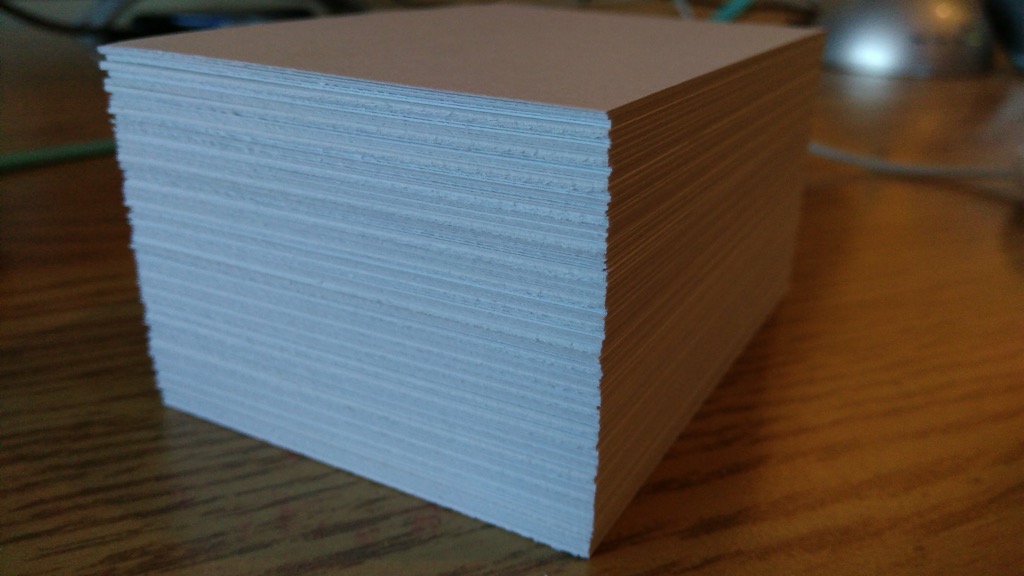
And then I set out to set-and-print, set-and-print: first four fronts, then the required title and credit line on the backs:
I started with Temperantia, using three dots as a symbol, reasoning that the visual metaphor of the ellipsis represented a sort of breath that one might take while considering restraint.
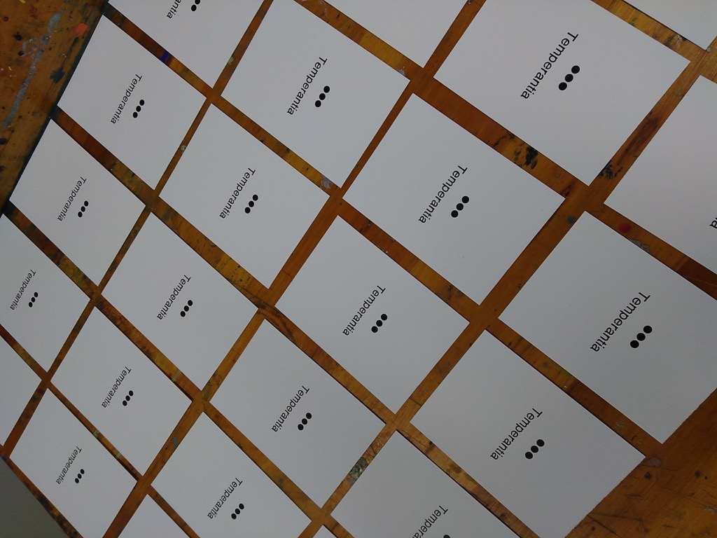
Two hours and three virtues later, I had 30 copies of each virtue’s card:
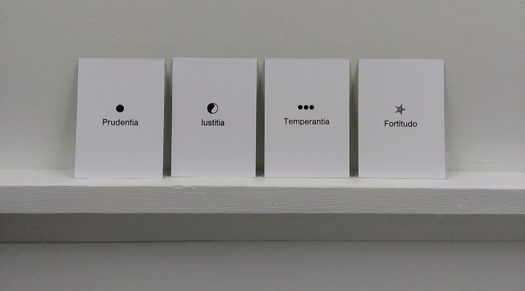
That the Latin word for “Justice” is Iustitia created a design issue, for the word looks like it starts with a lower case “L” to the uninitiated. But I can’t change Latin.
I used a tiny, tiny 6 point Spartan font of type, acquired from the print shop of the old Prince County Hospital, for the backs of the cards; it’s a well-used font, and so isn’t in the best of shape. But it’s the smallest face I have, and I wanted something tiny, so I decided to live with the irregularities:
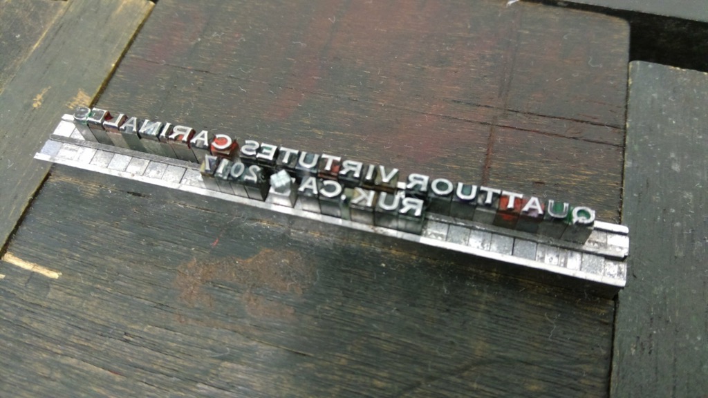
Careful reverse-readers will note a missing “D” in cardinales which, fortunately, I caught early and tucked into place before printing.
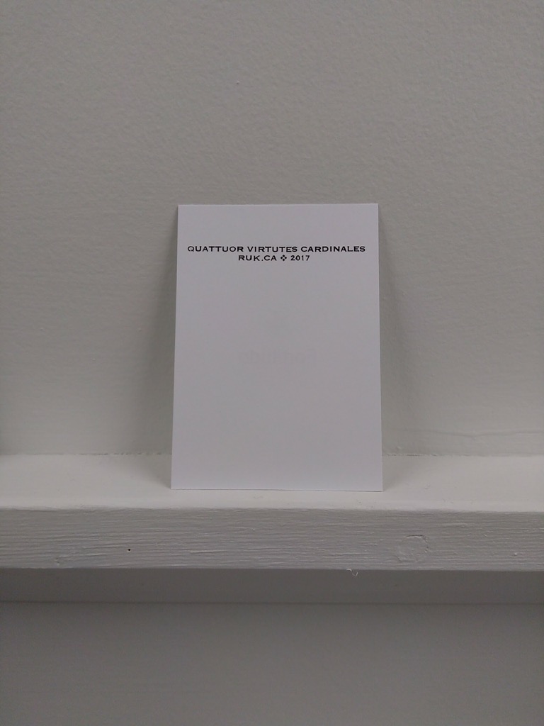
The printing of the credits caused a little bit of show-through on the front, but nothing too dire.
The cards are all printed, both sides, and drying in the print shop now, ready for next Thursday.
Please do come out for the card-trading frenzy next Thursday; I’ll buy you a drink. And there might be lava pits.
This is a pretty good hook for a video series:
Long story short, I’m living with a family displaced from the war, former drug addict/alcoholic father, extremely poor, etc… but they also have the best functioning family I’ve ever come across. They are beautiful. There’s a lot to be learned here, and it’s been quite a radical and challenging adventure so far living outside of my language and normalities.
Fish Out of Water starts on YouTube today.
From Coudal Partners Fresh Signals this morning:
Thanks Pearle Vision for making me cry in my office this morning, Ben’s Glasses.
That was enough to get cynical old me to tap, while sitting waiting for my lunch to be served, this afternoon. And I did cry, right there in the restaurant.
It’s a brilliant ad.
I just watched it again, and tears rose up again.

 I am
I am