
I’ve been meaning to join in the Confederation Centre Art Gallery’s Artist Trading Cards event for several years, but the timing has never worked for me: I’ve always been away, or busy, or distracted.
This year I resolved to break the logjam–I do own a machine capable of printing many copies of things, after all–and I sent my name in to the Centre in June, and in early July I got the call to produce:
The count is in. We all have 40 cards to make for the August 3 exchange.
The idea being that 40 people make 40 cards and then leave the evening with 39 new ones from other artists. At least that’s how I think it works; for all I know there’s competitive bidding and lava pits. But it sounds like fun regardless.
Then I procrastinated for almost a month.
With the event coming up next week (it’s Thursday, August 3 at 7:00 p.m., and everyone is welcome, card-trader or not), I decided that I’d better start printing.
But what to print?
This morning in the shower the word “whimsy” came into my head.
What about if I created a new “seven deadly sins”–whimsy, pith, ambition, and so on.
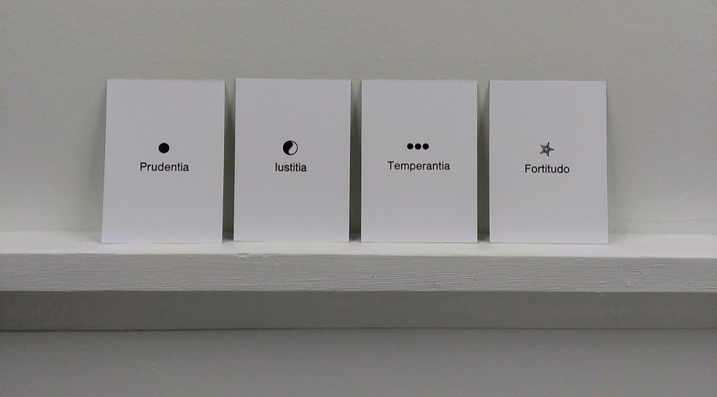
I Googled “seven deadly sins” when I got to the office to see what I was dealing with, historically. And in doing so I learned that in addition to seven deadly sins there are also seven virtues, and, of those, four are cardinal virtues: temperance, fortitude, prudence and justice. Ever-mindful of feature-creep, I reasoned that printing four virtues would be a reasonable task to take on in the time available.
The technical requirements for participation in the event are as follows:
Cards can be produced in editions (a limited number of the same card), series (set of cards with a unifying theme), or as singular originals. The main requirement is the size: cards MUST be the same size as modern baseball cards or 2 1/2 x 3 1/2 inches (6 cm x 9 cm), small enough to fit inside standard card-collector pockets, sleeves or sheets. ATCs must be self-produced. The artist’s name and contact information, as well as the card title and the edition or series number is to be written on the back.
I decided to print 10 copies of each cardinal virtue, ending me up with a variety pack of 40 to go into the card pool.
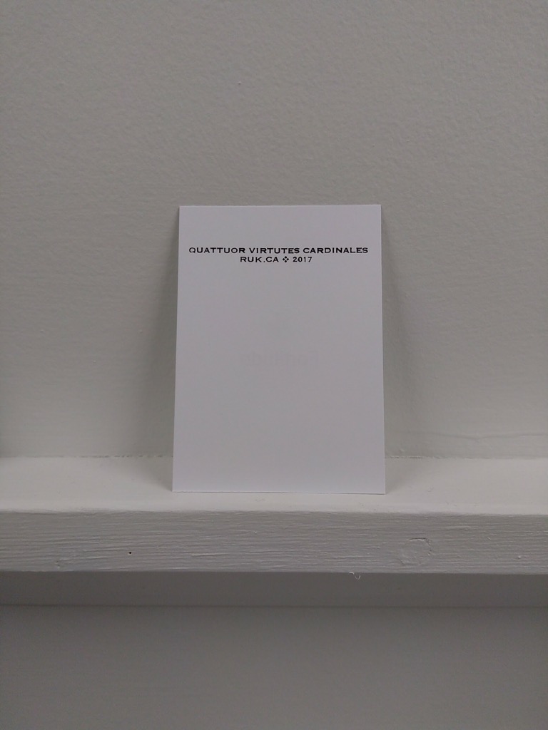
And I decided to print the cards in Latin, what given that Saint Thomas Aquinas was their most recent canonizer.
And so was born the Quattuor Virtutes Cardinales project.
Prudentia, Temperantia, Iustitia and Fortitudo.
I couldn’t choose the size of the cards, but I could choose the type, and I opted to use a recent acquisition, a sans serif font left at my doorstep by Sarah Saunders:
Also in the doorstep drop-off type surprise was a collection of various klischee, and I selected four, one for each virtue, to accompany the type.
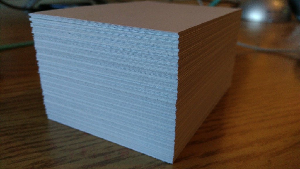
I cut up 20 sheets of letter-size card stock into 9 baseball-card-sized pieces per sheet, to give me 180 cards in all (I only needed 40, but I know from experience that it’s always good to have lots of extras):
And then I set out to set-and-print, set-and-print: first four fronts, then the required title and credit line on the backs:
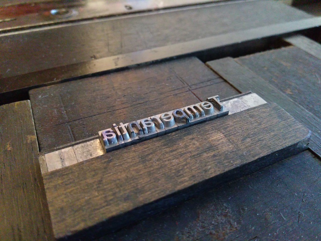
I started with Temperantia, using three dots as a symbol, reasoning that the visual metaphor of the ellipsis represented a sort of breath that one might take while considering restraint.
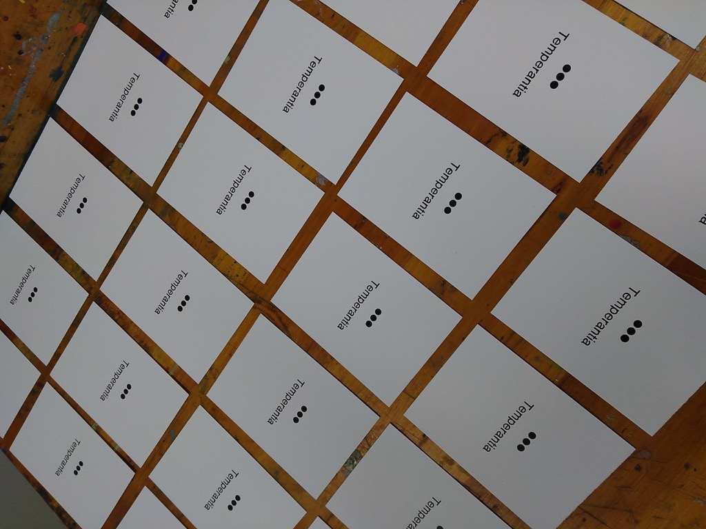
Two hours and three virtues later, I had 30 copies of each virtue’s card:
That the Latin word for “Justice” is Iustitia created a design issue, for the word looks like it starts with a lower case “L” to the uninitiated. But I can’t change Latin.
I used a tiny, tiny 6 point Spartan font of type, acquired from the print shop of the old Prince County Hospital, for the backs of the cards; it’s a well-used font, and so isn’t in the best of shape. But it’s the smallest face I have, and I wanted something tiny, so I decided to live with the irregularities:
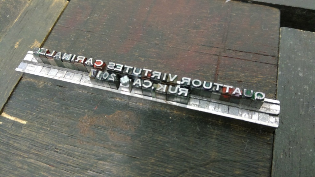
Careful reverse-readers will note a missing “D” in cardinales which, fortunately, I caught early and tucked into place before printing.
The printing of the credits caused a little bit of show-through on the front, but nothing too dire.
The cards are all printed, both sides, and drying in the print shop now, ready for next Thursday.
Please do come out for the card-trading frenzy next Thursday; I’ll buy you a drink. And there might be lava pits.
About This Blog
 I am Peter Rukavina and this is my blog. I am a writer, letterpress printer, and a curious person.
To learn more about me, read my /now, look at my bio, listen to audio I’ve posted, read presentations and speeches I’ve written, see things I’ve favourited elsewhere, or get in touch (peter@rukavina.net is the quickest way).
I have been writing here since May 1999: you can explore the 25+ years of blog posts in the archive.
![]() You can subscribe to an RSS feed of posts, an RSS feed of comments, an RSS feed of favourites elsewhere, or a podcast RSS feed that just contains audio posts. You can also receive a daily digests of posts by email. I also publish an OPML blogroll.
You can subscribe to an RSS feed of posts, an RSS feed of comments, an RSS feed of favourites elsewhere, or a podcast RSS feed that just contains audio posts. You can also receive a daily digests of posts by email. I also publish an OPML blogroll.
Instagram • YouTube • Vimeo • ORCID • OpenStreetMap • Internet Archive • PEI.art • Drupal • Github.
Comments
Your Sketches are The Real
Your Sketches are The Real Thing. https://sketchbookskool.com/ is the reason that assumptions about your artwork are gone.
Add new comment