One of my favourite possessions is a custom-made type holder from Japan that I purchased in 2015.
In the two years since it arrived, I’ve seldom had occasion to use it; that’s okay, as my purchase was as much to express my support for the creation of such a well-crafted object as it was to acquire a tool I’d immediately put to use.
But today, at long last, I finally had a job where it was exactly what I needed.
I’ve been printing 3D Pie Men for The Handpie Company for the last few hours, and I needed a way to customize the piece of chipboard I fashioned to act as their temporary home while en route to Borden.
So I opened a drawer of 36 point sans serif type, assembled the letters for PIE MAN, got out a green stamp pad I bought at Yu Yo back in March, and I was ready for action:
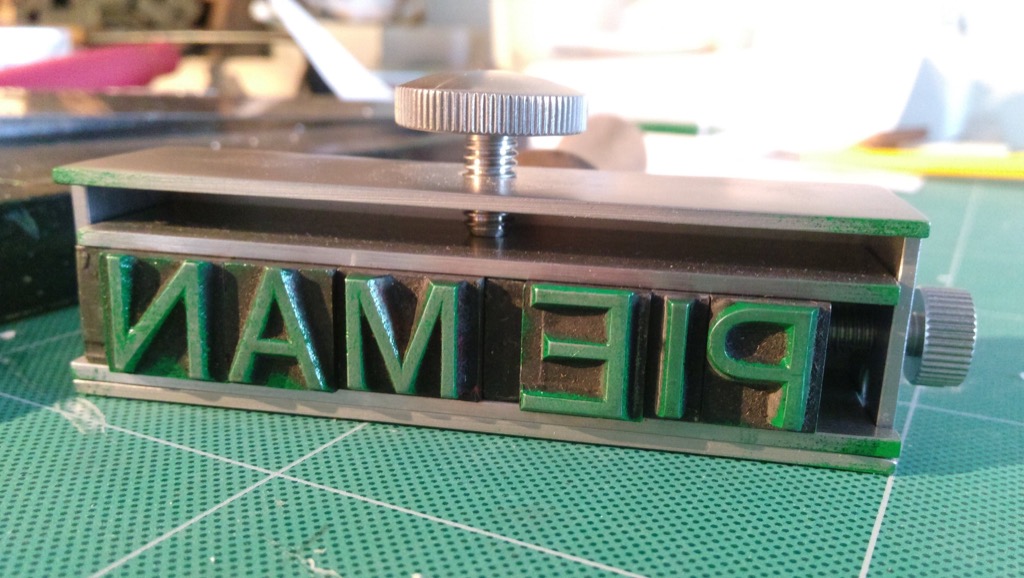
Using the heel of my hand for pressure, I carefully laid down the type onto the chipboard, and, rocking back and forth, pressed down as hard as I could. The result is not letterpress-quality, but it will do just fine for this temporary Pie Man holder:
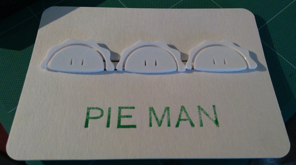
For those that have been following along (start here, then read here), Pie Men Mark IV are about 2mm thinner than the previous version, following on from feedback from Handpie HQ.
There’s still some work to be done: a desire for scalloped pie-like edges, and slightly tapered struts for letterboard-insertion. But for now, Mark IV Pie Men are ready for duty and should be up on the Handpie letterboard shortly.
Want to see them up close? Go buy a yourself a handpie!
For reasons that will become much more obvious shortly, I’ve been spending a lot of time trying out various ways to order food and drinks for pickup using mobile apps.
Starbucks has a very slick mobile app, with solid logistical support for it in their restaurants, and because you need to preload the mobile app with a minimum of $25, I’ve had more experience with it than others (despite not really having a taste for Starbucks coffee).
The one thing about the app that’s confounded me is that I haven’t been able to figure out how to order a decaf espresso macchiato.
I can select the cup size, the number of shots, the milk type and degree of froth, the sweetener, and whether I want extra water or not.
I can choose to add caramel sauce or cinnamon dolce syrup, or sugar-free cinnamon dolce syrup.
But there’s no way to select decaf coffee.
So I contacted Starbucks using the form linked to from the app, and their quick reply was:
I am so sorry that the mobile application is not set up for the option of a Decaffeinated Espresso Macchiato due to no decaf option. I will be sure to share your feedback to the correct department to be considered on the next update. Once again I am very sorry for the inconvenience.
So at the very least I’m not crazy: there is no option for selecting decaf.
This is such a bizarre design decision, that runs contrary to the app’s flexibility otherwise, that I have to imagine it’s tied to a process issue that’s not obvious.
Any thoughts?
I found a bottle of Expo-brand white board cleaner on the table outside my office, and I was curious to know what was in it, so I Googled “expo whiteboard care msds” and ended up at this list of Material Safety Data Sheets, one of which was for Expo Cleaner in Bottles.
This MSDS lists the composition of the white board cleaner as a 0.1% to 2% concentration of 3-butoxypropan-2-ol, another search for which leads me to another MSDS for this ingredient alone, under the brand name “Dowanol PnB,” from Dow Chemical. It’s described there as follows:
DOWANOLTM PnB glycol ether is a fast-evaporating, hydrophobic glycol ether with high solvency and excellent coupling abilities. DOWANOLTM PnB glycol ether is extensively used in heavy-duty cleaning formulations. It does an excellent job of solvating and coupling hydrophobic greases and oils in household as well as industrial formulations. It is partly water soluble and miscible with most organic solvents. DOWANOLTM PnB glycol ether also provides excellent surface-tension lowering ability. In coatings DOWANOLTM PnB offers good coalescing ability in systems requiring fast evaporation.
If you’re curious, here’s what the molecule looks like.
But back to the rabbits.
Here’s Section 11, Toxicological Information, from the Expo Cleaner in Bottles information:

I was just quickly breezing through the details on the sheet when the word “Rabbit” jumped out at me.
“Rabbit?”, I wondered to myself. What does this have to do with rabbits?
Some more Googling led me to the Canadian Centre for Occupational Health and Safety page about LD50, which defined the term thus:
LD stands for “Lethal Dose”. LD50 is the amount of a material, given all at once, which causes the death of 50% (one half) of a group of test animals. The LD50 is one way to measure the short-term poisoning potential (acute toxicity) of a material.
Toxicologists can use many kinds of animals but most often testing is done with rats and mice. It is usually expressed as the amount of chemical administered (e.g., milligrams) per 100 grams (for smaller animals) or per kilogram (for bigger test subjects) of the body weight of the test animal. The LD50 can be found for any route of entry or administration but dermal (applied to the skin) and oral (given by mouth) administration methods are the most common.
So if I’m reading this correctly, 50% of rabbits that were given a dermal 3100 mg/kg dose of 3-butoxypropan-2-ol died as a result.
The heart of the popular opposition to animal testing has focused on cosmetics; indeed the Body Shop page on the issue is headed by adorable-looking rabbits. I don’t know if I’ve ever come across office products, like white board cleaner, that make animal testing claims; it had never occurred to me that the cousins–or at least half of the cousins–of the Body Shop’s rabbits were killed to allow me to feel safe cleaning my white boards.
I’d like to know more about this.
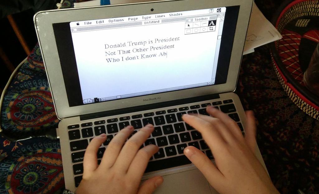
Here’s Oliver running Aldus PageMaker inside a browser that’s running a Mac System 7 emulator on his contemporary MacBook.
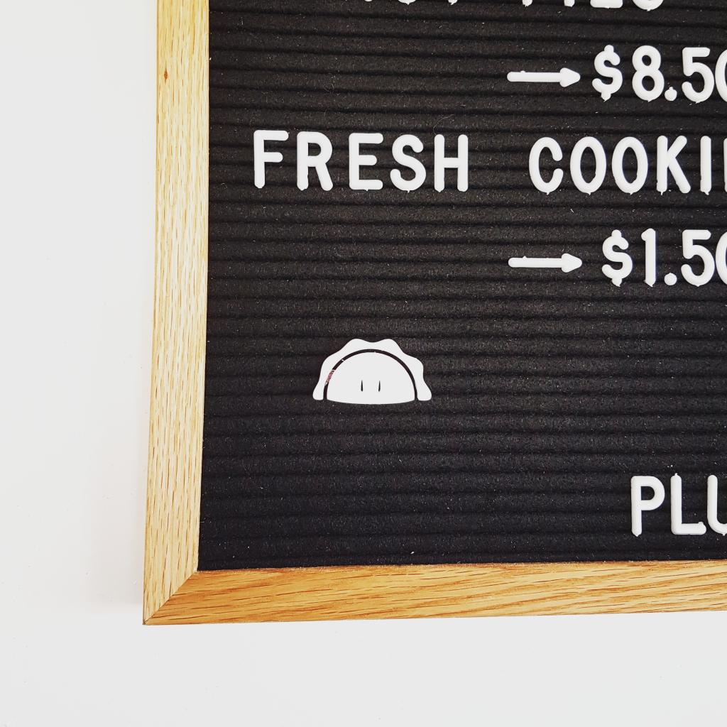
Thanks to the generosity of friend Bob, Pie Man 3.0 was ferried to Borden for review by staff in the Department of Three Dimensions at Handpie Company HQ. Here he is on the board.
The office paper towel dispenser has been broken for months, and we’ve been forced to use loose rolls of towels.
But today the last loose roll random out, leaving the only the paper towel in evidence the one locked in the broken machine behind a lock only opened with a proprietary key that I don’t have.
Wet hands. What to do?
It turns out that a standard-issue spork can unlock the machine.

The Guardian reports today that Vehicle hits pole after swerving to avoid fox on Charlottetown road.
The first time I ever touched an Apple Macintosh was the fall of 1984. I was a high school student embedded in the Ontario Science Centre, a position which afforded the privilege of 24/7 access to the building and its many wonders.
Somehow our tiny cabal of students managed to secure a “master key” that opened every door there, and it was behind one of those doors, a temporary cabin that had been set up in an unused exhibit area, that we came across a collection of Apple Lisa and Macintosh computers; the Lisa had been released the year before, the Mac just that January. We figured out to turn them on. And I was immediately mesmerized.
For context: I’d just that same month purchased a new PC for my own use, a Sanyo MBC-550 that existed in a mysterious realm between a bona fide IBM-PC and a completely proprietary computer; it ran a flavour of MS-DOS, and operated just like a PC. Or at least just enough like a PC. Many essays were typed on that computer. And many BBS systems were dialed into.
But that computer was nothing like the Macintosh: there were no graphics to speak of (Windows 3.0 wasn’t to be released until 6 years later), and so whereas at home it was all backslash-this and backslash-that, in the secret Science Centre Mac lab I got to use a mouse, a desktop, a drop-down menu, and all the other innovations that, 33 years later are still very much part of how I use the MacBook Air upon which I now type.
All of which is to say: isn’t it great that, thanks to the Internet Archive, you can now run a classic Mac in a web browser!
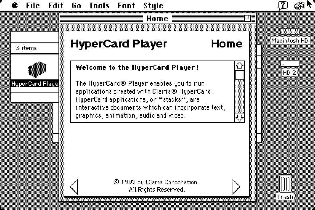
Some years later, at Trent University, I had more permanent access to a Mac, and got to dive deep into HyperCard, the hypermedia authoring tool that still, all these years later, so many of us from that day pine for lovingly. HyperCard was, for me, the gateway drug for everything that I’ve done since: the agency that it gave one to shape digital information landscapes was profound. This 1987 episode of The Computer Chronicles–also hosted by the Internet Archive–is a delightful look into the mind of Bill Atkinson, the man who created HyperCard, and about the uses it had been put to in those early days, including an effort to digitize The Whole Earth Catalog.
Since he revealed it last year, I’ve been very fond of Premier MacLauchlan’s conception of Prince Edward Island as “the mighty island” and, even better, the “isle of might.”
I was disheartened, however, by the facile video that unleashed this notion on the larger world. I couldn’t put my finger on the heart of my discomfort, though, until I rewatched it with Oliver tonight and heard the following line:
We didn’t get the memo that said “you can’t,” we got the one that said “anything is possible.”
The thing is: there aren’t two memos.
Wiktionary describes the idiom like this:
To be aware of the current state of affairs.
He hadn’t gotten the memo that there were too many strip malls.
Didn’t you get the memo about gasoline prices?
So let’s assume a memo that went out that said “you can’t.”
The idiom works if, say, Bob then goes out and runs a marathon. “I guess Bob didn’t get the memo!”, his friends could rightly exclaim.
But in this or no other situation is there a competing contrary memo; Bob didn’t run a marathon because he read an “anything is possible” memo, he ran a marathon because he didn’t read the “you can’t” memo.
The use in the “mighty island” video thus breaks the idiom, and not in a witty way, but in a “bad copywriting” way.
And this bad copy not only harms the video directly, but it serves to accentuate that the overarching “rah, rah, we’re totally plucky and awesome” tone of the video is a bad fit for a metaphor that is, at its heart, proud, humble, and ironic.
It’s time to go back to the drawing board and get “the mighty island” the brand support it deserves.
 I am
I am