This is the first trip I’ve taken in 10 years where I haven’t provided a play-by-play of angry travel tweets. It’s been cleansing. But y’all have been missing out on the details as a result, so here’s a taste, from the last 5 hours.
I finished up my work with [[Yankee]] colleagues around 3:00 p.m. and got in my car and headed east.
My first stop was the Barbour Milford Clearance Centre, a decidedly non-outlet outlet of the British apparel brand located in an industrial park in southern New Hampshire, conveniently on my way to the airport. I was the only customer, and I was treated to Olympic-level customer service from the friendly and helpful staff, who briefed me on UK vs. US sizing, on what “waxed jackets” are (Barbour is known for them; they are cotton jackets impregnated with wax so as to be waterproof), and on their various amazing deals (especially the “red tag” area at the back “where people find real gems”). After 20 minutes of browsing, I settled on two short sleeve shirts, regularly $119 each, but effectively half-price with a store-wide 35% off and a rack-specific “buy one get one at half price” discount. I shall return.
Next stop was Sunnyside Acura, where the son of a colleague has recently taken up work. I got a tour, and a coffee, and was sent on my way. I’ve known him since he was a young boy, and it was good to see him making his way successfully through life.
From Sunnyside (where it was raining some torrential), I headed out to Route 3 south into Massachusetts. The rain got worse and the traffic heavier as I made my way; I passed signs like “Woburn, 39 minutes” that seemed absurd in their high estimates but which proved conservative. It took me two hours to get to Logan Airport, about twice as long as it takes on a good day.
I’m the kind of person who’s constantly recalculating my progress and my possible arrival time, and thus my chance of getting stuck in Boston, every 5 minutes. I spent about 15 minutes within sight of the Zakem Bridge in Boston—the final waypoint before the airport—thinking that it was most certain I’d miss my plane.
Then traffic picked up, just a little, and I pulled into the Rental Car Centre about 7:10 p.m., heading for a 7:50 p.m. flight.
But, as soon as I connected to the free Logan wifi, I got alerts about flight delays, and my 7:50 p.m. flight turned out not to be leaving until 8:50 p.m. (an estimate that the check-in desk termed optimistic). So my rare not-filling-up-the-rental-car-with-gas panic was unwarranted.
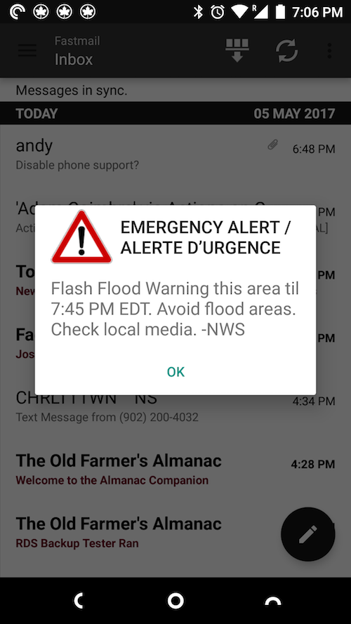
Also just as I arrived at the airport, whole bunch of people’s phones started to go off, including mine; turns out that “receive urgent public service alerts from Google?” setting actually works, and that everyone was receiving National Weather Service alerts about flash floods.
And so here I sit, in Ozone by Todd English in Terminal B, waiting for my optimistic flight.
The flight delay means I won’t get into Halifax until after 11:00 p.m. I’m overnight in the Alt Hotel at Stanfield, and then off to Charlottetown in the morning.
Oh how I long for the days when one could fly direct from Charlottetown to Boston.
It’s been a good trip, but I’ll be happy to get home.
Postscript: I posted this, then packed up and headed to the tiny dedicated Air Canada security checkpoint in Terminal B. It was all but deserted when I arrived, and the two TSA agents present both told me I was too late, that the gate was closed, and that I should have showed up 2 hours early as instructed. They were deadly serious. When I looked aghast, the both broke character at the same time and told me they’d been having me on.
Another Postscript: boarded the plane at 9:00 p.m. I slowed everything down with my usual “hold on, you didn’t use that passport when you flew into the US” dual national dance. But I’m on the plane and all systems are go.
Final Postscript: the plane left without incident; 30 seconds before boarding I impulse-purchased Ariel Levy’s The Rules Do Not Apply and it kept me engrossed from take off to landing. I’m a sucker for personal tragedy memoires from my age adjacents.
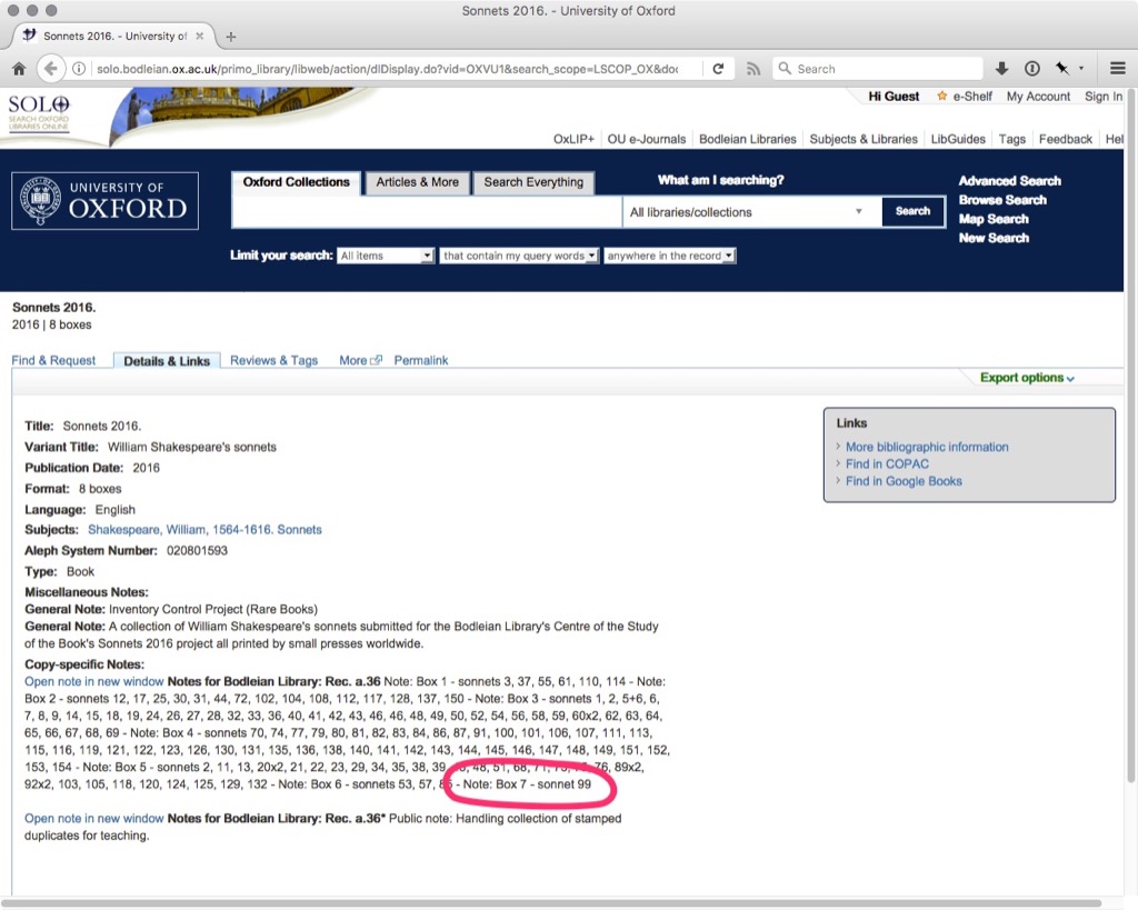
I received word today that my contribution to the Shakespeare’s Sonnets in 2016 project of Bodleian Library at Oxford has now, along with its sibling sonnets, been catalogued.
So you can take your “university degrees” and “career accomplishments” and “debut at Carnegie Hall,” and all those other markers that I lack in life, but I have 154th share of an Oxford University catalogue record!
Should you be at Oxford and wish to visit the actual items in person, here’s what you need to know:
For the purposes of viewing the Sonnets, as these are now in the Weston Library, may I draw your attention to the following:
Explaining the identification and proof of address required to make an application for a Reader Card. A Reader Card may be issued free for the purpose of your visit to the Weston Library.
The Weston Library is on Broad Street in Oxford, next door to Trinity College.
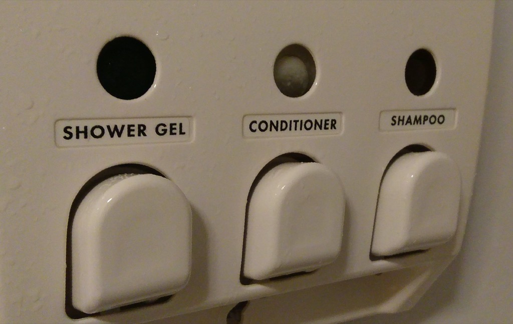
In the shower stall of my room at the Jack Daniels Motor Inn is a dispenser of shower gel, conditioner and shampoo. In principle this is a good idea: it keeps tiny bottles out of the landfill, it means I never run out of supplies, and it’s a lot easier to manage when showering.
Here’s what this dispenser looks like:
The problem is that I don’t shower with my eyeglasses on, so when I’m actually in the shower trying to figure out which handle squirts which liquid, this is what I see:
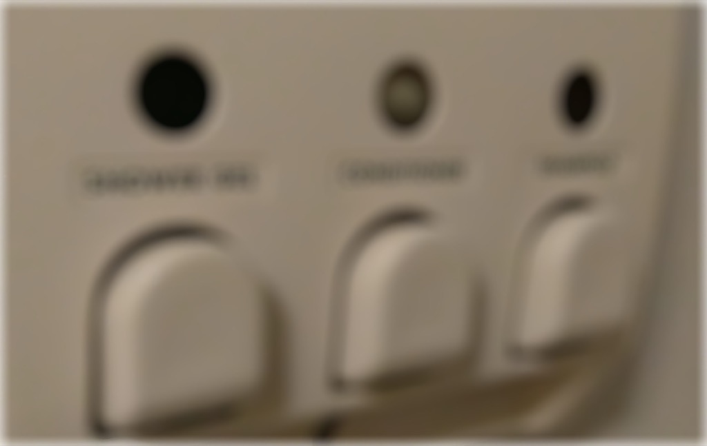
This means that, rather than being effortless, as it should be, using the dispenser requires that I memorize the order of the squirts while I’ve got my glasses on so that I can remember them when I have my glasses off (a memorization that would be a lot easier if the squirts were in the order that one might use them; but who uses conditioner before shampoo?).
I thought of this a few weeks ago when I was visiting the website of a former client.
The client had, about 5 years ago, asked me to do a high-level review of their website with an eye to making some simple design improvements. One of the things they were concerned about was making it clear, in the design, that they were not a subsidiary of the organization that was actually implementing and hosting their site for them; and so having a distinct look and feel was important to them. And at the time, that wasn’t in place.
The client went on to act on many of the recommendations that I made, including this one, and the result was a big improvement on many levels.
Which is why I was confused, when I revisited the site recently, that this distinct look and feel that they’d felt so important had disappeared.
I sent an email to the client pointing this out and, the next day, they replied that their programmer had looked into the issue, and couldn’t duplicate it: everything looked fine to them. So they recommended that I clear my cache, delete my cookies, etc.–all the things that people like me recommend to users when we think it’s their fault, not ours.
I replied that, in fact, the problem was not browser-related, that it happened in all browsers, old and new.
To aid in the diagnosis, I took a dive into the HTML of the pages in question, and, in doing so, I found the source of the issue.
What had happened was that the swapping out of one look and feel for another was something that was done in CSS: essentially the generic look and feel was the default, and the “we’re not a subsidiary, we’re an independent entity” look and feel was used to replace it by, in CSS, saying “override the default logo with this special purpose-specific one.”
The problem was that the CSS file containing these instructions was hosted on an internal server, with an internal corporate address, accessible only to people on the corporate network.
Which meant that the programmer looking into the problem didn’t see the problem because their browser could access the CSS file that solved the problem. The same thing applied to my client: they too were inside the corporate network, and so their browsers could also access the CSS file, and everything appeared just fine to them.
And so, like my problem with shampoo-blindness, the root of the issue was that the designers of a system weren’t able to take the perspective of the users of the system.
In the case of the shower stall dispenser, it’s unlikely that the designer of the dispenser, the purchaser of the dispenser, or the installer of the dispenser ever had a chance to see the dispenser without wearing their own eyeglasses. Any, indeed, it’s unlikely that the managers of the hotel have ever had cause to shower in their own rooms’ shower stalls, without eyeglasses, to experience the issue (or, indeed, perhaps none of them wear eyeglasses in the first place).
In the case of the broken website look and feel, there was no system in place to mimic all of the conditions of a regular everyday non-corporate user of the website, so problems related to inside-outside issues were unlikely to be noticed. Especially problems as subtle as a logo at the top of a web page that, to most people on the outside, looked perfectly fine.
This is a tale that we should all take to heart, not only when we’re designing or purchasing shower stall shampoo dispensers and making web pages, but anytime we’re designing anything for a broad audience.
Or anytime we’re communicating with anyone who might not share our assumptions or our language or our eyesight or our physical abilities.
Take off your eyeglasses if you want to understand me.
Remember my excitement regarding Hertz Ultimate Choice, the new “pick any car on the lot!” that was promoted to me in anticipation of my arrival at Logan Airport on Sunday?
Well it turns out that this was not the “I’ll take a bright red Mini Cooper with crushed yellow velour interior” paradise that I thought it was going to be.
Here’s what happened:
When I arrived in the Logan Car Rental Center and made my way to the Hertz part of the garage, I was directed by signage to the Gold area to pick a car, any car.
This area was one aisle of many, and it was populated exclusively by the opposite of the cars you’d think would be every person’s “ultimate choice.” Scads of generic Hyundai, Nissan and Toyota mid-size cars that one would buy if they were a perfectly sensible, if not particularly inspired person, who doesn’t pay any heed to fuel economy or style.
But I like smaller, more boldly styled, more fuel efficient cars, and the Gold lot contained none of these.
Back in 2015, I rented a peppy Fiat 500 from Hertz; it was that sort of car I was looking for. So I went inside to the desk to see if one might be coming into the rotation.
I was told–and I’m not making this up–that not only were there no Fiat 500’s on the lot, but that even if there were, I wouldn’t be eligible for one because I’m a Gold member, and Gold members, it seems, can only drive big cars, midsize or larger.
Reconciled to a life inside the mundane gold prison, I went back to try to find the best of the worst. I tried a few cars on for size: a Kia Soul, a Jeep, a Nissan. But none made my heart sing.
Seeing me get out of my third car in a row, a Hertz employee asked me what was up and I told him I was looking for something smaller.
This seemed odd to him: Gold members get to drive big cars. You’re supposed to want to drive a bigger car. Why would I want to deny myself this pleasure?!
Nonetheless, he told me that I could walk to the opposite end of the Hertz lot, to the non-golden peasant section, and pick whatever car I liked.
So that’s what I did.
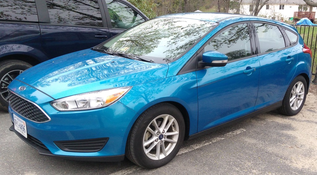
I found three models of car left: Toyota Echo, Nissan Versa and Ford Focus. I’ve rented Fords from Hertz before, and while they’re not the cars of my dreams, they’re solid, comfortable, efficient and well-equipped, so that’s what I ended up with:
I got myself sorted, and headed toward the exit booth for the paperwork, showing the agent my driver’s license as requested.
Confusion resulted.
“That’s not your car, that’s Anthony’s car,” said the agent. “Hold on a second.”
The agent phoned into the office; there was a question about whether I was allowed to drive away in “Anthony’s” Ford Focus.
It was decided that another car could be found for Anthony.
And I was on my way.
The Ford Focus has proved an entirely adequate car. It does not enliven my spirits, but it does not dampen them either. And it got 40 miles to the gallon on the trip up to New Hampshire from Boston.
Hertz Ultimate Choice is a bust, though. Both because it offered me the pick of an ugly litter, and because it reinforced that “bigger and more guzzling the better” is still too much a part of the American dream.
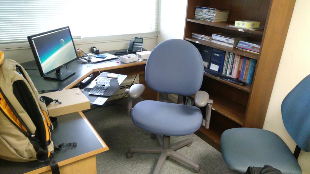
After a decade of working out of the third floor “crow’s nest” here at Yankee, I’ve been upgraded to an office. Or at least an office-like cubicled-off section of the third floor hallway.
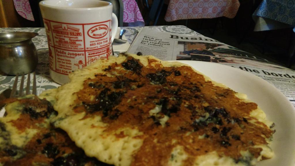
Breakfast in Peterborough, New Hampshire. Short stack of blueberry pancakes, $5.50.
“You like coffee?”
“Yes, please.”
It’s just me and two older veterans a couple of tables over.
They’re taking about military prisons.
“You kill somebody on board your ship, that’s a dishonourable discharge… It fucks up your life pretty good.”

 I am
I am