While I was printing my MMXX! cards last night, I was also filming what I was doing, using my iPhone and a tripod.
I’m not an accomplished filmmaker, and know very little of camera angles and visual storytelling; what I tried to do was to tell the story of how the idea came to life, and how the typesetting and printing process works from beginning to end; I hope I succeeded, at least a little. I learned a lot editing this in iMovie: the mind is capable of filling in so many gaps that it’s possible to trim big stretches of what I might have otherwise thought as invaluable action; watching the video again now, I see I could have done even more of this.
Thanks to Olle for the filmmaking inspiration; he has started a YouTube channel for his tool-cleaning videos, and his efforts made me remember that I carry around a powerful video camera in my pocket.
The music is from Scott Buckley, an Australian composer who’s generously released much of his music with a Creative Commons Attribution 4.0 International License; I used his Solecism, Snowfall, and Wanderlust tracks.
I’ve uploaded the movie to YouTube (with captions), YouDescribe (with audio description); you can also download it here (without captions or audio description) or watch it below (it’s licensed under a Creative Commons Attribution-NonCommercial 4.0 International License).
I decided it wasn’t just to release the video without captions or audio description, so, with the help of my friend Cheryl, I figured out how to add these; I welcome feedback on these particularly, as they are a freshman outing, and I want to get better at it. The audio description suffers, I think, from the relative volume of the music and the description, but I couldn’t find a way to adjust this in YouDescribe.
I had a lot of fun doing this.
Sometimes you get hit out of the blue with an idea, an idea that cries out for immediate action. That’s what happened with MMXX!, which, over the last 90 minutes, I’ve imagined, set, printed and offered for sale in the shop.
It all started with this video about railway track laying from Geoff Marshall, the closing frame of which is this:

Although we’re almost 11 months through 2020, this was the first time I’d realized that in Roman numerals it’s MMXX, and that seemed to have some typographic potential for adventure.
Next year will be MMXXI. Or, I thought, MMXX!. Read the entire story in the shop. Here’s the result:
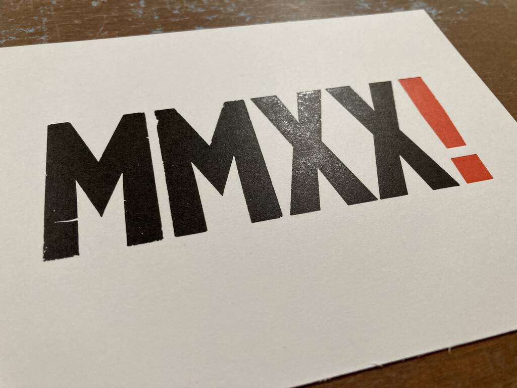
Nineteen copies standing by for your 2021-anticipating, Black Friday shopping-from-home pleasure.
I added three “classic” items to the Queen Square Press shop this morning:
- The Island Hymn – a triptych of the lyrics, originally set and printed in 2012 (if you need backing organ, you can find it here, reconstituted from sheet music).
- Set a Goal – another from 2012; watch a video of its printing here.
- Map of Charlottetown – from 2017, the simplest map ever. Available both with and without a whole punched in the top!
Reception to the shop from friends and familiars has been heartening, and I’ve enjoyed the process of packing and shipping envelopes across the continent and across the ocean.
From US Aids to Navigation, from the US Coast Guard:
You may have heard the phrase, “Red, Right, Returning.” This expression refers to the fact that when returning (entering a channel from the open sea or proceeding upstream), a boater must keep the red Aids on the right (starboard) side of the boat.
Red, Right, Returning. Except when it’s not.
The world has two marine aids to navigation systems, opposite of each other. From Cruising World:
Region A consists of Europe, Australia, New Zealand, parts of Africa and most of Asia. When entering a harbor in this region, marks to port are red and marks to starboard are green.
Region B consists of North America, Central America and South America, plus the Philippines, Japan and Korea. When entering a harbor in this region, marks to port are green and marks to starboard are red (red, right, return!).
This seems like something everyone should be taught in elementary school.
Trailer for Our Friend, coming to “theatres” in January. Impossible to watch without crying, at least if you’re, well, me.
I mark the true start of winter from the date I hurriedly put the last few things from the yard—the garden hose, the wheelbarrow, the deck chairs—into the back shed because it’s about to seriously snow. Today was that day.
I also moved my bicycle, and Oliver’s, inside, marking the end of cycling season (last year I went all the way to December 2), put the lawnmower to bed, and moved the snow shovel up from the basement.
It seems more winter this year because I’ve started to turn down lunch and dinner dates, moving my personal COVID Code Red ahead of Public Health’s in the abundance of caution (and prevalence of anxiety).
As it happens, Amazon Web Services has been having a technical issue today the result of which is my receiving a text message every 15 minutes or so that says, in essence, “everything’s okay.” While under different circumstances that would be annoying, today the constant reassurance, as snow starts to fall, is welcome.
One of the aspects I love about letterpress is that, unlike digital design, where anything goes, there are hard limits to what’s possible, given the nature of the process, the typefaces in my collection, and my own creative limits.
When I launched Queen Square Press, I realized I’d need a logo for the new enterprise, and, because I wanted to be able to print the logo, it needed to hew to the limitations of the medium.
I recalled that I had a square in my collection of ornaments–I think I acquired it from Letterpress Things at the Printing Arts Fair in 2011–that I could perhaps build something around.
My favourite and most reliable font of type is 24 point Bodoni Bold I purchased in Montreal in 2012 (and hauled back to PEI in the back of a KIA Soul): it’s a foundry-cast font, and is tough as nails.
After a bit of playing around with the position of the “Queen Square Press” and the square in OmniGraffle, here’s the digital version of what I came up with:

In metal, I set the type and then started out with an all-red version for position:
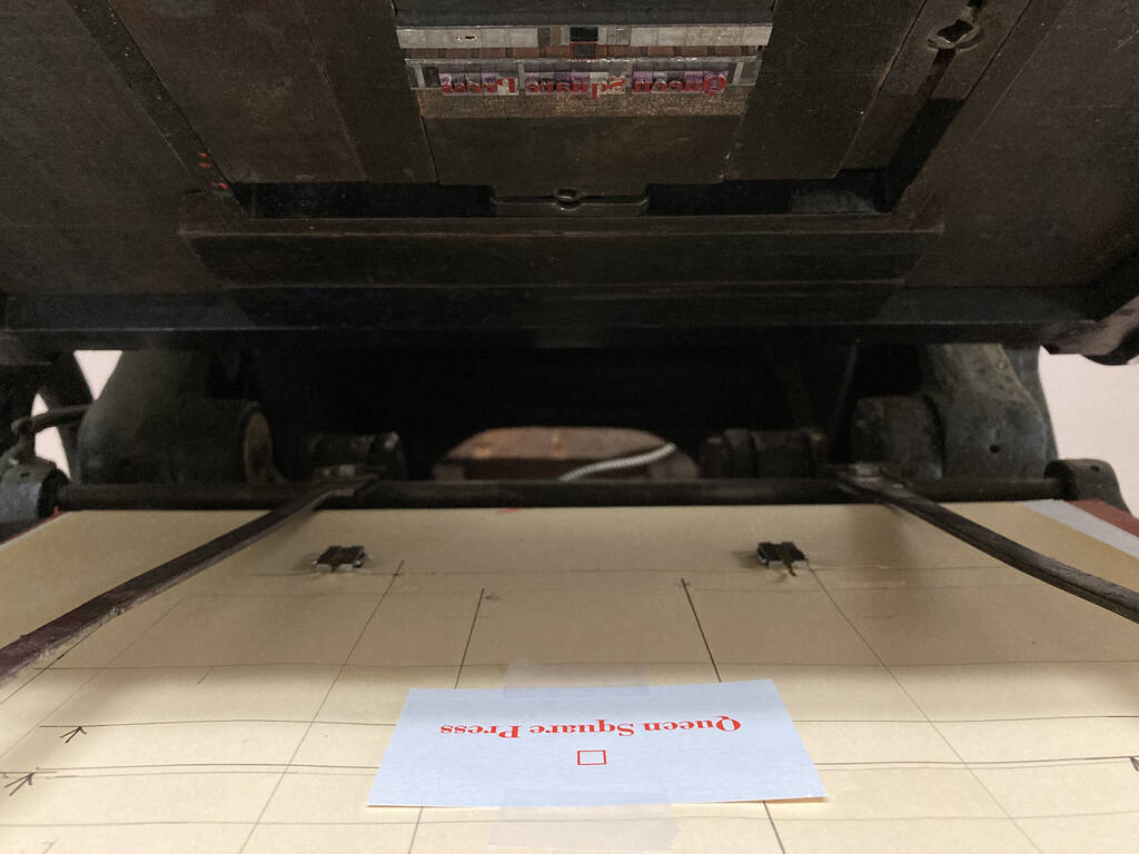
Once I got everything positioned properly, I removed the type that I would later print black, Queen Square Press, leaving just the square to print in red; I printed 60 cards with red squares.
Next, after some time for the red to dry, I swapped out the red square and replaced the Queen Square Press, and printed the black layer:
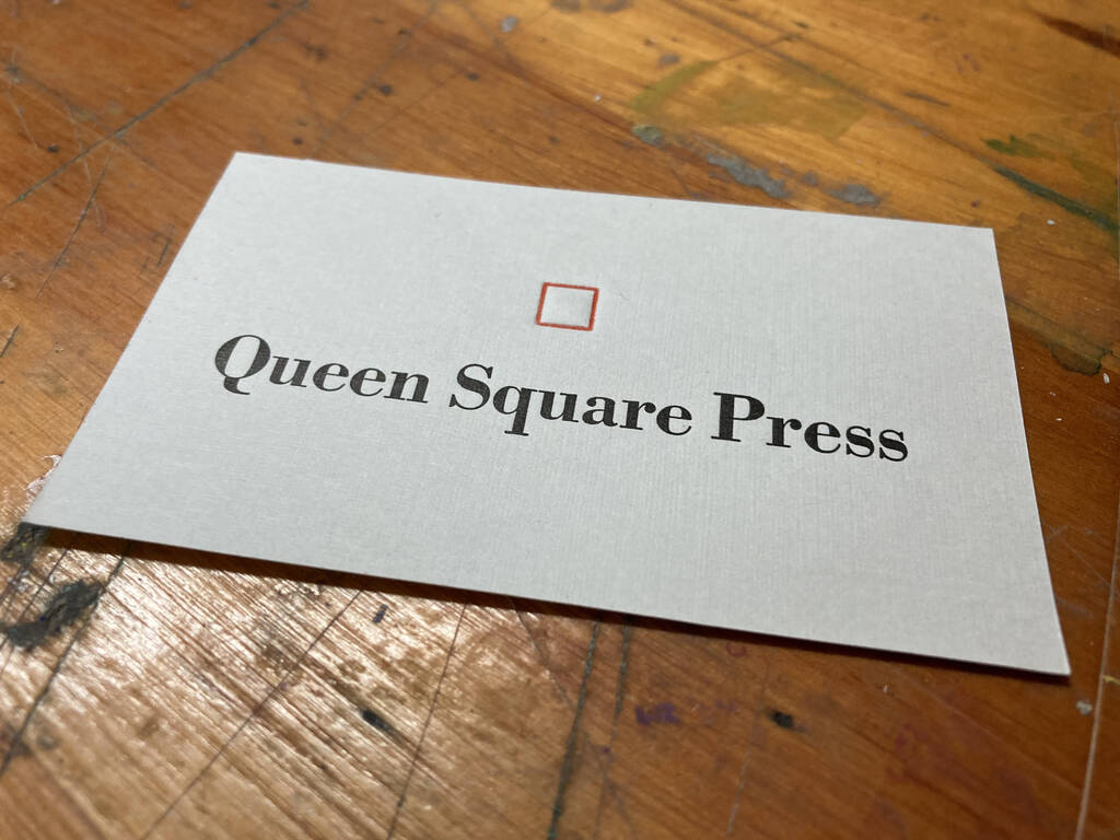
I realized, as I was printing the black, that the impression of the red square was a little too deep for my taste; I console myself that it emphasizes the letterpress-printed nature of the cards, even if it does violate the traditional rules of the trade:
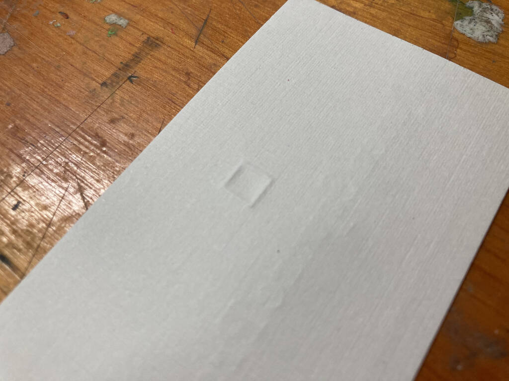
The cards themselves are grey linen-finished, part of the collection of business card stock I was generously gifted by Gertie and Bill Campbell when I purchased their Golding Jobber № 8 (which should last me a lifetime).
You’ll notice that the weight of the Bodoni in the printed version is heavier than in the digital; I’ll need to update the digital to match.
If you order something from the Queen Square Press shop, you’ll receive one of these cards in your package!
–––
Update: I secured a digital font of Bodoni Roman that better matches the weight of what I have in metal, and prepared an updated version of the digital logo.
Here’s the original:

Here’s the update:

Much-improved!
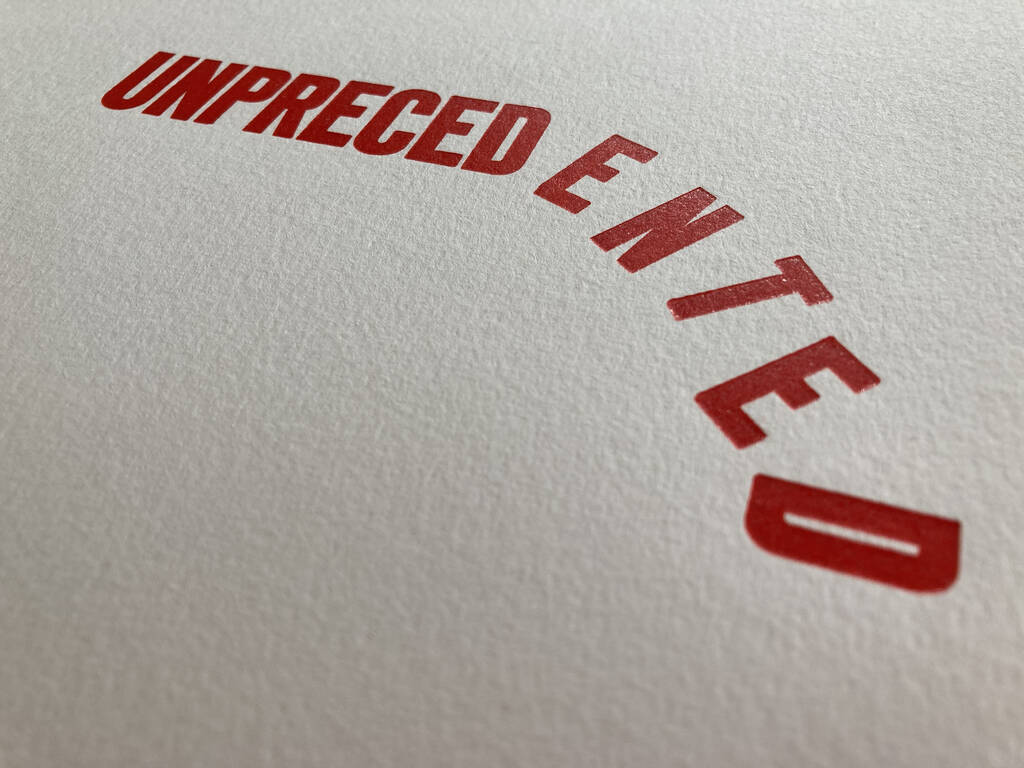
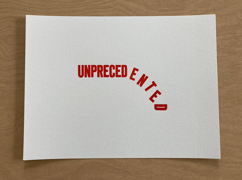
I took advantage of having red ink on the press yesterday to prepare a special limited-to-12 edition of the UNPRECEDENTED broadside. This version is on 140 lb. Canson cold press watercolour paper, and is a slightly larger 9 by 11 inches. Because of the heavier weight of the stock, there’s a more obvious “three dimensionality” to this version, as the type bit into the paper with more tenacity.
I’ve added this version to the Queen Square Press shop.
There’s a spot along the headwaters of the Hillsborough River known as The S. It’s an officially registered geographic name. It is shaped, not surprisingly, like an S.

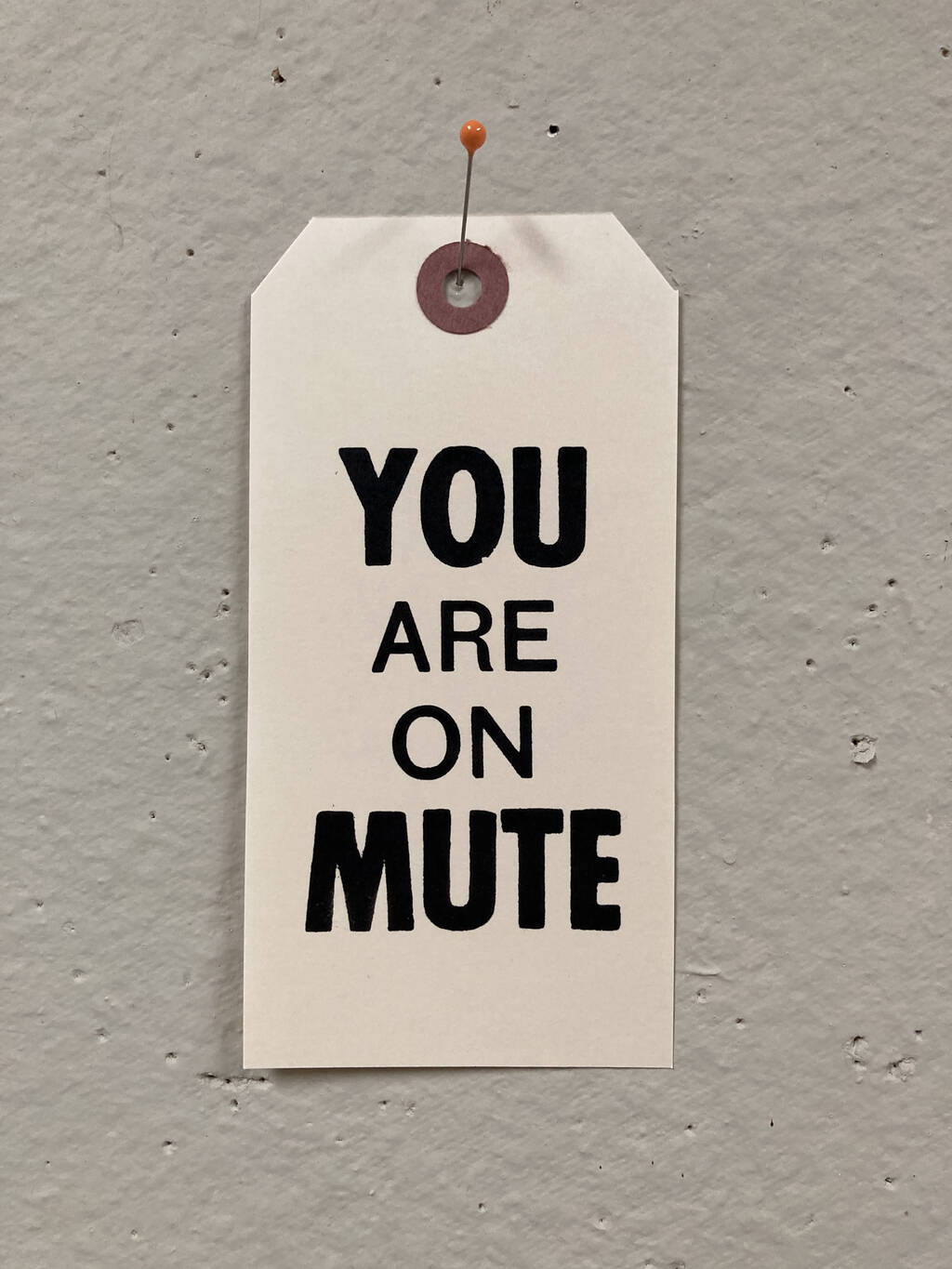
New off the letterpress today (and on sale in the Queen Square Press shop), You Are On Mute printed on a № 6 shipping tag.
I used a couple of fonts of battered old sans serif type: “Are On” is type from a printer in Montreal who was downsizing; “You” and “Mute” a font on loan from Holland College.
 I am
I am