
Isn’t this paragraph, by Eva Wiseman in Sex is back, but it’s going to be different in The Observer, just the greatest:
The trick will be to weaponise this awkwardness, and transform it into a series of exquisite tensions. It is a chance to be naive again, to purr as a person presses your back like a cat on Instagram or a David Attenborough cub. People are excited simply to sit across from a person they admire, simply to pull the window closed or wetly kiss their cheek – each drop of this excitement must be noted, harnessed and claimed as adorable. There will be people who want to lie fully clothed on top of the covers and breathe at each other. There will be people who want to use all the knowledge accrued from twice-daily Zoom meetings to direct erotic films with high production values and a plotline about office politics. There will be people who unload all the therapy they’ve had across the year on to their partner’s bed and roll around on it. There will be someone for everybody, once they’ve worked out how to say hello, I like you.
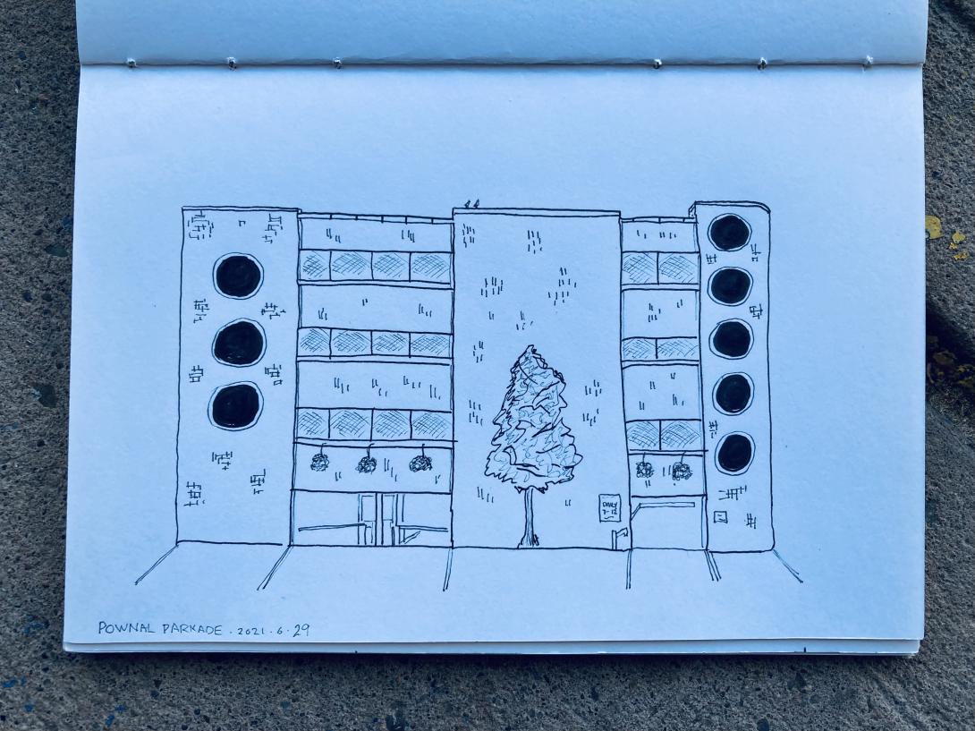
It will be eight years this weekend since frozen yogurt last hit the big time in Charlottetown:
It’s like 1998 all over again – the year Deep Impact vs. Armageddon, both asteroids-vs-Earth movies, opened the same summer – but more local and more frozen.
Both of the original adversaries in that pitched yogurt battle have long since closed, one space is a barber shop, the other an outpost of a Taiwanese grocery chain.
Miraculously, Goji’s in West Royalty continues to hang in there, ready for another froyo resurgence that, by my calculations, should arrive in 2038.
My father opted to solve his high cholesterol with walking instead of medication. And because he was who he was, his walking program included detailed diagrams of the local shopping mall’s step count, and an elaborate playlist of songs of walking-appropriate tempos, organized by beats per minute.
Because he shared those playlists with we boys freely—hoping, I think, that we’d develop a walking habit earlier than he did—I have a visceral sense of his walking pace. And so coming across a new track in his BPM range never fails to connect me to him.
Which is why my first thought on hearing Wolf Alice’s Don’t Delete The Kisses was “I should send this to Dad.”
Alec Baldwin interviews Eddie Marsan and David Arquette. He is such a masterful interviewer. And Marsan and Arquette are more interesting that you might assume.
To be clear, there actually is a need to get vaccinated.
The (other) Guardian’s Corrections and clarifications section is among my favourite destinations to check daily, made easier by being available as an RSS feed.
Two musical gems from yesterday:
- Despite what you have been singing in the shower, the first line of Culture Club’s Karma Chameleon is “Desert loving in your eyes all the way”, not “There’s a loving in your eyes all the way” as we had it (Pass notes 4,278, 5 May, G2, page 3).
- In an interview, Green Gartside described the brightness of Joni Mitchell’s musical ascent as pyrotechnic and her vocal runs as melismatic. Mistranscriptions rendered these as “psychedelic” and “melodramatic” (‘She took off like a rocket’, 22 June, G2, page 8).
Another runner in the night.
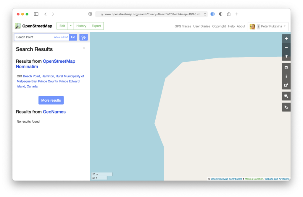
Prince Edward Island is missing Miꞌkmaq-language place names on OpenStreetMap, something easily resolved using this list from the Miꞌkmaq Confederacy.
Here’s how.
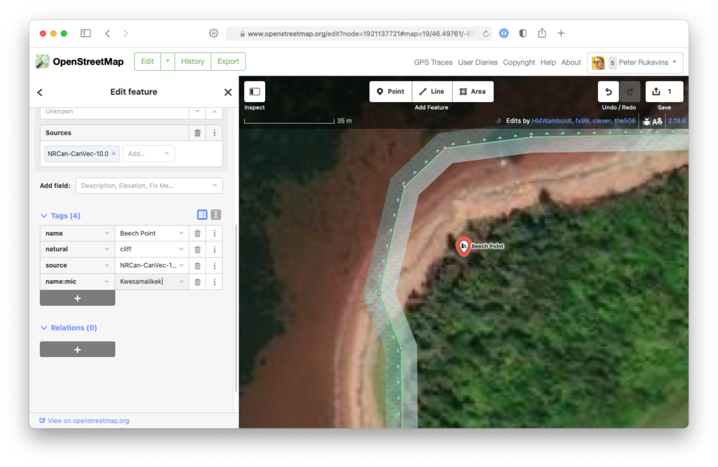
Go to OpenStreetMap.org and search for the English-language place name. Say, Beech Point:
Click on the search result, and then Edit (creating an OpenStreetMap account in the process, if you don’t already have one).
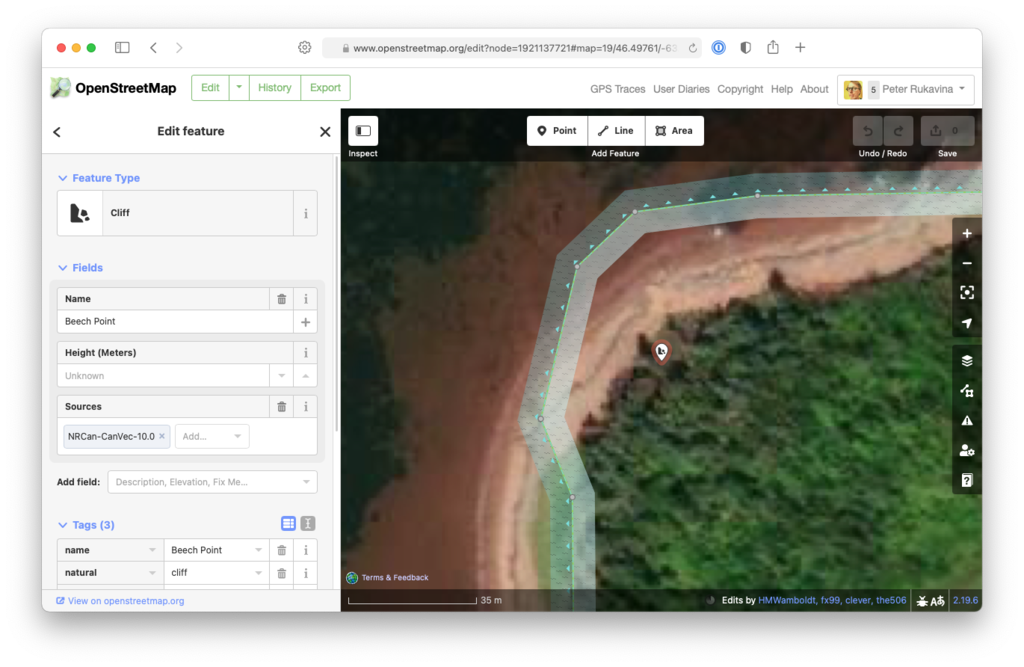
Scroll down to the “Tags” section and click the “+”, and then enter name:mic for the tag name, and the Miꞌkmaq name as the value:
Click the “upload” button (upward-pointing arrow) in the top-right corner of the map, and add a note indicating what you entered, and click Upload.
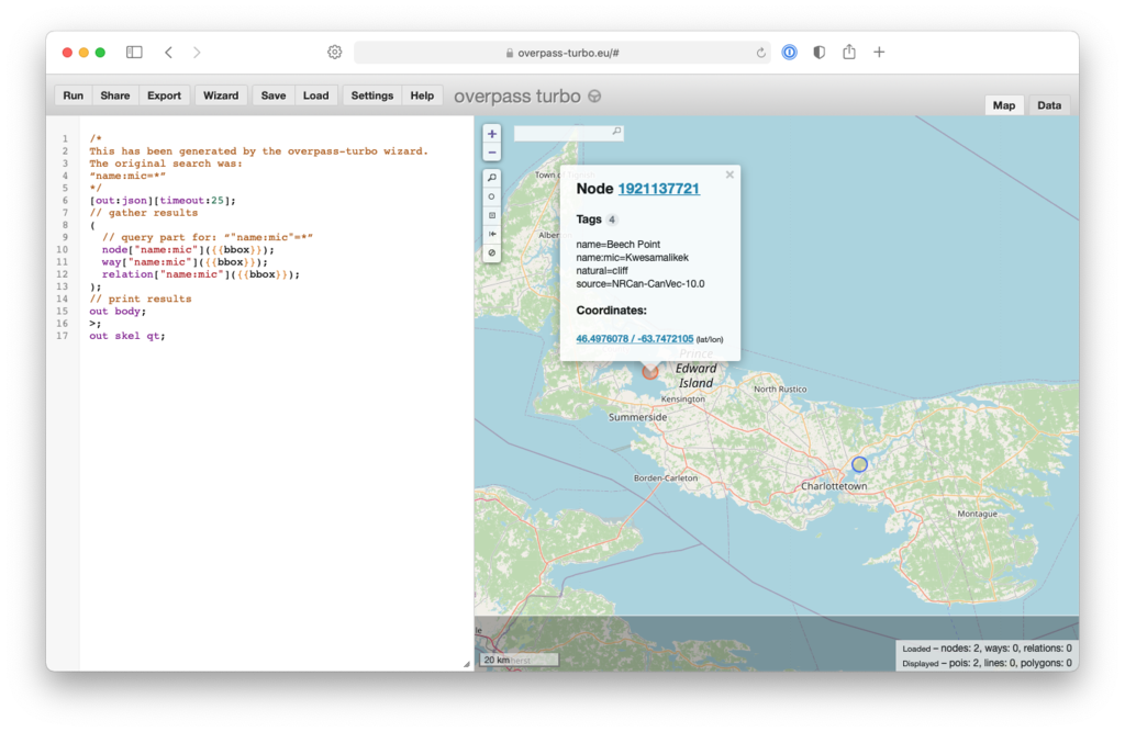
As you go along, you can use this Overpass Turbo link to see the list of Miꞌkmaq names already added:
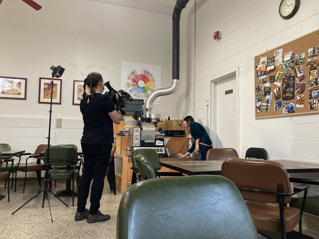
Via Clark I learned about The Shed a few weeks ago. I made my first visit this afternoon and had an exceptional macchiato.
It’s located in a corner of the Royal Canadian Legion building on Pownal Street. It’s as close to a Berlin-style third wave “coffee, coffee and more coffee” coffee shop, with a tiny roaster in the corner and owners who are obviously coffee-talented.
Camera phone hack: shoot in panorama mode, but vertically. The iPhone, at least, is smart enough to figure out what you’re doing. And the vertical is often a lot more interesting that the horizontal.
Here’s the back yard at 100 Prince Street last night about an hour before sunset:
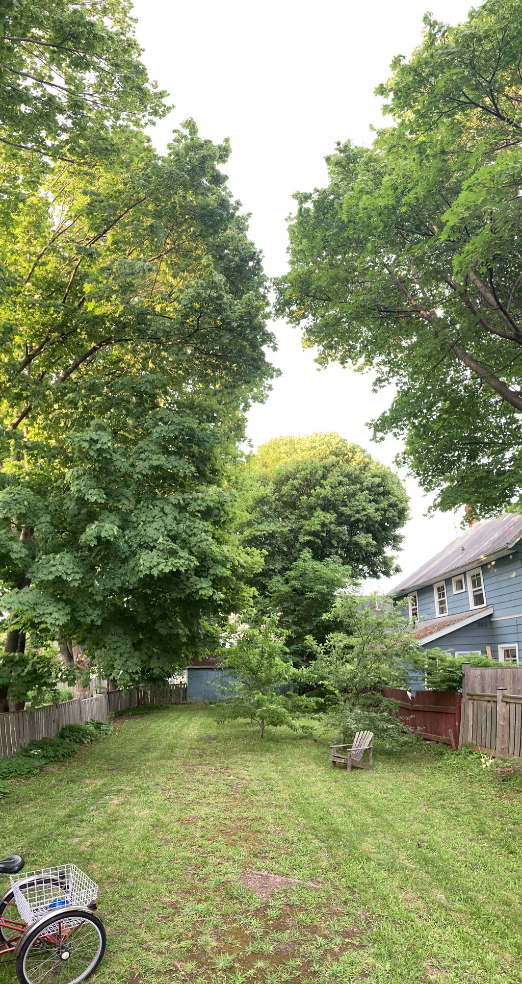
Evidence of the runway that Ethan the Dog used to bound off the back deck and into yard is still evidence, but nature is gradually sprouting it back to life.
About This Blog
 I am Peter Rukavina and this is my blog. I am a writer, letterpress printer, and a curious person.
To learn more about me, read my /now, look at my bio, listen to audio I’ve posted, read presentations and speeches I’ve written, see things I’ve favourited elsewhere, or get in touch (peter@rukavina.net is the quickest way).
I have been writing here since May 1999: you can explore the 25+ years of blog posts in the archive.
![]() You can subscribe to an RSS feed of posts, an RSS feed of comments, an RSS feed of favourites elsewhere, or a podcast RSS feed that just contains audio posts. You can also receive a daily digests of posts by email. I also publish an OPML blogroll.
You can subscribe to an RSS feed of posts, an RSS feed of comments, an RSS feed of favourites elsewhere, or a podcast RSS feed that just contains audio posts. You can also receive a daily digests of posts by email. I also publish an OPML blogroll.
Instagram • YouTube • Vimeo • ORCID • OpenStreetMap • Internet Archive • PEI.art • Drupal • Github.