
One of the aspects I love about letterpress is that, unlike digital design, where anything goes, there are hard limits to what’s possible, given the nature of the process, the typefaces in my collection, and my own creative limits.
When I launched Queen Square Press, I realized I’d need a logo for the new enterprise, and, because I wanted to be able to print the logo, it needed to hew to the limitations of the medium.
I recalled that I had a square in my collection of ornaments–I think I acquired it from Letterpress Things at the Printing Arts Fair in 2011–that I could perhaps build something around.
My favourite and most reliable font of type is 24 point Bodoni Bold I purchased in Montreal in 2012 (and hauled back to PEI in the back of a KIA Soul): it’s a foundry-cast font, and is tough as nails.
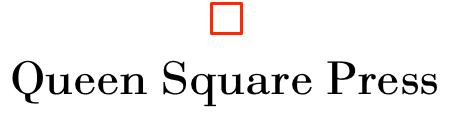
After a bit of playing around with the position of the “Queen Square Press” and the square in OmniGraffle, here’s the digital version of what I came up with:
In metal, I set the type and then started out with an all-red version for position:
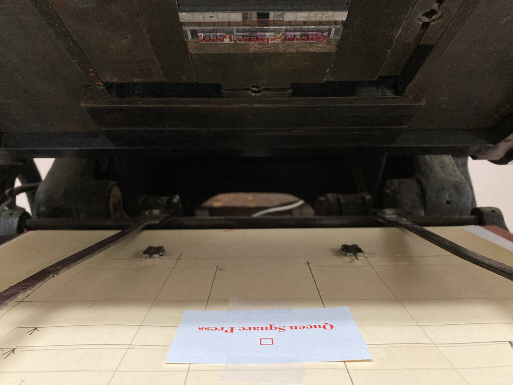
Once I got everything positioned properly, I removed the type that I would later print black, Queen Square Press, leaving just the square to print in red; I printed 60 cards with red squares.
Next, after some time for the red to dry, I swapped out the red square and replaced the Queen Square Press, and printed the black layer:
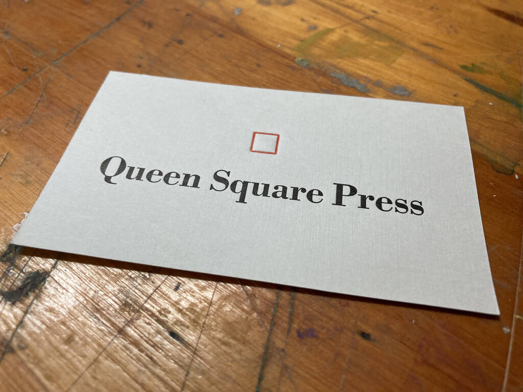
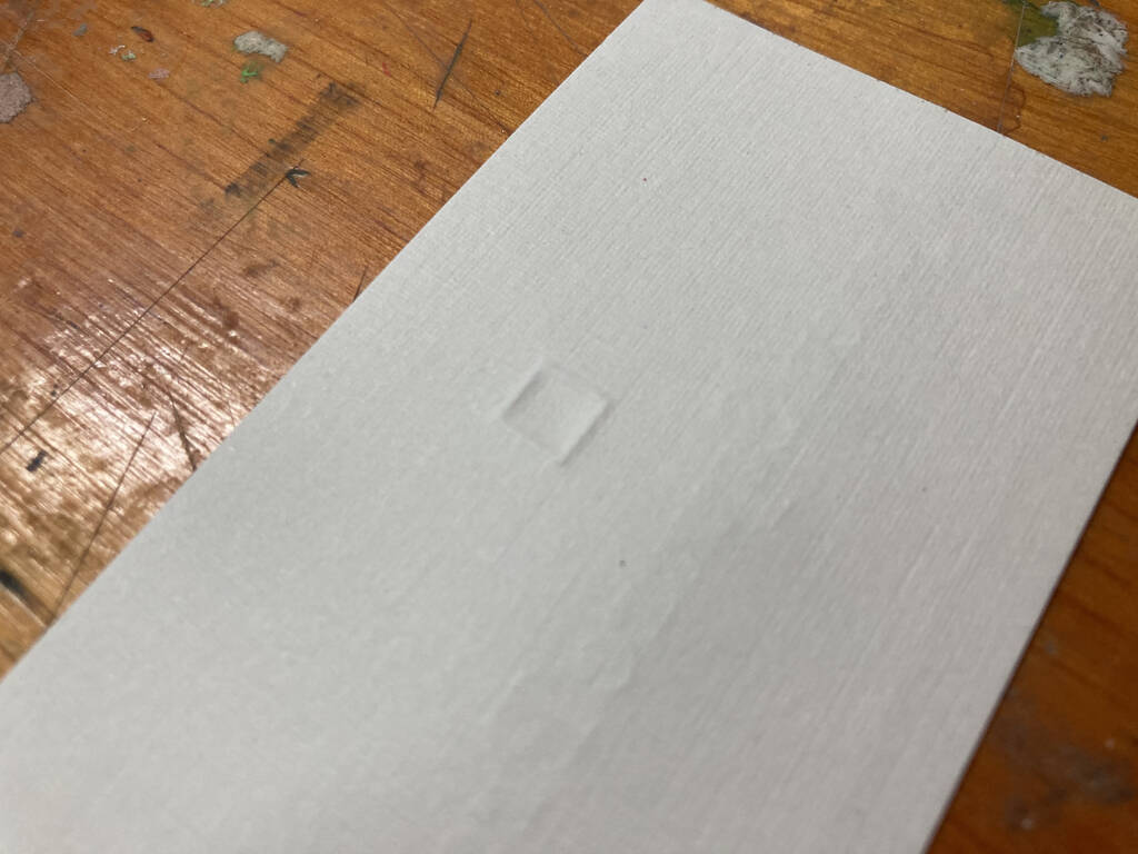
I realized, as I was printing the black, that the impression of the red square was a little too deep for my taste; I console myself that it emphasizes the letterpress-printed nature of the cards, even if it does violate the traditional rules of the trade:
The cards themselves are grey linen-finished, part of the collection of business card stock I was generously gifted by Gertie and Bill Campbell when I purchased their Golding Jobber № 8 (which should last me a lifetime).
You’ll notice that the weight of the Bodoni in the printed version is heavier than in the digital; I’ll need to update the digital to match.
If you order something from the Queen Square Press shop, you’ll receive one of these cards in your package!
–––
Update: I secured a digital font of Bodoni Roman that better matches the weight of what I have in metal, and prepared an updated version of the digital logo.
Here’s the original:
Here’s the update:
![]()
Much-improved!
About This Blog
 I am Peter Rukavina and this is my blog. I am a writer, letterpress printer, and a curious person.
To learn more about me, read my /now, look at my bio, listen to audio I’ve posted, read presentations and speeches I’ve written, see things I’ve favourited elsewhere, or get in touch (peter@rukavina.net is the quickest way).
I have been writing here since May 1999: you can explore the 25+ years of blog posts in the archive.
![]() You can subscribe to an RSS feed of posts, an RSS feed of comments, an RSS feed of favourites elsewhere, or a podcast RSS feed that just contains audio posts. You can also receive a daily digests of posts by email. I also publish an OPML blogroll.
You can subscribe to an RSS feed of posts, an RSS feed of comments, an RSS feed of favourites elsewhere, or a podcast RSS feed that just contains audio posts. You can also receive a daily digests of posts by email. I also publish an OPML blogroll.
Instagram • YouTube • Vimeo • ORCID • OpenStreetMap • Internet Archive • PEI.art • Drupal • Github.
Comments
Love it. I thought a slight
Love it. I thought a slight variation would be interesting: https://actsofvolition.com/images/queen-square-press.png
After trying it, I think I prefer your original. I did wonder if that angle I introduced could be base on something meaningful, like the way the Charlottetown street grid differs from North-South, but it looks like that's almost a 45° angle, which turns a square into a diamond.
I appreciate your
I appreciate your experimentation; I agree that the slight tilt, while interesting, would benefit from being tied to some aspect of the geography.
Elegant.
Elegant.
Love it.
Love it.
Beautiful!
Beautiful!
Looks great. Have you ever
Looks great. Have you ever read the book "Just my Type" by Simon Garfield? If no, you ought to.
Add new comment