
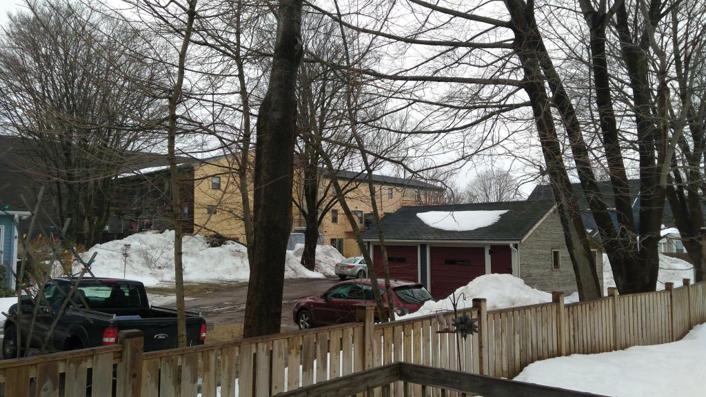
A few years ago the housing co-op up on Kings Square went through what my friend Catherine Hennessey calls a “vinylization,” replacing its wood shingles with beige vinyl siding.
I feared that our neighbour, the Hensley Green Co-op, would do the same thing, and so I was pleasantly surprised to hear the rat-rat-tat of nail guns one morning two weeks ago. It’s a sound that’s rung out every morning since.
A tip of the hat to the co-op and its federal funders for this investment in our community.
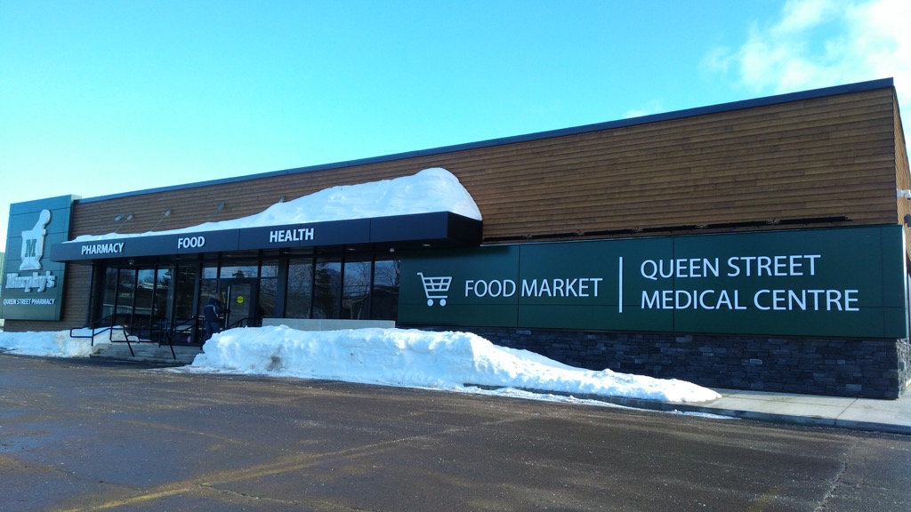
The old Central Farmers Coop space on Queen Street in midtown Charlottetown has had new life breathed into it over the winter, thanks to Murphy’s Pharmacies, which completely transformed the tired old building into a gleaming new centre of the neighbourhood.
It’s a bright, cheery space that’s more than just a drug store: there’s a medical clinic, a good selection of dry goods and food (including fresh meat and fresh produce) and even a “Receiver Coffee Bar” (although that would more properly be described as a “counter with a carafe of Receiver Coffee sitting on it).
While I lament the departure of the Coop–and the demise of the coop grocery system in Charlottetown generally–it’s nice to see community-minded Murphy’s take over this space rather than a more mercurial big-city chain. One has the sense they’ll still be on Queen Street in 50 years.
I stopped in for my first visit on Tuesday morning (it’s conveniently situated on my drive back from the morning school run to Colonel Gray) and, as I didn’t want to leave empty-handed, I purchased a couple of boxes of tissues, and, on the spur of the moment, a mobile phone “kickstand.” Here’s what that looks like in use:
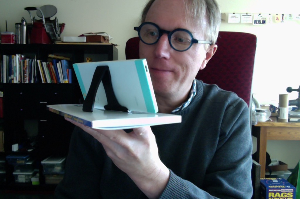
It’s not designed to be used aloft like that, of course; but how else could I take a photo of my camera than to use the computer upon which I type, and this required a hoist.
It’s the perfect form-factor for my Nextbit Robin, especially in landscape orientation as I can plug in the end that way. For $1.99, it’s the best capital purchase I’ve made all year. You’ll find them on the aisle-end just around the corner from the Purity Dairy milk cooler.
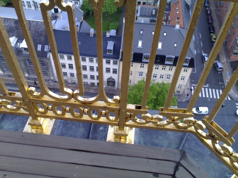
Eleven years ago, in an effort that confounds me when I look back at it, Oliver and I climbed to the top of Vor Frelsers Kirke in Copenhagen.
It was raining. Oliver was only 6 years old. By all rights he (and I) should have been terrified at the prospect of walking up creaky woeden ladders through spooky antechambers and then out onto the slippery, twisting, copper-sheathed ramp to the golden top. But somehow it seemed like the right thing to do at the time, and we survived. As the evidence clearly shows:

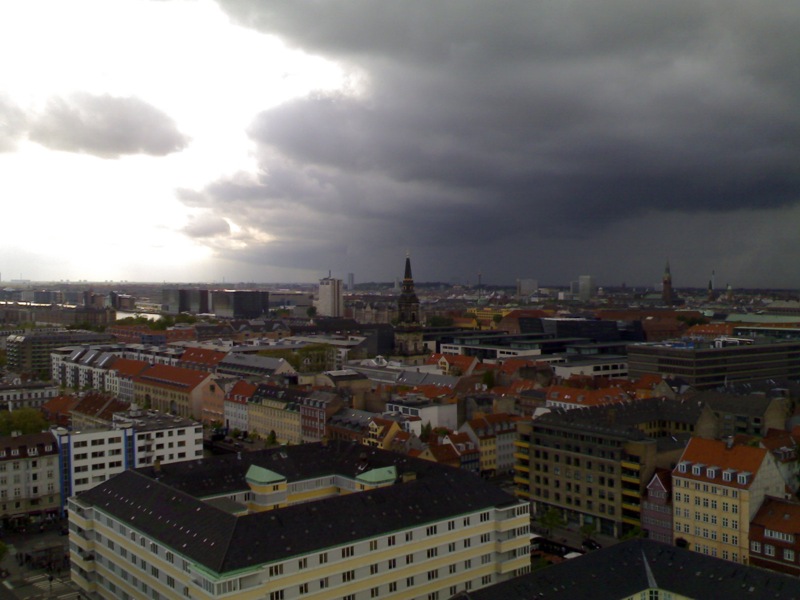
I thought of that rainy May morning today while watching the Bjarke Ingels episode of the Netflix series Abstract.
There’s a scene, about halfway through, that features Ingels–superstar iconoclastic Danish architect–making exactly the same trip up to the top of the church spire.
It’s a beautifully shot scene–much better visuals than my lowly Nokia N70 could capture back in 2006–and it’s an appropriate visual metaphor for the arc of Ingel’s rise:
If you ever find yourself in Copenhagen, the trip up to the top, should you be able to contort yourself into the same height-defying state of mind that Oliver and I did, is well worth the effort; here’s the church’s own description of its spire:
The spire of the church was consecrated in 1752, more than 50 years after the building of the church had been completed. After more than 250 years as an internationally noted landmark of Copenhagen, the tower and spire now stand in all their splendour following the last great restoration in the 1990s. The city has grown in the meantime, but the view from the tower of Our Saviour’s is still the best in town - and the most frightening. It has always been regarded as somewhat of a manhood test to climb up and touch the globe on the summit. That the whole spire is built of oak which can shake a little in a strong wind, adds to the sinking feeling as one stands at the top. The tower on Copenhagen Town Hall is 14 metres taller. The tallest church tower in Denmark on Århus Cathedral is three metres taller but no tower in Denmark can match the beauty of Our Saviour’s tower as the evening sun shines on the gilding ‘like a tongue of fire’ (Thurah’s Vitruvius III)
The architect Lauritz de Thurah (1706-1759) designed the spire, his greatest work, and had it approved and paid for by Christian VI. He was inspired by the university chapel of St. Ivo in Rome where Borromini’s Renaissance tower also has an external spiral form. While Borromini built in sandstone, de Thurah used oak, making it possible to achieve the great height of the spire.
The spire consists of an external staircase with four twists, starting from the gallery and continuing all the way up. On the way towards the top, the visitor is protected by a gilded iron grating. At the top is a gilded globe from which the gilded figure of Christ with banner looks out over the city.
The dimensions of the spire are considerable. It is 90 metres from the ground to Christ’s banner and there are 400 steps to be climbed, of which, the last 150 wind around the outside of the spire. The globe at the top can contain 12 grown men and is 2.5 metres in diameter, the Christ figure is three metres tall.
I’d no idea that our climb was regarded as a “manhood test,” and I reject the sexism implicit in that claim.
But it was thrilling.
I fancy myself Charlottetown’s foremost citizen reporter of pedestrian signal issues: every month I seem to report one or two. Here’s how you can join me:
- Think of a way of communicating the location of the problem: “northwest corner of Kent and Prince,” or “in front of the 1911 Jail.”
- Call the main City of Charlottetown number at (902) 566-5548.
- Ask for Public Works.
- When Public Works answers, tell them you have a traffic light problem to report, and then give them the location.
That is all.
Thinking of my newspaper days led me to a column by Ed Arnold, who was Editor at the Examiner during my time there. Back in 2009, Ed wrote about Terry Keating, who was the foreman in the composing room; Terry was the man who hired me. Ed wrote:
He’s not quite 100 yet, a mere 43 years away, but it was 40 years ago last week that Terry Keating started working at The Examiner.
He worked his way from the mailroom to composing room foreman during those years.
That’s more than 14,600 days ago.
Through those years he has seen amazing changes — from hot lead to cold type, ticker tape to no tape, typewriters to word processors.
When he began there were no computers, now it’s a world of computers.
He has been through such publishers as Bill Garner, Bruce Rudd and Darren Murphy (we have both worked here longer than Darren Murphy has been alive!) and remembers his fellow tradesmen when he started such as Ken Underhill, Bill McKelvey, Dan Cannon, Len Appleton, John Braine, Gerry Armstrong, Vince Donohue, John Wickert, Bob Noble.
TK jokes that his hair was jet black when he arrived and solid white today.
Working in a daily newspaper environment is like no other job.
No day is the same and none will ever be routine. While some people watch the clock hoping its hands move faster, we watch the clock begging for more time because our hands can’t move any faster. Congratulations to TK.
Those people that Ed lists, Terry’s “fellow tradesmen,” were almost all working in the composing room when I was there. I heard hundreds of stories from and about each of them over the short two years I worked at the paper. Their influence on my personal and professional life continues to this day.
As it happens, Terry retired last month after 47 years on the job; the Examiner had that story as well:
“It was never dull. It was exciting. It was stressful at times, but you were never bored,” he said.
Back then, more than 100 men and women - journalists, ad salespeople, circulation staff, compositors and press operators - were responsible for putting out each daily edition. They used typewriters and hot wax and blades to cut and paste, literally, stories and advertisements, before computers revolutionized production in the 1980s, 1990s and beyond.
It’s hard to put into words just how much the the digital era changed everything, Keating said, calling computers the move that “changed the whole ballgame.” Each leap forward allowed the paper’s succesion of owners to put out the same paper with far fewer people.
“It’s just incredible,” he said, pondering the technological evolution. “Where will it end up?”
Terry was a victim–or perhaps beneficiary?–of those technological changes. After spending most of his career in the composing room, he became a real estate account manager once production was consolidated elsewhere.
This blog and its design are a constant work in progress.
For the last couple of years it’s been peachy to read on mobile devices like phones and tablets; indeed it’s almost a better reading experience.
But that bit down there at the end of posts with all the metadata, that’s never been very nice looking:
So I took a few moments this afternoon and cleaned it up:
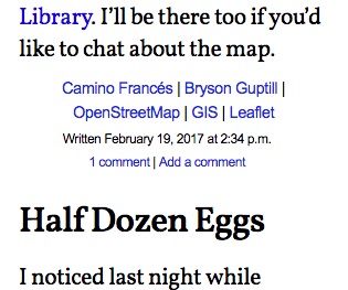
I adjusted the line breaks, made the category links bigger (and so easier tap targets, in mobile parlance), and, my favourite change, switched the rendering of “am” and “pm” to “a.m.” and “p.m.”
That last change is one the importance of which was ingrained in me on the first day of my apprenticeship as a printer in the composing room at the Peterborough Examiner: John Braine, longtime journeyman and the man I got sat down beside that first day, in front of a green screen terminal, saw me type “pm” and immediately schooled me in the proper composition thereof. Thank you, John.
Pablo Martínez, of NRMAL, on starting your own festival:
You do have a calm, almost zen demeanor. Do you maintain this calm during the festival or do you ever melt down?
No, not during the festival. For example during the festival, I don’t use a radio. Normally people who are producing festivals, they are using a radio and what I do is I just walk around the festival and try to solve problems on my own and try to enjoy all the bands I can. I try to keep it chill. Normally it works.
Does this tie in with your decision not to use social media?
Well, I remember, early on, trying to use a radio, I couldn’t focus on important things. I was just hearing whatever was happening around other areas of the festival. So I decided not to use the radio and just focus on the things I could solve with my own hands. Maybe it’s a thing about focus.
From time to time I want to include video clips in my blog posts, but I end up not doing this very often because I forget the steps for doing it.
So I’m noting them here so I can refer back to them later.
First, I capture the video somehow. Often I do this with Voila, a screen-recording app for the Mac (since renamed Capto).
Voila has a basic video-trimmer built into it, so I trim the video down to that part I want to include.
The result is a H.264-format video file with a .mov extension.
Next, I use VLC to convert this to a Webm-format video (File > Convert / Stream and then select “Video - VP80 + Vorbus (Webm)” as the profile).
When that conversion is done, I upload both the H.264 and Webm files to Amazon S3, and make sure they’re world-readable, and that the MIME type on the Webm file is set to video/webm (or else more recent versions of Firefox will refuse to play them).
It seems that VLC doesn’t properly leave the resulting Webm file with a duration that can be read by browsers; this can be fixed with ffmpeg:
ffmpeg -i original-file.webm -c copy -fflags +genpts /tmp/fixed.webm
rm original-file.webm
mv /tmp/fixed.webm original-file.webm
Finally, I reference them both from my blog post:
<p>
  <video controls="" style="width: 100%; max-width: 100%; height: auto;">
     <source src="https://s3.amazonaws.com/images.ruk.ca/abstract-clip.mov" type="video/mp4; codecs=avc1.42E01E,adpcm_ima_qt)" />
     <source src="https://s3.amazonaws.com/images.ruk.ca/abstract-clip.webm" type="video/webm; codecs=vp8,vorbis" />
  </video>
</p>
And that’s it. Between the H.264 and the Webm, the video will play in most modern web browsers.
And I save myself the indignity of using YouTube or Vimeo.
The first episode of the documentary Abstract: The Art of Design (see also here) profiles Christoph Niemann.
Toward the end of the episode, Niemann discusses the difference between being a creator and being an editor of his creations:
I need to be in control and I need to have a very clear sense of where I’m going and why something’s working and not working. On the other hand, I’ve also realized that being more free-spirited is necessary. I’ve found that I need to develop these two personas separately. Be a much more ruthless editor, and be a much more careless artist. This I find physically exhausting, but there’s good stuff happening there.
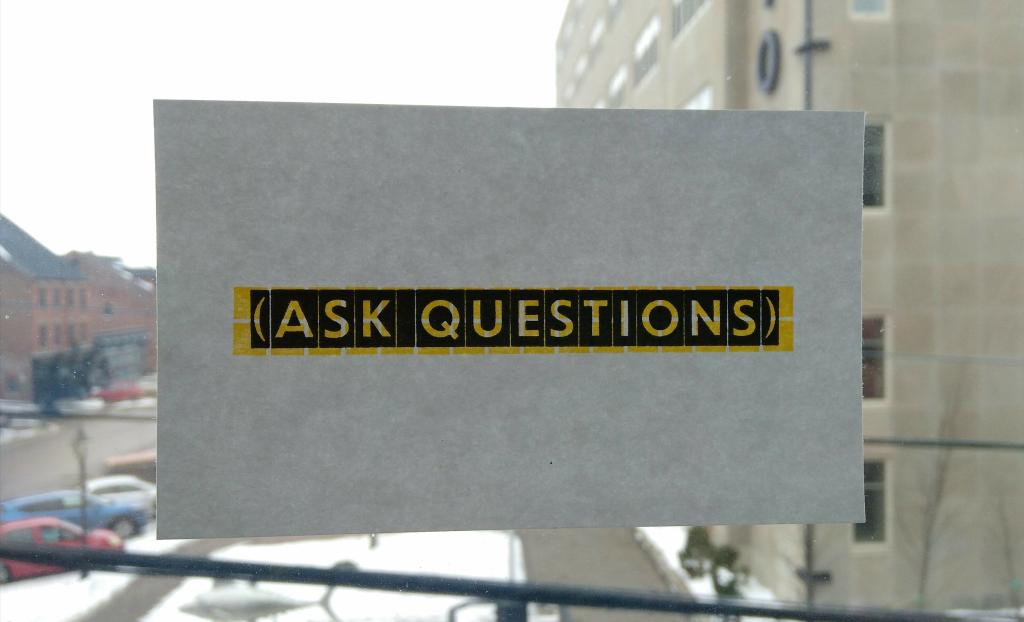
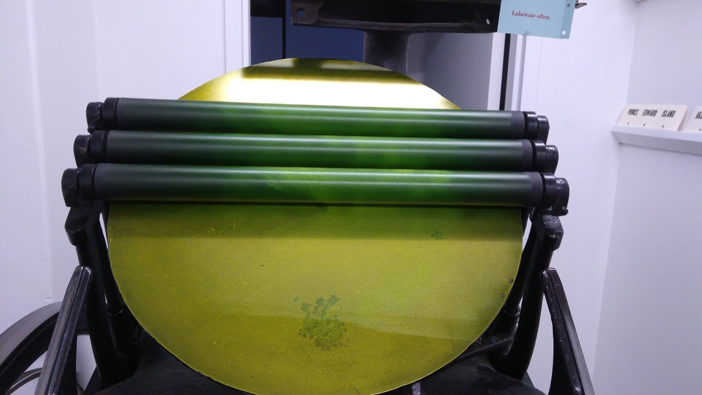
As a printer, the time I’ve found myself the most free-spirited was the summer I spent printing in Berlin. Every Tuesday I showed up at the print shop with nothing but a day reserved to print, and I dove right in, with no distractions and the only limit that I had to be done by the end of the day. The work I did that summer is the work I’m most proud of, and it’s been a challenge to recapture that spirit in the years since.
This is not to say that my printing life here in Charlottetown is a strict (ruthless) regime: it’s not a business, it’s an avocation. But because it’s co-located with my business, it tends to inherit the underlying psychology of the business, and so even setting aside time for printing seems reckless and indulgent. I could be using that time to fix code!
But Niemann’s elegy was enough, at least for today, to get me over this.
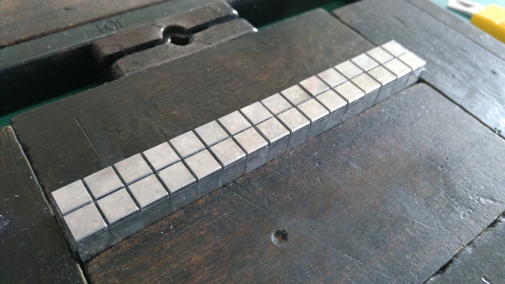
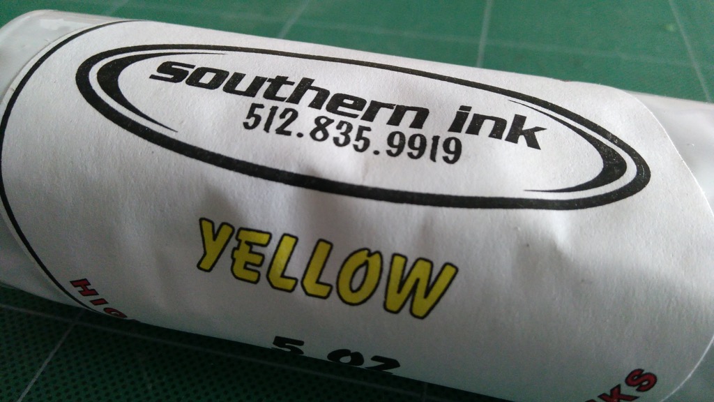
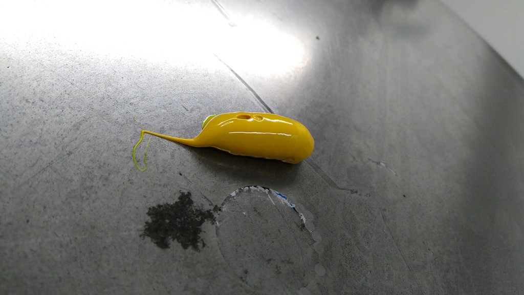
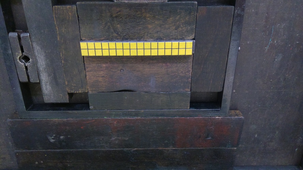
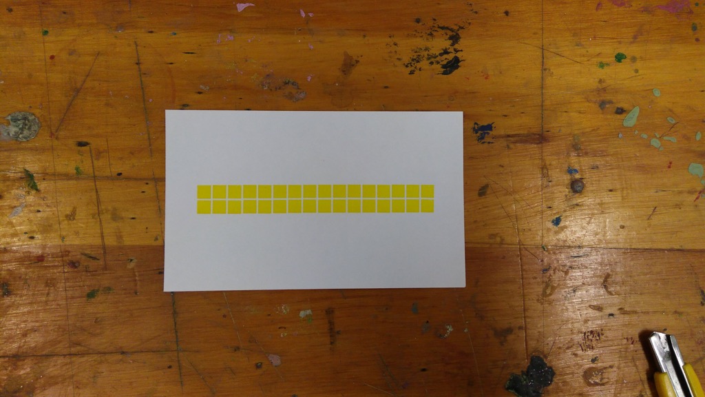
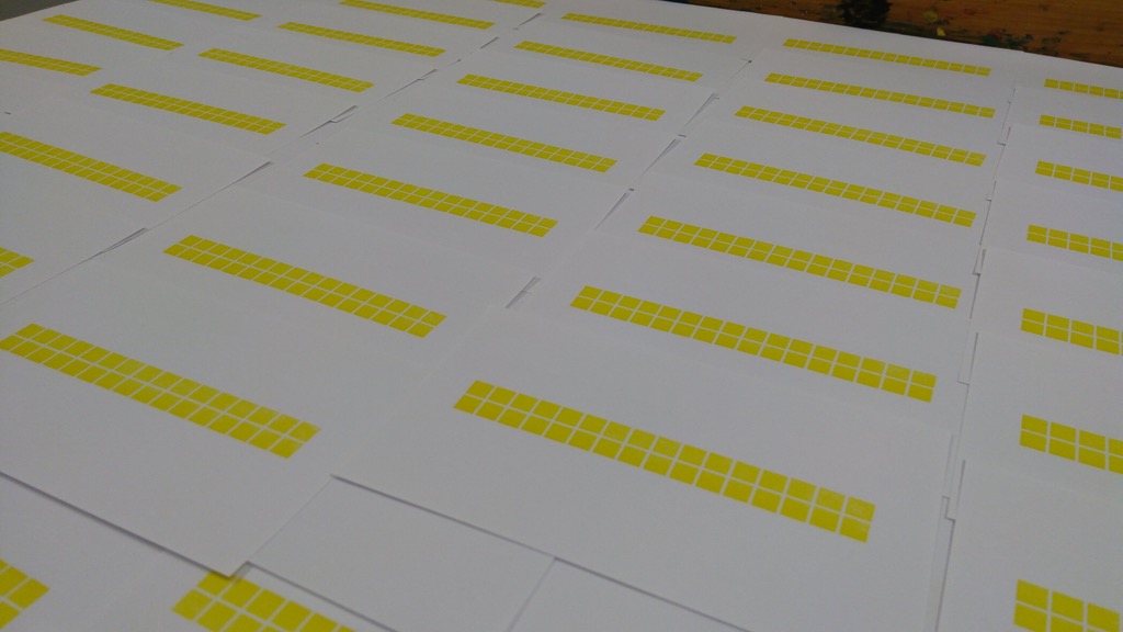
And so I spent a part of the day printing a grid of yellow squares.
There’s more method to my madness than the yellow squares convey–this will become evident in later posts–but this is an idea I dreamed up on the spur of the moment, an idea that I couldn’t have planned for it required some typographical improvisation that can only happen at the bench.
It was a lovely feeling.
About This Blog
 I am Peter Rukavina and this is my blog. I am a writer, letterpress printer, and a curious person.
To learn more about me, read my /now, look at my bio, read presentations and speeches I’ve written, or get in touch (peter@rukavina.net is the quickest way). You can subscribe to an RSS feed of posts, an RSS feed of comments, or receive a daily digests of posts by email.