
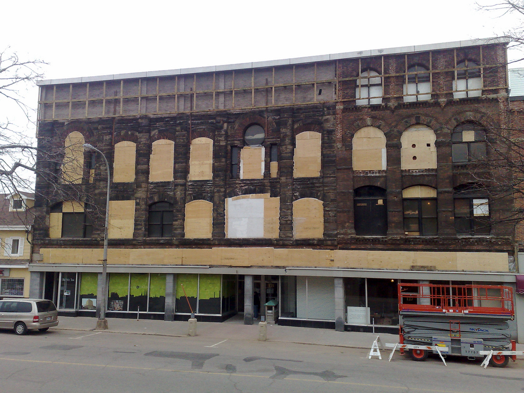
Last week this is what the sign on the corner near our house looked like:
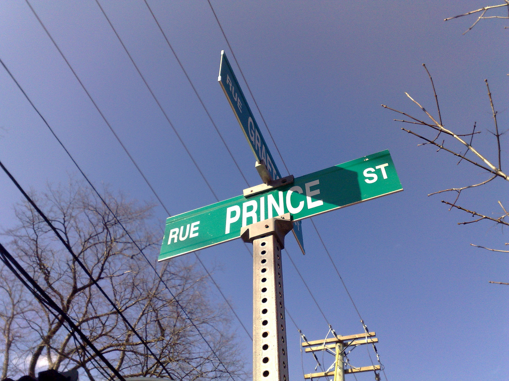
It followed accepted standards for colour, typography and layout, and, more importantly, it was clear, easily visible both close-up and far-away and served its way-finding role well.
Here’s the sign that replaced it this week, part of an $22,000 effort to “brand the downtown as ‘Historic Charlottetown’ ”:
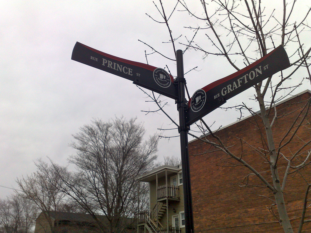
The new signs are non-standard, use considerably smaller type, colours that are much more difficult to read, and are a significant step backwards in terms of their purpose of clearly identifying city streets.
This is clearly a case where the “ye oldeification” tendencies of tourismocrats trumped principles of good design. What a shame.
As I first noted in 2001 and as well-reviewed in the Spring 1986 issue of The Island, the original owners of our house at [[100 Prince Street]], the family of Henry Smith, set forth in the late fall of 1858 for New Zealand. By way of explaining what might draw Islanders into such a Herculean venture The Island suggests:
Reports on the favourable New Zealand climate could also have been an inducement to emigrate. The conditions and the terms of the Waste Lands Act as applying in the six provinces were set out by Charles Hursthouse in his book New Zealand, the ‘Britain of the South’, published in 1857. Its favourable reports on the colony’s potential and careful instructions for would-be emigrants were believed at the time to have influenced the architects of the Prince Edward expedition, especially Robert Haszard, who was its principal organizer.
Thanks to Google, it’s now possible to read New Zealand, or Zealandia, the Britain of the South in its entirety (there’s another edition as well, although it’s incomplete). It’s a truly amazing work — I wish there were contemporary versions available for all the countries of the world. Here’s what it suggests is one of the attractions for those who might immigrate:
Families emigrating to New Zealand in 1861 will find a population sufficiently large to have subdued the roughness of the wilderness to have established society and social institutions to have founded several thriving Settlements and to have raised annual exports to the value of nearly a million sterling But they will not find a population sufficiently large as in the United States and in the older emigration fields of Canada and Australia to have taken the cream of the country by monopolizing town and village sites garden valleys water privileges and the crack agricultural estate creating lands.
All was not altruistic sweetness and light however:
The occurrence of the native disturbances described in the last chapter is much to be lamented. But we must remember that these affect only the north island and that in all human probability these ere long will effectually and for ever be put down. Indeed in a few months I trust we shall be able to liken these native disturbances to the thunder storm clearing the political atmosphere of the north and producing for the Auckland and New Plymouth emigrant of 1861 such welcome fruits as good land and plenty of it clear titles and good laws.
In other words, no so much unlike Canada.
Update: You can buy a re-print, New Zealand, Or, Zealandia, The Britain of the South, Volume I, from Amazon.com.
Issa, the artist formerly known as Jane Siberry, has a new album out called Dragon Dreams. And while you can buy a physical copy from CD Baby, you can’t buy a downloadable version as Issa’s Sheeba store is offline for the moment. Helpfully, however, is this notice there:
if you ordered Dragon Dreams mp3s here and haven’t downloaded yet, or would like to order any music here and know what you want, email me for link. you can pay later at EZpay when the store re-opens if you wish to.
She sent out the link to Dragon Dreams in her email newsletter and it is in my iTunes now. If you are a fan, I think you’ll like it. I’m particularly fond of the track When We Are Queen, with lyrics, in part:
It will be more about giving,
And less about getting,
And farmers, teachers and nurses
will be returned
to their honoured place in society
And all the widows will open
(for obvious reasons).
When we are Queen.
You have to imagine that wrapped up in bongos and harpsichord and children’s voices.
Pardon me, but I spend an inordinate amount of time thinking about things like this.
My Danish friend [[Luisa]] revealed to me that the letter otherwise know to me as “o-slash” — ø — is not, as far as Danes are concerned, a “letter ‘o’ with a slash through it” but rather a bona fide letter all its own. Or, as Wikipedia says:
Speakers of languages which use the letter ø hold that it is not a ligature or a diacritical variant of the letter o (That is, emically they perceive it as a different letter entirely).
Which leads me to the question of Upper Prince Street.
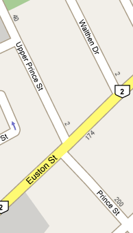
Oliver’s school is called [[Prince Street School]] but its civic address is 66 Upper Prince Street (emphasis mine). That the school is not called Upper Prince Street School suggests that Upper Prince Street belongs to the “Prince Street family” — in other words, it is a “ligature or a diacritical variant” of Prince Street. And thus, because our house is at 100 Prince Street, we live on the same street as the school.
This runs contrary to my own view, based simply on my own biases, which is that Upper Prince Street is a different street entirely, an opinion supported by the fact that Upper Prince Street and vrai Prince Street each have their own set of street numbers (which is why we often get mail intended for the Scouts at 100 Upper Prince).
Please let me know your view on this.
Saw this note from Roy Johnstone about his gig on May 24 at the new Old Triangle pub at the corner of University and Fitzroy in Charlottetown. So I guess it will be open soon.
Many commentators have commented on this, so I will note this simply for posterity:
# curl http://cdc.gov/swineflu/
<html lang="EN">
<head>
<title>This Page Has Moved</title>
<script language="JavaScript1.1">
location.replace("/h1n1flu/");
</script>
<meta name="robots" content="noindex">
<meta http-equiv="refresh" content="0;URL=/h1n1flu/">
</head>
<body>
<p>This page is found at <a href="/h1n1flu/">http://www.cdc.gov/h1n1flu/</a>.</p>
</body>
</html>
Here in Prince Edward Island they’ve decided to go the “more complicated still” route, with the official name now “Influenza A(H1N1) (Human Swine Influenza)” (which, to my ears, sounds like a flu that only contemptible people get).
If you spend any amount of time on the UPEI campus, you quickly realize that visual communications is not the institution’s strong suit: campus maps are out of date, building signage is subtle enough to be invisible, and there appear to be three visual identity programs in simultaneous use (The Crest, The Big U and Rust and Gold).
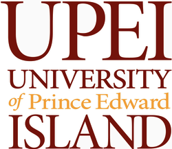 It seems there is a move to bring some clarity to this hodge-podge: a Task Force on Visual Identity has concluded its deliberations, and the result is an refreshed visual identity program for the institution.
While the project is laudable — I’m one of those people who think this stuff matters — I’m somewhat perplexed by the typographic emphasis of the new wordmark. I heard it referred to as “the University Island” today, and sure enough in the guidelines for the identity is the comment:
The type appears in a straightforward and easily readable presentation, and the colours have been chosen to bring attention to the words “University” and “Island.”
Perhaps there are more profound reasons for this emphasis, but it seems to me that what’s being emphasized is separateness — after all UPEI already is a sort of “academic island” floating aloof in the sea of the civilian community that surrounds it, and surely this isn’t something you’d want to typographically draw attention to.
If anything it sould be the word of that is emphasized, for it is the most important if you feel that the interplay between UPEI and the community should be strengthened: UPEI as an institution of the Island. And yet there it lies in italicized ignominy, almost hidden.
To say nothing of poor downgraded Prince Edward, once Duke of Kent and Strathearn, commander-in-chief of the forces in British North America, Governor of Gibraltar, and Knight of the Order of St. Patrick, now reduced to Pantone Gold 143 rendering half the size of the ISLAND to which he lends his name.
 You know those things that they clip to your finger when you’re in the hospital that are connected to a cable that connects to a machine that beeps. Well they’re called pulse oximeters and they measure the amount of oxygen in your blood and your heart rate.
What’s really interesting is how they do this: one side has a pair of LEDs, each of a different wavelength, that shine light through your finger; on the other side is a detector that detects this light. Because oxygenated blood and deoxygenated blood absorb the light at different rates, the changes in the reception of the light can be used to calculate both oxygen saturation in the blood and heart rate. All without needing to stick anything inside you or draw any blood. Neato.
About This Blog
 I am Peter Rukavina and this is my blog. I am a writer, letterpress printer, and a curious person.
To learn more about me, read my /now, look at my bio, read presentations and speeches I’ve written, or get in touch (peter@rukavina.net is the quickest way). You can subscribe to an RSS feed of posts, an RSS feed of comments, or receive a daily digests of posts by email.