
In truest “if you have a problem, then build a solution and share it with others because they probably have the same problem” spirit, international gadabout Dan Misener today released The Kickback Machine, a “Kickstarter research tool for people who think it’s a smart idea to learn from the past.” Here’s Dan unveiling the machine:
What a wonderful little project. And so nice to see Dan migrate from “reporter of interesting things” to “maker of interesting things.”
From the Mexican Instituto de Políticas para el Transporte y el Desarrollo (Policy Institute for Transportation and Development), a video about the costs of car usage (in Spanish with English subtitles).
I got a chance, in clear skies, to see the International Space Station whiz over Charlottetown last night — it was only in the sky for 6 minutes, starting at 10:04 p.m. — and, despite the fact that I’ve almost zero interest in outer space nor its exploration, the thrill was palpable.
Here’s how Oliver and I figured out where and when to look in the sky last night (there are opportunities for sightings over Charlottetown again tonight, August 8, at 9:11 p.m. and 10:47 p.m.).
First, to get a general idea of when and where to look, consult the NASA ISS Sightings page for Charlottetown and scan down to today where you’ll find the time and duration of the sighting opportunity along with where to look in the sky:
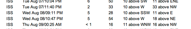
So there’s a sighting possibility tonight at 9:11 p.m. that will last for 5 minutes and that Space Station will travel from the south-southwest (SSW) to the east (E) in the sky.
We found it helpful to be able to “pre-visualize” that path using the excellent and free Stellarium application, which is available for almost any computer you can imagine (Mac, Windows, Linux).
To see the path of the Space Station in Stellarium you need to do a couple of things once the application has started.
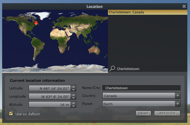
First, change your location by clicking on the “Location Window” tool in the bottom left. Enter “Charlottetown” in the search box and check the “Use as default” box in the lower left corner:
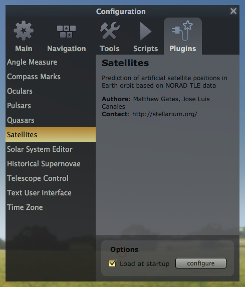
Next, make sure the Stellarium “Satellies” plug-in is turned on: to the “Configuration window”, select Plugins and then “Satellies” and make sure the “Load at startup” box is checked. If it wasn’t checked you should check the box and then restart Stellarium before continuing.
Next, make sure the Satellites view is turned on by clicking on the icon on the bottom left of the screen:
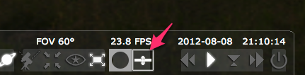
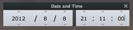
Finally, change the “Date time window” to the expected time of the observation — in tonight’s case 21:11 (9:11 p.m. in 24 hour time):
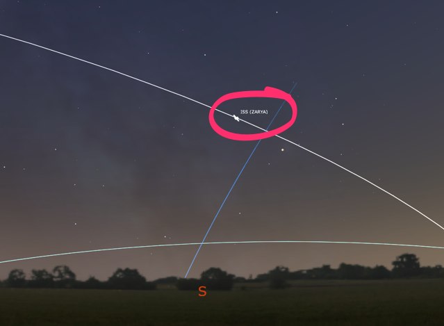
Now it’s simply a matter of scrolling the Stellarium view of the sky with your mouse so that you’re looking into the south-southwest — just swing things around so that you’re looking between the “S” and the “W” on the horizon. And you should see the object labelled ISS (ZARYA) moving through the sky:
Now you’re prepared: at 9:11 p.m. tonight you’ll know where in the sky to look. If you don’t have a compass just remember that, in Charlottetown, south is pretty well straight out the mouth of Charlottetown Harbour, west is toward Summerside and east is toward Montague. So “south-southwest” is in the sky over Rocky Point.
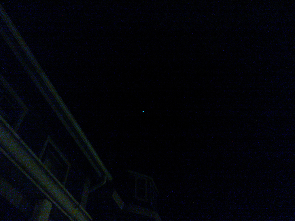
I was worried about how I would be able to distinguish the Space Station from other objects in space, but that wasn’t a problem: it was moving so fast, and was so bright, relatively speaking, that it was easy to spot. This photo, taken in haste, doesn’t do justice to it, but it gives you an idea:
Happy space exploration!
Once again this year I’ve taken the official Prince Edward Island School Calendar and created a set of public calendar files to make it easier for parents and others to shunt the information around their digital devices. Here you go:
(Note for those of you who already had the 2011-2012 Eastern School District Calendar integrated into your digital devices: you don’t need to do anything, as those addresses haven’t changed from last year).
Now that I’m a member of the official School Calendar Committee (representing the PEI Home and School Federation), I’m hoping, in the future, to be able to have the calendar released as structured data by the Department of Education and Early Childhood Development itself.
My favourite gift from my trip to Ukraine last month is this Ukrainian alphabet stencil, a present from my cousin Victoria:
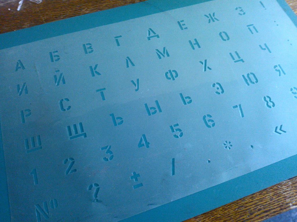
Here’s my name, in capital letters, rendered in Ukrainian (ПИТЕР) with the stencil.

Next logical step is to acquire some Ukrainian metal or wooden type.
I met mackt at Forskningsavdelningen in Sweden last summer. Now he’s part of a project making a film “about political hacking, world wide.” They’re looking to raise $80,000 in the next 40 days to fund a round-the-world trip interviewing people in the hacker world. I’ve supported them; I’d encourage you to do so too. Here’s their trailer:
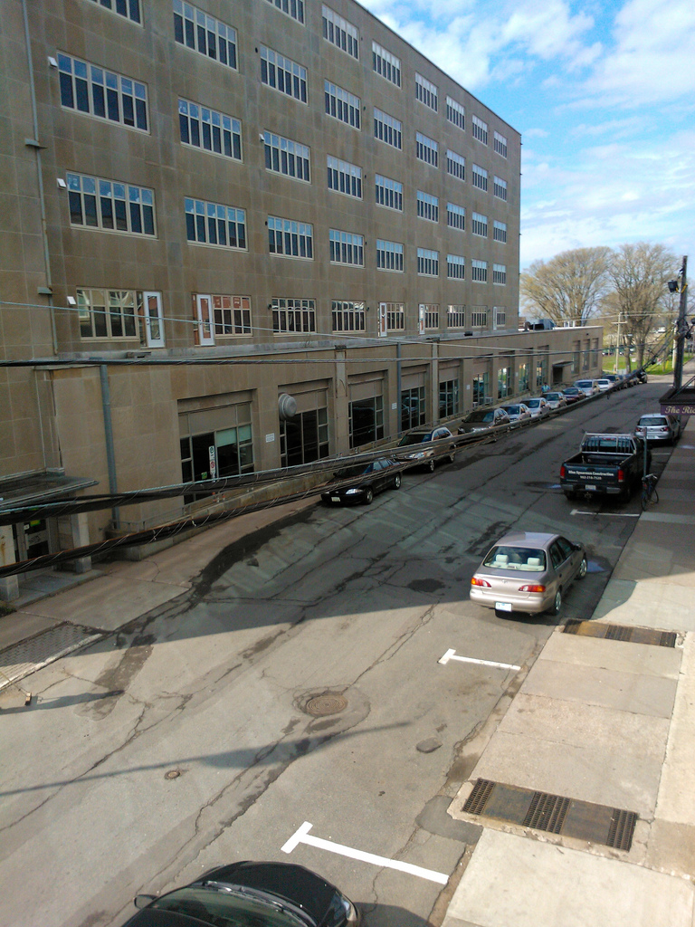
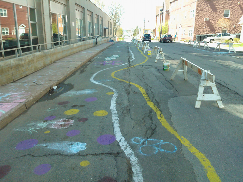
Last fall I was on the selection committee for the City of Charlottetown’s micro-grant program, part of the city’s sustainability initiatives. One of the projects we selected was “Transforming a Street,” which proposed to take the portion of Richmond Street between Pownal and Queen and transform it into a more sustainable urban landscape.
Between the time the project was approved and the time it went ahead I moved my office three blocks south into The Guild, which afforded me a bird’s eye view of the selfsame stretch of the street.
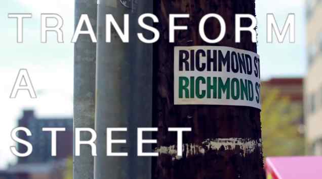
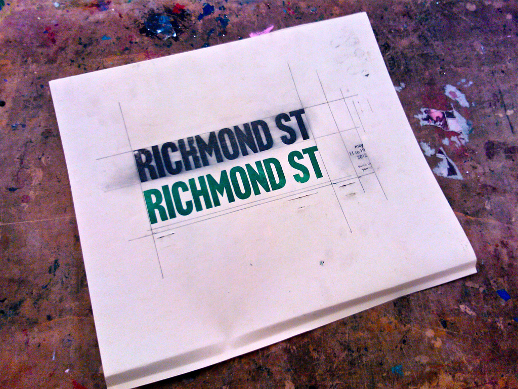
Given that Richmond Street was now the spine of my daily life, this, in turn, inspired me to put together a sort of “unauthorized promotional campaign” for the project in the print shop, the evidence of which looked like this:
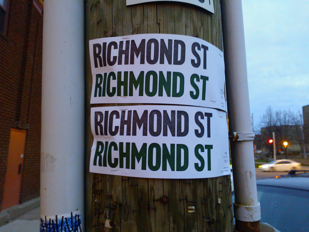
In the weeks leading up to the transformation, Oliver and I peppered many of the electric poles in the downtown core with these signs, making it hard to ignore the project (at least if you were willing to grok the subtle message of the sign):
When the actual transformation itself got underway, I was giddy with anticipation (well, perhaps not giddy, but at least eager). To be frank, I ended up the week disappointed by what seemed to amount to no more than some chalk drawings, some plants, a wobbly bicycle path and a fridge full of kids books. This wasn’t the transformed, sustainable urban landscape I pictured myself living in, it was more like arts and crafts day at summer camp.
One of the promised outcomes of the project was a documentary by filmmaker Millefiore Clarkes and last month this film was released online.
My reaction to the film, at first, was that it managed to make a silk purse out of a sow’s ear, presenting the project as something far more “transformative” than it actually was.
But I’ve watched it several more times since, and I’ve come to realize that I was, perhaps, wrong to concentrate on the infrastructural result of the week: the heart of the project was the community that came together for the transformation. I was disappointed by the nouns; the verbs, it turns out, were pretty interesting. And it took the documentary to get me there.
I still wish that the transformation project had been able to pull out more than just the usual suspects; surely one of the requirements of a truly sustainable city is that it engages even non-hippies. Given that a lot of Charlottetown residents, if asked, would see “more parking” (not “more chalk drawings”) as one of the things that downtown Charlottetown needs, skewing the project towards the “previously-engaged” set skirted around the real challenge at hand, which is convincing the broader community that sustainability doesn’t necessarily mean a decrease in quality of life nor a switch to all-burlap clothing.
Net-net, though, I think the Transforming a Street project was a step in the right direction, especially looked at through the lens of the documentary: anything we can do to make the urban landscape seem malleable is a step in the direction toward sustainability, for it’s only when we see ourselves all as actors in the urban drama that we can begin to reshape the decidedly non-sustainably legacy systems that we’ve inherited from previous generations.
I hope the project happens again next year, and I hope that when it does it’s able to, dare I say, engage and empower a wider swatch of the community. And maybe rather than seeing myself as a passive, critical bystander of the transformation, next year I should help in the effort to make that happen.
If you’re not listening to Alec Baldwin’s Here’s The Thing podcast, you really should be. Baldwin’s interview style is pitch-perfect: he interviews people like Peter Frampton, Lorne Michaels and Erica Jong with an equal mix of fan, peer, and curious questioner. He is the anti-Lipton; his interviews sound like you would like a conversation between you and Peter Frampton in your kitchen to go.
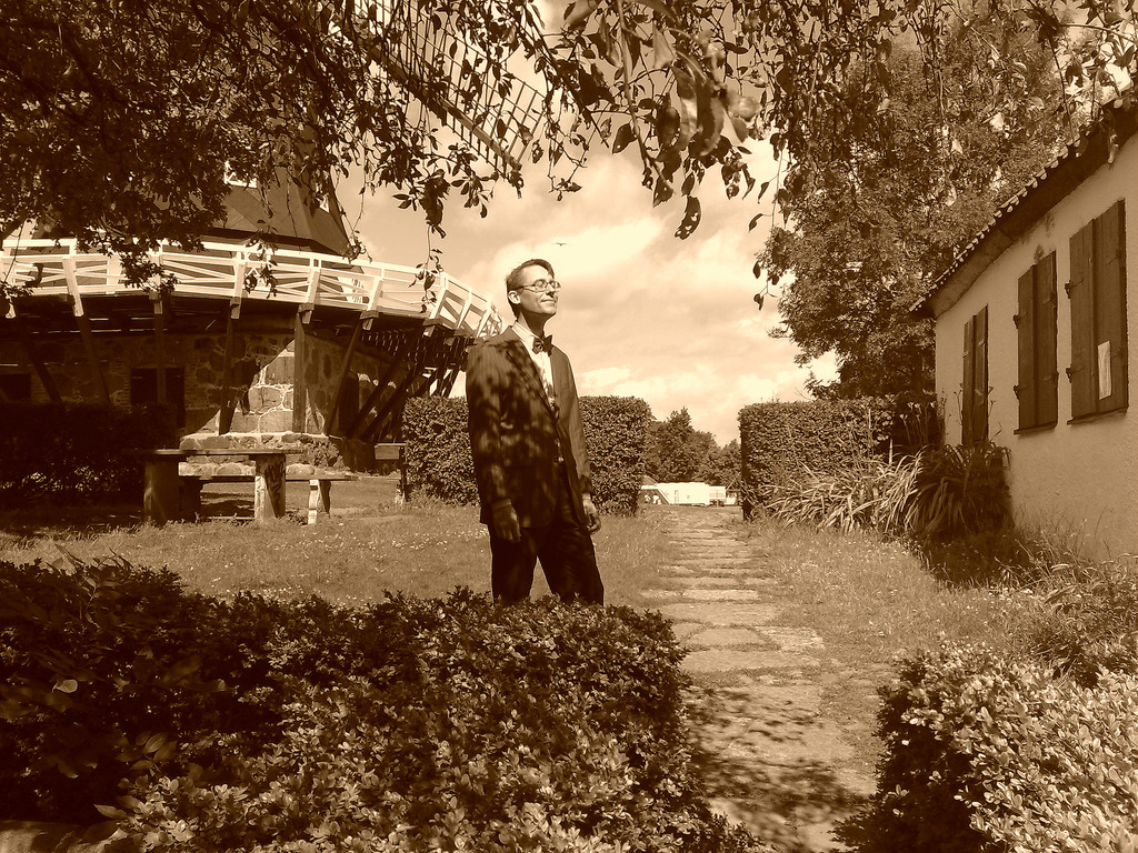
My friend Olle has become a full-fledged, card-carrying member of the Put This On sensibility. Among other things (constant buying of interesting-looking ties on eBay, for example), this tends to make him an incredibly good subject for sepia-toned photos. Here is is, for example, near the windmill in the Slottsträdgården in Malmö:
And here are Olle and Luisa (no stranger to dressing well herself) in the garden at Fredriksdal in Helsingborg:
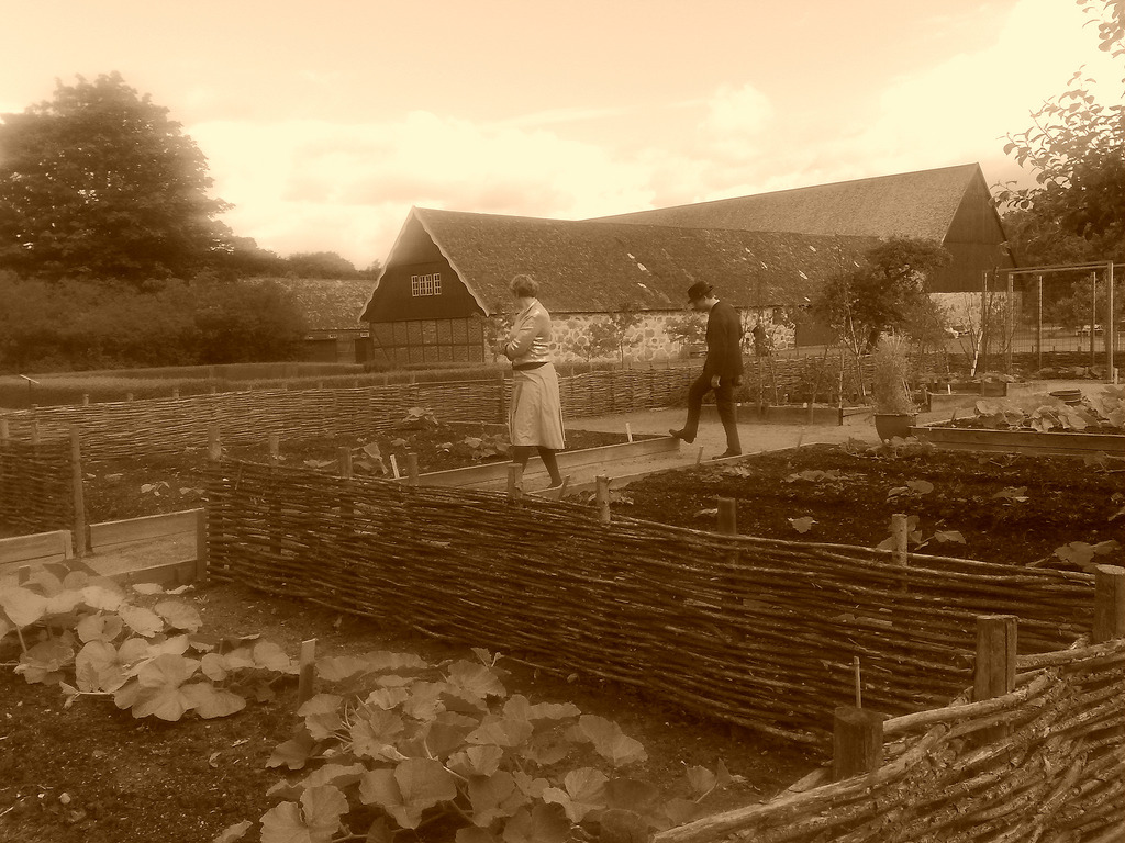
Olle’s commitment to dressing well is laudable and deliciously nerdy.
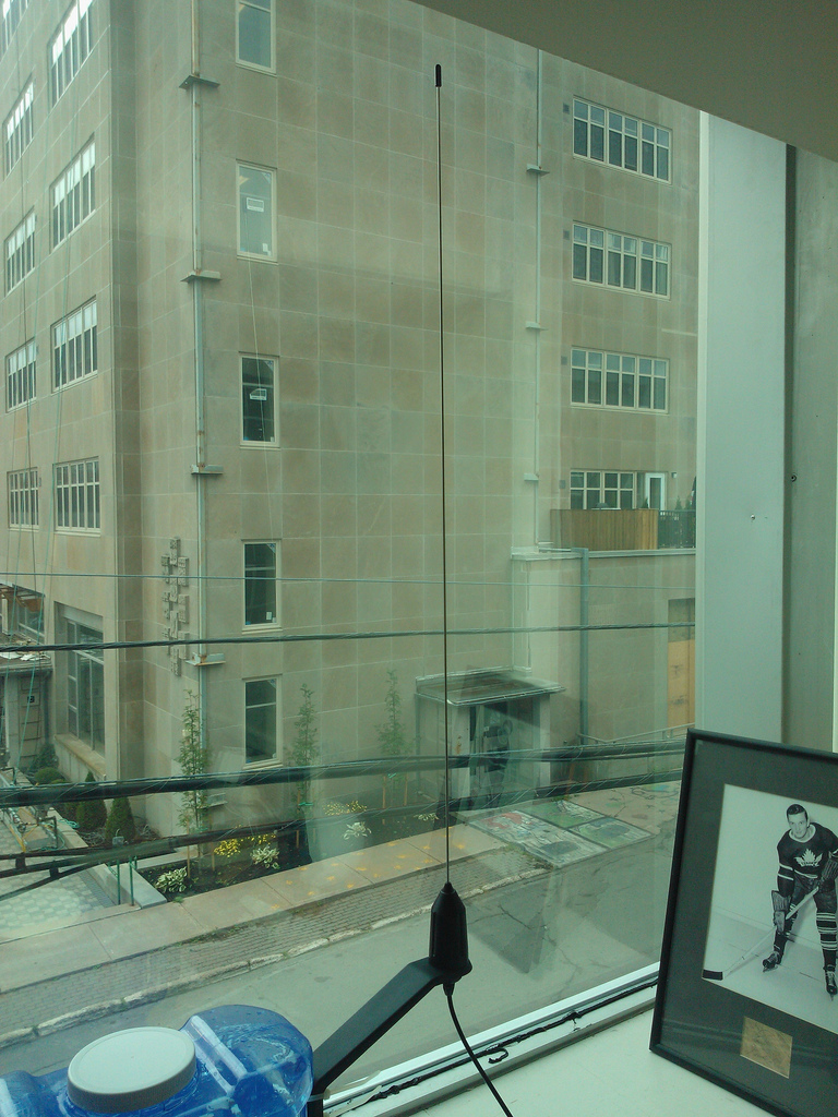
When I was crafting up the Is there a cruise ship in Charlottetown? site I inevitably came across MarineTraffic.com, a website that aggregates together ship’s position information from receiving stations around the world and displays them on a map. There wasn’t any data for the Port of Charlottetown because there was nobody in Charlottetown sending the data; but over in the left corner of the site I spotted a call to action:
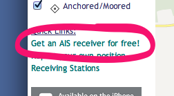
I followed the link, and then followed the instructions to request a VHF receiver and antenna. And, to my surprise and delight, while I was away in Europe last month they both arrived in the mail. This morning I got things set up — really just a matter of attaching the antenna and power supply to the Ship Location Received (a SLR200N) and connecting the received to our office Internet router. And then, blamo, data started to flow to MarineTraffic.com showing all the yachts moored down at the Charlottetown Yacht Club.
Here’s what the gear looks like:
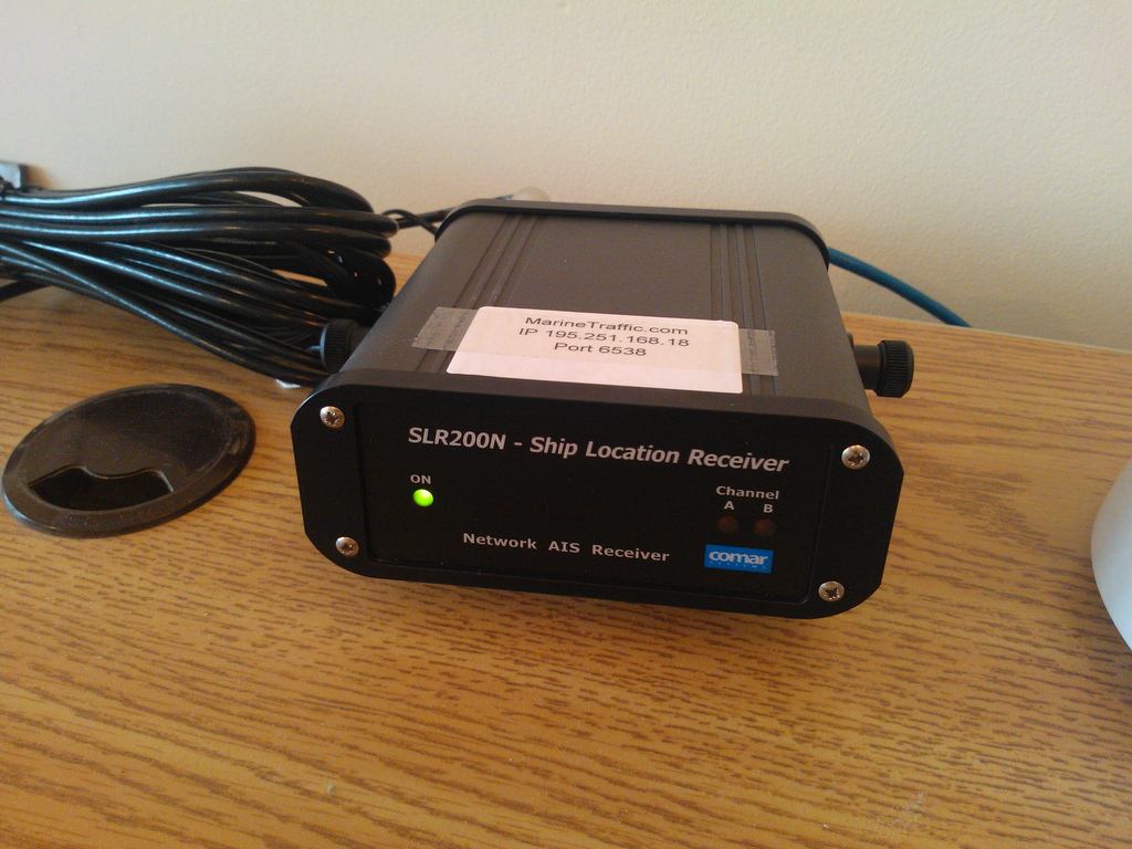
I’m Station No. 1218 at MarineTraffic.com and we’re on the air now streaming ship’s position information 24/7 for the curious.
About This Blog
 I am Peter Rukavina and this is my blog. I am a writer, letterpress printer, and a curious person.
To learn more about me, read my /now, look at my bio, listen to audio I’ve posted, read presentations and speeches I’ve written, or get in touch (peter@rukavina.net is the quickest way).
I have been writing here since May 1999: you can explore the 25+ years of blog posts in the archive.
You can subscribe to an RSS feed of posts, an RSS feed of comments, or a podcast RSS feed that just contains audio posts. You can also receive a daily digests of posts by email.