
Two notable instances of excellent customer service today.
First, we decided it was time to get Oliver a laptop for use in school. He’s been successfully using the hand-me-down Windows laptops provided by the school since grade 4 (bless the hearts of the resourceful resource staff!), but he’s getting frustrated by having to use a Windows machine at school and a Mac at home, and we want him to have a computer he can take back and forth from home to school.
We settled on an 11 inch MacBook Air, and my first call was to Little Mac Shoppe. It’s a small, local business, that I walk by at least twice a day. I know the owners. I want to support them.
“Hi, I’m wondering if you have a MacBook Air in stock?”, I ask.
“Sorry, we don’t. If you need something today, then I know Future Shop has them in stock,” says the helpful person on the end of the phone (who turned out to be John Cox, the personable owner).
“Gee, thanks,” I said, and rung off.
After our regular visit to the Charlottetown Farmer’s Market Oliver and I headed off to Future Shop. We got as far as the parking lot.
I just couldn’t shop there again: I couldn’t face the disingenuous “extended warranty” money-grabbing upsell. I couldn’t handle the pumping back-beat of the in-house sound-system. I couldn’t handle the nervous energy. I couldn’t support a faceless big-box chain. So we kept on driving.
Back to Little Mac Shoppe.
Where we ordered an 11 inch MacBook Air, to be delivered in 5 to 7 business days. There was no extended warranty invoked. No attempt to even upsell us to AppleCare. John was friendly, engaging, and a human being.
Which, I have decided, is what we should optimize our shopping to support.
Laptop on the way, the next step was to switch our cell phone provider.
I was a loyal Island Tel Mobility customer for many years, until I needed a GSM phone to travel with and they hadn’t switched over from CDMA yet. So in recent years I’ve been a reluctant customer of Rogers Wireless, putting up with their moribund service, 1970s-style customer website, and spotty service unless you happen to be in certain parts of Charlottetown.
When we looked at cutting the cable TV cord last month I took the opportunity to review our entire telecommunications agenda, and realized that we were spending $120+ a month for Rogers service. Some quick comparisons showed me that we could cut our bill almost in half and get more service by switching to Virgin Mobile, which works on the Bell (née Island Tel) network, so has service across PEI. And a jaunty attitude to boot.
But I dragged my feet, reasoning that switching would be complex and time-consuming.
The straw that broke the camel’s back was a call to Rogers to have them unlock the Samsung Galaxy Rugby I’d acquired a few months ago for doing Android development with. I paid full price, and thus reasoned that the only reason it was locked to Rogers was administrative, and that they’d unlock it for free.
I was wrong.
They refused to unlock the phone unless I paid them $50.
So to Virgin it would be.
I bought a $14 unlock code for the Samsung phone from cellunlocker.net, and took that phone, along with my Nokia Lumia 800, to The Source (née Radio Shack) in the Confederation Court Mall where I made the arrangements to port our existing numbers over to Virgin Mobile. The staff there was very friendly, the process of switching was quick and painless, and after 30 minutes I walked out the door a switched man. Total out-of-pocket costs was $0.
I hold no illusions that Virgin Mobile will be a perfect replacement for Rogers — I’ve been burned by enough multinationals to know that it’s in their nature to be essentially evil — but I gotta say that, at least so far, I’m impressed: the customer website is simple, clear, and works every time, the plan pricing was simple and clear and inexpensive, and even the sassy British voicemail narrator is a breath of fresh air.
Stay tuned to see how it works out.
Here’s the side-by-side cost breakdown of the before-tax cost:
| Item | Rogers | Virgin |
|---|---|---|
| Catherine’s Voice Plan | $25.00 | $20.00 |
| Peter’s Voice Plan | $25.00 | $20.00 |
| Peter’s Data Plan (based on usage) | $25.00 | $10.00 |
| Peter’s Call Display | $8.00 | $0.00 |
| Fake “Gov’t Regulatory Recovery Fees” | $4.26 | $0.00 |
| Real Government Fees (911) | $1.00 | $1.00 |
| GRAND TOTAL | $88.78 | $51.00 |
That’s a savings of $37.78 a month, or $453.36 a year. And Catherine gets Call Display included, which would have been $8.00 a month more with Rogers, and the option to use data if she wants to at non-exorbitant sliding-scale rates. Our “free” voice minutes decrease from 100 to 50, but as we really only call each other, and “within account” calls are free with Virgin, that’s not an issue for us. Oh, and those 50 “free” minutes are for calling anywhere in Canada, whereas Rogers’ 100 “free” minutes were local calls only.
I have a lot of friends whose businesses depend on the cruise ship part of Prince Edward Island tourism to survive: cruise ship visitors, which cluster around the “shoulder seasons” in spring and fall, are the sort of “bulk buying” part of tourism, where hundreds and thousands of visitors can be processed in a small amount of time, each leaving some money behind.
But even my friends who depend on cruise business will admit to some discomfort with the nature of the cruise business: cruise ship passengers generally arrive in the morning, have a single “Island experience,” and then get back on their ship before nightfall and the voyage to the next port.
Other than money and sewage these visitors leave little behind on the Island. It’s a stretch to even call them visitors, because it’s doubtful that their quick breeze through actually allows them to learn anything truly meaningful about Prince Edward Island.
And of course they neither stay in hotels nor eat in restaurants because they bring their own floating city with them, where all that is already paid for.
The notion that they would actually interact with any Prince Edward Islander outside of the confines of the tourist economy is remote: unless you happen to be benefiting economically from these tourists, it’s likely there there’s no love lost for them; we put up with the tour buses clogging the streets of the city and the “Cruise Ship Visitors Welcome” signs in the local shop windows because we have friends and neighbours who depend on the visitors for part of their livelihood.
Which is why it was galling to have the Deputy Mayor quoted in a news release as saying (emphasis mine):
“The economic impact from these cruise ships is incredible. Research done in 2010 showed that cruise passengers spend an average of $76 per day in Charlottetown,” said Deputy Mayor Stu MacFadyen, chair of the City’s Economic Development and Culture Committee. “Beyond that, these passengers contribute to the atmosphere and buzz of activity in our downtown. We wish to thank those who have included Charlottetown in their vacation, but also extend our appreciation to the Harbour Authority for the work they put into hosting these large ships in the City’s port.”
No they don’t. At all.
I’m not trying to be mean, but I don’t believe that the presence of a cruise ship in the Port of Charlottetown has ever contributed a single thing, in a positive way, to the “atmosphere and buzz of activity in our downtown.”
Cruise ship passengers may be economically valuable to the city, but they’re little better than zombies when it comes to the things that actually matter when it comes to building a downtown with “atmosphere” and “buzz.”
It’s one thing to ask us to passively accept the necessary evil of cruise ships in our midst. It’s an entirely different thing to have it the official position of the city that cruise ship visitors are more than a necessary evil and that they somehow contribute to our quality of life. They don’t. And we should be honest about that.
Bogotá Change is a fascinating film about the transmormation of the Columbian city of Bogotá that started in 1994. It’s well worth watching if you are a student of urban behaviour and the challenges of getting things done against all odds. If Bogotá can be what it is today given what it was 20 years ago, then anything seems possible. Thanks to TheCityFix for the pointer.
By far and away the youngest and most enthusiastic patron of my letterpress pursuits is 6-year-old Roisin. She visited Type in the Open on Saturday night with her mother, camera in hand, and spent 15 minutes taking pictures while I attended to the typographic needs of others.
When I looked up they were gone. and it wasn’t until I got the photos by email yesterday that I got to see letterpress through Roisin’s eyes, and to find out that not only is she an enthusiastic patron, she’s also a talented photographer.
See all her photos here (and even more here), but here’s a sample of my favourites:

Thanks to everyone who came out to Type In The Open on Saturday evening. Over the course of the 5 hours I had about 30 people come through the door, and about half a dozen of those tried a hand at setting some type and printing on the Adana Eight Five. I got to show off the Golding Jobber No. 8 (its mechanical beauty was, by far and away, the highlight of the event), tell the story of how it came to me, and talk about type, printing and why I’m interested in it.
It was a diverse crowd, and people found there way there via a combination of Twitter, Facebook, and the posters I’d peppered around the downtown. Kenny and Winnie printed up a card for Tai Chi Gardens, I printed up a batch of Tourists Not Allowed In This Area posters, and there was a lot of interest in the collection of letterpress cuts loaned to me by Ian Scott.
A reminder that I’m opening my letterpress studio in downtown Charlottetown at The Guild tomorrow night, August 25, 2012 from 4:00 p.m. to 9:00 p.m. You’re welcome to drop down any time during those hours: not only can you see my Golding Jobber No. 8 press in action, you’re welcome to try your hand at setting some metal type and printing on the smaller (and thus much easier to learn on and handle) Adana Eight Five press. There’s no charge for anything.
Here are some things to remember:
- You can enter either through the Richmond Street entrance of The Guild (all night) or, when the gallery is open, through the Queen Street entrance.
- The studio is only wheelchair accessible when the Queen Street entrance is open; you might want to ring 368-4413 before you head down to verify that entrance is open and that the lift is staffed.
- The bar in the Gallery in the Guild will be open from 8:00 p.m. onward if you want to grab a drink.
- I recommend wearing clothes you don’t mind getting dirty if you want to try your hand at printing.
- People of any age are welcome; because there’s metal type involved, which contains lead, I recommend you make a point of washing your kids’ hands after your visit (I also have latex gloves available if you want to be extra-cautious). Read Metal (Lead) Type Handling Safety if you want some background. Also, do not eat the metal type.
- I have paper in various sizes available, but you’re welcome to bring your own paper if there’s something special you’d like to print on: the maximum printed size of the Adana Eight Five is, as you might expect, 8 by 5 inches.
Hope to see you all in the readership out tomorrow night. And be sure to take in the rest of Art in the Open while you’re around and about, especially Catherine and Lori’s installation down the street in Connaught Square.
I’ve been running a little side-project this week, working to add street numbers to the OpenStreetMap of Charlottetown. I’ve been using the excellent little Windows Phone app MapStalt Mini (from Microsoft itself, oddly enough), which makes walking up and down the block entering street numbers really easy. My goal is to number all visible addresses from Euston Street to the water. I’m making good progress; here’s the corner of Queen and Kent:
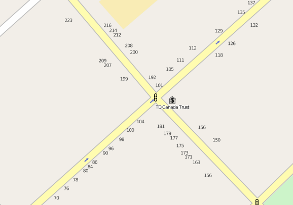
It’s remarkable, given how useful street numbers are as an aid to potential customers (to say nothing of the fire, police and ambulance), how many buildings have no visible street number at all.
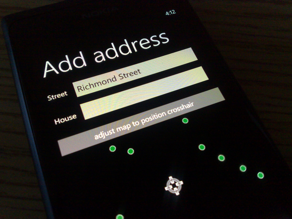
Here’s what the process of “address tagging” looks like in MapStalt Mini. The app auto-detects nearby streets from your geolocation, you select one, and then you just walk down the street stopping in front of every address typing in the house number (note to Microsoft: it would be nice if the keyboard presented for this was the numeric one rather than the alphanumeric one):
If you’d like to contribute to this effort yourself, and you have a GPS-enabled mobile device (there’s free software for iOS, Android, Blackberry and many other platforms).
The nice thing about a project like this is that the data you contribute become immediately useful and usable: here’s walking directions based on address data I captured yesterday afternoon; and the OpenStreetMap itself gets updated with address numbers less than 10 minutes after you add them.
A lovely acoustic from Tim Chaisson. If they ever make a docudrama about my life, please arrange to have Tim compose the soundtrack. Also, if I am to be reincarnated, please give me a small smidgen of his talent (and perhaps a small smidge of his beard).
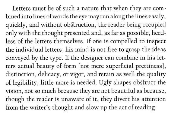
Everything I need to say about the new Woody Allen film To Rome with Love was better said in 1940 by type designer Frederic Goudy in his book Typologia:
To Rome with Love is a collection of interesting themes and ideas that, despite that, never come together to make a compelling whole. Sometimes this approach works; in this case it doesn’t. It’s still a worthwhile film, and if you are a fan of Allen’s work I suggest you see it; just don’t expect anything life-altering.
About This Blog
 I am Peter Rukavina and this is my blog. I am a writer, letterpress printer, and a curious person.
To learn more about me, read my /now, look at my bio, listen to audio I’ve posted, read presentations and speeches I’ve written, or get in touch (peter@rukavina.net is the quickest way).
I have been writing here since May 1999: you can explore the 25+ years of blog posts in the archive.
You can subscribe to an RSS feed of posts, an RSS feed of comments, or a podcast RSS feed that just contains audio posts. You can also receive a daily digests of posts by email.