Back in April, seemingly on the spur of the moment, Catherine created a quilted wall hanging for a public event at Trinity United Church to memorialize the many city elm trees that were being cut down due to Dutch Elm disease.

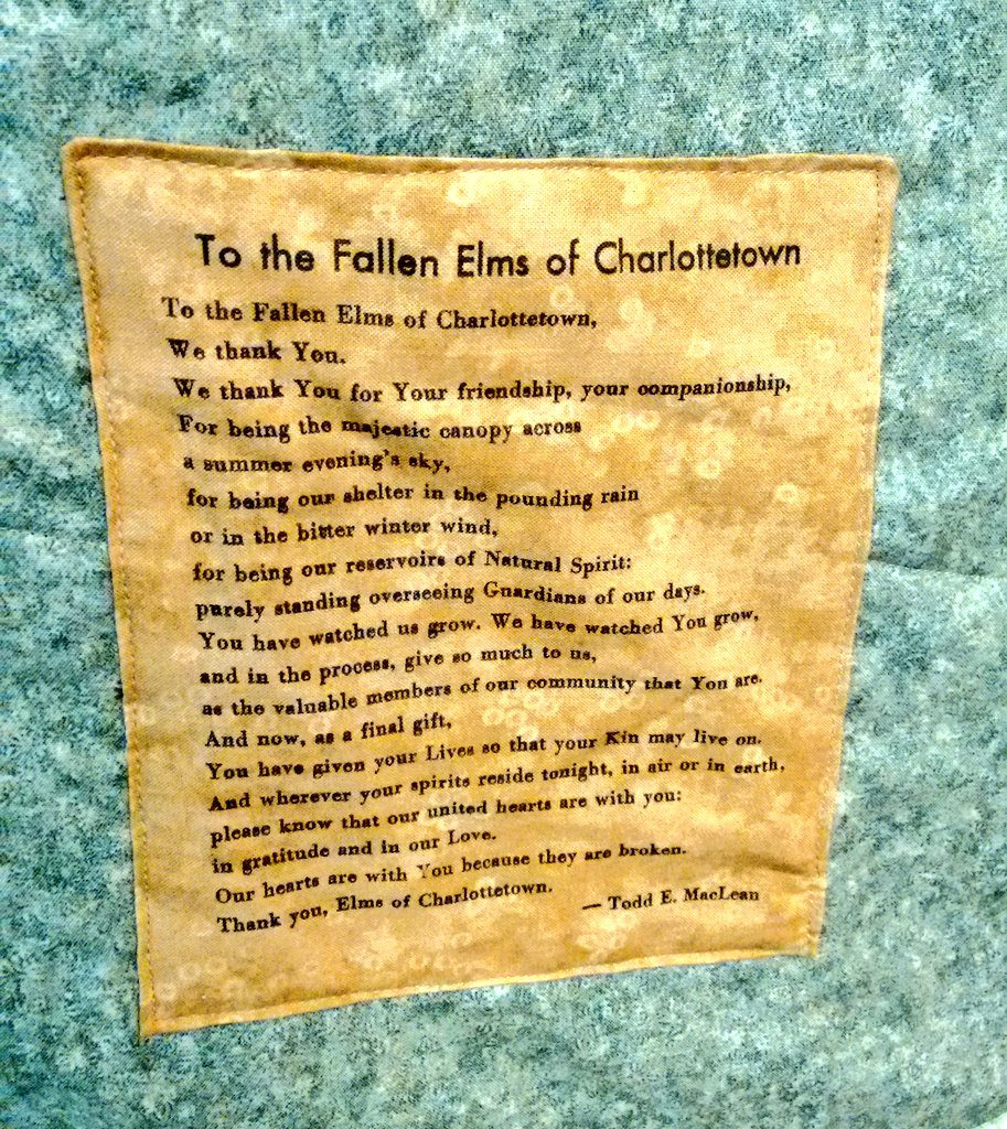
At that same event, Todd E. MacLean both performed a beautiful solo on the sax and delivered a poem he’s composed for the occasion, To the Fallen Elms of Charlottetown.

In the months since then Catherine polished the wall hanging and I set Todd’s poem in type and printed it on fabric on my Golding Jobber № 8 letterpress. Catherine then quilted the poem to the wall hanging.

Printing on fabric turns out to be harder than I thought: not only is it harder than paper to keep in place, but it doesn’t take to the ink in the same way that paper does, resulting an less-even inking that I would like. Nonetheless, I’m happy with the result, and I’m happy that, for the first time (other than Oliver!), Catherine and I got a chance to collaborate on something.
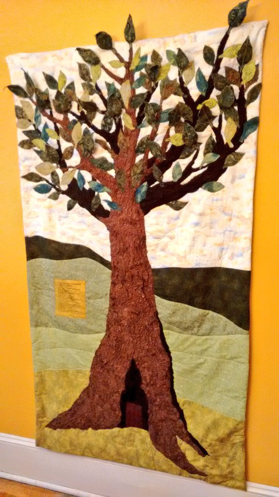
Fallen Elms Wall Hanging

To the Fallen Elms of Charlottetown

🗓️
Catherine Miller  •  Letterpress  •  Art  •  Charlottetown

Every day at around 4:00 p.m. I get an email, via IFTTT (IF This Then That, a free web service that glues disparate services on the web together in interesting ways), that contains a digest of the Instagram photos taken in my neighbourhood in the last 24 hours.

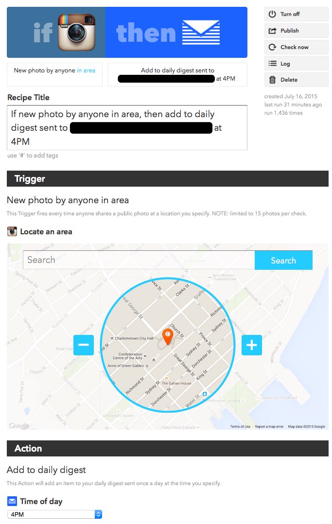
The recipe (that’s what IFTTT called “rules for routing stuff from one place to another,” in this case from Instagram to my email) looks like this (you can add it to your own IFTTT account, with your own location, if you like):

IFTTT recipe screen shot

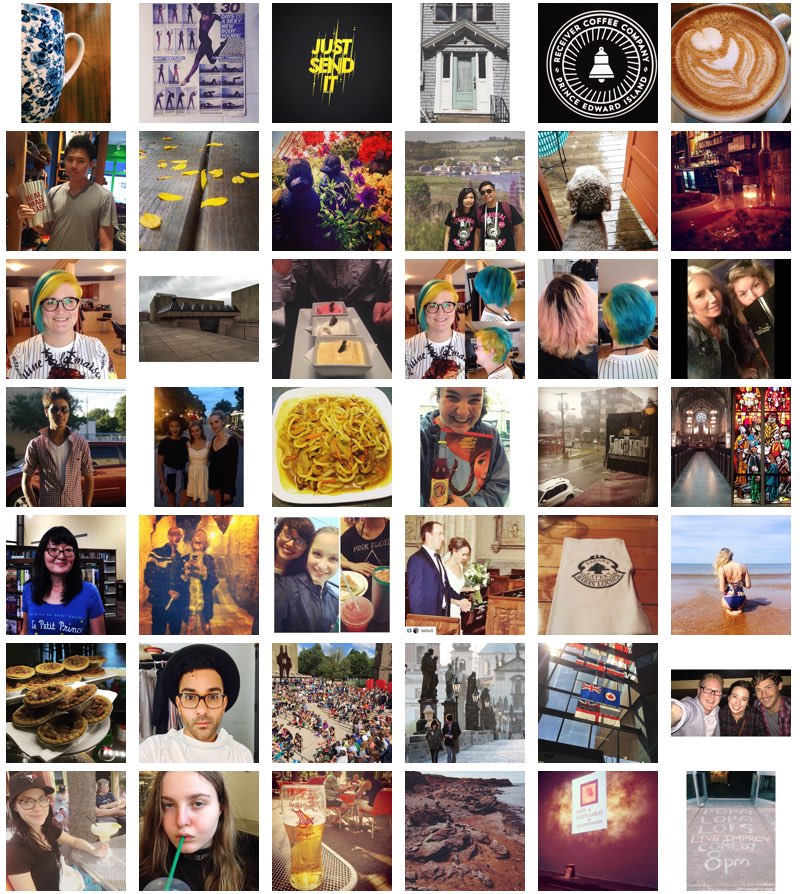
And here are thumbnails of the photos that I received today (the actual email from IFTTT contains larger images, with links to the Instagram originals)

Instgram Photos taken in my neighbourhood in the last 24 hours

Instagram’s method for figuring out where a photo was taken is, to some extent, reliant on the user to identify the location; that’s why there are beach and cliffs photos in the mix,

But, that aside, I find this daily digest provides me with an interesting insight into what people – Instagram-using people, at least – find interesting in the area where I work and live.

(The images above are from the following Instagram users: audreyannej, chloemahar, cohenmcdonald, darinmuck, dmwedge, dong_zheming, everythingeverywhere, factorypei, haleyhbu_, ibaadshah101, ilovemoonsnail, kalkalkal, katkruger, kissthebride1, lauethier, lauradawnclerk, libigatti, lingerietop28, lsquiresiv, madisonmcginniss, mfabaughen, miss_emilysarah, rebelrebelgrrl, ruk, ryan_cheverie, salitabacchi_henry, soxmerry, sreevatsan, taylorgill7, theguildpei, thekettleblackpei, theqasimkhan, timothydanielob, triple7presents, and wallace_katie).

On a technical note, I used the excellent ripMIME utility to decode the MIME email I get from IFTTT into an HTML file, and then ripped the images ouf of that with Firefox to produce the collage about with GraphicConverter.

🗓️
Instagram  •  IFTTT  •  Charlottetown

Remember Dave’s Service Centre, my mechanic of choice?

Well I had the Jetta in the shop there today to replace the pads and rotors on the front brakes – Dave suspects the rotors were the factory-originals, which is pretty amazing given that it’s a 15 year old car.

On the way out of the parking lot after picking up the car I ran into comedy’s Patrick Ledwell on the way in and I made a comment about his having great taste in mechanics.

It turns out that Patrick found Dave through this here blog, which is about as gratifying a result for the world as you can get in the blogging business.

And so I reiterate – again – that if you’ve got a car that needs attention, in Dave’s you will find friendly, talented service at reasonable prices.

🗓️

Remember those discretionary ligatures I wrote about last week?

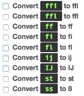
Well, with regret, I’ve realized it’s best I stop using them, and so, by changing the settings in the Typogrify module for Drupal that conjured them to life in the first place, they are gone.

Turning off Typogrify Ligatures

I did love them so.

But the problem was that, in using them, I had to pretend that I lived in a typographically perfect universe where all of the ligatures were available in all of the typefaces that might eventually be used to render the text I write here.

But that, alas, is not the case, leading to some ugly rendering when the text left its home here for other pastures.

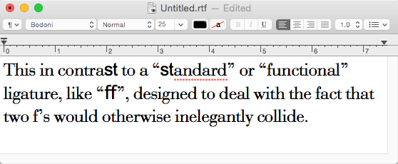
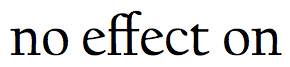
Let’s say, for example, you copied a paragraph from this post into TextEdit on a Mac to use in your PhD thesis on Goudy, and set the typeface to Bodini; the result would look like this:

Ugh.

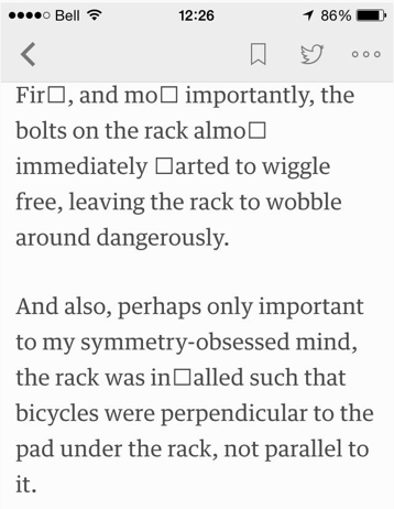
Todd Gallant pointed out, on Twitter, the result of the ligatures when the RSS feed of the blog gets rendered by Feedly on a mobile device:

Feedly on mobile showing (not) ligatures

There was another problem, too: browsers aren’t smart enough to do search-in-page search for ligatures-as-their-component-letters. So if I search on a page for “contrast,” for example, and the “st” in the occurrences on the page are rendered as ligatures, then they won’t be found by the browser.

Not Found "contrast" in search within page for browser.

Ugh.

So it’s back to regular old non-ligatured text.

It was fun while it lasted.

🗓️

It’s August 9. In previous years I was doing all manner of things this week:

Which is to say two things:

I’ve been doing this a long time, this writing-on-the-web thing.

And in none of the above was I at all conscious of the fact that summer would soon be over.

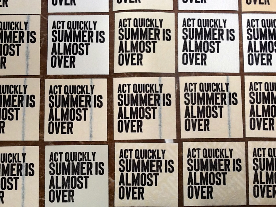
So let this serve as your official reminder (we’re going to Richard’s for lunch in Covehead; maybe we’ll see you there?)

Act Quickly: Summer is Almost Over

🗓️

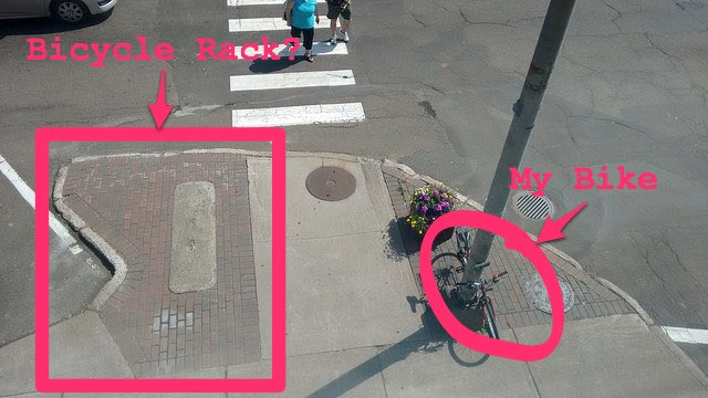
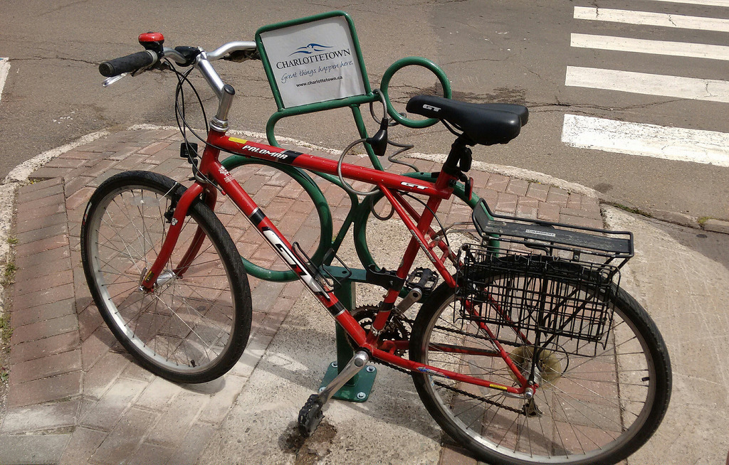
In the beginning there was no bicycle rack at all in front of The Guild. So I took a photo of how I parked my bicycle vs. how there was a large expanse of bicycle rack-friendly space a few metres away, and sent it to the City of Charlottetown:

No rack!

The city, bless its heart, had a spare bicycle rack in its inventory, and a willingness to install it, so less than a month later, a bicycle rack was installed:

New Bike Rack

Alas there were two issues.

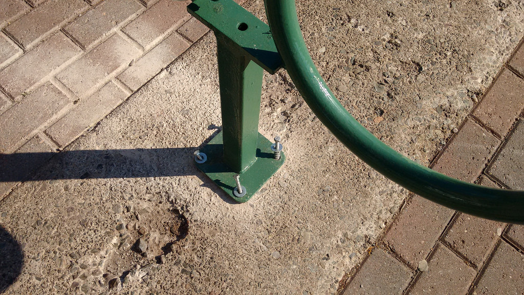
First, and most importantly, the bolts on the rack almost immediately started to wiggle free, leaving the rack to wobble around dangerously.

And also, perhaps only important to my symmetry-obsessed mind, the rack was installed such that bicycles were perpendicular to the pad under the rack, not parallel to it.

Bike Rack Out of Control!

The city was alerted.

The bicycle rack disappeared earlier this week.

Oh no!

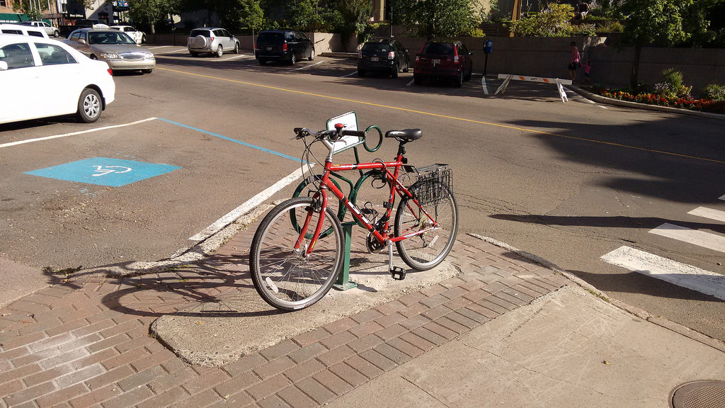
But then, this morning, it was back!

Firmly bolted to the ground. And comfortably symmetrical.

Bicycle Rack is Back

Thank you to Ramona Doyle, Sustainability Officer, and to the Public Works crew for working together to make this happen.

🗓️

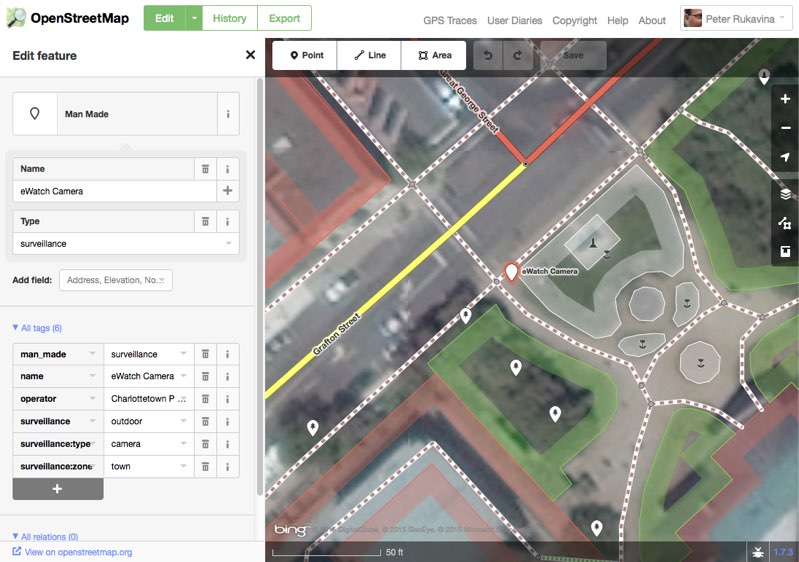
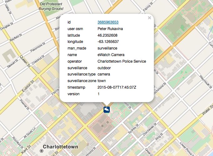
Using this man_made=surveillance page as a guide, I’ve started to add the new Charlottetown Police Service CCTV cameras to OpenStreetMap. You can see the position of one here.

OpenStreetMap + CCTV

I’m adding them each with the following tags:

  • man_made = surveillance
  • name = eWatch Camera
  • operator = Charlottetown Police Service
  • surveillance = outdoor
  • surveillance:type = camera
  • surveillance:zone = town

While the cameras don’t render on the main OpenStreetMap slippy map, they do, however, render on the purpose-built osmcamera.tk site, a project that, helpfully, has released its source code.

CCTV on http://osmcamera.tk/

You are welcome to join the effort as new cameras sprout up in your neighbourhood; once we’ve reached a critical mass, perhaps we can create a similar Charlottetown-focused resource.

🗓️

Remember that new CCTV surveillance network that Charlottetown City Police are installing?

Today The Guardian reports that this is being done at “no cost to taxpayers” as it’s a business-supported initiative called eWatch:

Deputy Police Chief Gary McGuigan said Thursday the cameras are being paid for by the businesses that have partnered with police for this initiative. Businesses that wish to partner with police contribute $5,000 to the eWatch initiative. Police then go to that business and do a site survey to determine the best possible location for the placement of the camera. All of the cameras are high definition and some are equipped with infrared technology that enables them to capture images in complete darkness.

So not only are the police going to be constantly watching us, they’re doing so in partnership with business, which takes the project to new heights of civil liberties violation.

The Guardian further reports that the police justify the project’s lack of public consultation thus:

Members of the police committee at City Hall have been fully briefed on operation eWatch. There was no requirement to bring the matter before council.

That’s not the standard of community consultation we deserve from our city, especially for so sweeping a project.

While the involvement of business in a public-private surveillance partnership is chilling, at least it affords citizens an opportunity to oppose the move in an additional venue: alerting business “partners” that we won’t do business with them as long as they’re supporting this initiative.

A reminder that if you feel similarly, I encourage you to let public officials know: Councillor Jason Coady is chair of the Protective and Emergency Services Committee and you can write to him, with copies to the Mayor and to Ward One Councillor Eddie Rice, at P.O. Box 98, Charlottetown, PE, C1A 7K2.

🗓️

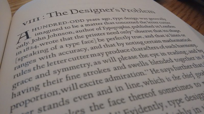
In the fall of 2009 I took a short trip to Copenhagen as part of a climate change blogging project. Once the formal activities were over, I had four days to wander the city as a tourist, and it was during that time that I came across the book Typologia by Frederic Goudy in the Danish Museum of Art & Design.

It is a stunning book, both for its contents and for its design, the distinguishing element of which is that it is set in Goudy’s own University of California Old Style typeface. Indeed, says the colophon, it was the first use of that typeface in print.

I fell in love with that face right there: it has a sense of openness, and a feeling of whimsy, that hit me over the head. When I returned to Canada, I immediately ordered a paperback reprint of the book simply so that I could return to its design as often as I liked. And I have done that frequently.

Typologia Excerpt

It turns out that the typeface has a Prince Edward Island connection: as related in this post from P22 Type Foundry in Buffalo, New York, University of California Old Style was originally designed by Goudy for the exclusive use of the University of California at Berkeley. The Lanston Monotype company later released a version for general use. In the 1980s, Gerald Giampa acquired the Lanston company’s assets and moved them to Canada, settling, in 1994, in Mount Stewart, Prince Edward Island.

As P22 goes on to relate:

The lead patterns were part of the very few physical materials that survived the tragic disposition of most of the original Lanston Monotype matrices and patterns. The full story of all that happened has yet to have a fully reliable telling: that is for another time.

The patterns however were the source material from where Gerald Giampa derived his digital versions of Lanston fonts. Most of the Lanston fonts created between 1989-2000 were done this way. When P22 acquired the Lanston Company in 2004, the Californian patterns were already proofed on newsprint.

P22 has released this digital version, dubbed Californian, and today I purchased a license from them to use it as a web font for this website.

I’m still experimenting with the right size and line spacing for this digital format, but I’m quite happy with how the face appears on the screen even now.

One of my favourite aspects of the face is what I’ve now come to learn are called discretionary ligatures, the marriage of two adjoining letters for decorative rather than purely “functional” reasons. The most obvious one in Californian is the one marrying lower case “s” and “t”, like this:

Ligature

This in contrast to a “standard” or “functional” ligature, like “ff”, designed to deal with the fact that two f’s would otherwise inelegantly collide:

Another ligature

In Typologia, Goudy described the approach he took to creating the original University of California Old Style typeface:

I did not attempt any radical departures from good tradition. I believe, however, that some of the individual characters present a measure of novelty, yet in complete harmony with their more conservative kinsmen in the font. In short, it was my purpose to attempt a type face which would present a new type expression in mass, not by drawing forms of letters radically different from the accepted shapes, but rather by including in them those fine and almost imperceptible qualities of design which mean so much in the massed effect of the type page.

Not only a good expression of what Goudy achieved with his new type face, but also an excellent approximation of the way I strive to live my life.

🗓️
Type  •  Gerald Giampa  •  Design  •  Weblogs

The entire August 31, 1946 issue of The New Yorker magazine was devoted to a single article, by John Hersey, about the bombing of Hiroshima the year before. The magazine has re-published the article to mark the 70th anniversary of Hiroshima, and while I laud them for doing that, I find myself constitutionally unable to read the magazine on the screen: it is an irrevocably print experience for me. And so I needed to find a way of approximating a read of the original article in printed format.

Fortunately I am afforded unlimited access to the magazine’s archives by virtue of being a print subscriber. So I printed myself a copy of the issue on my laser printer. Here’s how I did it.

First, I went to The New Yorker archives site and logged in.

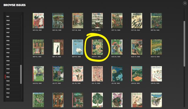
Next, I clicked on Browse Issues and selected the August 31, 1946 issue:

The New Yorker Browser

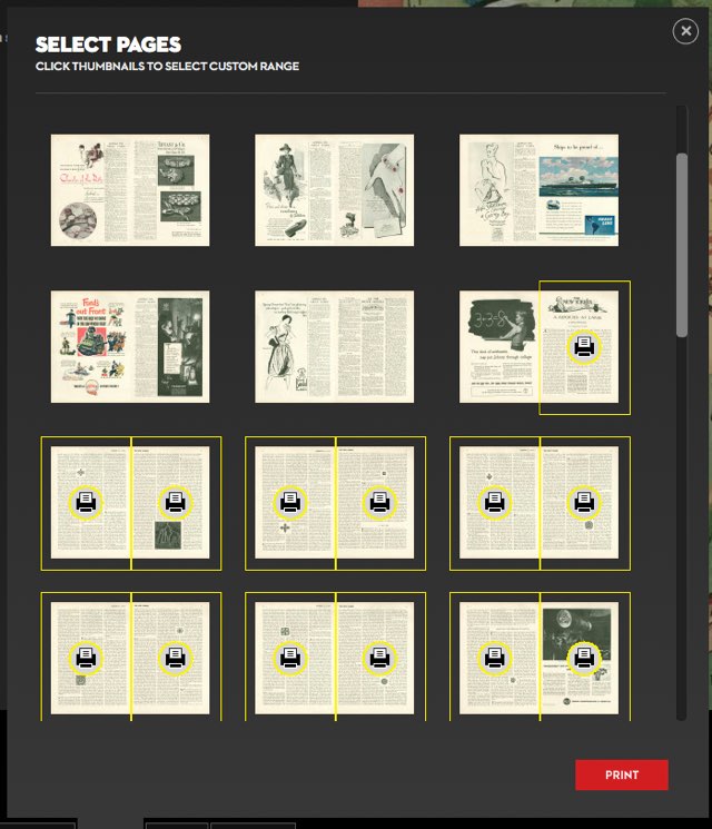
With the issue itself on the screen I clicked Print and then selected all of the pages of the article (I opted not to print the Talk of the Town frontmatter, which a New Yorker purist might quibble with):

Printing The New Yorker

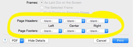
Clicking Print once I’d selected the page brought up the Firefox print dialog. I set the Page Headers and Page Footers to “—blank—”:

Print without Headers

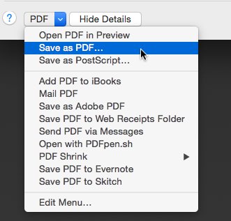
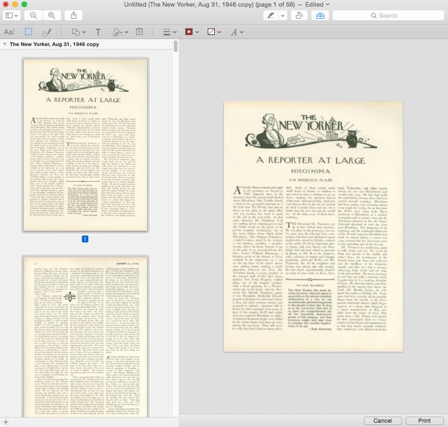
Finally, I clicked PDF and then Save as PDF to print to a PDF file instead of the printer:

Print

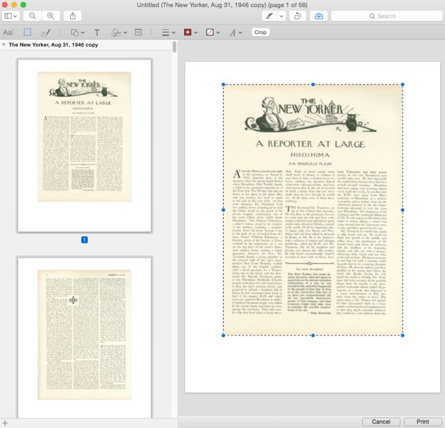
The resulting PDF had too much whitespace around the page images, which I used the Mac OS X Preview app to crop out:

Cropping

To do the cropping I did this:

  1. Selected Tools > Rectangular Selection.
  2. On the first page of the article, drew the rectangular box around the border of the page image (as pictured above).
  3. Selected all of the pages in the thumbnail view in the sidebar.
  4. Pressed Command + K to crop all of the pages.

The result looked like this:

Cropped!

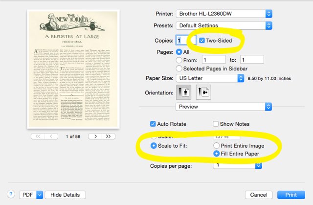
I then printed to my Brother laser printer directly from Preview, checking the Two-Sided option, and the Scale to Fit > Fill Entire Paper option:

Printing PDF to Brother Laser Printer

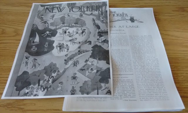
The result is pleasantly like a real copy of The New Yorker, albeit in black & white and not nearly as crisp as an original:

The Resulting Pseudo New Yorker

Now, to read the 30,000+ word article!

🗓️

About This Blog

Photo of Peter RukavinaI am . I am a writer, letterpress printer, and a curious person.

To learn more about me, read my /now, look at my bio, listen to audio I’ve posted, read presentations and speeches I’ve written, see things I’ve favourited elsewhere, or get in touch (peter@rukavina.net is the quickest way).

I have been writing here since May 1999: you can explore the 25+ years of blog posts in the archive.

You can subscribe to an RSS feed of posts, an RSS feed of comments, an RSS feed of favourites elsewhere, or a podcast RSS feed that just contains audio posts. You can also receive a daily digests of posts by email. I also publish an OPML blogroll.

InstagramYouTubeVimeoORCIDOpenStreetMapInternet ArchivePEI.artDrupalGithub.