Catherine and I had a meeting at Colonel Gray High School this morning with Oliver’s teachers, and when the meeting was over we headed back to the car. Snow had started to fall in the interim, and it was lightly dusting the ice below, creating prime slipping conditions.
Catherine is the primary slipping danger in our family, as she has cancer sites in her bones that render her more brittle than the average person; the orthopedic surgeon she consulted with a couple of years ago gave her strict instructions not to fall, ever, under any circumstances, a request she’s (mostly) honoured since.
As Catherine was (gingerly) getting into the car, she said “be careful, Pete, it’s really slippery.”
Advice I promptly ignored, as I threw myself headlong into the task of brushing the snow off the car.
And, suddenly, I was falling backwards onto the aforementioned ice.
It was slippery. Very slippery.
Fortunately I did not break anything, and my injuries appear restricted to some pain in the heel of my right hand when I put pressure on it (most noticeable, so far, if I get out of a chair, using my right arm to help, or if I use a stapler with that hand).
I was concerned, though, that trouble might be lurking–catatonic carpal thrombosis syndrome or some such thing. I didn’t want to go to the ER, and I didn’t want to use my doctor’s time, so I did what you’re supposed to do in non-emergency medical situations, and I called 811.
After a couple of rings and a bleep and bloop through a shallow phone tree I was talking to a very helpful and friendly registered nurse. They took my name, my family doctor’s name, and my date of birth, and then walked me through an exhaustive set of questions over the course of about 10 minutes (is there a bruise? is there a puncture? is there swelling? do you have full range of motion in your hand?). At the end of the flow chart was the recommendation that I could ice my hand, take pain relief if needed, and see how things go over the next 7 days.
The most impressive part of the dialogue was the nurse asking me to repeat back the instructions I’d just received to make sure I understood them: that’s a great idea, especially when dealing with people who are, inevitably, under more stress than average.
Given the range of calamity that could have befallen me, I’m more than happy to deal with a little bit of pain in my heel for the next while, and to avoid stapling.
811, meanwhile, has revealed itself to be a treasure of a service.
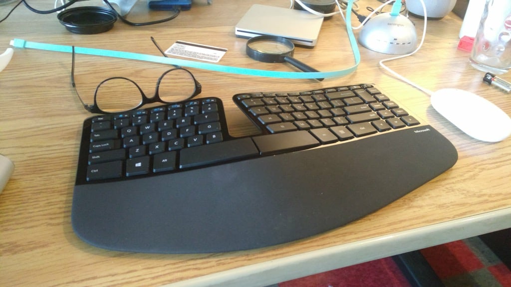
My keyboard of choice for the last 10 years or so has been the Microsoft Sculpt Ergonomic Keyboard, which I switched to after many years of the Microsoft Natural Keyboard Pro.
I don’t love the Sculpt: its key travel isn’t fantastic, I don’t like the combination of the function keys and special-purpose keys (like volume controls) into one row of keys with a toggle, and the key labels tends to wear away pretty quickly with regular use.
But its ergonomics work well for me, I love the fact that the numeric keypad (which I seldom use, but keep handy when I need to do a lot of bookkeeping) is a separate device, leaving room on the immediate right for my mouse. And it’s still in production, relatively easy to pick up retail almost anywhere, and is reasonably priced (although I wish you could buy it without the companion mouse, which I never use looks like you can buy it separately from Amazon now: woohoo!).
My first Sculpt here in the Charlottetown office finally gave up the ghost today. The key labels, especially on the left side, were long-ago worn away, and the keys had been gradually more mushy for a while; the final straw was the right-hand side of the space bar giving up.
Fortunately I pre-planned, and had a backup Sculpt at the ready, upon which I type this very post.
It’s taking some getting used to, as the key travel is crisply new, and all the subtle modifications in hand behaviour I’d unknowingly been making in recent years to accommodate the decay of the old one are no longer needed.
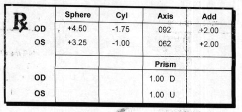
Posting my eyeglasses prescription here has got me out of a jam more than once since I started doing it, so I’ll continue the tradition: here’s the updated prescription for progressive bifocals I received this morning from Charlottetown Vision Care:
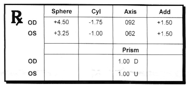
Moving back in time, here’s the 2016 prescription:
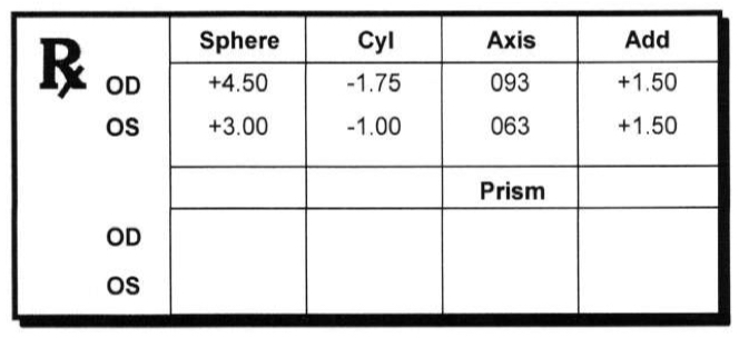
And the prescription from 2014, one I never had filled:
And the prescription from 2012:
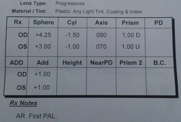
And the prescription from 2008:
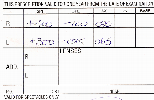
I’ve now enough data points that making a table is useful to see the evolution of my prescription:
Right Eye (OD)
My right eye, at least from the inside looking out, is the most challenged one: if I toggle back and forth between my eyes, whether wearing my existing prescription or without eyeglasses, the right eye is demonstrably weaker than the left.
The only change this time from the last prescription is in the “Add” column. This is described here as:
The Add, short for Reading Addition, is the additional correction required for reading, this can be used to make either reading glasses, bifocal glasses or Varifocal glasses. This figure is an indication of how much extra power is required ‘on top’ of the distance prescription for near or intermediate glasses.
On this prescription the “Add” went from +1.50 to +2.00:
| Year | Sphere | Cyl | Axis | Add | Prism |
|---|---|---|---|---|---|
| 2018 | +4.50 | -1.75 | 092 | +2.00 | 1.00 D |
| 2016 | +4.50 | -1.75 | 092 | +1.50 | 1.00 D |
| 2014 | +4.50 | -1.75 | 093 | +1.50 | |
| 2012 | +4.25 | -1.50 | 090 | +1.00 | 1.00 D |
| 2008 | +4.00 | -1.00 | 090 |
Left Eye (OS)
The stronger eye, which presumably why its “Sphere” measure (“the strength of lens required to correct your focus “) is less than the right. Again, the only change here is the “Add” from +1.50 to +2.00:
| Year | Sphere | Cyl | Axis | Add | Prism |
|---|---|---|---|---|---|
| 2018 | +3.25 | -1.00 | 062 | +2.00 | 1.00 U |
| 2016 | +3.25 | -1.00 | 062 | +1.50 | 1.00U |
| 2014 | +3.00 | -1.00 | 063 | +1.50 | |
| 2012 | +3.00 | -1.00 | 070 | +1.00 | 1.00 U |
| 2008 | +3.00 | -0.75 | 065 |
My optometrist assures me that there’s lots of room in the corrective spectrum to continue correcting my vision for years to come.
Oliver is taking Global Issues this semester at Colonel Gray, and to start things off the class talked a lot about the United Nations.
This prompted me to read the Universal Declaration of Human Rights for the first time, and, by way of helping to commit it to memory, to start to set and print portions of it.
Here’s the result of the first effort: the first sentence of Article 1, “All human beings are born free and equal in dignity and rights.”
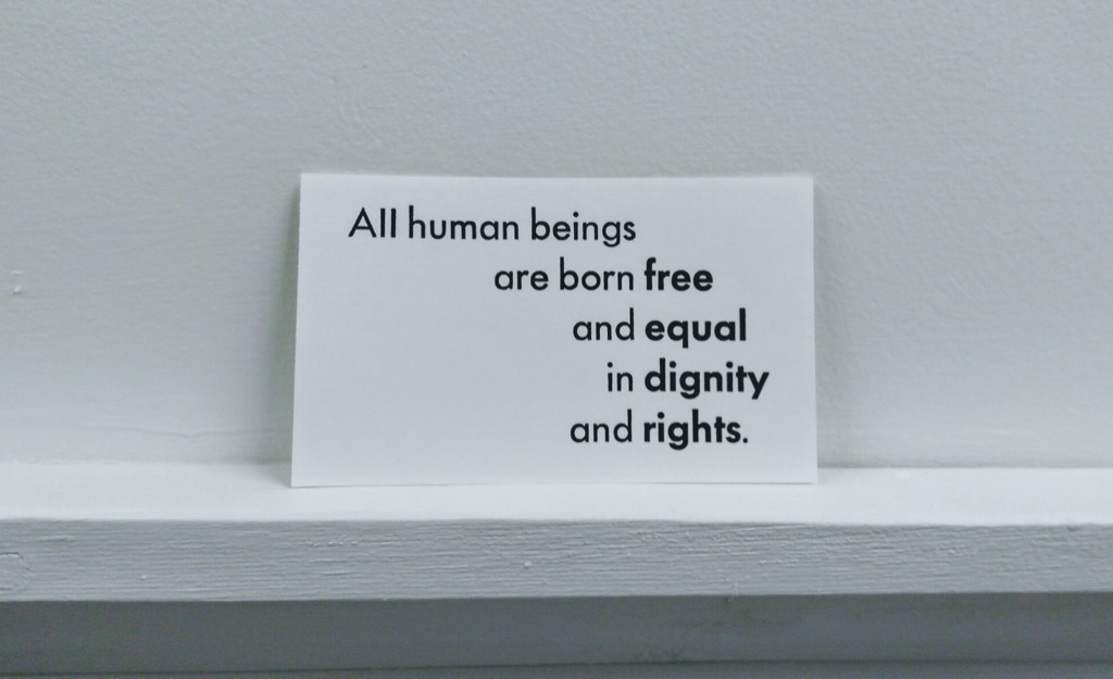
It’s set in a mixture of 30 point Futura Regular and Bold, and printed in black ink on standard white index cards.
It turned out, despite its simplicity and brevity, to be a bear of a passage to print, as there wasn’t anywhere particularly convenient to tuck the tongues of the gauge pins, so I had to improvise. But I persevered, and managed to print 100 copies. I’m going to try to print the title, in something resembling United Nations Blue, as a next step. Which will be my first attempt at mixing colours.
This photo, taken early this morning, sums up the winter of 2018 perfectly. Yesterday was warm, today is cold. The cycle repeats week after week after week. As a result, our backyard is, alternatively, an ice rink, a swimming pool, and a mud bath. Ethan the dog is not amused.

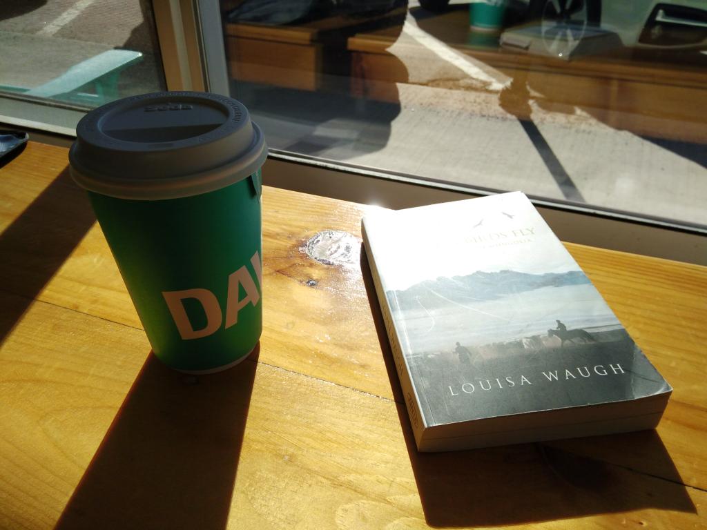
While I feel guilty for patronizing Big Tea, on a cold winter afternoon there’s no better place for a break than the front counter at David’s Tea.
Every morning The Old Farmer’s Almanac sends a tweet with a photo of the sunrise over its Dublin, New Hampshire headquarters. This morning’s photo was simply spectacular:

When Matt Rainnie was host of Mainstreet on CBC Radio we produced a couple of summer’s worth of eclectic radio pieces, like Everything You Wanted to Know About Ice Tea in 2004.
Matt is inveterately curious and a great interviewer, so when I wanted to flush subscribers to The New Yorker out of the bushes I dropped him a line, and he quickly bit, coming along to the Reinventorium yesterday morning to tape a short piece that aired this morning.
The awesome power of radio has resulted in a half dozen more subscribers outing themselves.
Two items of note on the typography trail this morning:
- Maria Montes (you’ll remember her from Scared Shitless) posted a comprehensive list of typography events in 2018 on the Alphabettes site (itself a constant source of inspiration).
- A fascinating post about the “angled terminal” on London street nameplates (via the Fresh Signals RSS feed from Coudal Partners)
It turns out that I’ve misunderstood the meaning of “Always Open With” on a Mac for all the years I’ve been using one.
Here’s where I’ve been going wrong.
Let’s say I have a PDF file on my Desktop, and I want to open it with the Mac Preview.app. I right-click on the PDF, select Open With, then Other…, then select Preview.app and, finally, check the Always Open With checkbox. Like this:
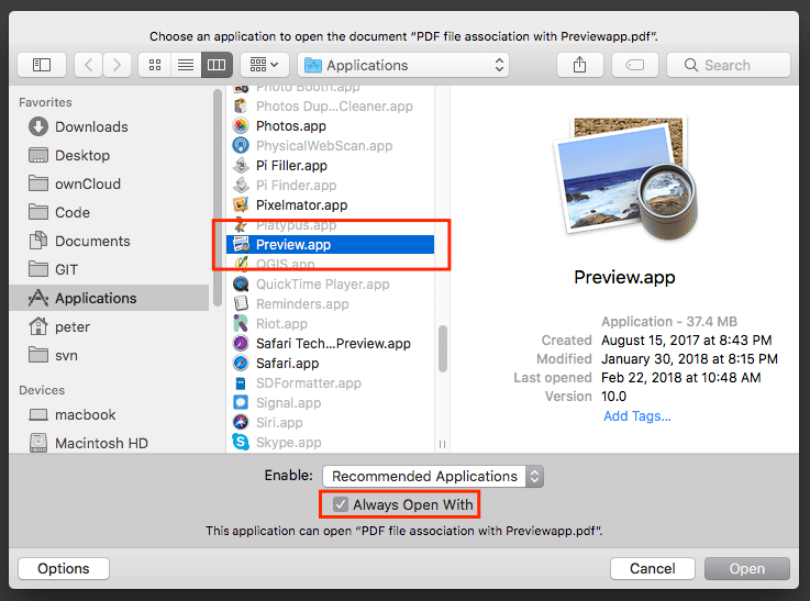
I’d always assumed this means “always open PDF files with Preview.app.”
But it doesn’t.
It means “always open this specific PDF file with Preview.app.”
The real way to change the default app for all PDF files is to right-click on a PDF file, select Get Info, then, in the Open with: section, select Preview.app and click the Change All… button. Like this:
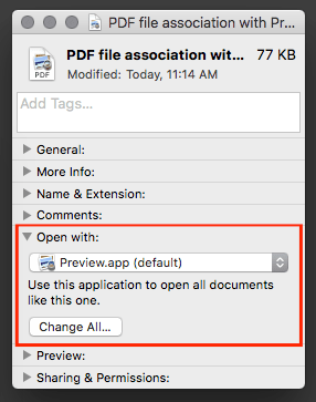
Thanks to The Mac Observer and Smile technical support for steering me straight on this one.
 I am
I am