Every weekend I continue to bluster away on my Adana Eight Five letterpress, each time learning, by trial and error, a little more about how paper and ink and type and pressure relate. And each time I learn how much I don’t know, and how much I need to learn simply by rinsing and repeating, over and over and over.

The hard part of letterpress, I’ve learned, is what’s called the makeready. This is the time after you’ve set the type, but before you start running off “good copies.” In computer programming it would be called the “debugging.” And as with debugging, it can consume a lot of time.

British Letterpress has a good introduction to the term; they write, in part:

[M]akeready is the process of ensuring that each part of the forme receives sufficient ink and pressure to satisfy its individual requirement. Bold, solid areas of type or blocks need more ink-and more pressure-than do light, delicate areas.

Simple enough. But achieving this, especially when, like me, you’ve both a limited array of equipment and supplies and a limited amount of knowledge, is a slow slog.

Mostly this is because the materials of letterpress – type, leading, furniture, chase – are all subject to wear and tear and thus amounts of “inexactness” that need compensating for.

Take a look at this type sample I printed tonight, for example:
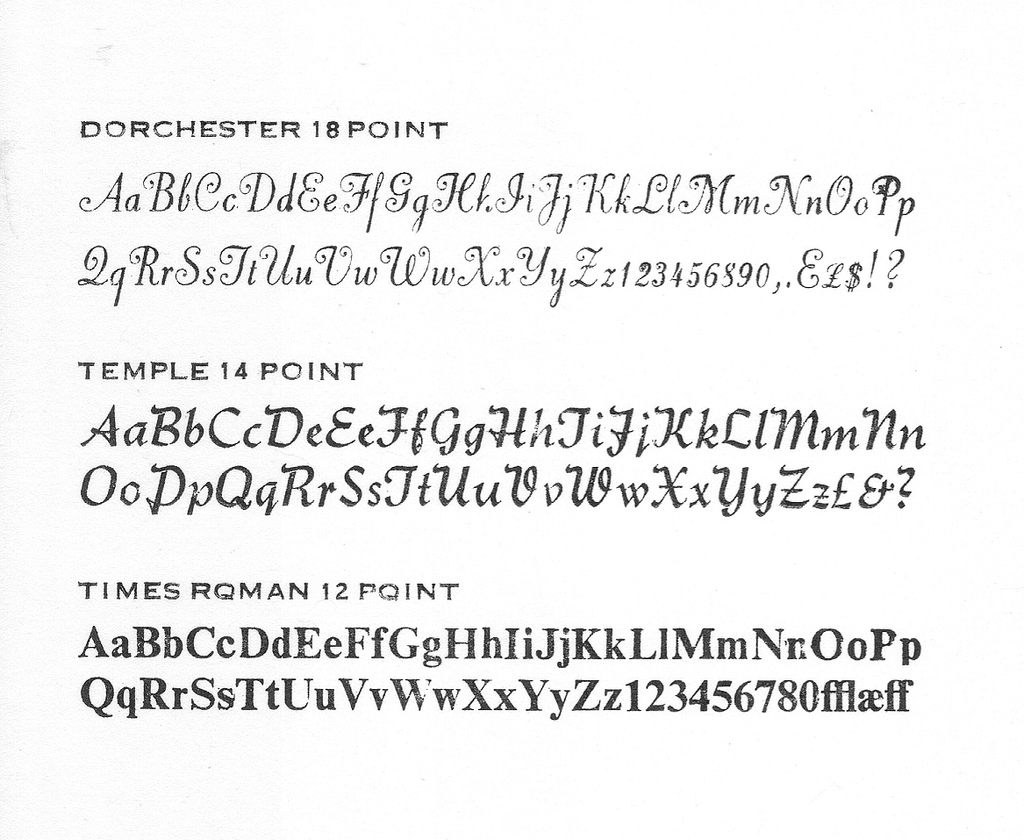
Type Sample (Card Stock)

This proof is one I printed after perhaps 30 minutes of fussing about, and it’s still far for perfect.

Look at the upper case P in the top line of the Dorchester section, for example: in this typeface the upper case P has a slight overhang that extends over the right edge of the body and, in this case, overlays the body of the lower case P. The effect of this – likely because of wear and tear and accumulated cruft – is to push the P up slightly resulting in a different amount of ink and pressure than the letters before and after. And so, as you can clearly see, it’s too dark. As this is my only upper case P in this font, I’m kind at a loss as to what to do, other than too (somehow) bring its sister letters up to meet it.

Another issue on this same sample is on the top line of the Times Roman section: notice the incomplete printing of the “NnOoPp” letters. This case is a little easier to handle: it seems easier to add pressure than it is to take it away, and one quick hack I’ve found for this is to stick a layer of sticky tape on the tympan (the layer of oiled paper onto which the paper to be printed is set). Many times this seems to be just enough to add the right amount of pressure; in this case I’ve still a way to go in this regard, but it’s a lot better than when I started.

As another experiment – I’d seen it suggested on places like Briar Press – I tried moistening the paper I was to print on before putting it on the press. To do this I consolidated a collection of Windex bottles to free one up, and then lightly spritzed some water on the paper; for this test I used some straw paper I bought at HazelTree this morning. Here’s what resulted:
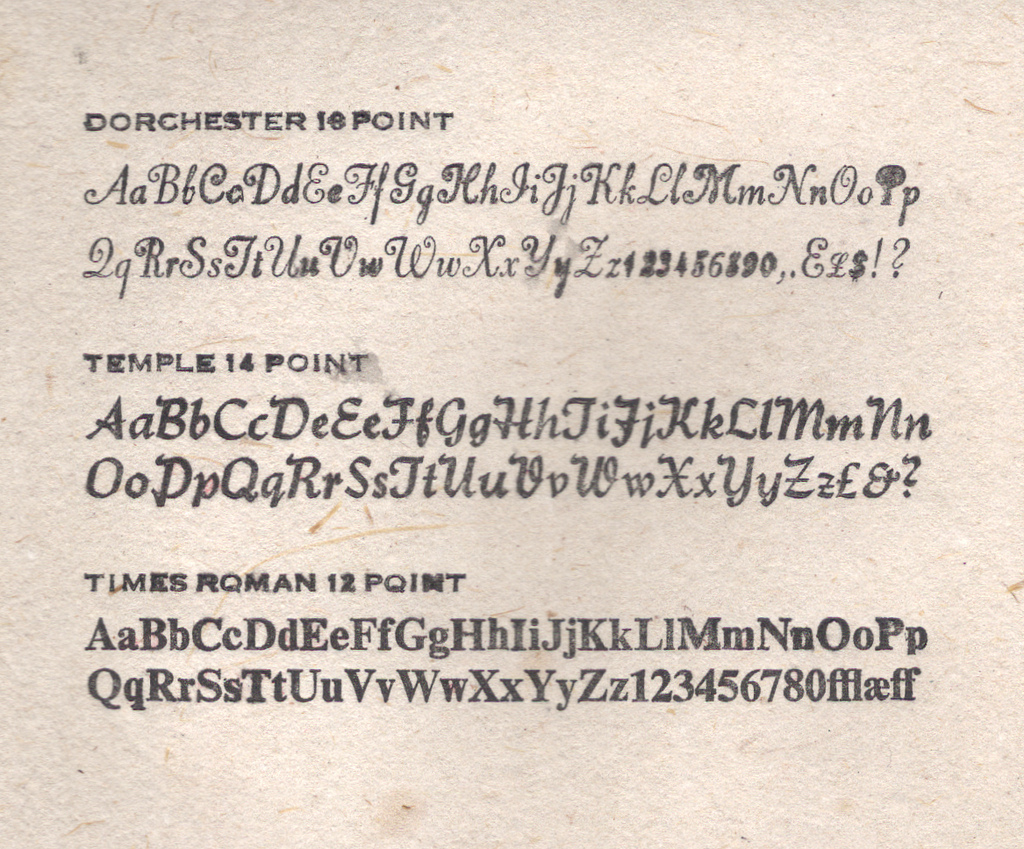
Type Sample (Straw Paper)

I seem to have used a little too much water for my own good but, that said, the effect was rather dramatic: the water loosened up the paper such that the type could “bite in” much more effectively. Because of the different faces in the sample, the effect of this was alternatively good and bad: the Dorchester suffered for it, the Temple looks slightly better, and the Times Roman (truth be told it’s Times Roman Bold) was much improved. Some further experimenting with this technique is in order; I may need a more effective (i.e. less rain-like) way of moistening.

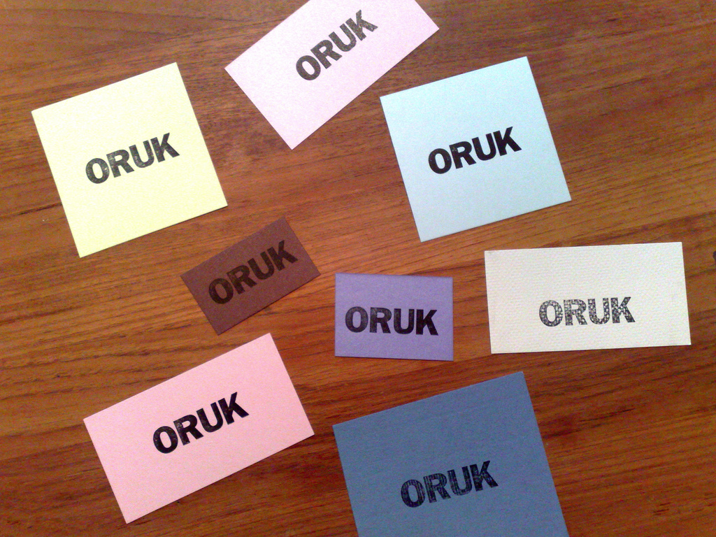
I ended up printing about 2 dozen versions of the type sampler on various weights and types of paper. Here are seven of the most interesting examples:
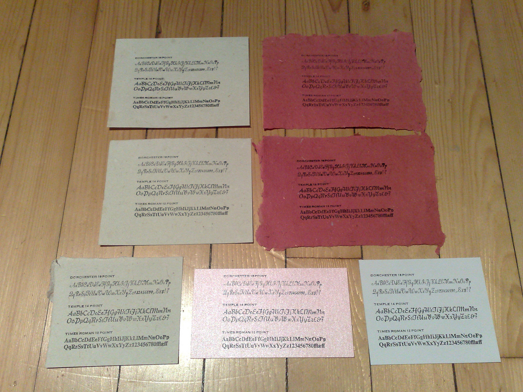
Type Samples, Various Papers

My favourite, if only because it’s the least likely, was the pink card stock (it’s shiny and has a styrofoam-like quality): it took the ink quite well, especially for the Times Roman.

Learning letterpress is very reminiscent of learning computer programming, another trade in which I’ve no formal education: it’s all about test and iterate, test and iterate. See what works and what doesn’t, and evolve.

Fortunately, like with programming, there’s a good body of guidance on letterpress, both historic and contemporary. There is, however, no substitute for the slog. Which is why if you look in the window at Reinvented HQ on the weekends you’ll likely see my hunched over a case of type or up to my elbows in Varsol.
🗓️
Letterpress  •  Education  •  Adana

As quoted in Prince Edward Island and Confederation 1863-1873 by Francis Bolger, an 1873 quote from the Patriot in reference to Prince Edward Island joining Canada:

“On Tuesday, July 1, whether for weal or for woe, Prince Edward Island became a Province of the Dominion. At twelve o’clock noon, the Dominion Flag was run up on the flag staffs at Government House and the Colonial Building and a salute of 21 guns was fired from St. George’s Battery and from H.M.S. Sparton now in port. The Church and city bells rang out a lively peel and the volunteers under review at the city park fired a feu de joie. So far as powder and metal could do it, there was for a short time a terrible din. But among the people who thronged the streets there was no enthusiasm. A few minutes before 12 the Sheriff, Mr. Watson, stepped forward on the balcony of the Colonial Building and read the Union Proclamation. He was accompanied by two ladies and a half dozen gentlement. The audience within hearing consisted of three persons, and even they did not appear to be very attentive. After the reading of the Proclamation was concluded, the gentlemen on the balcony gave a cheer, but the three persons below – who like the Tooley St. Tailors who claimed to be the “people of England” – and at that moment represented the people of Prince Edward Island, responded never a word.”

🗓️

When I was in Montreal earlier in the month I took a Dyad-brand electric bicycle for a test drive. It wasn’t something I went looking for: on a stroll down St. Laurent with my family we stumbled across the dealership, which had just opened the week before, and I went back the next day to take one of their bikes for a ride.

As near as I can tell, Dyad is the local branding for a line of electric bicycles made in China, and the Montreal dealer – they’re on St. Laurent just south of Rachel – is buying direct from the factory. Or maybe he is the factory: the owner suggested that if there was anything I didn’t like, I just tell him and he’d have it changed.

There were three models to choose from.

At the bottom end there was what amounted to a mountain bike with an electric motor strapped on. I took this for a brief spin and it was immediately obvious that while the motor might give an extra kick up a hill, it was more “power assisted” than a motor-powered bicycle.

At the top end was something very Vespa-like in design – to see it you’d think “that’s a cool scooter” and not “wow, an electric bicycle” – and test-driving it I found it weighed as much as a scooter too, and was just too ungainly to imagine as part of my everyday life.

Which left me with the middle of the pack, a model they call the Mojito. I had the option of a quick 15-minute ride for free or a longer drive at $15/hour and I decided to really get a feel needed more time, so I opted for the rental. Here’s a brief tour of the Mojito (not my finest work, but it will give you a taste):

I’d planned to shoot some video of the bike in action too, but I was uneasy enough about remembering which control did which that I decided that it was best to devote all my attention to the driving.

After riding the Mojito around for 45 minutes, I left it impressed with what an electric bicycle could do: I was reaching top speeds of 50 km/h on a hill, going up hills without too much struggle, and the bike handled very nicely, with the nimbleness of a regular bicycle with some of the power of a scooter.

The battery statistics I was promised were a range of about 50 km, a top speed of about 45 km/h and a recharge time, from drained, of 6-7 hours (with a regular household plug). I didn’t ask about the battery life, but I’ve seen similar cycles quoted with a limit of 300-400 recharging cycles per battery, which could mean the battery could need to be replaced as much as once a year.

These limitation means that, unlike an electric scooter, which you can, in theory, drive forever as long as you have a gasoline station in range, you’re limited to a 50 km distance from an electric outlet that you can use to recharge and a 6-7 hour window of time to wait for the recharge to happen. This means, for example, that I’d be lucky if I reached Summerside from Charlottetown on a single charge (about 62 km).

So these bikes are obviously not suited for intercity transit, but rather for quick trips around the city.

All of which makes me wonder, at least in the Charlottetown context, where the electric bicycle fits into the transportation landscape: you can, in theory, take a moped-style bicycle like this anywhere you can take a regular bicycle, and Charlottetown is of the scale that, unless I had to make regular trips to Winsloe and back, I can’t see why a regular bicycle wouldn’t be the better option: no charging or batteries to worry about, no maintenance worries (or at least maintenance worries that I can’t solve myself with a screwdriver and a wrench) and I get exercise in the process.

Don’t get me wrong: driving the Mojito around Montreal was loads of fun – I felt like a gasoline-free Gregory Peck in Roman Holiday – but in the end riding electric bicycle felt a lot like using an electric can-opener: something I could do “manually” without much additional effort and with a lot less complexity.

Am I missing something? Would an electric scooter of this sort work well into your daily routine?

🗓️

If, like me, you’re averse to the notion of fencing public parks for expensive touristic events, you still have a chance to see Cirque du Soleil this week in Charlottetown, as part of their show – the foreplay, if you will – happens outside the gated fortress: every night’s performance begins with a parade down Great George Street from Province House to the water.

Milling around the house tonight around 8:30 p.m. I sensed that something was going on up at Province House – it’s only half a block away – and so I grabbed Oliver and we headed over. Over the next hour it became obvious that a dress rehearsal was in the works: the police motorcycle showed up, the Minister of Tourism showed up, and then lots of tourismocrats holding walkie-talkies landed. And at 9:30 things suddenly sprang to life. It’s an awfully impressive entertainment: juggling, fire-breathing, stilt-walking. They even light Great George Street on fire.

If tonight’s dress rehearsal was any guide – lots of people showed up, out of nowhere – there are going to be crowds. My advice: show up early, say around 8:30, and set yourself up close to the street around Great George and Dorchester: that way you’ll get the best view of the fire-intensive activities, and you’ll be well-positioned to stand up and follow things down for the finish.

🗓️
ORUK Letterpress Experiment
🗓️
Letterpress  •  Adana  •  Oliver

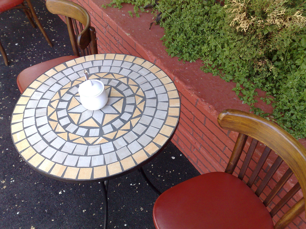
Remember Gusto, the obscurely-located Charlottetown pâtisserie that I mentioned back in October? Well I’m happy to report that they’re still going strong, despite the location (Pownal Street at the corner of King).

They now have an outdoor patio, which is very pleasant as it’s under the shade of some large trees and right next door to the burbling fountain at Technomedia:

Gusto Patio

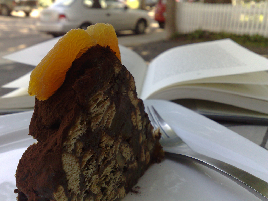
My current favourite from the dessert case is their Mosaik Cake, a very nice mixture of chocolate and apricots the likes of which you won’t find anywhere else on the Island:

Mosaik Cake at Gusto

Gusto also does custom cakes and catering, and the quality and flair that you’ll see in their products is excellent: a few months ago I saw a mermaid-themed cake they’d built to order, and it was fantastic.

If you’re looking for a cool oasis in downtown Charlottetown, away from the touristic Victoria Row hubbub, Gusto’s a good place to wile away an hour.

🗓️
Gusto  •  Restaurants  •  Charlottetown

It had never occurred to me that today’s national holiday in Quebec, Saint-Jean-Baptiste, references the same “John” as Sankt Hans in Denmark, celebrated yesterday. I’ve no idea why Saint John the Baptist deserves our veneration, but he was obviously famous enough to transcend language and culture.

🗓️

For the last few months Oliver and I have been in the habit of going for a walk every night after dinner. Our house is only a few blocks from the waterfront, and our walks usually take us through Confederation Landing Park either coming or going.

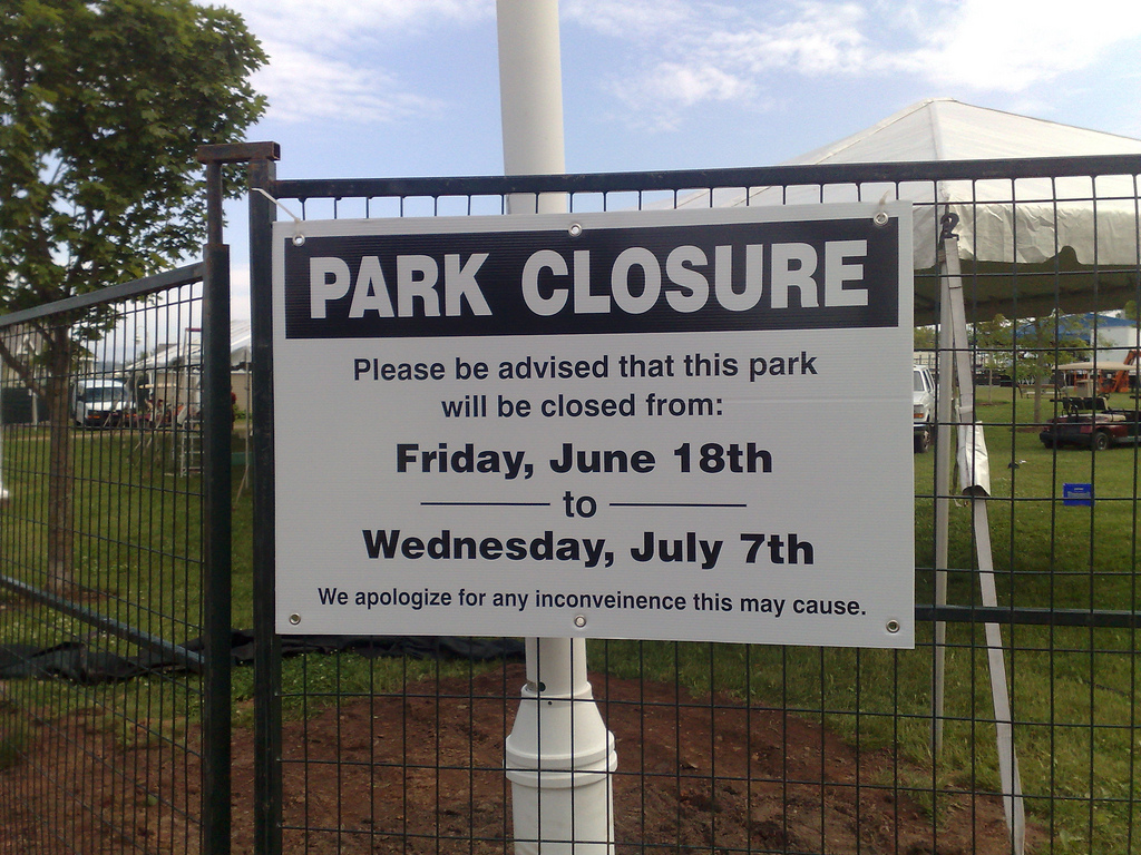
Earlier this week we headed out as usual, down Prince Street toward the park, until we were stopped by this sign:

Confederation Land Park Closure

Confederation Landing Park, it seemed, was closed. And not just closed for the day, or for a weekend, but for 19 days in a row.

Regular readers will know that there’s no love lost between me and the various rock festivals that happen yearly on Charlottetown’s waterfront: over the years we’ve become used to a July 1st weekend full of very loud music and neighbourhood disruption.

While I remain unconvinced that sacrificing the quiet enjoyment of the neighbourhood at the alter of tourism is prudent public policy, at least these interruptions have been restricted to a weekend and the day or two before or after the events for setup and teardown.

But 19 days in a row?

Summer is short in Charlottetown. Confederation Landing Park, especially for we downtown residents, is a pleasant waterfront oasis, and we’ve only a short time to enjoy it: there are basically 10 weeks – 70 days – of summer in Charlottetown, and this closure means that the park is closed to the public for almost 30% of that time.

The City of Charlottetown is rightly proud of its city parks system: parks are a vital resource for quality of life. They are important. They’re an integral part of our daily lives as citizens. They aren’t a “frill” that we dip in and out of, they are part of civic infrastructure, like roads, water, and policing.

When a large public park like Confederation Land gets closed for almost a third of the summer, the message that citizens are sent from the City is “public parks are important, but only some of the time.”

It seems the activities we’re encouraged to engage in when the park is open – walking, running, enjoying the view, playing catch, whatever – are suddenly downgraded in civic importance when something better comes along: “sorry, Billy, you can’t play ball this month, the rich tourists from away need the space.”

This is clearly unacceptable, and it violates the fragile covenant between Charlottetown-for-those-who-live-here and Charlottetown-for-those-who-visit.

🗓️
Tourism  •  Politics  •  Design  •  Customer Service  •  Charlottetown

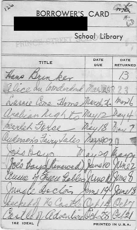
Our friend G. was cleaning up the other day and came across his Borrower’s Card from the Prince Street School Library. G. was a Prince Street student in the 1950s (in the old school). The library was described as follows in Mabel Matheson’s History of Prince Street School:

And our most recent and most ambitious project - the establishment of the Prince Street School Library. This is a unique project - conceived by the principal, undertaken by the staff, originally financed entirely out of school funds, and still largely supported in the same way, although the Board now makes an annual grant; and contributions have been received from organizations end Individuals especially to “The E. Lillian McKenzie Memorial Section” dedicated December 8, 1960. Although still in its infancy, it costs a great deal to feed it. Our brain-child has a voracious appetite!

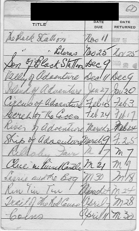
Here’s G.’s Borrower’s Card; as you can see, he had an appetite for adventure:

Prince Street School Borrower's Card Prince Street School Borrower's Card (Reverse)

It would be an interesting experiment to look to see which of these books, if any, remains in the school’s collection.

🗓️

When we were in Montreal earlier in the month, we spent a very pleasant hour browsing through the Drawn & Quarterly Store in Mile End. One the books I bought was the illustrated edition of the Elements of Style. It’s a beautiful book, and it’s also very useful: I hope it will, in time, cure me of my that/which issues.

In the spirit of the book, here’s a brief guide to elements of style more locally:

  1. Rukavina is pronounced with a long u. Think duty, not duck. Like it says here, roo-ka-VEEN-a. Or, if you like, roo-KA-veen-a.
  2. When speaking, I refer to this blog as “r - u - k dot c - a”, spelled out, like “check out my blog at r - u - k dot c - a”. If it must be pronounced, it’s also with a long u.
  3. While this blog is based on a nickname applied to me by my 9th grade gym teacher, ruk is the name of the blog, it’s not my name. So proper usage is “Peter said…” and not “ruk said…”
  4. Like ee cummings, silverorange and the fifth estate, it’s always all lowercase: ruk, not Ruk or RUK. This is sometimes inconvenient, and I’m not sure what to tell you about how to start sentences.
  5. While my last name does start with an R, that’s the only thing that it has in common with the last name Roggeveen. As such, I cannot sell you a Christmas tree.
🗓️

About This Blog

Photo of Peter RukavinaI am . I am a writer, letterpress printer, and a curious person.

To learn more about me, read my /now, look at my bio, listen to audio I’ve posted, read presentations and speeches I’ve written, see things I’ve favourited elsewhere, or get in touch (peter@rukavina.net is the quickest way).

I have been writing here since May 1999: you can explore the 25+ years of blog posts in the archive.

You can subscribe to an RSS feed of posts, an RSS feed of comments, an RSS feed of favourites elsewhere, or a podcast RSS feed that just contains audio posts. You can also receive a daily digests of posts by email. I also publish an OPML blogroll.

InstagramYouTubeVimeoORCIDOpenStreetMapInternet ArchivePEI.artDrupalGithub.