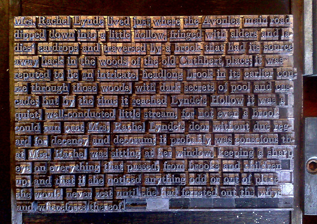
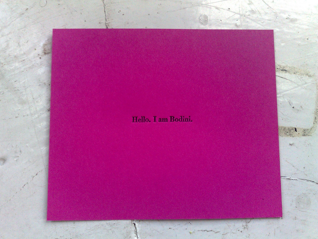
This afternoon I finished setting the type for the first sentence of Anne of Green Gables in Bodoni 12 point. I took a photo of the type in the chase and then digitally mirror-imaged it to allow me to proof it; here’s what that looks like:
I’m still thinking about the ends of each line: as you can see I threw in a couple of hyphenated word breaks to keep the right edge relatively uniform; I don’t think I’ve got it in me to do a full justification, but it would probably be a good exercise to go through.
Once I’d sorted my type drawer, the setting went much more quickly because I could be relatively confident that pulling a given letter out of the drawer would result in that letter being in my hand (before sorting it was a 50-50 chance it would be the wrong letter). The exercise also drilled the California job case layout into my head, so I now find myself almost being able to reach for the right letter without looking at the case layout diagram.
The other lesson learned: my case of Bodoni doesn’t have enough lower case d’s to set much more than this: I only have a half-dozen left over.
Who among us has not encountered the retailer or store-keeper looking for a website that “helps to communicate their brand identity” with elaborate ornamentation like this.
With all my lowercase Bodoni sorted into place, I needed a break from the pitter-pat of sorting type, and so I turned my attention back to setting the type for the (marathon) first sentence of Anne of Green Gables.
Once I got to eight lines I decided it was time to see how it was shaping up: I packed the type into the chase (not spending a huge amount of time on makeready), put some ink on the Adana Eight Five, and gave it a go. Here’s the best of about 3 dozen proofs I printed:
If you click on the image to view it in Flickr you can hover over the image to see notes about all the things that need correcting – u’s for n’s, and so on.
I used this opportunity to do a lot of experimenting with the various adjustments on the press, not all of which are well-oiled and fully-operable; I found that even tiny, tiny turns of the screw that adjusts how close the bed is to the platen (there are four of these, one in each corner), could result in one side or the other receiving no ink at all. I need to do some more experimenting with these controls to understand more about how to do it right.
I also experimented with different papers, and I’ve come to realize that the standard-issue 110 lb. white card stock from Staples is probably not the best paper to use for letterpress: it simply doesn’t have enough “give”, and so everything I print on it seems like I’m fruitlessly smashing my head against the wall. Here’s the maladjusted press printing on card stock:
By contrast, the (much nicer) first example above was printed on HazelTree straw paper; there’s too much ink on that one, mostly because I’d over-inked the press in an attempt to have more success with the ill-fated card stock. But the oatmeal paper is about 1000% better than the card stock: the type feels like it’s biting into the paper just the right amount. I’ll have to swing by HazelTree soon to pick up more.
Meanwhile, I’m about halfway through setting the type for that first sentence, and the result should just about completely fill up the available space inside my 8 inch by 5 inch chase. Stay tuned.
So when you call me at 892-2556, it’s Asterisk that’s answering the phone (and possibly taking a message). And when I’m in Europe it’s Asterisk that’s taking your call, making a call to my European mobile, and conferencing the two together, giving you the illusion that I never left town.
Until this morning, calls from Asterisk to me here in the office got routed from my Asterisk server downstairs over Ethernet to a switch and on to a Sipura SIP device into which a regular old Nortel telephone was plugged.
This system worked well, had great call quality, and I was generally happy with it.
In recent years, however, I’ve been having more (and longer) conference calls with clients, and the ergonomics of cradling a phone in my neck meant I needed to find a better solution; I found it in Telephone, a simple and elegant Mac VOIP client that lets me route VOIP calls into my Macbook and talk and listen using a headset.
This is much better ergonomically, lets me answer calls anywhere I have Internet and has the additional benefit of allow me to clear a lot of cables and other devices out of my office.
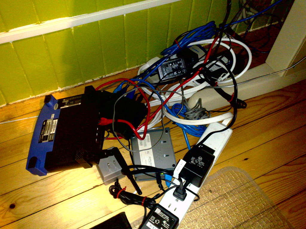
Here’s what the space under the left side of my office desk looked like before I cleaned out everything required to run the regular old telephone:
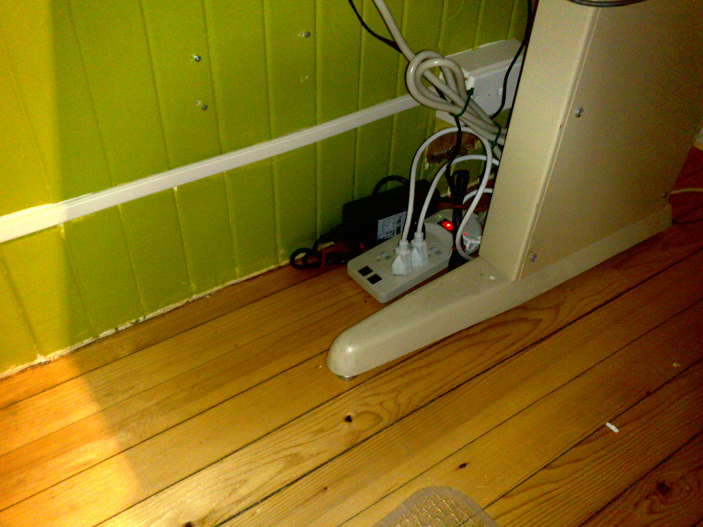
And here’s the same space after I cleared everything telephone-related out:
Without the telephone (and its power brick) I didn’t need the SIP device (along with its power brick), I didn’t need the switch (along with its power brick) and I didn’t need to run Ethernet into the office at all.
My next step? I’m thinking about going completely digital, converting 892-2556 from an Eastlink POTS line into a digital line riding in on the silverorange T1 like the 367-3694 transit information line. I’ve resisted this for a long time (to the consternation of my landlords, who had to go to great pains to keep the analog box attached to the back of the building) but, on reflection, my resistance seems silly, especially because going digital means I would finally be able to have incoming calls identified (the old Digium analog board could never seem to handled call display data properly).
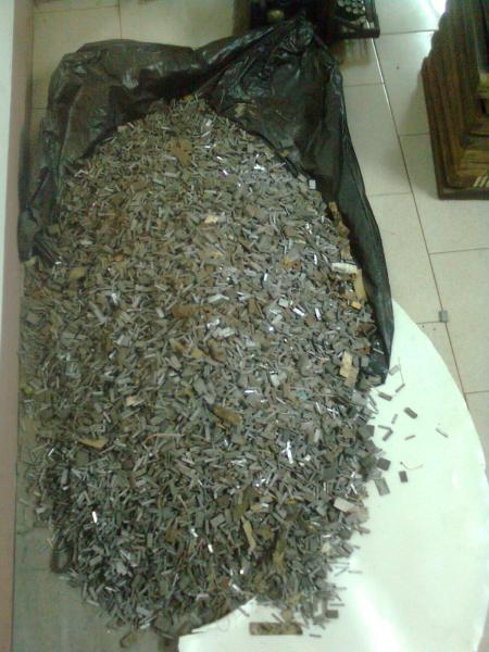
It seems that my recent acquisition, 30 pounds of Bodoni 12 point, is a little less “sorted” than I would like it to be.
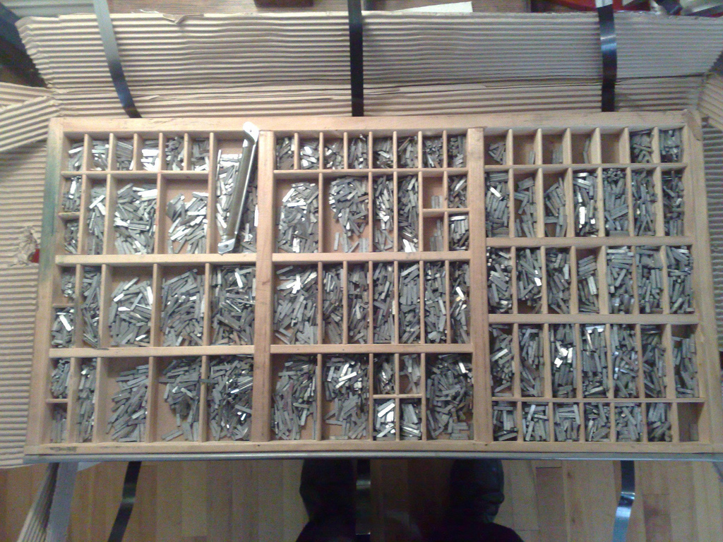
The type arrived in California Job Case, which is essentially a drawer with dividers that make compartments for each letter:
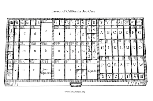
The placement of each letter is standardized by tradition; here’s the California layout (from briarpress.org):
As soon as I started to set my first paragraph with this type I started running into problem: I was pulling more non-letter-d’s out of the d’s than I was actual letter d’s; I had l’s in my t’s and b’s in my q’s.
A collection of completely unsorted type – like this – is called pied type. What I’ve got is certainly much, much better than that. In my case it seems that the mis-sorting is a combination of simple laziness on the part of previous printers combined, perhaps, with a desire to fill up every letter’s compartment with something to increase the perceived resale value of the type (I’m confident this didn’t happen at Don Black Linecasting, where I bought the type, but rather at an earlier stage of its life).
So I have two choices: put up with it and handle the mis-sorting as I go along – death by a thousand cuts, perhaps – or buckle down and sort everything out in advance.
I’ve opted for the second, and am now making my way slowly through each letter.
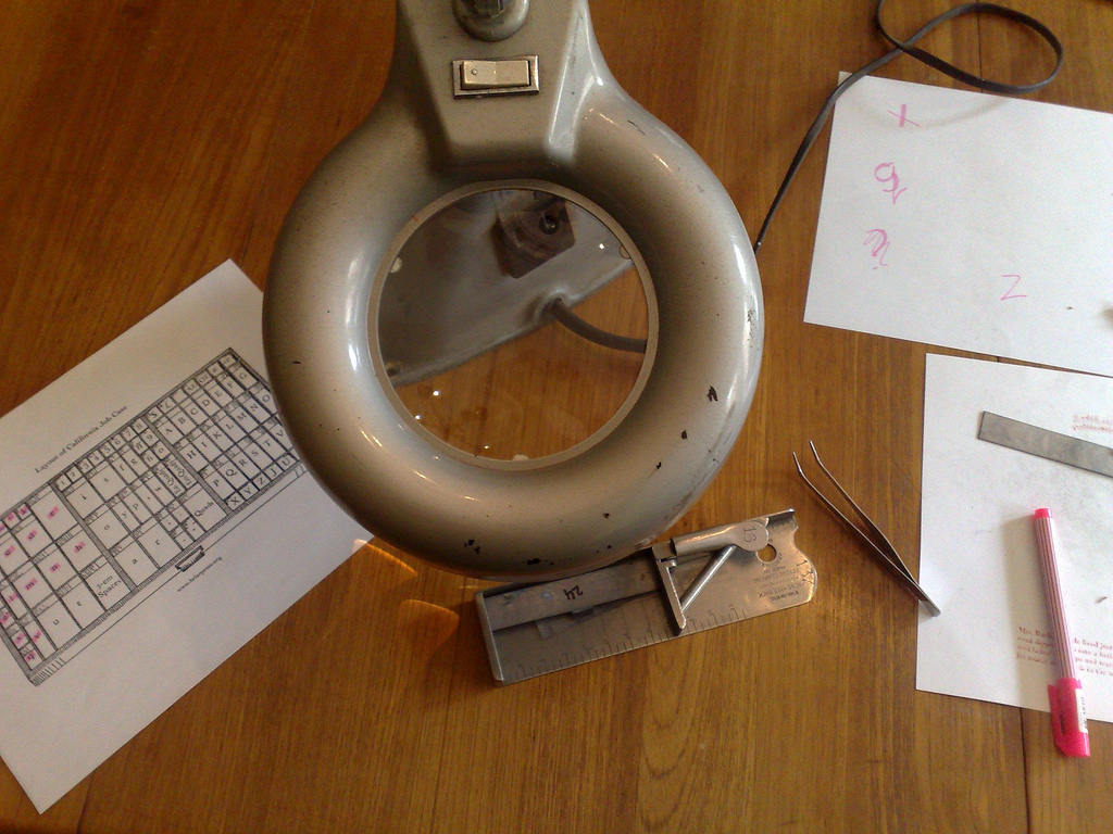
I pull all the type for a single letter out of the case, sort it into a composing stick, and then use a lighted magnifying glass (thanks to Catherine the jeweler for the lend of this!) to pull out every mis-sorted letter with a pair of tweezers (also from Catherine – it helps to have a silversmith in the family).
If you look at the job case layout above, I’ve made my way from the top-left corner – ffi – across through fi, ‘, k, j, ? b, c and d to e, and and then down through !, z, l, m, n, h, x, q, and v.
It’s tedious (though oddly relaxing) work, but it does have the surprising upside of making me very intimate with Bodoni letter-shapes and with the Calfornia job case layout (and given me cause to wonder whose idea it was to locate the ! and l characters and the z and x characters right beside each other – even under a magnifying glass x and z look almost exactly alike).
When I’m done – it will likely take me another week or so, working an hour or two a day – I’ll have a completely sorted case of job, and from then on I’ll have only myself to blame for mis-sorted type.
This type-sorting process is very evocative of the process I used to go through with my TRS-80 Model One computer and program listings from Creative Computing magazine. The magazine used to publish programs that enterprising geeks like myself could type in, line by line, to our computers to run locally (this was pre-Internet and, indeed, pre-cheap-transfer medium of any kind).
It would take hours and hours to type in a decent sized program. And then some more time to correct all the typing errors that prevents the program from actually running. Like sorting type it was tedious work, but the result was an intimacy with code that I’ve not experienced since; I get the same feeling from sorting type: there’s a knowledge of metal type that can only be gotten by examining each and every letter of a font under a microscope.
Did you know that the first sentence of the first chapter of Anne of Green Gables, a paragraph long, contains 148 words? It just goes on and on and on. There are 831 characters, punctuation marks and spaces in all. And 46 of these are the letter d.
Mrs. Rachel Lynde lived just where the Avonlea main road dipped down into a little hollow, fringed with alders and ladies’ eardrops and traversed by a brook that had its source away back in the woods of the old Cuthbert place; it was reputed to be an intricate, headlong brook in its earlier course through those woods, with dark secrets of pool and cascade; but by the time it reached Lynde’s Hollow it was a quiet, well-conducted little stream, for not even a brook could run past Mrs. Rachel Lynde’s door without due regard for decency and decorum; it probably was conscious that Mrs. Rachel was sitting at her window, keeping a sharp eye on everything that passed, from brooks and children up, and that if she noticed anything odd or out of place she would never rest until she had ferreted out the whys and wherefores thereof.
I know this because I’ve decided to use this sentence as a way of taking my Bodoni out for a ride.
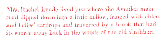
It turns out that my Bodoni wasn’t exactly lovingly handled in its previous home: I’m batting about 50% pulling letters out of where they are supposed to be. There are u’s where there are supposed to be n’s, and almost everything but d’s where the d’s are supposed to be. But I’m making my way. Slowly. Here’s a rough proof of where I finished off tonight:
It’s taking me about 10 minutes a line right now, in part because I’m just learning my way around the California job case layout.
There are 102,232 words in Anne of Green Gables in all; at my rate of about 1 word a minute, it would take me about 150 days to set the entire book (working 12 hour days).
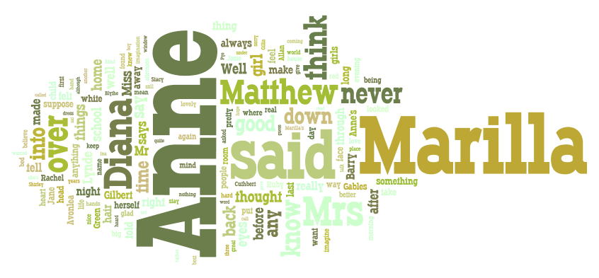
Longtime readers may recall the Anne of Green Gables Wordle I made a few years ago; this is a good map for where my hands would be heading were I to proceed; I would need many, many capital letter A’s.
Oliver and I were snuggled in front of our workstations here at the office on Sunday afternoon, content to spend an afternoon at work and play, when I was suddenly struck with one of those “oh my, winter will be here soon” revelations. At that exact moment I read this Tim Chaisson tweet:
heading up to souris to play a show in the park! last ‘morning fold’ show of the summer on pei, should be fun :)
With winter bearing down on us, and the added attraction of this being the last show of the summer, we had no choice: we detached from our desks, piled into the car, and headed east.
So the opportunity to hear Tim Chaisson and his group on home turf in Souris, for free, was simply too good to pass up.
I was not disappointed.
We got to Souris about 30 minutes after things were supposed to be starting – Souris is far away – and so we were just in time to catch two songs from Brielle Ansems, the opening act. Man, does she ever have a voice; she’s someone to watch for:
Twenty minutes later, Tim Chaisson and Morning Fold were on stage. And while this was a tiny free concert, with, it would seem, mostly Chaissons in the audience (and mostly Chaissons over 60), the band was as good as ever, and they came with a full kit and very good PA. Like I tweeted later, it was like seeing The Beatles in Liverpool.
When the concert was over we found ourselves in Souris and needing a place to go for supper.
My first thought was the Indian restaurant we’d eaten at least year, over by the hospital. We swung around there and found, alas, that it was all boarded up and overgrown. Back into town we stopped at the tourist information centre and asked for advice: our friendly travel counsellor confirmed the demise of the Indian place (and from her non-enthusiastic description of it you could derive some of the reasons why an Indian restaurant in Souris might not work out). Our choices turned out to be the Bluefin in Souris, the Sheltered Harbour in Fortune and the Sandstone in North Lake.
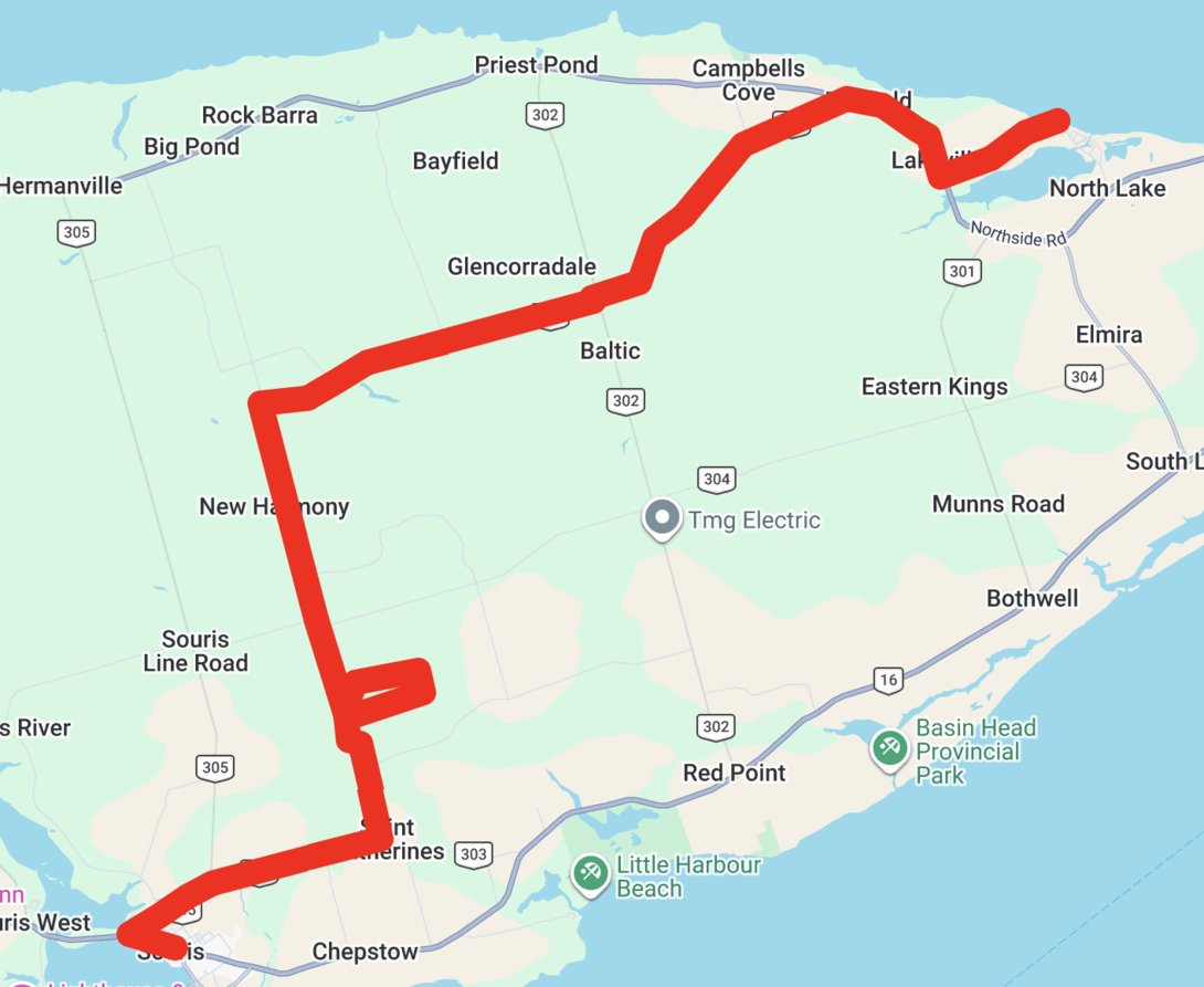
My personal mantra being “when in doubt, go to North Lake,” we headed off deeper into the heart of the eastern tip of the Island. My other personal mantra being “why go the regular old highway when you can go overland,” we found our way, with Oliver doing a decent job of navigating, to route 305, which led to route 335, which led (and so on). Each road smaller than the previous.
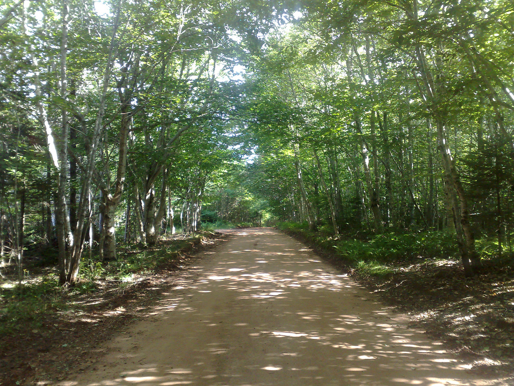
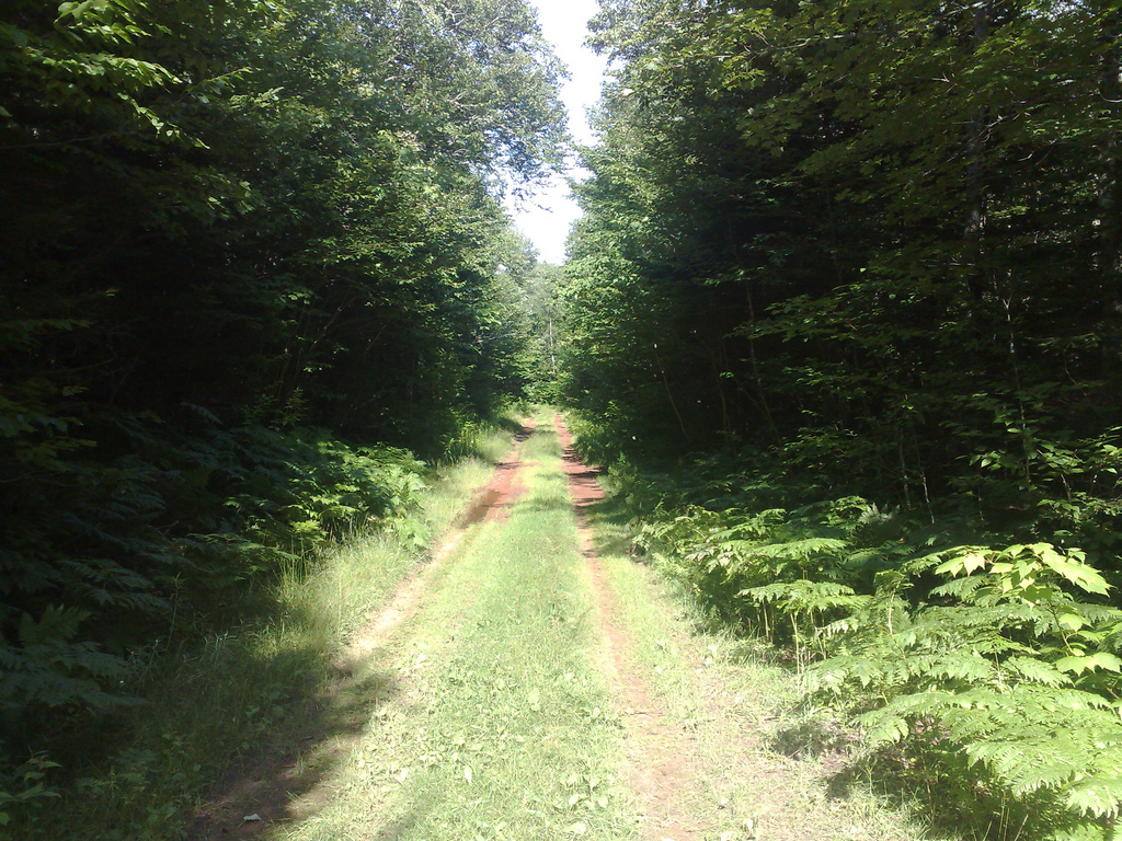
So what started out as a regular old highway, soon became this:
A few minutes later we arrived at the New Harmony Demonstration Woodlot and, being woodlot fans as we are, we swung in for a look. This ended up as a futile attempt to find the parking lot and trailhead and instead became a harrowing journey looping completely around the woodlot on a road like this:
There were a few times, faced the mud puddles of unknown depth, that visions of walking back out to the highway danced in my head. But we made it, the only drama being running into another car when we were at the very farthest point from civilization, a car driven by ruffians wearing headscarves that I reasoned it was best to not stop and chat with.
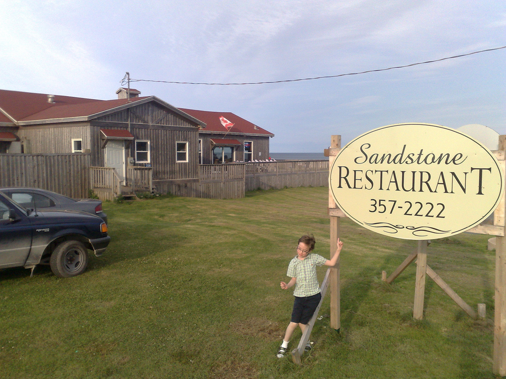
We emerged from the red clay roads mere steps from North Lake and the Sandstone:
The Sandstone, it turns out, is an uncommonly good seaside restaurant. I had a platter of fresh haddock, scallops and shrimp that, while slightly over-paprika-ed, was wonderfully cooked and was accompanied by potatoes – “baby reds cooked on the grill” the were described to me – that were out of this world. Oliver had a kids portion of fish and chips that he made short order of. I finished up with a slice of strawberry-rhubarb pie and Oliver with a moist chocolate brownie. The service was quick and friendly and their only misstep was prematurely clearing away our mostly-finished meal while we were off to the bathroom (how do single parents cope with this? it’s the second time it’s happened to us).
We emerged from the Sandstone around 6:30 p.m. with thoughts of taking in the Monticello ceilidh up the road, but decided to head back to town so as to not be out to all hours. With map in hand Oliver navigated us along Route 16 to St. Peters, memorizing the names of the communities along the way – Priest Pond, Rock Barra, Hermanville, Clearspring, St. Margarets, Naufrage, Monticello, Goose River – and by 8:00 p.m. we were pulling into the driveway at 100 Prince Street.
Elephant magazine is a lush magazine with sharp typography and beautiful illustrations. Unfortunately it tethered strongly to print, and its web presence, such as it is, it more digital paper than useful companion.
The latest issue has a fascinating section on “microworlds” – artists and photographers who create worlds in miniature. By way of helping others who found this equally fascinating, here are the artists that were profiled:
That seems like a sufficient microworlds bibliography to give anyone a foothold on this artistic sub-genre.
For me it’s less about the art than it is about pondering what wonders I could have created in the sand pit under the willow tree in our back yard when I was a kid had I had access to such inspiration.
You can buy the printed Elephant at Indigo in Charlottetown, or you can buy a digital copy from the magazine itself for 10 EUR.



 I am
I am  You can subscribe to an