
This is a picture of a situation that, in the world of pedestrian traffic signals, should never happen: the “walk” signal is still counting down while the light for cars is red, and the light for cars crossing is green. It’s at the north-east corner of Prince and Grafton Streets in Charlottetown, and it’s a signal that’s been problematic for at least a month.
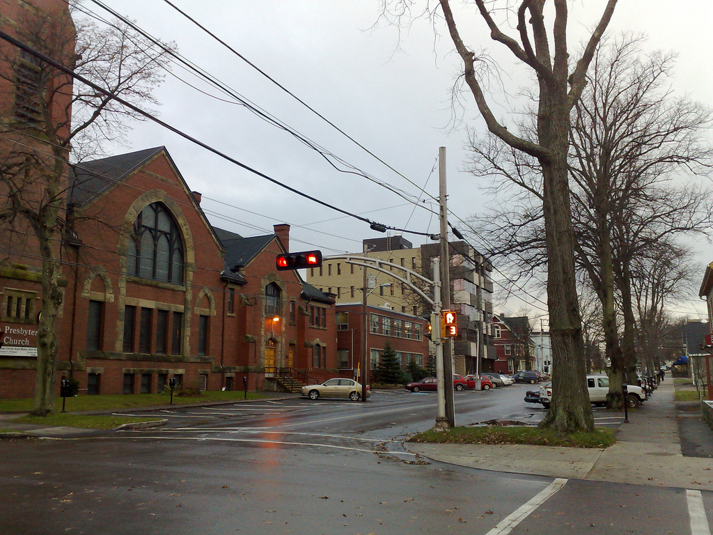
When the signal first started to fail, it would count down from 50 seconds while the light on the other side of the street would count down from 30. And then, suddenly, when it had counted down from 50 seconds to 30 seconds, blamo, it would turn red, despite the fact that pedestrians might very well be mid-intersection.
I’m the kind of person who sees things like this and immediately runs a thousand mental scenarios, most of them involving frazzled parents with multiple children, that all end up with someone getting run over by a transport truck; many Charlottetown drivers don’t pay attention to the signals when they’re working – who knows what happens when they’re broken.
And so I immediately called the City of Charlottetown Public Works Emergency After-Hours line, thinking, naively it appears, that they’d send someone right out: even settings aside the possible real dangers, traffic lights only work because we believe in them, and as soon as there are cracks in that, everything starts to fall apart.
And, besides, if the pedestrian signals were malfunctioning, who’s to say that the signals for cars, presumably controlled by the same box, wouldn’t start misbehaving too, and then you’d be talking about doubly real problems.
I waited a few days for the problem to be fixed. It seemed to correct itself, at least partially: the countdown timer stopped working completely. Then it started up again. I waited another week, and then sent a follow-up email to Public Works. I got a quick reply – “We have asked our electrical contractor to review and seek repair.” – and then nothing.
That was 10 days ago.
This morning I emailed the chairs of the Police and the Public Works committees, as well as our new councillor for ward one, and I just heard back from the chair of Public Works, Terry Bernard:
I have received word that the pedestrian signals are malfunctioning and can not be repaired. We ordered new ones today due to arrive Tues next week and will be installed then.
While it’s nice to hear that the problem has been identified and will be solved, surely a problem as serious as this shouldn’t take this sort of effort to get solved, should it?
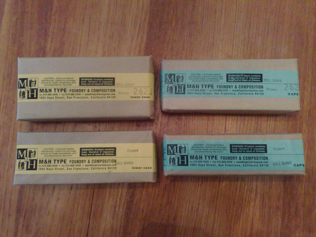
Newly arrived from M&H Type Foundry in San Francisco, Gill Sans in 18pt. and 12pt., caps and smalls. Never have I been so excited by the delivery of lead by post.
For almost three years we’ve been using Trac as a project and issue management application in our work with [[Yankee]]. This after many years of experimenting with other systems, some homebrew and some open source, none of them satisfying.
Trac hits the sweet spot for our team between comprehensiveness and brevity (nobody wants to fill in a 3-page form just to submit a bug report, but we do need a basic template of information to be efficient).
What this means, day-to-day, is that any work that any member of the web team, inside Yankee or outside, is going to take on gets an “issue” (aka “ticket”) created for it, using a web form that looks like this:
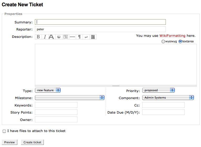
With any tool like this, one of the key pieces of information is how work gets prioritized (it’s the “Priority” field in the form above). And how this is handled generally depends on whether you’re on the “client” or the “server” side of the issue – the person who needs the work done or the person who’s going to do the work.
The simplest way to handle this is by simply assigning a ranked priority: priority 1 jobs get done before priority 2 jobs, and so on.
The problem with this is that while it allows for relatively fine-grained control on the client side, it tends to make programmers and designers feel “boxed in” by a strict order of operations. (Programmers and designers, as a rule, don’t like to be told “okay, work on this now.”)
To deal with this, we’ve come up with a system that gives the “clients” enough information about when their issues will be addressed (right now, soon, someday, never) and gives the “servers” (programmers, designers, QA people) enough flexibility to have a self-directed workday with some variety.
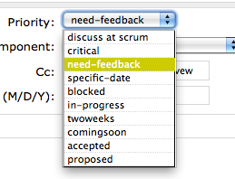 We’ve evolved a set of priorities with Yankee that work for our team; to keep things as simple as possible we add new priority settings with some reluctance, and only if everyone’s in agreement. Here’s what we use, and what each priority means in practice for us:
Discuss at Scrum: We have a weekly conference call with all members of the team present, to go over the issue queue, and assigning this priority means “we need to be sure to have a discussion about this,” generally because there’s some question about the issue or its priority. This is the priority we added most recently, and it’s saved us a lot of time at our weekly call because we don’t need to review the status of every ticket, only the ones here.
Critical: Drop everything else and work on this right now: there’s a problem with code, design or infrastructure that’s breaking something; we work on critical tickets to the exclusion of everything else.
Need Feedback: Generally a place for issues to go after work is essentially complete but before closing them. We put issues here when the person doing the work is finished, but before the issue is closed, if there’s some question as to whether the issue was really addressed, or if further information is needed. It’s a sort of short-form way of handling “Dave, please take a look at this and if everything is okay you can go ahead and close the issue out.”
Specific Date: If something absolutely has to happen on a specific date – a campaign released or a contest turned off, for example – the issue goes here. We have a “due date” field for issues that need to be completed by a certain date, this is for situations that are time-sensitive and need to happen on a specific date. It’s the least concrete of priorities, but it’s served a useful purpose for us.
Blocked: Issues go here if work can’t move ahead, either because some amount of time has to pass – we implement a change and need to wait a few days to see whether it worked – or because some third-party needs to take action before we can proceed.
In Progress: I’m working on this right now.
Two Weeks: We have a two week development cycle, and so work to break down all projects into bite-sized chunks of 2 weeks or less. Giving an issue this priority means “we’ll work on this issue during the current two week cycle” and it’s really the heart of the prioritizing system from the “doing the work” side of the equation because it allows us to treat all items with this priority equally, creating a sort of “smorgasbord” from which we can chart our daily work routine.
Coming Soon: An issue that’s “on deck” for a “two weeks” priority, but that we’re not ready to start work on yet. There’s an ever-present danger of issues languishing here forever, and if there’s a weak point in our system it’s that we need to be more disciplined about revisiting issues here regularly to prevent that from happening.
Accepted: An issue that we’ve agreed will be worked on someday, but that’s not being worked on right now, and it’s “on deck” for work soon. At worst this is where issues go to die, but we’ve been pretty good at either marking an issue as “won’t fix” and removing it entirely if we know we’re never going to work on it, or putting it here if we know we really are going to work on it, just not right now.
Proposed: All newly created tickets that aren’t “critical” start here, get discussed by the whole group at our weekly meeting, from which they either get rejected (marked as “won’t fix” or “duplicate”) or assigned another priority. Having this be the single point of entry for tickets is both a good filter and means that everyone’s eyes are, at least at the very beginning, on every ticket that gets created.
This list of priorities has evolved over time – the last item on the agenda of our weekly call is a “process review” where we talk about things like this. The most important aspect of the system is that there’s a shared understanding of what each priority means (so that, say, “this is really important to me” issues don’t get mis-prioritized as “critical”); the most challenging aspect is convincing everyone on the “client” side that when we say “two weeks,” it really means “two weeks” to the point where they can be comfortable enough to trust the system and not develop a out-of-Trac side-system for maintaining the “real” priorities.
When I compare “life with Trac” to life before, I can’t say enough about how it’s improved our long-distance working relationship with Yankee, and, I think, the efficiency of the web team inside and outside Yankee as a whole.
I see having some issue management that’s not “categories in my private email inbox” is a vital part of every project I take on now (to the point where I’ve sometime wished for “Trac@Home”, a system where I could maintain issues like “get glass for front door fixed” and “pick up milk”).
I took my new Reinvented logo engraving out for a ride this afternoon, printing it on 200 lb. Crane Lettra card stock. There was a small issue with the “bottom swoop” that I think I can solve by adjusting the pressure and the press packing, but otherwise it turned out very well:
The Reinvented Inc. logo in metal, produced by The Augustine Company. Original design by Tom Hughes (whose original EPS file simply got converted to a PDF and emailed to Iowa).

The City of Charlottetown has a serviceable website with one fatal flaw: a very annoying video of Mayor Clifford Lee that’s forever popping up right when you’re looking for the telephone number for Public Works to tell them about drowning puppies or felled trees:
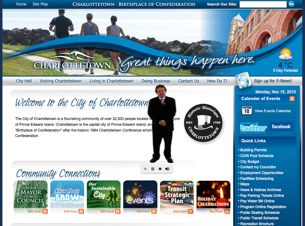
This is the kind of thing that gives the Internet a bad name, and the kind of thing that’s only looked upon kindly by those of a public relations bent (one can imagine the “wow, that would be cool” reactions when idea was proposed; there should have been a chaperone in attendance to ward this off).
Fortunately, what the web giveth, the web can easily take away. Here’s how you can make the tiny talking mayor permanently disappear, at least from Firefox:
- Location your Firefox “Profile” directory – find help here.
- Inside the directory, you should have a directory called chrome.
- Inside that chrome directory, either create or edit a file called userContent.css and inside that file put this CSS.
- Restart Firefox.
From there on in, you should forever be free of the tiny video mayor (should you ever have the desire to revisit the video, non-tiny-style, go here for a full-screen experience).
For a while there it looked like we’d be traveling to Tokyo instead of Germany this fall. Europe won out, but Tokyo’s still high on my list, and by way of experimenting both with the city and with what’s available on the iDevices Tokyo-wise, I bought the Wallpaper City Guide to Tokyo.
Populated with Wallpaper magazine content, it’s a useful way to get a quick overview of the city; here’s the “contents” screen:
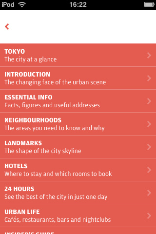
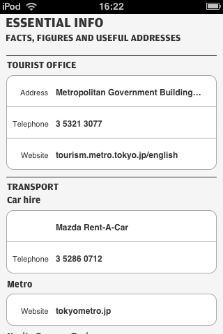
My favourite aspect of the application is that rather than trying to be a comprehensive guide to Tokyo, it’s a highly-curated stripped-down guide to Tokyo. In a world where Google can tell us 785,000 places to rent a car in Tokyo, the simplicity of “just go to Mazda Rent-a-Car” is very, very appealing:
We’re moving from an era where we were prisoners of scarcity of information to an era where we’re prisoners of choice; I’m convinced that there’s an unfulfilled demand for opinionated niche travel advice, the kind of advice that says “if you like Frank Gehry, go and visit these 6 places” instead of “here are the 2,600 things to do in Paris this weekend.”
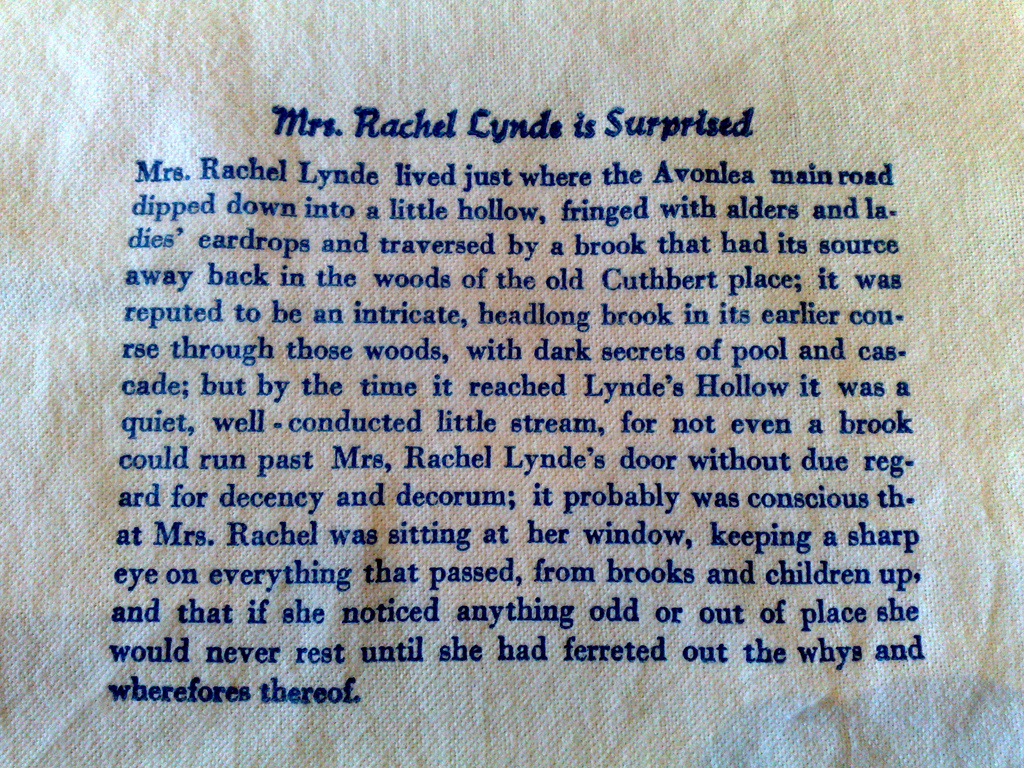
The first sentence of Anne of Green Gables printed on cotton fabric with an Adana Eight Five letterpress, using blue soy-based ink.
I use a modified Linksys WRT-54G wireless router as the heart of the Reinvented network here at HQ. It’s not an industrial strength router, but we’re not sending people to the Moon here, and it’s been pumping along just fine for 7 years.
Until last night at 8:00 p.m. when, for some unknown reason, it closed its pipe down to a trickle, effectively replicating dial-up bandwidth. The effects on the infrastructure here, which expects broadband, were somewhat chaotic, and as a result the mail stopped flowing, this website went offline, and a cascade of other less significant side-effects resulted from there.
It took some time to trace the problem back to the router, and all it took after that was a quick unplug/replug and the data started to flow strong and free once again.
With the exception of 178 Nagios messages in my inbox waiting for review – one of the weak points of the operation here is that the monitoring server is monitoring itself, and can’t send email out if something like this happens – all is back to normal.
Just another Saturday morning…
Somewhere – likely on the excellent BriarPress.org – I read that one way of obtaining ink to use with your letterpress is to ask local print shops for their “so little ink in the bottom of the can that we’re going to through it out” cans of ink. And so I did: I asked the personable Shawn at Kwik Kopy – you remember, Shawn – and he generously had the excess ink cans hanging around the shop rounded up for me.
It’s a motley collection of grungy-looking ink, but once you scrape off the think skin of congealed old ink off the top, there’s enough ink to keep me printing for the rest of my life. And so now I can print in colour! There’s several versions of red, a magenta, a very nice blue, and some colours I haven’t quite been able to identify yet.
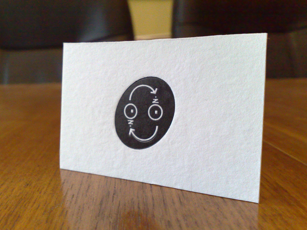
With the new old ink burning a hole in my pocket, I just had to print something this afternoon, so, with the type I borrowed from Holland College on its way back next week, I decided to do a two-colour variation on the business card. Here’s the result:
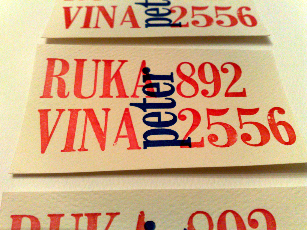
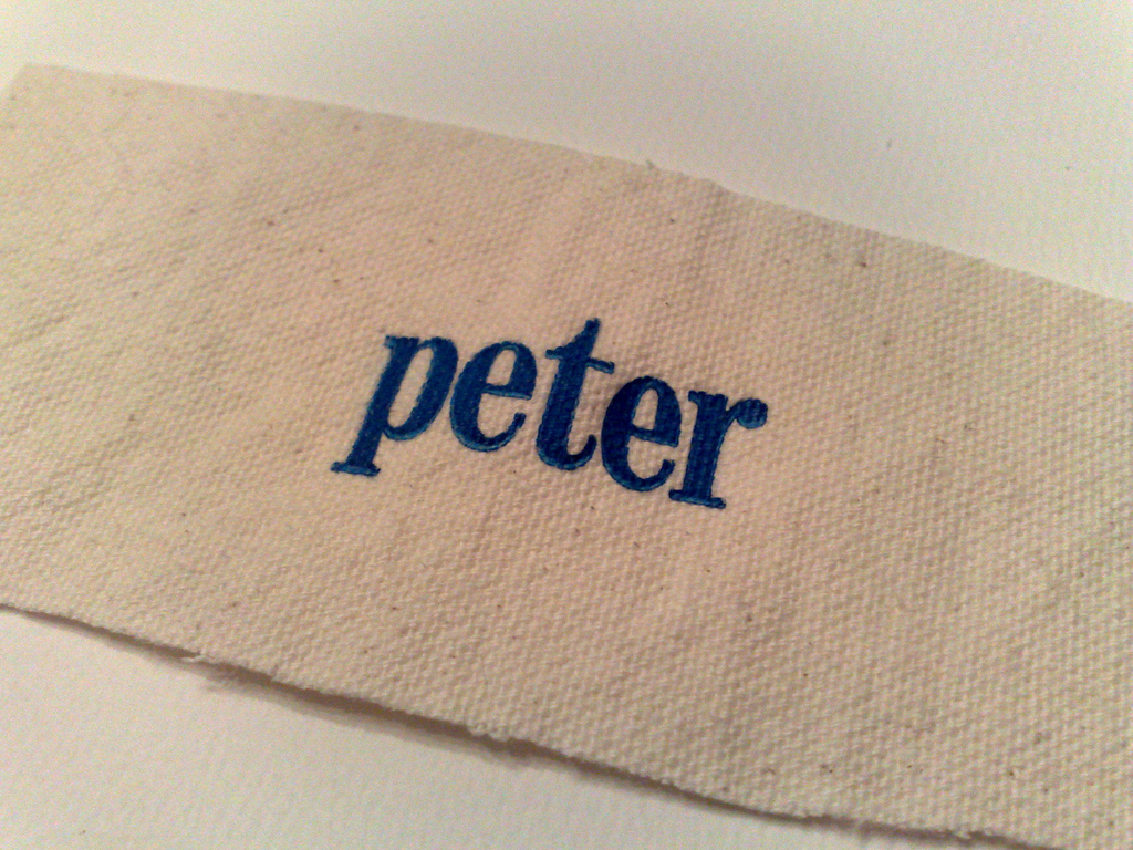
The blue is an especially dreamy ink: it seems to print almost anything with rich dark luscious blueness. Here’s just the “peter” printed on a piece of canvas that [[Erin]] left in the shop so I could try printing on fabric:
It’s time now to start printing things that aren’t vanity items or Anne of Green Gables-related. My first real-world project will be printing the raffle tickets for the Prince Street School Christmas Raffle; we need 300 of them, so I’ll have tired arms when that job’s done. Maybe I’ll print them in purple!
About This Blog
 I am Peter Rukavina and this is my blog. I am a writer, letterpress printer, and a curious person.
To learn more about me, read my /now, look at my bio, listen to audio I’ve posted, read presentations and speeches I’ve written, or get in touch (peter@rukavina.net is the quickest way).
I have been writing here since May 1999: you can explore the 25+ years of blog posts in the archive.
You can subscribe to an RSS feed of posts, an RSS feed of comments, or a podcast RSS feed that just contains audio posts. You can also receive a daily digests of posts by email.