
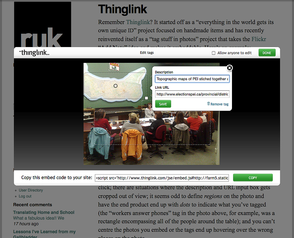
Remember Thinglink? It started off as a “everything in the world gets its own unique ID” project focused on handmade items and has recently reinvented itself as a “tag stuff in photos” project that takes the Flickr “Add Note” idea and makes it embeddable.
Thinglink is not without its annoyances: the “draw a rectangle around the thing you want to tag” tool doesn’t seem to start drawing where you click; there are situations where the description and URL input box gets cropped out of view; it seems odd to define regions on the photo and have the end product end up with dots to indicate what you’ve tagged (the “workers answer phones” tag in the photo above, for example, was a rectangle encompassing all of the people around the table); and you can’t centre the photos you embed or the tags end up hovering over the wrong places on the photo.
But I’ve wanted something like this for a long time – I was tired of writing “to see the notes in the photo go to Flickr” – and Thinglink certainly does the job.
And there are some cool things about Thinglink beyond the basics. I like the fact, for example, that I can edit tags in-place where I’ve embedded a tagged photo:
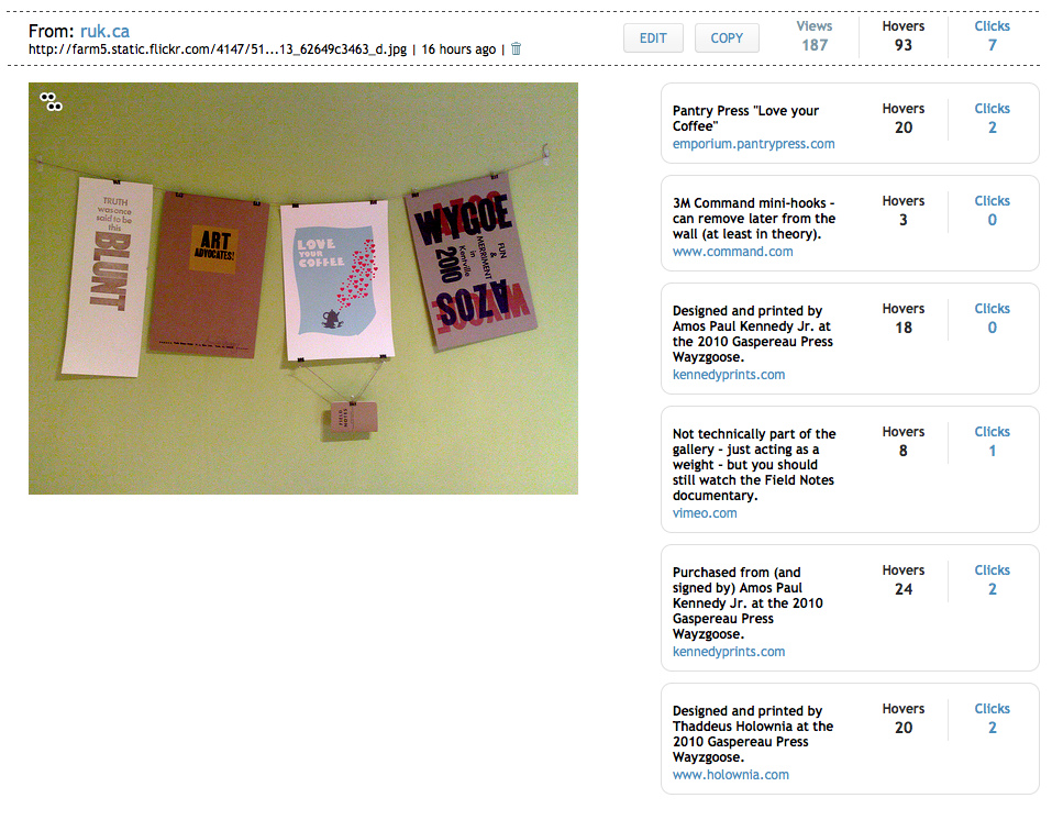
And I like the statistics that Thinglink provides on its website about hovers and clicks over embedded tagged images:
I’m a little nervous about using Thinglink for Serious Work because of its corner-turning past – what did happen to all those unique ID numbers that got assigned to all those things? – but it’s a useful enough tool, with a dead-simple-enough UI, that I might be unable to contain myself.
I’ve been accumulating examples of letterpress printing, and needed a place to hang them, so I strung a length of twine between two hooks in my office, and hung them all up with binder clips, inspired in part by a method that Amos Paul Kennedy Jr. using on the wall of Gaspereau Press at their Wayzgoose.

[[Oliver]]’s school has large population of new immigrant students, and not all of their parents speak English. At the Prince Street Home and School we began to become concerned last year that because of this the activities of the association were excluding large numbers of parents from active participation.
And so, with the help of the PEI Association for Newcomers to Canada and the support and cooperation of the school’s principal, we’ve been working to address this.
Our first effort, a small, tentative one, was to have the invitation to our annual Spring Fling translated into as many languages as possible back in 2009 and again in 2010. We also started talking about how we could improve written communication to parents.
And then, after many years of Home and School meetings where parents would be outnumbered by teachers and staff, suddenly last month we had 30 parents show up for our first meeting of the year, many of them non-English speakers. We stumbled our way through the meeting, but I think everyone was conscious that not everyone could understand everything that was being talked about.
For this week’s meeting we arranged to have translators for Chinese and Bhutanese parents at the meeting (as a bonus, our Bhutanese translator pitched in to also translate into Hindi!).
It was a new experience for all of us, and we weren’t sure how it would work. But it did. Things went a little more slowly than usual, as we’d have small bits of presentation in English, then wait for it to be translated. But we all made our way, and I think there was a good feeling on everyone’s part at the end of the meeting that we’d done better this time.
The highlight of the meeting, from a practical perspective, was when one of the Bhutanese parents was able to bring forward an issue about a change in school bus drop off points and have it addressed by the principal.
And that’s what home and school is all about at its heart: addressing concrete, practical issues with the day to day life of our children at school.
Every year I know that spring has arrived when Dave Coffin arrives on the Island from wherever life has taken him over the winter.
And I know that autumn is upon us when I run into Eugene Sauve at Casa Mia and we talk about where his travels will take him over the winter. Today was that day; fall us upon us.
I’ll not comment on the particulars of PoppyGate, other than to offer this: the president of the Royal Canadian Legion’s P.E.I. command was quoted by the CBC as saying “The people who are distributing these poppies are normally people who have never spent a day in the service of their country in their lives.”
Leo Broderick and his band of co-conspirators may be disrespectful, irreverent, iconoclastic, controversial, and somewhat tone-deaf as to how to effectively manipulate public opinion, but I challenge you to name me a group of more intensely patriotic people.
We each serve our county in different ways.
One of my favourite Google services is 1-800-GOOG-411, its automated free “directory assistance and call completion” service. The telephony geek in me appreciates its elegant design (and the biddy-biddy-boop) and it’s proved extremely useful a number of times, most notably a couple of years ago when I needed find flowers for Mother’s Day for my mother-in-law (it directed me to the florist just around the corner from where I’d pulled my rental car over).
Alas GOOG411 is closing as of November 11, 2010 so that, Google says, it can put “resources into speech-enabling the next generation of Google products and services across a multitude of languages.” I think that’s PR-speak for “we just decided we’re not going to do it any more.”
In any case, it will be missed.
In memory of GOOG411’s passing, I decided to record one last call for posterity. I probably should have told the robot “calls recorded,” but I don’t think it would have understood if I did.
It was municipal election day for Charlottetown, Summerside, Stratford and Cornwall here in Prince Edward Island yesterday, and my primary role in the process was to ensure that there was infrastructure in place to support delivery of election results to the public.
When I first started working with Elections PEI in the mid-1990s, putting results online was an afterthought at best; these days it’s the primary vehicle for distributing results information, and so it’s important that, well, it doesn’t break.
In previous elections I’d experimented with using Amazon S3 – Amazon.com’s “cloud-based storage service” – as a backup site in case something went wrong with Elections PEI’s primary website. This time out I decided to use S3 as the primary site, with the Elections PEI server as a backup should something go wrong: results were entered and managed on Elections PEI hardware and then uploaded, once a minute to S3.
You can think of S3 as a “place to put stuff on the web where other people can see it, and where you pay based on how much you store and how many people access it” and it has the virtue of being reliable, inexpensive and, in theory “infinitely scalable,” all of which are benefits for sites, like results.electionspei.ca, that get a lot of traffic, suddenly, for a relatively short window of time. Traffic like this:

That’s zero page views per hour to 200,000 page views per hour in the space of an hour.
In total the results.electionspei.ca site received:
- 7,422 visits from 5,557 unique visitors
- 460,276 page views
- 62 page views per user on average
- an “average time on site” of 44 minutes
- visits from 11 countries (98% from Canada and 90% from PEI)
By comparison, the results website for the 2007 Provincial General Election received 203,187 page views.
The web browsers that visited the site yesterday were:
- Internet Explorer, 65%
- Firefox, 18%
- Safari, 9%
- Google Chrome, 5%
Almost exactly half of the traffic was identified as coming from users with “cable” Internet, and half from “DSL” Internet; of the 7,422 visitors, only 28 were identified as using “dialup.”
(All of the above data was gathered, anonymously, from Google Analytics).
Amazon S3 performed well, and there were, as far as I know, no technical issues at all with throughput or availability. And this came at a very attractive price: the entire infrastructure cost for the results website was $2.44. Yes, two dollars and forty-four cents:
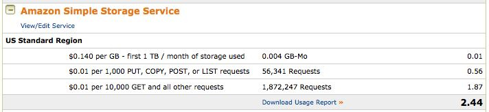
It cost 1 cent to store the data, 56 cents to put it there (data was uploaded from the Elections PEI intranet server every minute) and $1.87 to deliver it to the public (the reason that there were 1,872,247 “requests” was that each page view required four requests, one for the page itself, one for the CSS file, one for the Elections PEI logo, and one for the image under the sidebar).
(Brief technical tangent for those of you considering S3 as a solution for your own projects: the only annoyance with S3 hosting is that you can’t set a “default page,” like “index.html,” to be served when visitors hit your domain with no page referenced in the URL; to work around this we set the results.electionspei.ca domain to be served from Elections PEI’s Apache server and then simply redirected all traffic, with an Apache RewriteRule, to municipal.electionspei.ca/index.html. You’ll read that Amazon’s CloudFront service does allow a default page to be set; in our case, though, CloudFront’s minimum caching time of an hour didn’t suit a situation where content was changing minute-by-minute).
The results website’s pages were purposefully small and simple – the largest page was for Cornwall and it was only 14KB – to ensure they loaded quickly and worked with as many web browsers as possible.
There was one design issue that I hadn’t anticipated before the results started to come in: for wards like Charlottetown Ward No. 3, where the councillor position was acclaimed, because there were no poll-by-poll results shown for councillor it wasn’t possible to tell which polls had reported. I rolled out a quick fix for this around 8:00 p.m. by making the reporting polls bold-faced; it wasn’t a perfect solution, but I wasn’t prepared to do major surgery on a moving patient.
To ensure that everything hummed along as planned, and to free me up to deal with any technical issues that might have arisen, for the first time since 1996 I stepped out of the data-entry process entirely; logistically the process went like this:
- After the ballot count, results were telephoned in from the polls to a telephone bank at Elections PEI headquarters at 90 Great George Street where they were recorded onto paper sheets pre-printed with candidate names and plebiscite questions.
- These sheets were walked over to the data entry room where they were read aloud and simultaneously typed into a web-based editor on the Elections PEI intranet server and a Lotus 1-2-3 spreadsheet; they were then read aloud again and double checked.
- From the Intranet server, once per minute the results were totaled and a set of HTML pages created that were saved to the Elections PEI public webserver and then uploaded to Amazon S3.
- At regular intervals over the night the website totals were cross-checked against the Lotus 1-2-3 totals to ensure that accurate numbers had been entered into both.
The journey from poll-to-Internet took about 3 minutes from start to finish; results were slower to be reported than in previous elections simply because of the additional task of counting the plebiscite ballots in Stratford and Charlottetown: the first poll result was reported at 7:14 p.m. and the last poll reported was almost four hours later at 11:10 p.m.
Because there were no technical fires to put out, I was free to sit in the background, providing colour commentary on the Elections PEI Twitter feed (an experiment we launched over the weekend) and see the data entry process from the outside looking in for the first time (kudos to my colleague/brother Johnny, who did all the data entry this time out).
We’ll be back in the saddle in less than a year’s time, applying what we learned, for the Provincial General Election in October of 2011.

There’s an increasing opportunity for the curious among us to learn about the Chinese language as the number of newcomers to Charlottetown from Taiwan and China increases every day.
I’m used to learning new programming languages, and programming languages tend to be logical and to follow similar rules; today’s Chinese, like today’s English, is the process of hundreds of years of evolution, so isn’t necessarily logical at all.
So Chinese writing is like a big complicated puzzle to me; but, with help from my Chinese-writing friends, I’m gradually beginning to parse it apart. Take this sign, for example:

The sign is on the side of the new downtown social club and I had no idea what it meant. I tried writing the characters into my iPod touch, but to no avail; no matter how carefully I drew out the characters, I could never get the iPod to match what I saw on the sign.
What I really wanted was a “take a photo of Chinese characters, upload it, and get back English” service, like Google Goggles for Chinese (it doesn’t support Chinese yet itself), but none of those I tried worked.
Finally, I fell back to where I should have started: I asked my friend Winnie at Tai Chi Gardens and she told me, quickly and with a smile, that it means “China Town.”
And, according to Google Translate, she’s exactly right.
(Interestingly enough, when I handed my iPod Touch to Winnie and let her write in the Chinese for the first character, it recognized what she wrote on the first go even though, to both her eyes and mine, we created almost exactly the same shapes).
The sign on the door with hours was a little easier to parse apart:
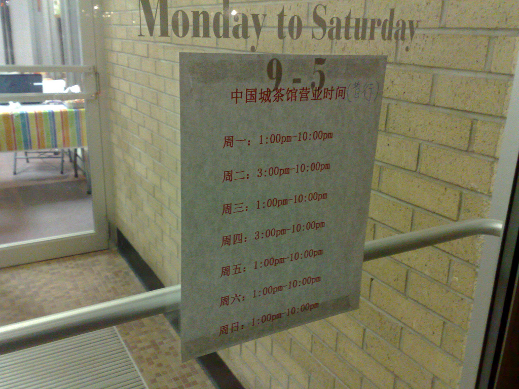
For this sign the Days of the Week in Chinese page was a big help, specifically:
The modern Chinese names for the days of the week are based on a simple numerical sequence. The word for ‘week’ is followed by a number indicating the day: ‘Monday’ is literally ‘week one’, ‘Tuesday’ is ‘week two’, etc.
And of course one can assume that Tuesday follows Monday, and so on, so it wasn’t too difficult to figure out that:
- 週日 is Sunday
- 週一 is Monday
- 週二 is Tuesday
- 週三 is Wednesday
- 週四 is Thursday
- 週五 is Friday
- 週六 is Saturday
Some other things I’ve learned:
- People from Taiwan write using “Traditional Chinese” characters and people from China write using “Simplified Chinese” characters; in general one can understand the other, but not always. For example, 中国城 is the Simplified Chinese for “China Town” while 中國城 is the “Traditional Chinese.”
- Historically Chinese signage would be read right-to-left, but contemporary signs are generally read left-to-right. Which is why the sign read “China Town” and not “Town China.”
- If you’re Taiwanese and using a computer, you can either use a touchpad-like device to write character as they are, or use something called Bopomofo; watch this video to understand more on this from a 5 year old or this video to see how to use this yourself with Windows.
- The peichinese.com website is the place to hang out if you’re interesting in learning more about the Chinese-speaking community in Prince Edward Island in Chinese.
Still so much more to learn!
It’s municipal election day in Charlottetown, Summerside, Stratford and Cornwall today, and starting after 7:00 p.m. when the polls close you’ll be able to get live election results updates from results.electionspei.ca.
About This Blog
 I am Peter Rukavina and this is my blog. I am a writer, letterpress printer, and a curious person.
To learn more about me, read my /now, look at my bio, listen to audio I’ve posted, read presentations and speeches I’ve written, or get in touch (peter@rukavina.net is the quickest way).
I have been writing here since May 1999: you can explore the 25+ years of blog posts in the archive.
You can subscribe to an RSS feed of posts, an RSS feed of comments, or a podcast RSS feed that just contains audio posts. You can also receive a daily digests of posts by email.