
I’m happy to report that after more than a month of searching, I’ve found a space to house my newly-acquired Golding Jobber letterpress, in the basement of The Guild, two blocks from my house and two blocks from my office. I’ll be sharing the basement space next to the gallery with This Town is Small and its screenprinting workshop and with Wendy Druet and her art classes for children.
It looks to be a great arrangement: none of us need a space full-time, and none of us need all the space. There’s also an opportunity, because it’s a larger space, for me to run the occasional letterpress workshop. The only downside, and it’s a small one, is that there isn’t a lot of storage space, so I may end up splitting my operation into “composing,” here at 84 Fitzroy Street, and “printing” down at The Guild.
Over the weeks I’ve been plumbing my networks, digital and analog, for pointers to spaces, I’ve met some people I should have, by all rights, met long ago. Like George Dow (who showed me the old Dillon Printing space under Leonhard’s Café on University Avenue, unfortunately being used as storage), Chuckie (who showed me the building he owns on Fitzroy Street where Condon’s Woolen Mill used to be), Ken Peters (who’s renting space in the basement of 1 Rochford Street), and Adam and Rebekha Young who are transforming the space formerly occupied by Ampersand on Water Street into a coffee shop cum knitting café cum bicycle shop. Everyone’s been very patient with me while I work to find a space that works in all the ways I need it to work (floor to support weight, ceiling high enough to work, access for movers, affordable rent).
I’ve also become aware at just how little non-residential space there is in Charlottetown, especially downtown: if you have an idea that needs space, whether it be artistic, retail, or light-industrial, there really isn’t much space left, especially if you don’t want to pay a lot of money and/or rent from an objectionable landlord.
The irony here is that I’ve always had a sort of “meh” attitude toward The Guild, thinking, naively as I now realize, that artists and craftspeople should just be able to work, well, anywhere. Now that I’ve got a Big Heavy piece of machinery, I’ve become aware in a visceral way that in the analog world space is a very important consideration for any sort of making activity. So thanks to all the backers of The Guild over the years, and retroactive apologies for my benign indifference.
The letterpress itself is about to start moving closer to town: Griffin’s Service Centre will drive it into McQuaid’s Warehousing on Allen Street where it will be readied for moving into The Guild. I did a tour of The Guild this morning with Austin McQuaid and his son (about the nicest movers I’ve ever met; thanks to Tom Cullen at Purity Dairy for the referral) and they’re in the process of figuring out the best way to wrangle the press into place, and how big a crew they’ll need to do it.
Things are so much simpler in the digital world: I want 32 webservers, I just hit a few keys on my keyboard and, presto, Amazon Web Services is firing up servers for me and billing my credit card; it’s good to be reminded, once in a while, that out here in the material world things are slightly more complicated.
It’s only fair, after I lavished so much praise on my Marimekko Cash & Carry bag, that I give credit to the bag that started it all for me, one designed and manufactured for me by Catherine and Oliver.
Back in April I was lucky enough to receive a surprise gift of an iPad 2 for my birthday; in the early days I snarfed up the bag that Oliver uses to carry his Nintendo DS to carry the iPad, but eventually Oliver wanted that back and so I was left with a need for a similar bag.
Fortunately I live with a talented designer and seamstress and so I received another surprise a few weeks later with the gift of a custom-tailored bag:
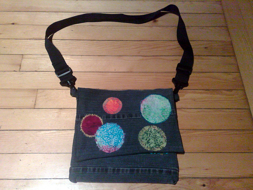
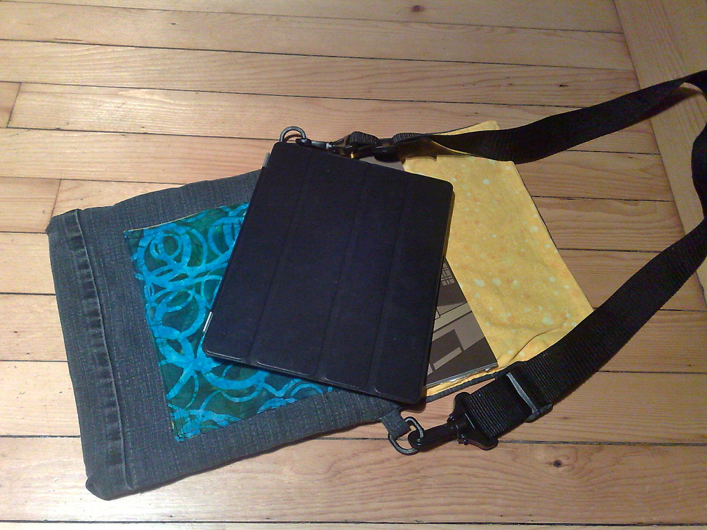
The exterior of the bag is made from an old pair of jeans, with multi-coloured circles appliqued on the outside. Inside there’s just enough room for the iPad and an accompanying analog book or magazine, with an inside pocket to hold a USB cable or other small accessory:
After I’d been using the bag for a week or two I had it in the shop for a few days (Catherine is nothing if not patient and willing-to-renovate) to take a few of the rough edges off (the iPad was getting caught on an inside seam every time I took it out of the case).
It seemed a little over-the-top to be carrying two bags around this fall, so I generally left the iPad at home; now that the Marimekko is up on jacks for the winter, the iPad bag is back out for the winter, working as well as it ever has.
My Cousin Sergey has been here on Prince Edward Island for a month now, and while he’s been learning English, I’ve been learning a lot about Ukraine, and the Ukrainian branches of my family tree.
Sergey’s command of English is improving every day, and for most “come by our house at 10:00 for breakfast” kinds of things we can leave the technology aside and use a combination of English and charades to communicate. For the tougher, more subtle things, however, we use a combination of Google Translate and Yandex and watching Sergey type in Cyrillic is giving me a good opportunity to casually have that alphabet and its 32 characters seep into my brain. “In two weeks you’ll be speaking Ukranian,” Sergey said yesterday. Probably not. But I’ll know a lot more than I did a month ago.
I spend an inordinate amount of time thinking about language and everyday life, both because I spend an inordinate amount of time embedded in Germany, Denmark and Sweden, but also because many of the people I deal with in my day to day life around town don’t have English as their first language. What I’ve learned, most of all, is that there is no room for timidity in langauge-learning issues: you are never going to get things perfect, and to imagine that you can squirrel away on your own until you do is naive. Language is alive, and to trully stuff it into your brain requires using it actively, boldly and without hesitation every day.
I imagine that part two of this process will involve me spending time embedded in Ukraine with Sergey’s family and then the Ukrainian shoe will be on the other foot; let’s hope I have the courage of my convictions when that time comes.
(пітер Рукавіна, by the way, is Ukrainian for Peter Rukavina)
Nice to see that SoundCloud has upgrade to include the ability to embed an HTML5 widget, instead of a Flash one. Here’s an audio snippet I grabbed last night at the beginning of The National; it’s an audio montage of CBC news themes that they used to mark the corporation’s 75th birthday.
Here’s what it looks like on the SoundCloud side: you just go through the regular Share > Embed process, and then select the HTML5 tab.


For several years I’ve been casually looking for a bag to carry all my everyday stuff. If I was a woman this would be called a “purse,” but I’m not yet confident enough in my sexuality to call it that, so we could agree, perhaps, to call it a “shoulder bag” or a “carry-all” or, if you must, a “murse.”
Back in the 70s all a guy needed to have on him was keys and a wallet. These days I’m carrying around keys and a wallet and an iPod Touch and a mobile phone and a notebook and a fountain pen and my passport and who knows what else. I don’t carry scotch mints and Kleenex, but otherwise my personal carting-around needs are closer to my grandmother’s than to the Marlboro Man’s.
In the winter I solve this problem with an L.L. Bean jacket with an over-abundance of pockets. In the summer, though, I either end up wearing a coat that’s too warm for the weather or trying to cram everything into my trouser pockets.
I finally decided that enough was enough and that it was worth putting up with the catcalls from the muscled men in Camaros (yes, this has happened to me: “nice bag!”, not a compliment) to solve my problem.
Which provided me with a whole new problem: finding the right bag. I’m particular about this kind of thing: needed to be free of Velcro, small enough to not weigh me down but large enough, and with enough pockets to store and compartmentalize everything I need to cart around.
Being in Berlin for the summer provided me with the perfect opportunity to bag-shop: in Berlin everyone carries a bag, and having a bag on your shoulder offers no assault on your manliness. As such, the skies were full of bags of every design, colour and function.
I ended up finding a lot of bags that almost worked out for me: I’m a big fan of Freitag bags, made in Switzerland of recycled truck covers, but Freitag bags are drenched in Velcro, and I just can’t abide all that scrunching-sound every time I need a pen. There’s a great store on Rosenthaler Straße called Waahnsinn Berlin that sells a good selection of bags, but none of them quite met my specs.
Just as I was on the cusp of giving up, I wandered into the Marimekko store on Alte Schönhauser Straße. I’d walked past Marimekko stores before — the airport in Helsinki seems to be one giant Marimekko outlet and there are branches in Malmö and several other cities we’ve visited — but never been in, thinking them to sell only fabric and household goods. It turns out they also sell bags.
I spent a good 30 minutes looking through their selection until I found the perfect bag for me, the model they call “Cash & Carry.” It looks like this:
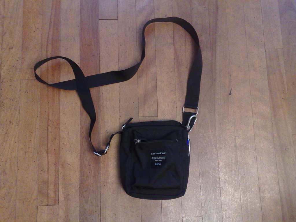
I bought it — “ah, you’ve settled on a classic,” said the clerk — and I’ve been carting it around ever since. The bag has a lot to recommend it:
- It’s just the right size for my everyday stuff, and can hold some extra things — a paperback book, or a CD — if called upon.
- There’s is an outside pocket at the front for my Nokia N95 and an outside pocket at the back that holds my iPod Touch.
- There’s an outside slot for a pen on the right-hand side.
- Inside there’s a pocket for a passport.
- All the pockets, and the main closure, are zippered, not velcro.
- It’s all made out of a space-age fabric that’s tough, somewhat waterproof, and is easy on the hands.
- Like the clerk said, it’s a classic: it was designed in the 1970s by Ristomatti Ratia (son of Armi Ratia, Marimekko’s founder) and is free of ornamentation or other superfluous elements.
The bag has worked out well — there’s not really anything I would change about it. My only challenge is learning the everyday skills of bag-management that, I presume, come as second-nature to bag-carrying people (where to put it in a restaurant, how to remember not to leave it behind, etc.).
If you’re ready to take the leap into bag-carrying, I highly recommend this model; it will be easy to find in Europe, and Marimekko has several shops across Canada (including one in Thunder Bay, Finnport, that will ship).
Back at the dawn of the century, when the web was a new frontier and we were making it all up as we went along, a lot of what was written about in the nascent weblogs of the day (did we even call them that?) was blogging itself (we might have just called it “writing”). These days we tend to treat blogs as though they’ve always been here: there’s nothing novel about them, and the basics of the form — posts sorted in reverse chronological order written in a personal tone — has largely remained frozen for the last 10 years.
That’s a good thing — how long would your interest be kept up by a prime time TV lineup that consisted of shows about the prime time TV lineup? — but it’s also a bad thing, as it means that if you want to write on the web you basically do it in a blog-like format or you don’t do it at all.
Meanwhile, I just keep blogging along: it’s become part of the DNA of my everyday life, and it would be hard to stop doing it, as it’s an integral part of how I process my thoughts and ideas, and, increasingly, it’s how I remind myself of where I’ve been and where I’m going.
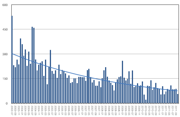
One of the things that has changed in this space is the degree of what they call “user engagement” in the business. As a reader, your opportunity to “participate in the dialog,” such as it is, has been through your ability to comment on each post (when we all thought that eventually everybody would have a blog we had visions of an interconnected network of cross-linked blogs; that idea has largely died out and comments are what’s left over). Here’s a graph of the number of comments per month here on ruk.ca from July 2003 to October 2001. The peak was that first month, with 532 comments; the valley was March, 2010 with 21 comments. And the trend is, unmistakenably, down.
You’d think that this trend might simply reflect a decrease in the number of visitors to the weblog, but that has remained scarily consistent over the this period; here’s a Google Analytics graph of visitors by month from 2007 to present:

The number of visitors per month hovers just around 30,000 and the number of pageviews per month around 50,000.
So you’re all visiting and reading just as much as you ever did, you just have less to say. There are a whole host of reasons I imagine that this might be true:
- I’m writing less interesting, or at least less-comment-worth (less inflamatory, less gripping) posts; it’s easy to chime in when I get coffee thrown at me; perhaps I’m the only person on earth with as intense an interest in Charlottetown building permits?
- It’s become harder to comment: various anti-spam mechanisms that are in place now to combat the ceaseless torrent of comment-spammers may have the unintended side-effect of making it harder for real people with real things to say.
- The Guardian and the CBC ruined commenting: it’s generally acknowledged that the comments section of both news outlets’ websites are fetid cesspools of ad hominem attack and anonymous name-calling; perhaps the very act of web-commenting has suffered as a result.
- Facebook et al is where all the conversations are happening. It’s no secret that I think of Facebook, Google+ and all the other walled parallel Internets as a wrong turn on the information superhighway, but there’s no arguing that they’ve made “user engagement” painless and integrated into a whole host of other everyday activities (all with the goal to making us more highly-valued advertising targets, but that’s another story). Who wants to hang out on a creaky old blog in this new world?
At the risk of encouraging comments-about-commenting, I’d be interested to know more about what your actual reasons for reading-but-not-writing here are.
I have mused in frustration several times over recent years, usually around this time of year, about my eyeglasses fogging up when I come in from the cold. This is usually met by either stony silence or suggestions that I walk into buildings backwards, which I’ve always taken as a practical joke (and which, in my experience, doesn’t work).
That is, until last week when the helpful Sara Roach Lewis replied to my frustration-tweet with:
@ruk you can get glasses cleaner that has an anti-fog ingredient. Works like a charm. Can get it at island optical.
And so, despite being a loyal Boyles Optical customer, I dropped in at Island Optical on my way to the office this morning.
“Word is that you folks sell some sort of magic defogulant eyeglass cleaner here,” I exclaimed (apparently I talk like Garrison Keillor when dealing with local merchants). The friendly clerk climbed down from her ladder, reached behind the counter, and handed me this:
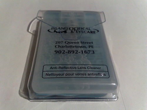
“I’ll take it!”, I said. “How much?”
“It’s free!”, she replied.
I’m applying it to my eyeglasses now and I’ll report back — it’s a good day for this, cold and damp and blustery as it is — and let you know whether it is, indeed, a magic defogulant.
Klara Harden walked across Iceland and returned to make a short film about her trek. It’s a nicely made film, and considerably more compelling than your average “towering mountains and surging streams” Iceland travel video. For a film largely without words, it’s gripping, and watching it through makes me want to do something terrifying.
A few weeks ago the Supreme Court of Prince Edward Island announced that it would be holding courses for the public on court-related matters. Registration was to be limited to 50 people, and would begin today. I noted the date in my calendar and made a point to call early to ensure I’d get a seat, all the while having a sneaking suspicion that there would be little interest and the courses might cancelled.
I was wrong.
I was late calling today — the wind and the rain and a nasty cold got the better of me — and I didn’t get around to making the call until noon.
Too late, as it turns out: the courses are fully subscribed, and there’s a waiting list — also almost at its 50-person limit — for a repeat round in January.
While I’m frustrated that I won’t be able to attend in November, it’s extremely heartening to see Islanders taking such an interest in the courts; kudos to Chief Justice David Jenkins and his colleagues for having the imagination to set this up and the belief that there would be interest.
You can call Sheila Gallant at 368-6024 if you want your name on the waiting list for the new year.
Following from yesterday’s resusitation of the Charlottetown Building Permits RSS feed, I decided that it was finally time to get around to seeing if there was enough data locked inside the City’s PDF files to create a map of building permit approvals. It turned out to be not that difficult to do using some open source wrangling. Here’s what I did.
The goal was to take the 219 PDF files I was able to scrape from the City’s Building Permit Approval page that each look like this:
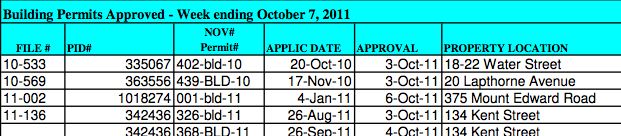
and to pull enough information out about each approval to be able to geocode it. I did this using the excellent pdftotext utility, part of the open source Xpdf package. Doing this:
pdftotext -raw Weekly_approvals_webpage_21_Oct_2011.pdf \
  Weekly_approvals_webpage_21_Oct_2011.txt
produces a plain ASCII text file that looks like this:
10-533 335067 402-bld-10 20-Oct-10 3-Oct-11 18-22 Water Street...
10-569 363556 439-BLD-10 17-Nov-10 3-Oct-11 20 Lapthorne Avenue...
11-002 1018274 001-bld-11 4-Jan-11 6-Oct-11 375 Mount Edward Road...
11-136 342436 326-bld-11 26-Aug-11 3-Oct-11 134 Kent Street...
From those files, because the Provincial Property Identification Number — the PID — is always a 6 or 7 digit number, and because such numbers rarely, if ever, appear elsewhere in the files, I was able to pull out the PID for every approval using some PHP:
preg_match('/\d{6,7}/',$line,$matches)
From there I looked up each PID in the freely-available Provincial Civic Address data, leaving me with a CSV file like this:
-63.12688,46.23066,22 WATER ST,"10-533 335067 402-bld-10 20-Oct-10...
-63.12606,46.24454,20 LAPTHORN AV,"10-569 363556 439-BLD-10 17-Nov-10...
-63.14558,46.27834,375 MOUNT EDWARD RD,"11-002 1018274 001-bld-11 4-Jan-11...
-63.12808,46.23572,134 KENT ST,"11-136 342436 326-bld-11 26-Aug-11 3-Oct-11...
This CSV contains geocoded record of the 1,985 building permits I was able to scrape out the PDF files. Finally I used the open source KMLCSV Converter app to convert the CSV file into a mappable KML file and from there it was simply a matter of doing any of:
- Feeding the KML file to Google Maps
- Adapting my PEI Schools Map to show the Building Permits on an CloudMade-drive OpenStreetMap map.
- Opening the KML file in Google Earth
I continue to hope that the City of Charlottetown will eventually release building permit data in an open format so that all the scripery-scrapery required to do this can be eliminated and we can all concentrate on doing interesting things with the data rather than on getting the data in the first place.
About This Blog
 I am Peter Rukavina and this is my blog. I am a writer, letterpress printer, and a curious person.
To learn more about me, read my /now, look at my bio, listen to audio I’ve posted, read presentations and speeches I’ve written, or get in touch (peter@rukavina.net is the quickest way).
I have been writing here since May 1999: you can explore the 25+ years of blog posts in the archive.
You can subscribe to an RSS feed of posts, an RSS feed of comments, or a podcast RSS feed that just contains audio posts. You can also receive a daily digests of posts by email.