
We’ve now had a water meter at our house at 100 Prince Street for more than two years.
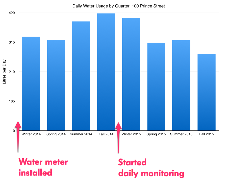
We started monitoring our daily water usage, as part of the Social Consumption Project, in late October 2014; in the quarter previous to that our daily usage was 417.58 litres, which was up almost 100 litres per day from when the meter was installed in late 2013.
Almost every quarter since that our consumption has decreased; in the most recent quarter it was 272.53 litres per day, down 35% from where we started in the fall of 2014:
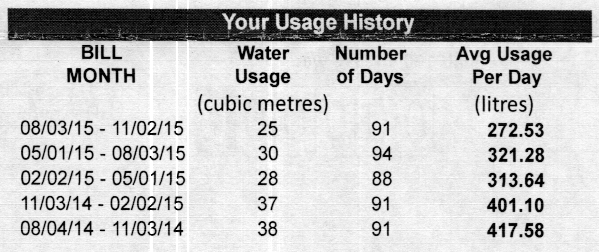
On a chart our daily consumption from the winter of 2014 to the fall of 2015 looks like this:
I think we can attribute at least some of the 35% decrease to the fact that we were monitoring our usage daily: not necessarily because we were carefully monitoring every drop, but because it made us pay more peripheral attention to our consumption, and more likely to not run the tap when brushing our teeth, to use the rain barrel to water the garden, to have showers instead of baths.
My next step is to talk to our Social Consumption Project fellow households and see what their experiences have been.
If you want to follow along, here’s a web app that shows our daily consumption of water and electricity, along with our partner households, in real time.
I don’t spend a lot of time at Starbucks, for all the reasons you might imagine.
But sometimes it’s unavoidable — airports, desolate suburbia, need for anonymity — and something I’ve found that makes it slightly more bearable is the secret keyword for here.
If you place a Starbucks order for here then your coffee will be served to you in a real china mug and your food (such at it is) on a real plate.
Just beware that when you do this you’re triggering an exception, and there may be small ruptures in the coffee service while dusty cupboards are opened to locate the for here mugs.

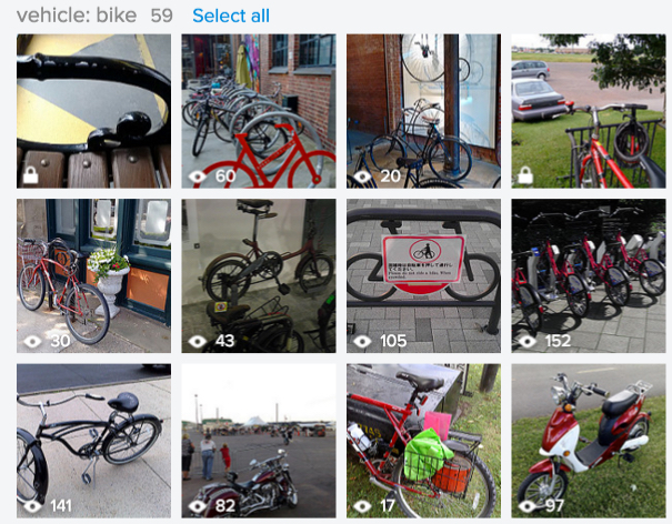
Flickr has a “magic view” on its Camera Roll tab that auto-tags images.
Generally it really is quite magic-seeming.
It can find bicycles, for example:
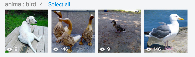
But sometimes it misfires. Like when it thought [[Ethan]] was a bird:
From my friend Oliver comes a pointer to Of Oz the Wizard, an “alphabetized version of the entire film.” Watch it to understand what that means.
It brings to mind my Hacking Stuart McLean experiment from three years ago.
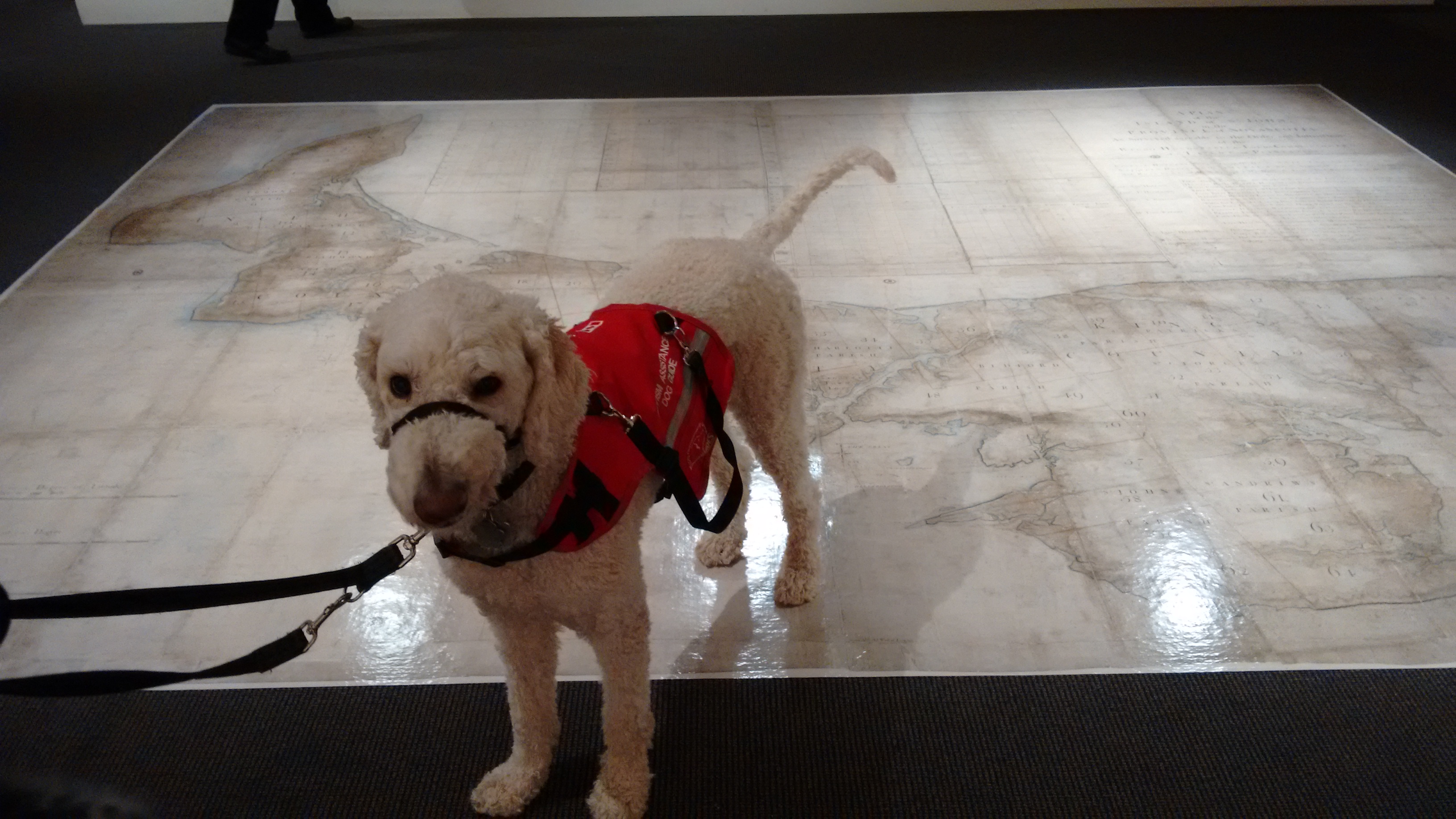
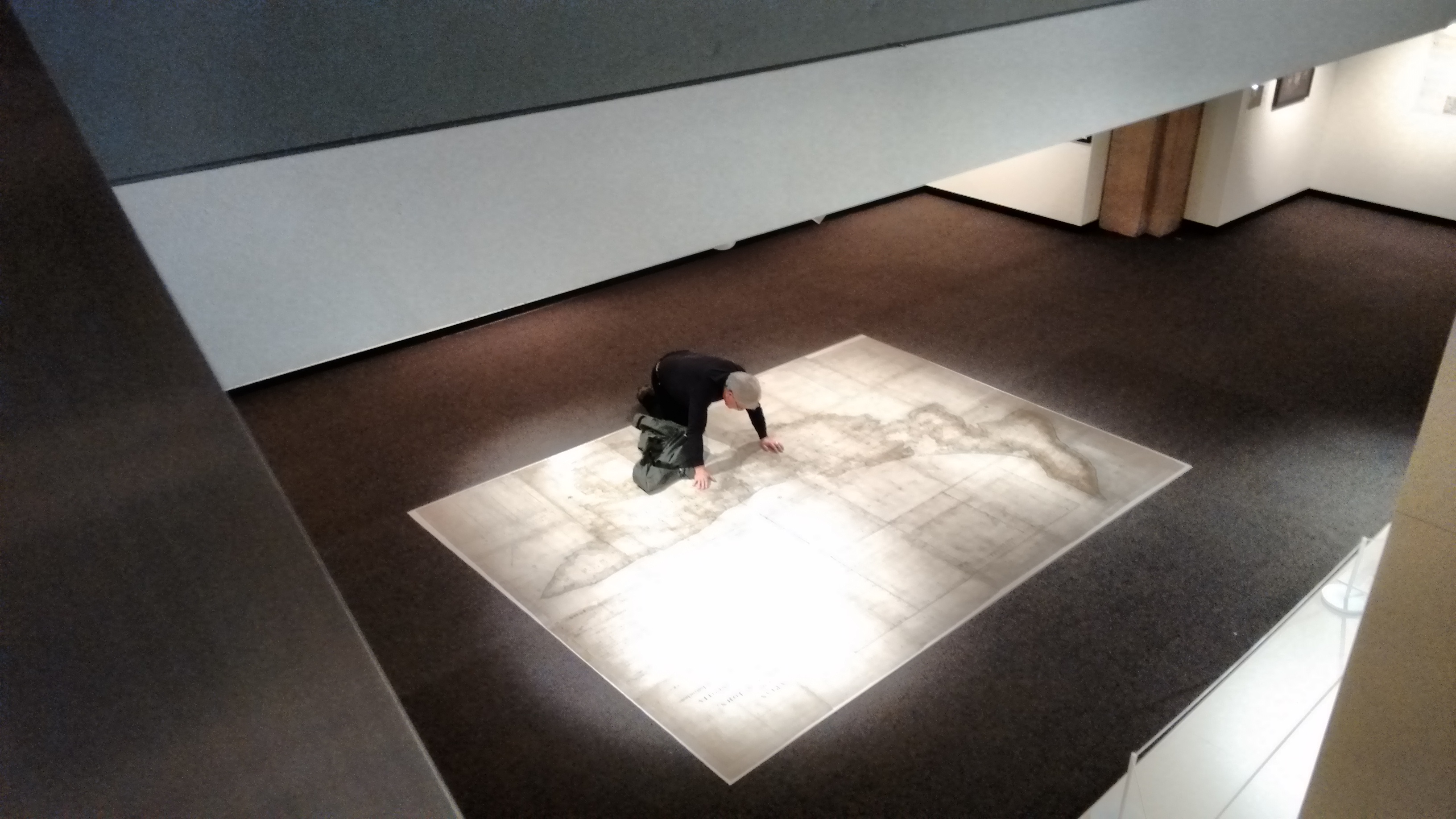
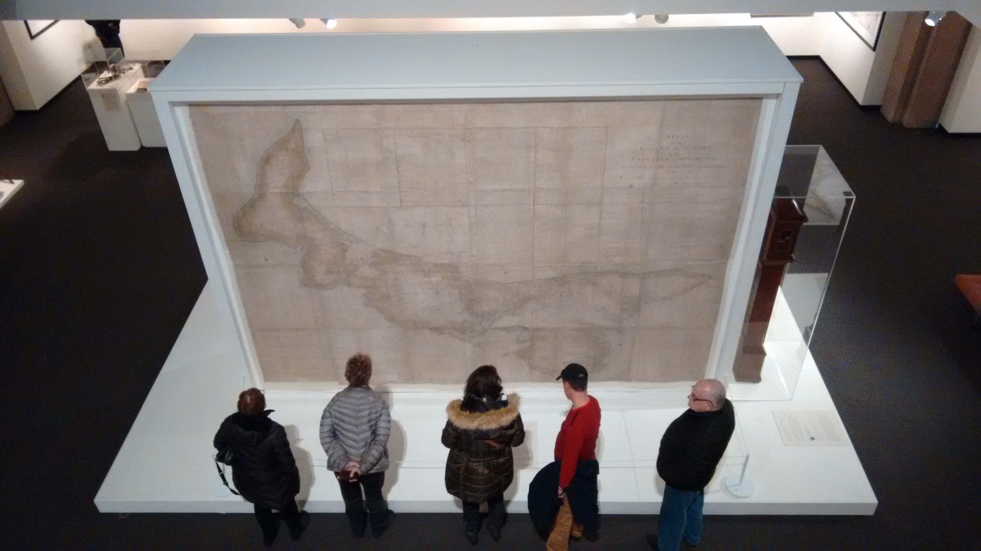
The Samuel Holland map of Prince Edward Island has been at the Confederation Centre of the Arts since midsummer; today is its last day on public display before it returns to the National Archives in London on Tuesday.
Oliver and I went for a last visit yesterday; you can visit today until 5:00 p.m.
Scott David Herman is a American living in Hamilton. He has blogged at erasing.org since 1999.
I moved to Canada in 2005 in order to more frequently go out to dinner with Laura. At the time she was my Canadian Girlfriend, which of course means imaginary girlfriend. We got married in 2006, at which point I became imaginary too.
I am also an American living in Canada (albeit for somewhat longer) who, for the longest time, lived around and about Hamilton (I remember the day that the new Hamilton Public Library was officially opened by Prince Philip).
I have also been blogging since 1999.
I found Scott’s blog because, like me, he found A Soldier’s Guide to the Cold.
I believe this may mean that I too am imaginary.
About This Blog
 I am Peter Rukavina and this is my blog. I am a writer, letterpress printer, and a curious person.
To learn more about me, read my /now, look at my bio, listen to audio I’ve posted, read presentations and speeches I’ve written, or get in touch (peter@rukavina.net is the quickest way).
I have been writing here since May 1999: you can explore the 25+ years of blog posts in the archive.
You can subscribe to an RSS feed of posts, an RSS feed of comments, or a podcast RSS feed that just contains audio posts. You can also receive a daily digests of posts by email.