In the grander scheme of Prince Edward Island corporate patronage, my little Reinvented Inc. is small fry. We, after all, is just me. And so while your Credit Unions and Cavendish Farms and PEI Mutuals can keep entire festivals and arenas alive with their largess, I have to be tactical.

We (me) have been a sponsor of The Island Fringe Festival, on and off, since 2013. My friend Ann was the original route in: she’s been a strong supporter of the festival since day one, and made a compelling case for support; in more recent years Josh Coles has taken up the mantle.

As a member of the audience, I thoroughly enjoyed last year’s Fringe: Oliver and I tried to take in all the shows (Catherine was confined to a hospital bed at the Queen Elizabeth Hospital that week, so it was a dizzying week of alternating fringe theatre and hospital visits).

Fringe 2016 left such an impression on me, that I emailed Josh when it was all over:

As a sponsor and audience member both, I was very pleased with the way things went this year.

As such, I would be well predisposed to a fundraising solicitation for IFF No. 6 while the heady glow of IFF No. 5 is still in the air.

Two weeks later, just as the heady glow was at risk of fading below the horizon, I received an email from festival director Sarah Segal-Lazar:

Josh mentioned that you had expressed interest in sponsoring the 2017 festival while 2016 is still fresh. We’d love to help make that happen!

To which I quickly replied:

I’m happy to double my contribution this year to $500. Let me know where to send the cheque.

I wish all patronage relationships could be so effortless; I’ve often thought that if we removed the “at the Gold sponsorship level you’ll get 2 VIP tickets and a 3x4” logo on the brochure” from the equation we could save everyone a lot of time and effort on both ends (in this regard my friend Tim Banks is perhaps a model to follow; his philanthropy is, in addition to its public face, often of the quiet kind).

Which is all a long lead-up to reminding you that the 2017 edition of The Island Fringe Festival is next week, August 3 to 6, 2017, right here in downtown Charlottetown.
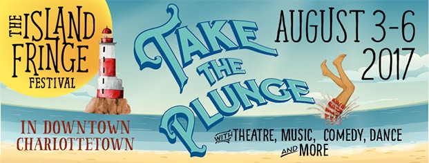
The Island Fringe Festival 2017

As last year, my contribution to the festival, other than financial support, has been to take the schedule and turn it into data. So in addition to the festival website and the printed schedule, you can get a Google Calendar view of the Fringe Schedule and load it up into your device of choice; or, better yet, load this iCal feed into the calendar app on your mobile and have portable access to the schedule as you ramble around the city next week.

I’ll see you at the Fringe.
🗓️

I’ve been meaning to join in the Confederation Centre Art Gallery’s Artist Trading Cards event for several years, but the timing has never worked for me: I’ve always been away, or busy, or distracted.

This year I resolved to break the logjam–I do own a machine capable of printing many copies of things, after all–and I sent my name in to the Centre in June, and in early July I got the call to produce:

The count is in. We all have 40 cards to make for the August 3 exchange.

The idea being that 40 people make 40 cards and then leave the evening with 39 new ones from other artists. At least that’s how I think it works; for all I know there’s competitive bidding and lava pits. But it sounds like fun regardless.

Then I procrastinated for almost a month.

With the event coming up next week (it’s Thursday, August 3 at 7:00 p.m., and everyone is welcome, card-trader or not), I decided that I’d better start printing.

But what to print?

This morning in the shower the word “whimsy” came into my head.

What about if I created a new “seven deadly sins”–whimsy, pith, ambition, and so on.

I Googled “seven deadly sins” when I got to the office to see what I was dealing with, historically. And in doing so I learned that in addition to seven deadly sins there are also seven virtues, and, of those, four are cardinal virtues: temperance, fortitude, prudence and justice. Ever-mindful of feature-creep, I reasoned that printing four virtues would be a reasonable task to take on in the time available.

The technical requirements for participation in the event are as follows:

Cards can be produced in editions (a limited number of the same card), series (set of cards with a unifying theme), or as singular originals. The main requirement is the size: cards MUST be the same size as modern baseball cards or 2 1/2 x 3 1/2 inches (6 cm x 9 cm), small enough to fit inside standard card-collector pockets, sleeves or sheets. ATCs must be self-produced. The artist’s name and contact information, as well as the card title and the edition or series number is to be written on the back.

I decided to print 10 copies of each cardinal virtue, ending me up with a variety pack of 40 to go into the card pool.

And I decided to print the cards in Latin, what given that Saint Thomas Aquinas was their most recent canonizer.

And so was born the Quattuor Virtutes Cardinales project.

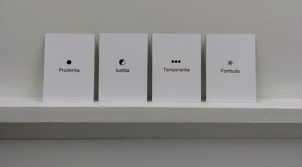
Prudentia, Temperantia, Iustitia and Fortitudo.

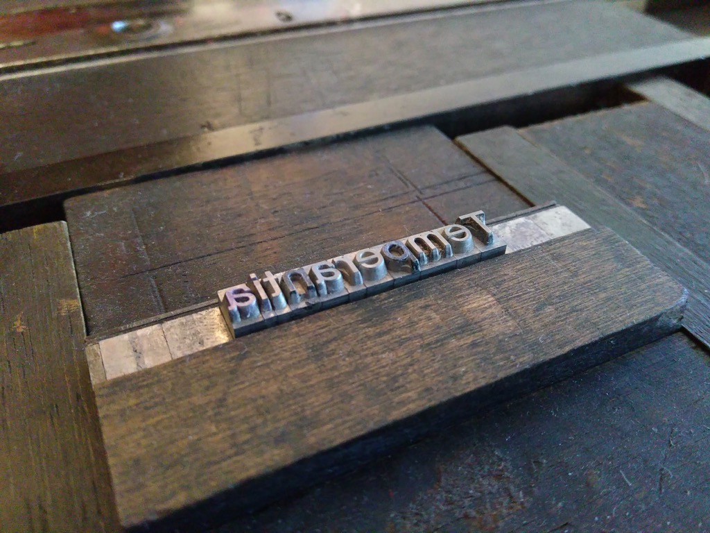
I couldn’t choose the size of the cards, but I could choose the type, and I opted to use a recent acquisition, a sans serif font left at my doorstep by Sarah Saunders:

Temperantia (in metal type in the lockup)

Also in the doorstep drop-off type surprise was a collection of various klischee, and I selected four, one for each virtue, to accompany the type.

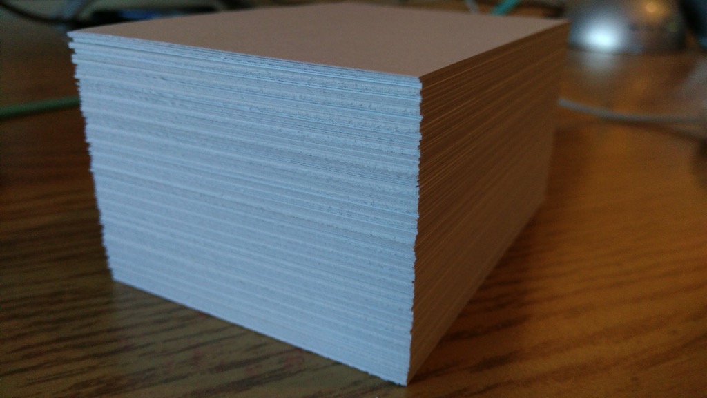
I cut up 20 sheets of letter-size card stock into 9 baseball-card-sized pieces per sheet, to give me 180 cards in all (I only needed 40, but I know from experience that it’s always good to have lots of extras):

Cards cut and ready for printing

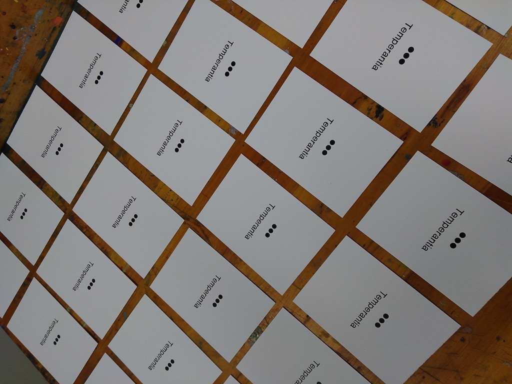
And then I set out to set-and-print, set-and-print: first four fronts, then the required title and credit line on the backs:

I started with Temperantia, using three dots as a symbol, reasoning that the visual metaphor of the ellipsis represented a sort of breath that one might take while considering restraint.

Many Temperantia, printed

Two hours and three virtues later, I had 30 copies of each virtue’s card:

All the Cardinal Virtues, printed on baseball card-sized cards

That the Latin word for “Justice” is Iustitia created a design issue, for the word looks like it starts with a lower case “L” to the uninitiated. But I can’t change Latin.

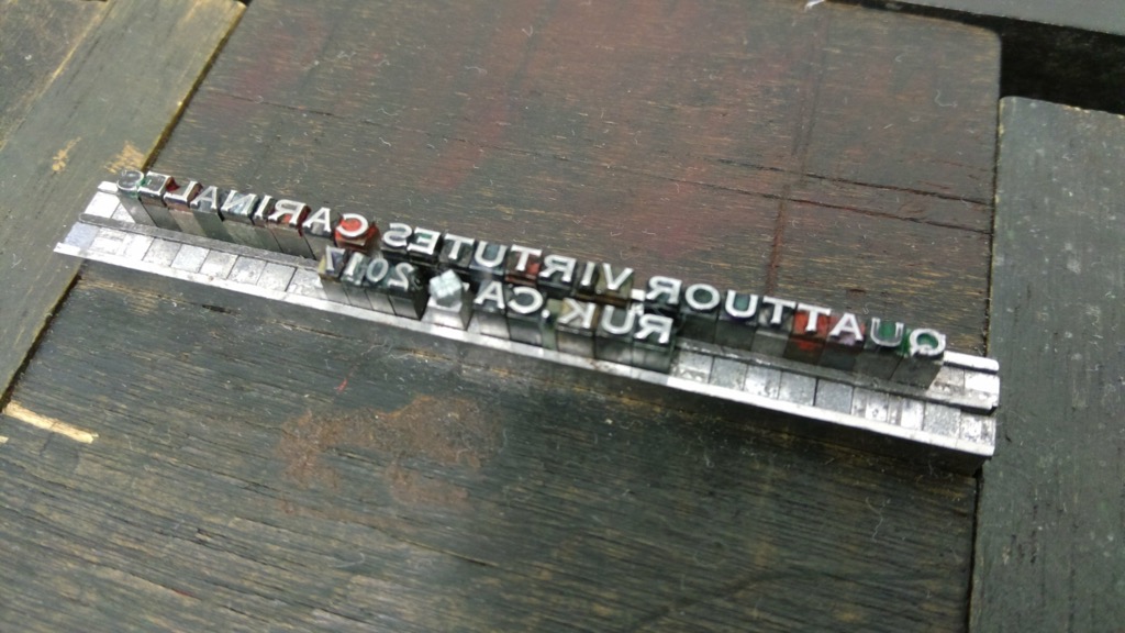
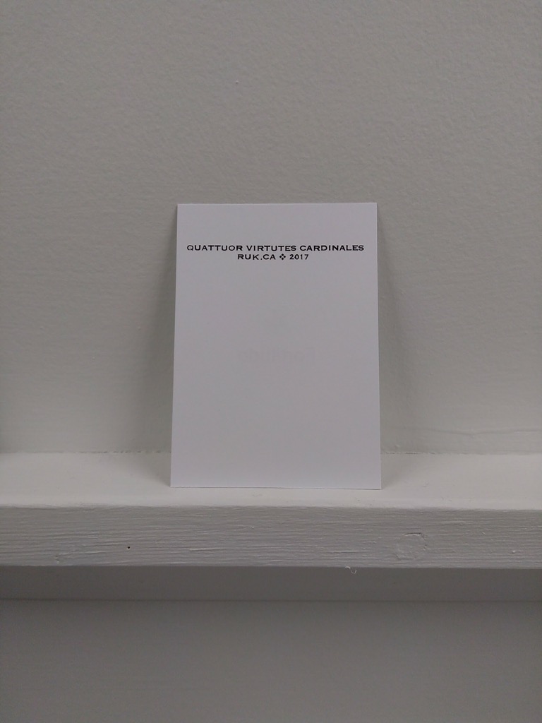
I used a tiny, tiny 6 point Spartan font of type, acquired from the print shop of the old Prince County Hospital, for the backs of the cards; it’s a well-used font, and so isn’t in the best of shape. But it’s the smallest face I have, and I wanted something tiny, so I decided to live with the irregularities:

Spartan type for the card credits

Careful reverse-readers will note a missing “D” in cardinales which, fortunately, I caught early and tucked into place before printing.

Printed Credits

The printing of the credits caused a little bit of show-through on the front, but nothing too dire.

The cards are all printed, both sides, and drying in the print shop now, ready for next Thursday.

Please do come out for the card-trading frenzy next Thursday; I’ll buy you a drink. And there might be lava pits.

🗓️

I’m so glad we invented blogging. If only for Oliver.

🗓️
Oliver  •  Weblogging

This is a pretty good hook for a video series:

Long story short, I’m living with a family displaced from the war, former drug addict/alcoholic father, extremely poor, etc… but they also have the best functioning family I’ve ever come across.  They are beautiful.   There’s a lot to be learned here, and it’s been quite a radical and challenging adventure so far living outside of my language and normalities.

Fish Out of Water starts on YouTube today.

🗓️
Ukraine  •  Travel  •  Video

From Coudal Partners Fresh Signals this morning:

Thanks Pearle Vision for making me cry in my office this morning, Ben’s Glasses.

That was enough to get cynical old me to tap, while sitting waiting for my lunch to be served, this afternoon. And I did cry, right there in the restaurant.

It’s a brilliant ad.

I just watched it again, and tears rose up again.

🗓️
Video  •  Eyeglasses

Twice in the past month, once in a meeting and once in a telephone conference call, someone has used the phrase “let’s take this offline.”

By which they’ve meant “let’s not talk about this now, let’s talk about this later.”

But the phrase makes no sense to me: if we’re discussing something face-to-face (or telephone receiver to telephone receiver), we’re already offline, aren’t we?

Maybe I’m interpreting this too literally, but it gets even more confusing when you realize that when people say “let’s take this offline,” they often mean “let’s exchange some email about this after the meeting.”

In other words what they really mean is “let’s take this online.”

Am I missing something?

🗓️

Since I decamped from social media six months ago, I haven’t really looked back. I’ve sent a couple of Twitter direct messages to people that I only know how to reach that way, but otherwise I’ve been absent from Twitter and Facebook and haven’t missed them at all. It all seems like a strange addiction now. So much pith, so much scrolling, so little satisfaction.

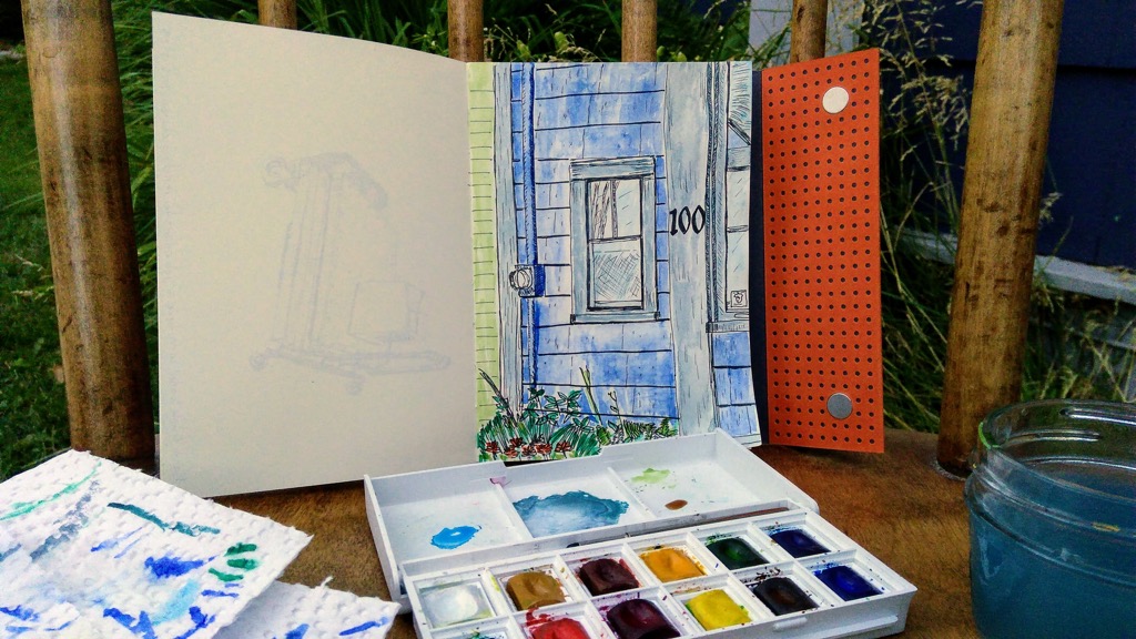
But then I started sketching, and I started to post some of my sketches on Instagram. And now I do it as a regular thing.

I like that, as a side effect of this, I’ve been able to chat, in real life, to a collection of people who follow me on Instagram about what I’m sketching, and how I’m sketching; it’s good feedback and great fun both. I like that other people have started sketching and posting their sketches, following my lead. I like seeing what they come up with.

And I enjoy, I must admit, the rush from the micro-dose of dopamine that comes when someone likes one of my sketches.

So I’ll keep posting, at least for a while; it’s a good summer to micro-dose on dopamine. But I’ll also remember to post sketches here too, because while Instagram is an ephemeral public canvas, this space is mine, and I don’t want to lose these moments to my personal historic record; future me should have a way to remember.

Sketch of 100 Prince Street

🗓️

Magazine B has a list of places you can buy it. You could do worse that planning a world tour that saw you stopping at each.

🗓️
Magazines  •  Travel

I was on a conference call with a vendor today as was required to use a video-conference platform called Zoom to participate.

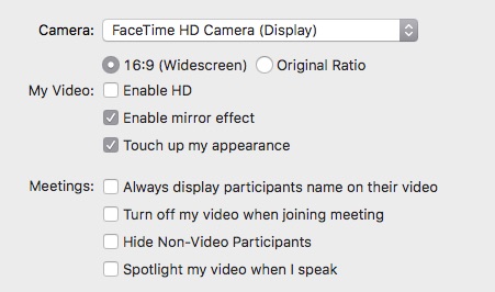
In the preferences for the app was a checkbox titled “Touch up my appearance”:

Zoom Touch Up My Appearance option checkbox

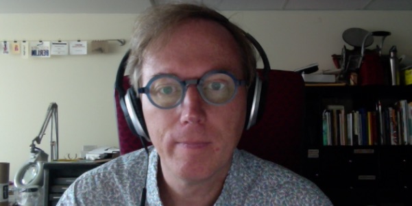
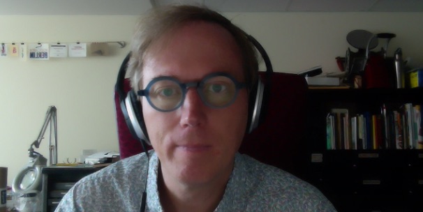
Here’s a before-and-after of me in regular everyday appearance and me “touched up” by the app:

Me before touch up by Zoom

Me after touch up by Zoom

I’ve never felt so haggard.

🗓️
Video  •  Zoom

It all started a couple of weeks ago: my friend the restaurateur needed help getting the email on his iPhone set up again after unlocking it as part of switching wireless carriers.

In the discussion that ensued, he related the tale og how he was constantly going over his monthly wireless data limit with Rogers, his former wireless provider; he’d contacted Eastlink to see whether they would do better, and they offered him a deal that was too attractive to refuse: $40 per month per line with 3GB of data and unlimited Canada-wide calling and texting.

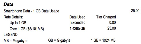
My ears were extra-perked to this kind of talk, for that very morning I’d paid my Virgin Mobile bill and had to fork out a $25 data overage charge for Catherine’s line (she’d been listening to Spotify while in the hospital), and I was, in any case, already paying $55 per line per month for only 1GB of wireless data.

Detail from my Virgin Mobile bill, showing $25 in data overage charges

I contacted the salesperson at Eastlink my friend had dealt with, and she confirmed that, as long as I was an incorporated business, I was eligible for the same deal.

After confirming that Catherine’s phone–an older Moto G–and mine–a Nextbit Robin–would operate on Eastlink’s wireless 1,700 MHz network (they have a handy tool for this), I called Virgin Mobile and gave them the opportunity to counter.

They couldn’t: they would increase my data, and lower my bill from $55 per line per month to $51, but they’d remove Canada-wide calling to do so.

So I told Eastlink to go ahead. The salesperson emailed me a service agreement, I signed it and emailed it back, and two days later a Purolator package arrived with two SIM cards.

I spent 30 minutes on the phone with Eastlink’s support department to port our Virgin numbers–more time that I would have liked, but at least I only had to do it once–and we’re now happy customers of Eastlink.

The final result: our monthly wireless bill (assuming no data overages) will go from $111.40 down to $81.76. But Eastlink also gave us a $400 “port-in credit” per line, meaning that we won’t actually have any wireless bill for the next 9 months or so.

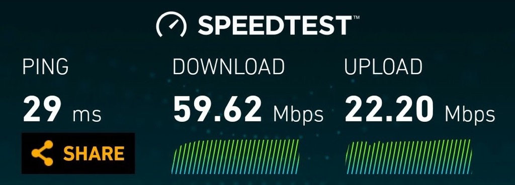
Once I was up and running with my new Eastlink SIM last night, I did a speed test, and here was the result:

Results of an Eastlink wireless Speed Test showing 59.62 Mbps down and 22.2 Mbps up

My Eastlink-enabled wireless phone now has 60% of the throughput that my Eastlink-enabled home Internet does “down,” and 200% of the throughput “up.”

Oh, and this.

🗓️
Eastlink  •  Wireless  •  Virgin Mobile

About This Blog

Photo of Peter RukavinaI am . I am a writer, letterpress printer, and a curious person.

To learn more about me, read my /now, look at my bio, listen to audio I’ve posted, read presentations and speeches I’ve written, see things I’ve favourited elsewhere, or get in touch (peter@rukavina.net is the quickest way).

I have been writing here since May 1999: you can explore the 25+ years of blog posts in the archive.

You can subscribe to an RSS feed of posts, an RSS feed of comments, an RSS feed of favourites elsewhere, or a podcast RSS feed that just contains audio posts. You can also receive a daily digests of posts by email. I also publish an OPML blogroll.

InstagramYouTubeVimeoORCIDOpenStreetMapInternet ArchivePEI.artDrupalGithub.