
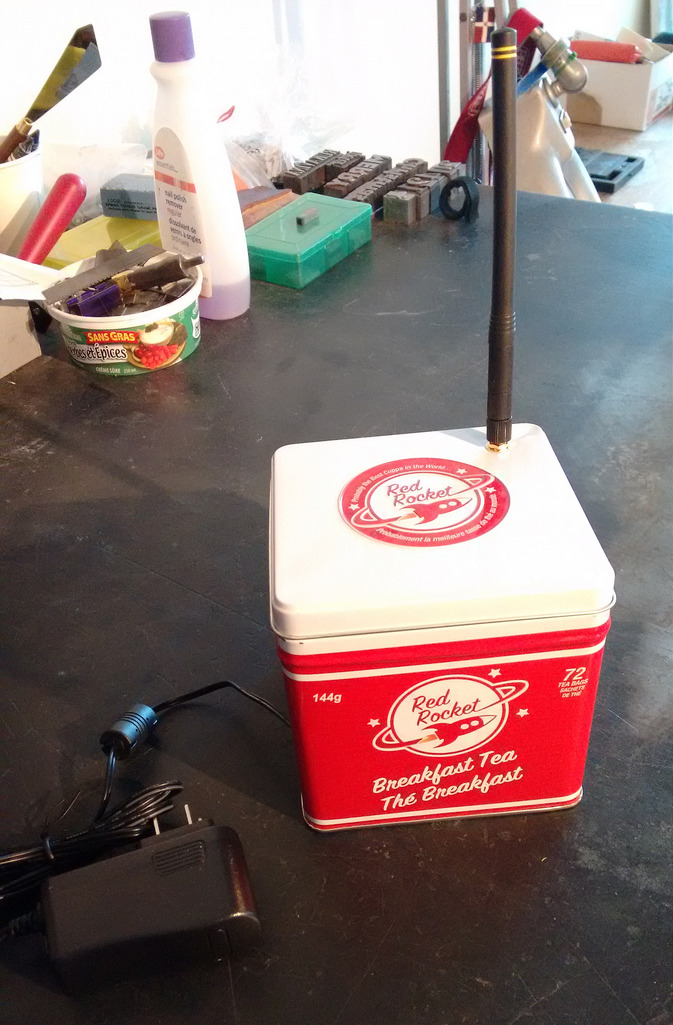
A couple of years ago I bought canister of Red Rocket-brand breakfast tea at Sobey’s. I knew nothing about the brand, or the tea; I was 100% driven by the sharp-looking aluminum canister and its potential for becoming a box for some yet-to-be-determined electronics project.
The tea finally got finished up earlier this year – we’re not big breakfast tea drinkers, as it turns out – and I brought the box to the office.
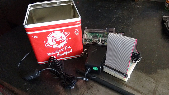
Today was the day that the yet-to-be-determined project got determined: I’m putting together another electricity and water meter reader for a new location, and I needed something to hold the Raspberry Pi and the breakout board that go together to make it all happen.
And so, behold the Red Rocket Pi:
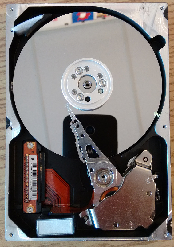
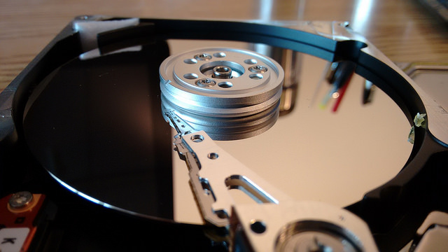
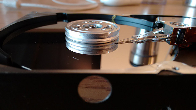
I’ve been using hard disk drives for more than 30 years. It was only today, during preparation of a load of e-waste that included an old iMac, that I opened one up and looked inside it for the first time. It’s a Maxtor, from 2002.
Thanks to Laura Chapin, who mentioned it on Facebook, [[Oliver]] and I headed to Cape Traverse for lunch at The Fifth Ingredient this at.
Part of what might be called the “Island Good Bread Explosion,” a miraculous happenstance of bakeries that’s transformed the quality of bread available on this Island, this French-style bakery offers all manner of bread, pastry, pizza and sandwiches.
Oliver and I each had a tomato and cheese sandwich on a croissant, and it was top-flight, especially when eaten in their front yard, overlooking the beach.
In the summer – Father’s Day to Labour Day – they’re open Monday to Wednesday from 3:00 p.m. to 7:00 p.m. and Thursday to Sunday from 9:00 a.m. to 7:00 p.m., meaning that it’s possible to make a Sunday afternoon of it: drive out to Cape Traverse, pick up some sandwiches, head to the beach, and perhaps pick up some pizza on the way home. Just look up the tide to find the best Sunday for your particular taste in beach.
What was I thinking updating my avatar to one that made me look like a foreboding, drunken, bruised, giant-nosed weirdo?
I have recanted, and removed most traces thereof, replacing it with a variation of the same photo by Alper Çuğun from 2009 that I sliced and diced two years ago.
|
So what was once this:
|
is now this:
|

Same image. Just revealing more of myself.
Maybe that’s a better metaphor than “here, let me stick my nose in your face,” no?
I spoke to the Queen’s Printers Association of Canada this week and wrote a little bit about my experience and included the slides I used.
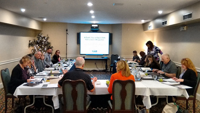
The Queen’s Printers Association of Canada is meeting in Charlottetown this week, and Mike Fagan, Queen’s Printer for Prince Edward Island, who is hosting the meeting, asked me to be the keynote speaker, speaking to the conference theme of “Open Government – Open Information.”
And so on Monday morning I joined Queen’s Printers from most of Canada’s provinces, along with their federal counterpart, for an hour long session I called “A Cook’s Tour of Open Data from a User’s Perspective.”
My focus was not on policy and portals – often the terrain when open data is on the agenda – but, rather, on real world examples of how I’ve consumed, created and written about open data over the last decade.
Right off the bat I used the example of the association’s own agenda, distributed to attendees as a PDF file with, I suggested, the information “imprisoned” inside it – unable to be used, for example, in a desktop or mobile calendar app, unable to have alarms attached to it, unable to provide driving directions. I showed how with some cutting-and-pasting, the calendar could be freed from its PDF prison and recreated as an open iCalendar file that could show up on my phone, my tablet, my desktop, or any other device or service that could speak iCalendar.
I then proceeded to tell a series of open data “war stories,” each designed to illustrate an “open data principle,” an arbitrary (rather than universal) list that dervices simply from my own experiences. The projects I discussed were:
- Electricity load and generation data for Prince Edward Island
- New Brunswick System Operator open(ish) data
- CBC Spark interview about my “turn energy flow into music” project
- Archiving and visualizing electricity load and generation data
- Mobile app displaying PEI energy load and generation in real time
- The PEI Energy Thingy (a prototype of a device to provide in-home feedback)
- Making a Charlottetown Building Permits Map
- Making the Charlottetown Zoning and Development Bylaw easier to read
- WhatsMyLot.com
- Creating an interactive public transit map for the City of Charlottetown
- Supreme Court Reasons for Judgment (archived)
- OpenCorporations.org
The 7 “open data principles” that emerged from these projects, which I discussed in more detail in light of these examples, were:
- You have no idea (at all) what open data might be used for.
- PDFs are where data goes to die.
- Sometimes “open” can simply mean following rules of design.
- Open data is a conversation.
- Sometimes your users will create open data for you.
- “Opening” changes the audience.
- “Opening”allows for new connections.
There was a good question-and-answer session after the presentation with some of the audience relating their own “war stories,” and we were able to pick up the conversation over lunch and delve into some additional areas.
It was clear that Queen’s Printers, as a group, are already well-versed in this area, and keen to learn more about how they can leverage the data and information they oversee the distribution of to increase citizen engagement through greater openness. I left the meeting enthusiastic that we’ll see great development in this area across Canada in the months and years to come.
In addition to the opportunity to speak with Queen’s Printers, the meeting also afforded me the opportunity to meet Krista Grant, Assistant Deputy Minister for Communications PEI, newly housed in Executive Council Office. Krista demonstrated a great understanding of the benefits of an open data philosophy, and indicated that there’s a strong will within government to move in this direction. Another reason for optimism.
Here are the slides I presented to Queen’s Printers as a PDF.
[[Oliver]] and I were having coffee this afternoon and I took this photo just to see how it would look if I held it up to my face:
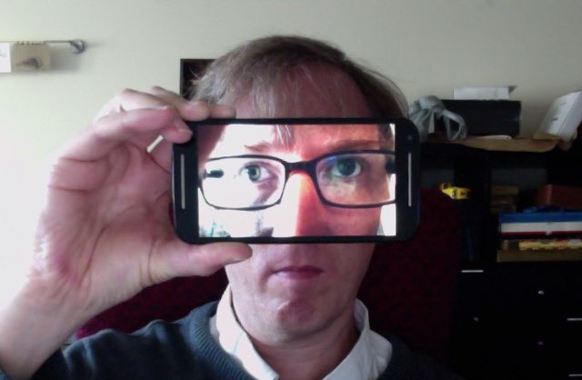
Cropped into a square and filtered through Instagram, the photo ended up like this:
![]()
And, as I hadn’t updated my personal avatar since 2013, I decided to try it on for size:
I’m not entirely sold on it. Which is, I think, a good reason to leave it in place and see if it grows on me (and, I suppose, on y’all).
It’s Autistic Pride Day today, a day that, Wikipedia tells us, is “is a celebration of the neurodiversity of people on the autism spectrum.” I know this because [[Oliver]], who’s the person in our family who’s on top of what-day-is-what, told me so.
My favourite explanation of what this day might mean comes from the Autistic Self Advocacy Network and its poster “Why Acceptance?” that reads, in part:
What is autism acceptance? Autism acceptance means embracing and valuing autistic people as autistic people instead of being afraid of us, having low expectations, or trying to find a way to make us not autistic.
and then continues:
Acceptance is not passive. Acceptance is an action. Acceptance means doing everything you can so that your autistic child will grow up into the best autistic adult they can be, supporting your autistic friends in a world that is not designed for us, and working to make our world a better, more inclusive, safer place for autistic people of all ages and abilities.
It is, in other words, not a day for me to mark how proud I am of my autistic son (although I am enormously proud, every day, of the man he is becoming), it is a day for us all to celebrate the pride that Oliver takes in being who Oliver is.
If I could snap my fingers and change the world, I wouldn’t change a single thing about Oliver: he is a funny, creative, perceptive, compassionate, person who I love dearly.
My job, as his father, is to ensure, to the extent that I can, that the world – the world that is, in many ways, not designed for him – greets Oliver on his terms.
We were in Nova Scotia for a long weekend, and on the spur of the moment Sunday decided to drive up the Valley toward Wolfville, an area of the province we hadn’t been to, as a family, in more than 15 years ago.
When we saw the sign on the highway pointing to “Coffee Museum” at the Grand Pré exit, I quickly signaled to exit, and 10 seconds later we were pulling into the driveway of the Just Us! café, retail store, roastery and coffee/fair trade museum. It’s an impressive operation and the museum in particular is of note for it covers not only the world of coffee, but the worlds of fair trade coffee and of cooperative enterprises (like Just Us!). Plus, they make an excellent cup of coffee.
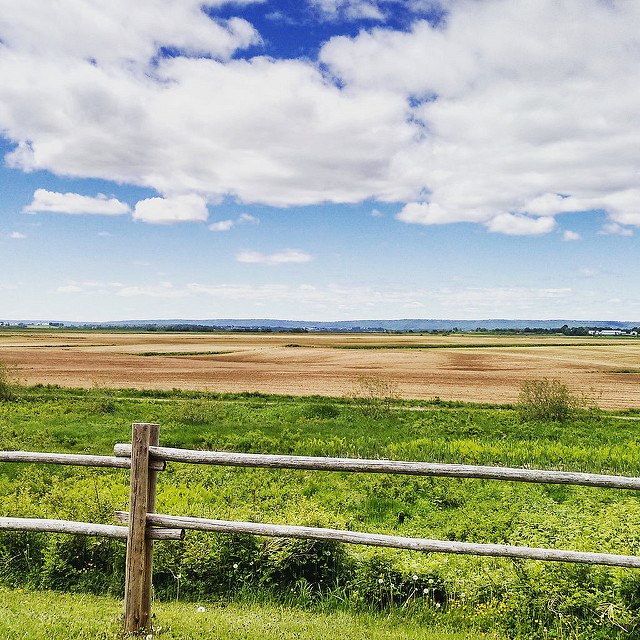
As we’d left the highway anyway, I cast about for other things to see and do in Grand Pré, and the nearby National Historic Site because our next destination.
This too is an impressive destination: a well-done film and exhibit on the history of the expulsion of the Acadians all set in one of the most scenic areas of the country I’ve ever come across. Here’s a picture I casually snapped with my phone while walked back from the blacksmith shop on the edge of the site, looking over the rich farmland of the area, all reclaimed from the sea by Acadians more than 250 years ago:
We finished up the visit to the Valley with a jaunt into Wolfville for lunch at The Library Pub and a shop next door at The Box of Delights. Save for a brief oh-my-we’re-almost-out-of-gasoline panic on the other side of Windsor, it was an entirely pleasant day, and we’ve lots of reasons to go back before another 15 years passes.
This week I had occasion to learn about pin marks, courtesy of Ed from Swamp Press, who replied to a query I’d sent him asking “what about the pin marks?”
Which prompted me to wonder “hmmm, what does he mean by pin marks?”
So I set out to learn, ending up at Identifying Metal Type: Pin Marks, an excellent resource that says, in part:
A “pin mark” is a distinctive, usually circular, depression which appears on the side of some (but not all) metal printing types. It may be relatively simple … or quite elaborate … It is only one of many features which may assist in the identification of type.
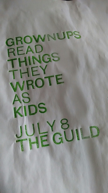
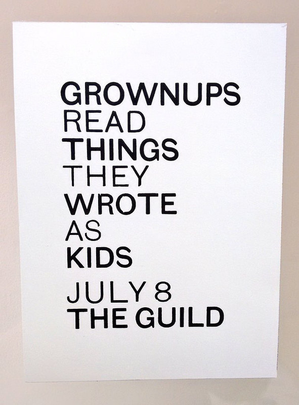
My question for Ed was prompted by a careful reader of my Twitter feed noting that, in this proof of a poster for Grownups Read Things They Wrote as Kids, the U in “GUILD” appeared out of sorts.
And it was (I’d used a U of the wrong weight for that letter).
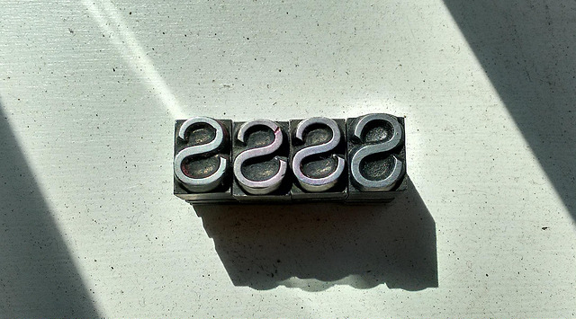
Which further prompted me to look more carefully at all the type and realize that the “S” in “AS” appeared out of sorts as well.
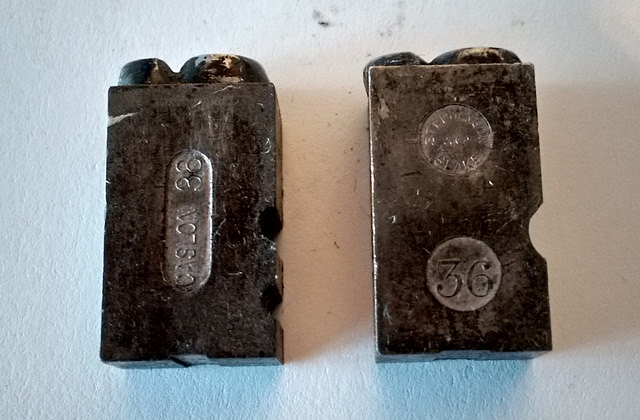
A closer examination of this “S” (on the right in the photo below) compared to other “S” (on the left in the photo) in the drawer revealed the, indeed, although they were all on a 36 point body, the one I’d pulled out was of a slightly larger size:
I sent a query to Ed – who knows more about metal type than I will ever know – and he asked, as indicated earlier, “what about the pin marks?”
So what about the pin marks!
Here’s a close-up of the pin marks on a “regular S” (left) and on an “oversize S” (right). What I learn from these is that the letter on the left was cast by Caslon, whereas the one on the right was cast by Stephenson, Blake. Both are marked “36,” for 36 point. Among other things this tells me that company that cast each, that it’s European type (as Caslon and Stephenson, Blake were both UK companies; indeed Stephenson, Blake acquired Caslon in the 1930s) and, generally, that it’s “foundry type,” as opposed to type cast on a Monotype casting machine.
The shocking thing is that this type has been in my midst – less than a metre from where I type, in fact – for two years, and it’s only now that I’ve come to learn that this helpful information is imprinted on every letter.
So much to learn!
Here’s the finished print, with both the U and the S corrected:
About This Blog
 I am Peter Rukavina and this is my blog. I am a writer, letterpress printer, and a curious person.
To learn more about me, read my /now, look at my bio, listen to audio I’ve posted, read presentations and speeches I’ve written, or get in touch (peter@rukavina.net is the quickest way).
I have been writing here since May 1999: you can explore the 25+ years of blog posts in the archive.
You can subscribe to an RSS feed of posts, an RSS feed of comments, or a podcast RSS feed that just contains audio posts. You can also receive a daily digests of posts by email.