This week I had occasion to learn about pin marks, courtesy of Ed from Swamp Press, who replied to a query I’d sent him asking “what about the pin marks?”
Which prompted me to wonder “hmmm, what does he mean by pin marks?”
So I set out to learn, ending up at Identifying Metal Type: Pin Marks, an excellent resource that says, in part:
A “pin mark” is a distinctive, usually circular, depression which appears on the side of some (but not all) metal printing types. It may be relatively simple … or quite elaborate … It is only one of many features which may assist in the identification of type.
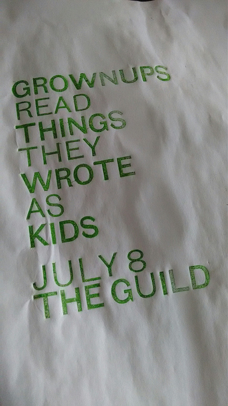
My question for Ed was prompted by a careful reader of my Twitter feed noting that, in this proof of a poster for Grownups Read Things They Wrote as Kids, the U in “GUILD” appeared out of sorts.
And it was (I’d used a U of the wrong weight for that letter).
Which further prompted me to look more carefully at all the type and realize that the “S” in “AS” appeared out of sorts as well.

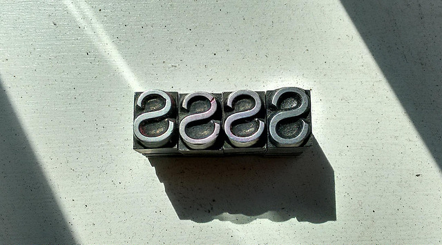
A closer examination of this “S” (on the right in the photo below) compared to other “S” (on the left in the photo) in the drawer revealed the, indeed, although they were all on a 36 point body, the one I’d pulled out was of a slightly larger size:

I sent a query to Ed – who knows more about metal type than I will ever know – and he asked, as indicated earlier, “what about the pin marks?”
So what about the pin marks!
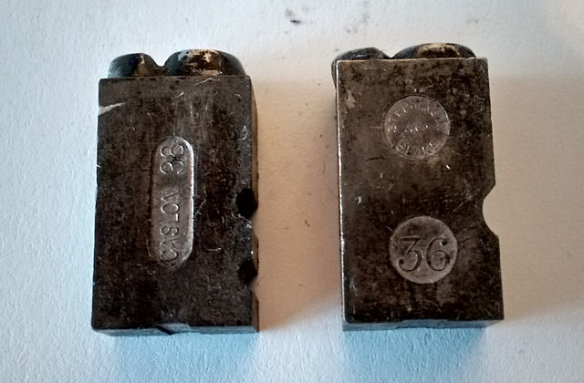
Here’s a close-up of the pin marks on a “regular S” (left) and on an “oversize S” (right). What I learn from these is that the letter on the left was cast by Caslon, whereas the one on the right was cast by Stephenson, Blake. Both are marked “36,” for 36 point. Among other things this tells me that company that cast each, that it’s European type (as Caslon and Stephenson, Blake were both UK companies; indeed Stephenson, Blake acquired Caslon in the 1930s) and, generally, that it’s “foundry type,” as opposed to type cast on a Monotype casting machine.

The shocking thing is that this type has been in my midst – less than a metre from where I type, in fact – for two years, and it’s only now that I’ve come to learn that this helpful information is imprinted on every letter.
So much to learn!
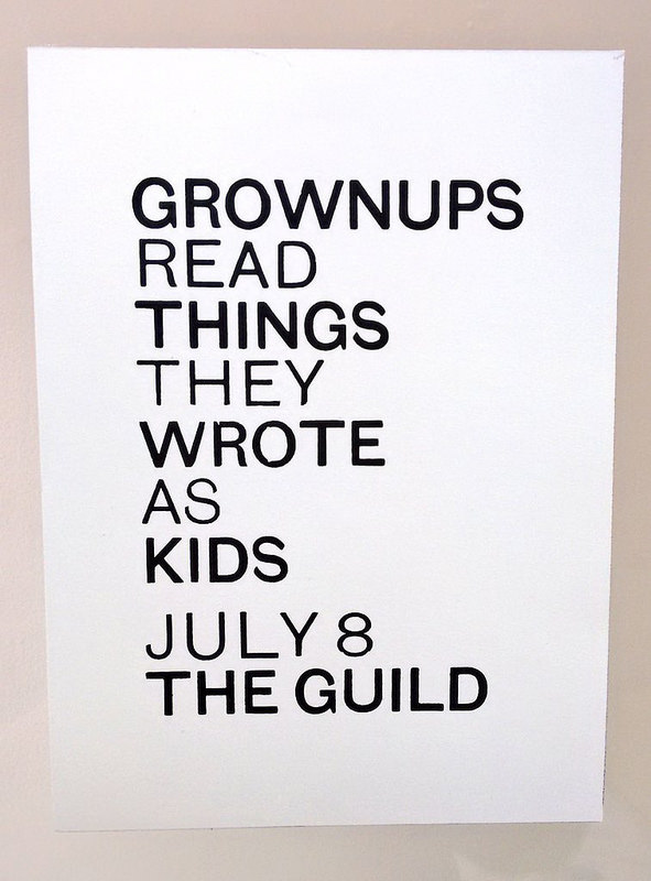
Here’s the finished print, with both the U and the S corrected:

 I am
I am
Add new comment