
From Archdeacon John Clarke’s blog, describing a church event that included farm animals:
I didn’t get to see if for myself but, after the worship (when most of us were enjoying the potluck), as they were putting the animals back into the truck, the sheep made a dash for it. I can only imagine the hilarious sight of Stephen and Harley chasing a sheep in -14 degree weather. I can only imagine being the innocent guy just out for a stroll on a Sunday when suddenly he sees a sheep running towards him, being chased by two people. This heroic stranger managed to corral the sheep long enough for Stephen and Harley to capture the sheep and return it to the truck.
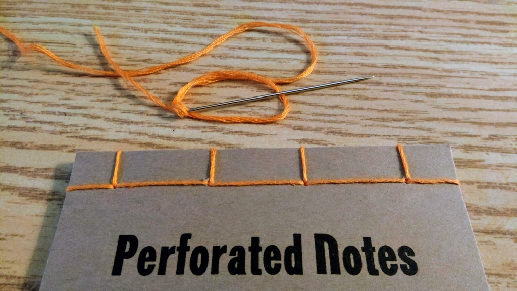
I’m eleven notebooks into the binding of the 23 Perforated Notes notebooks, and I think I’m finally getting a handle on the hand contortions needed to render a clean-looking result.
From today’s Autism Society of PEI newsletter:
The Autism Society of PEI and the PEI Public Library Service are happy to partner on a new collection sharing initiative. Islanders can now access the Autism Society’s in-house collection with their PEI Public Library card. Members of the public can search and request these materials through the library’s online catalogue and have them delivered directly to their local library. Thank you to the PEI Public Library for this great partnership opportunity!
This is tremendous news, and a fantastic move forward given the previously muddled situation with autism resources.
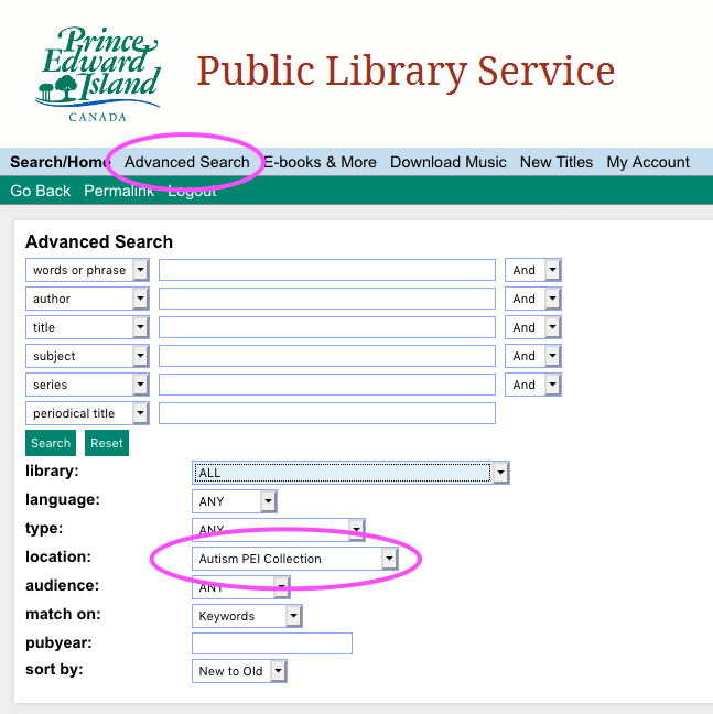
You can see all of the available resources like this:
- Go to the Public Library Service catalogue in your browser.
- Click Advanced Search.
- Select “Autism PEI” under Location.
- Click Search.
As of this writing there are about one hundred items in this collection, from 101 tips for the parents of boys with autism to Video modeling for young children with autism spectrum disorders. The ability to order these resources for delivery to one of the 26 library branches across the Island makes the collection so much more valuable than when items were only available from the Autism Society’s office in Charlottetown.
This is also a good example of interlibrary cooperation in general: there are myriad resource libraries held by non-profit organizations and institutions across the Island, with collections that could benefit greatly from exposure to a wider audience. Cooperative projects like this leverage the curatorial skills of subject-matter-expert organizations with the visibility, systems and logistics expertise of the Public Library Service.
Bravo!
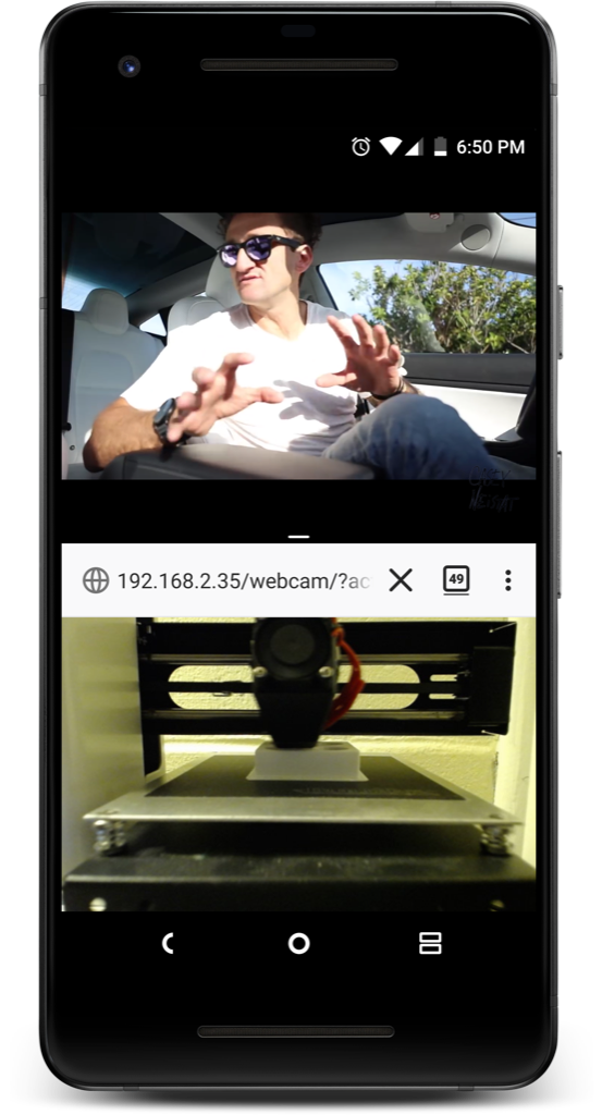
Printing my ink vial holder last night on the 3D printer took a lot longer than I thought it was going to, and I had to leave the office for supper midway through the print.
I didn’t want to leave the printer unsupervised lest something go wrong and I burn down the Parish Hall, so I took advantage of the OctoPrint feature that streams a view of the printer to a browser and also of the Android “split screen” feature that allows two apps to run at the same time, to watch YouTube and the 3D printer at the same time:
I finally found a Canadian source for good quality typewriter ribbons: Toronto Typewriters. I ordered a Big 3 Combo a couple of weeks ago, and it arrived yesterday.
The “Big 3” are a black, a black/red, and a purple; I installed the purple and it’s like I have a new typewriter:
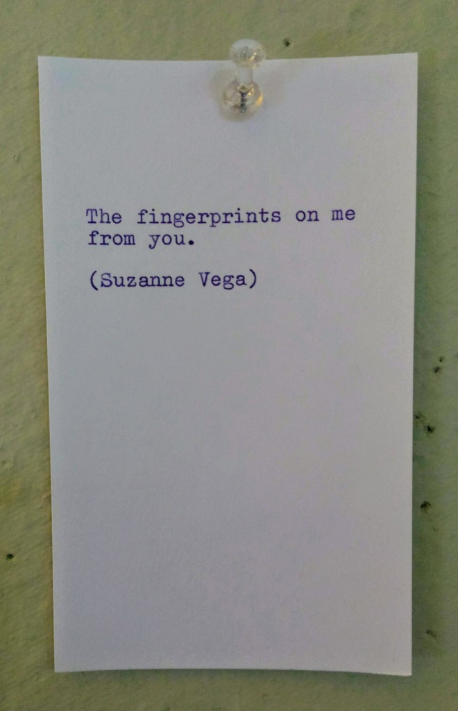
That’s a line from Marlene on the Wall, by Suzanne Vega that’s always stuck with me since I first heard it:
Even if I am in love with you
All this to say, what’s it to you?
Observe the blood, the rose tattoo
Of the fingerprints on me from you
As I related in October, my friend Nene turned me on to the world of Pen Chalet fountain pen ink samples, and starting from her lovely gift of a sample of Morning Star ink, I’ve acquired a small fleet of 4 ml vials of my own.
The only downside of the tiny sample vials from Pen Chalet is that it’s hard to keep them upright: they’re top heavy, and so whether on a table or in a drawer, I find they’re forever falling over on me.
Not such a bad thing, really.
Unless I have the top off to refill a pen (fortunately this hasn’t happened yet).
I set out this afternoon to solve this problem: I used my calipers to find that the diameter of the vials is 16mm and then designed a 3D model of an “ink vial holder” in Tinkercad:
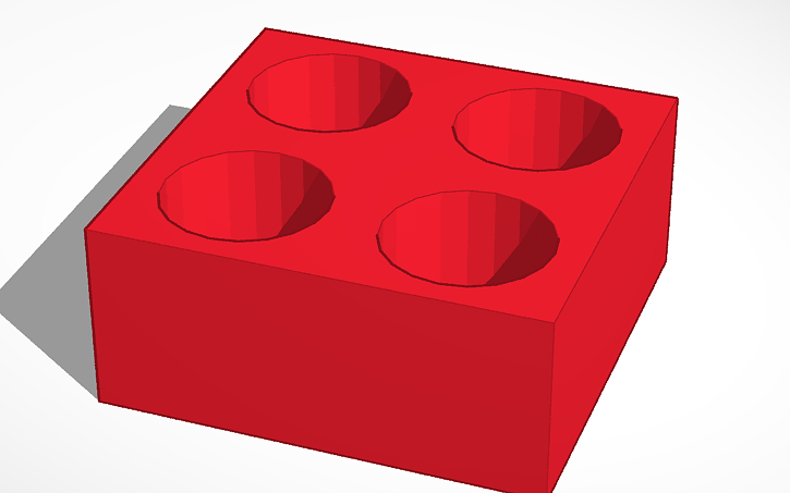
I printed the model on my Monoprice Select Mini 3D printer this afternoon and the result does exactly what I set out to have it do, holding four Pen Chalet sample vials upright:
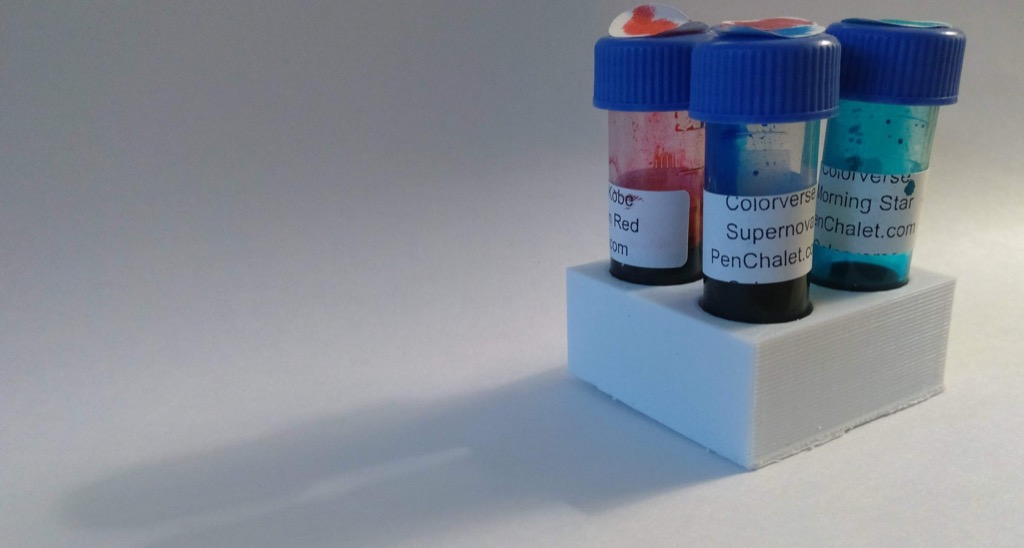
An unintended side-effect of the design is that it also works really well for moving the vials around; it reminds me of those boards used to transport sampler flights of beer:
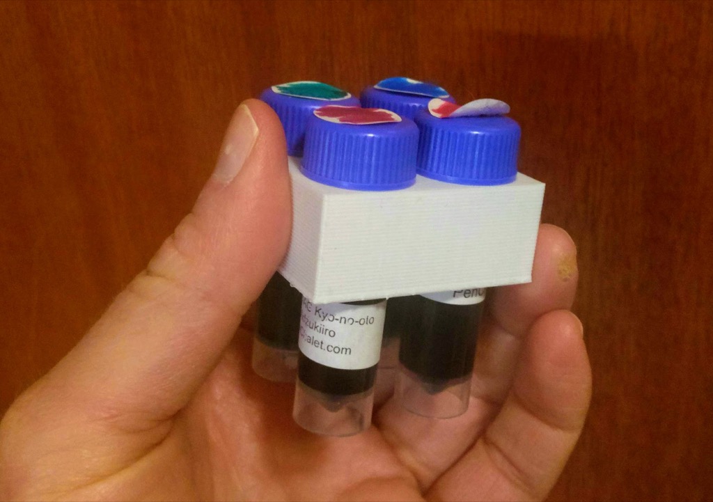
Keen-eyed readers will note that my ring finger in the photo above bears witness to accidentally touching the “hot end” of the 3D printer a few weeks ago when making an adjustment. As burns go, this one went very well and served mostly as a lesson to me to never touch the hot end of a 3D printer.

William Denton is selling copies of a limited edition of a book version of Listening to Art.
I like his pricing:
While I have supplies, copies are available at a special price: $20 Canadian for Canadians, $20 US for Americans, and €20 for people anywhere else in the world.
At today’s exchange rate, this translates to:
- $20 Canadian = $20 Canadian
- $20 US = $26.53 Canadian
- €20 = $30.47 Canadian
The result is nice even-numbered shipping that seems reasonable to Canadian, Americans and Europeans all, but that builds in an allowance for the increased shipping costs attached to each.
(For example, the Canada Post lettermail rate for a large envelope for weighing 400 g is $5.78 to Canada, $10.90 to the USA, and $21.80 to Sweden).
Euan Semple writes, in Fear, and loss of control, in part:
Life keeps on happening, without our control. We are out of control. We don’t even control our own thoughts never mind the world around us. Deep down we know this and numb ourselves to the fear it induces with mindless media, sugary food, or alcohol.
But something magical happens when we stop worrying about our lack of control. We can still take actions, we can still think thoughts, we can still affect the world around us, we just stop worrying about whether things turn out as we expect. We stop piling stress on top of the lack of knowledge of how things will end up.
Rather than inhibiting us, the acknowledgement of our total lack of control makes it easier for us to take action. We stop worrying and do stuff. We enjoy going along for the ride and worry less about where we are going. In doing so we might just get somewhere magical - again and again.
Having a partner with an incurable illness has taught me this empirically: I am someone who likes order, and predictability; snow days weird me out; I get discombobulated when my shaver gets moved to a different shelf or when I can’t find my phone charger where I left it.
Needless to say, introducing cancer into the mix rendered that way of thinking unworkable.
While I can’t make any great claims about calming down about snow days and shavers and phone chargers, I do believe I’ve gained some small amount of “grace to accept with serenity the things that cannot be changed,” and to, as Semple writes, “stop piling stress on top of the lack of knowledge of how things will end up.”
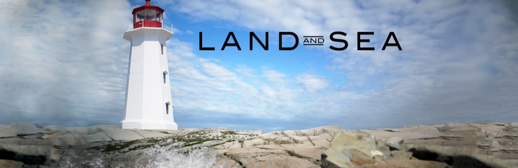
Back in the day when television was still television and we all gathered around the hearth to watch CBC (the only channel we picked up on the rabbit ears), CBC’s Land and Sea was a perennial favourite (longtime readers will recall this episode about the Charlottetown Farmer’s Market that captured wee Oliver and me).
For some reason–perhaps its website, not updated since 2014–I’d assumed that the program had long ceased production. And so I was surprised to hear a piece on Mainstreet this afternoon promoting an upcoming episode about Prince Edward Island.
It turns out that Land and Sea is still very much alive, and is in its 18th season. The website is, a friendly and helpful person at CBC Communications in Halifax tells me, a vestigial one that needs re-pointing: CBC Gem is the place to find Land and Sea now, I was told. And, indeed, there are 10 seasons of back-episodes ready there for the watching.
Welcome back, Land and Sea!
About This Blog
 I am Peter Rukavina and this is my blog. I am a writer, letterpress printer, and a curious person.
To learn more about me, read my /now, look at my bio, listen to audio I’ve posted, read presentations and speeches I’ve written, see things I’ve favourited elsewhere, or get in touch (peter@rukavina.net is the quickest way).
I have been writing here since May 1999: you can explore the 25+ years of blog posts in the archive.
![]() You can subscribe to an RSS feed of posts, an RSS feed of comments, an RSS feed of favourites elsewhere, or a podcast RSS feed that just contains audio posts. You can also receive a daily digests of posts by email. I also publish an OPML blogroll.
You can subscribe to an RSS feed of posts, an RSS feed of comments, an RSS feed of favourites elsewhere, or a podcast RSS feed that just contains audio posts. You can also receive a daily digests of posts by email. I also publish an OPML blogroll.
Instagram • YouTube • Vimeo • ORCID • OpenStreetMap • Internet Archive • PEI.art • Drupal • Github.