DeCoursay in France!
A priceless story of diplomacy from Rob Paterson. Rob’s weblog has undergone a dramatic turn in the past 24 hours, best summarized by “more Rob, fewer links.” That’s a Good Thing.

A priceless story of diplomacy from Rob Paterson. Rob’s weblog has undergone a dramatic turn in the past 24 hours, best summarized by “more Rob, fewer links.” That’s a Good Thing.
You can now purchase Mott’s Natural Style Apple Juice at the Atlantic Superstore (but not at Sobeys) in Charlottetown. It’s 100% juice, not from concentrate. The difference between this apple juice and regular old apple juice is analogous to the difference in orange juice between drinking Old South and drinking Tropicana. It’s great stuff.
While on the subject of Tropicana: pay attention when buying their products. While their orange juice is not-from-concentrate, many of their juice blends, which come in similar packages and are sold in the same area, are from concentrate.
Interesting historical note: Tropicana used to be a unit of Seagram Co., controlled by the Bronfman family. The Bronfmans funded the CRB Foundation Heritage Project, and one of the projects funded by the Foundation was the National Heritage Fair. When the Fair was held here in Charlottetown in 1995, the Word Came Down from On High that the cafeteria needed to provide only Tropicana-brand juices to the participants.
Here is an old page about the 1995 Heritage Fair season. The map of PEI was ripped directly from www.gov.pe.ca. I know this because it was one of the first graphics created for the site. It’s an ugly mottled map. And for a while you could find everyone and their uncle ripping it off to use on their websites. Thankfully, better tools, and better maps. came along, and this outpost is one of the few places the map remains.
I’ve been hearing all about some technique called “shaqinaw” for the past two days on television. I assumed it was some technical term, perhaps coined by General Shaqinaw of the Cavalry, to describe a way of attacking the enemy.
It wasn’t until I read it in print that I realized the term is “shock and awe,” which is described as:
…necessary effects arising from application of military power… aimed at destroying the will of an adversary to resist.
That, apparently, is what the Big Bombs will be used to inflict on the people of Iraq.
I take back what I said about the CBC’s war coverage earlier today: I’ve just watched The National, and they had some of their best reporting ever, and certainly the best reporting on The War I’ve seen anywhere. I could still do without Mansbridge, and the talking “retired military officer” heads, but reporters like Adrienne Arsenault are doing a fine job.
Just for the record, the last company on earth I would ever purchase a subscription anti-virus service from is Aliant. They are currently spamming their High Speed Internet customers with a subscription offer. Why would I trust a company that can’t calculate my cell phone bill properly with the security of my computer?
Reporters at the CBC in Montreal are blogging the campaign trail.
Now that we’re almost 24 hours into The War, here are some thoughts about how it’s being covered on television:

ABC — The only major network to omit the annoying “crawl” from the bottom of the screen, and thus the only source I can watch with any regularity and not get dizzy. Peter Jennings is smart and well-spoken. Correspondents are the weakest, with the exception of Ted Koppel, who is excellent.

CBS — Can anyone take the corn-ball Dan Rather seriously? Completely unwatchable. The big green LIVE blob in the top-right of the screen is very annoying, especially when combined with the ever-present “crawl” at the bottom.

NBC — Best correspondents. I can take or leave Brokaw. Same “crawl” problem. Good alternative is CNBC, which uses the intelligent and insightful Forest Sawyer as host during the evening.
FOX — Like watching an SCTV imitation of real news.
CBC — Seems like second generation news: I get the impression that people at CBC are watching the pool feeds from afar, and reporting what others are reporting. Correspondents seem remote from the war, and experts seem to neither be expert nor particularly informed. And there’s the usual “Mansbridge as automaton” problem.
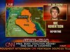
CNN — Very full of themselves, but arguably the best coverage going. Smart, well-informed experts; correspondents all over the place (including Nic Robertson, who’s taking his life in his own hands by staying in Baghdad). Aaron Brown is very annoying — almost as much as Dan Rather — other hosts less so.
PBS — Charlie Rose has the best commentary with the best guests.
Apparently Tom Dressen (who guest-hosted the Late Show tonight ) is “Corporate America’s Favorite Entertainer.” Is that a good thing?

I am Peter Rukavina and this is my blog. I am a writer, printer and developer.
To learn more about me, read my /now, look at my bio, read presentations and speeches I’ve written, listen to audio I’ve produced, see the places I’ve been, or get in touch (peter@rukavina.net is the quickest way).
Mailing Address
100 Prince Street
Charlottetown, PE
Canada, C1A 4R4