There are six panels to be set and printed for the Confederation Country Cabinet. Milton Acorn’s Poem for the Astronauts is the third one I’ve completed. It’s not the longest piece by letter-count, but it’s the “tallest” and was the piece that determined the paper size of 7 inches by 10 inches that all the panels are being printed on.

🗓️

Work on the Confederation Country Cabinet pieces continues in the press room. After the delay waiting for capital Ks to be freshly cast, there was another pause of a few days waiting for a batch of paper to arrive from Papeterie Saint-Armand in Montreal.

After consulting with Brenda Whiteway (the artist overseeing the project), and visiting the cabinet itself, I ordered some Canal Paper, Saint-Armand’s machine-made paper in both cream and white and it arrived early this week.

There are three pleasant aspects to using this Saint-Armand paper: first, David and his crew at Saint-Armand as simply lovely people, a pleasure to deal with, and a company to be treasured by anyone who appreciates craftsmanship and pride-in-product; second, it was David who connected Brenda and I in the first place (we live only a few miles apart, but it took our paper man to connect artist with printer) and, finally, back in 2010 I got to visit Saint-Armand and see the machine that makes the Canal paper right up close.

With K and paper in hand, I was ready to head back to the print shop. This work is a challenge for reasons beyond simply naivety: I’m using a newly-case 14 pt. Bodini and a decades old 12 pt. Bodini on the same job, which makes the process of “makeready” (the subtle adjustments, with bits of tissue paper and other magic, to make sure everything is evenly inked) more complicated that usual (amplified by my naivety). But, with the wise counsel-by-Facebook from my friend Fred the Printer in Sweden (best piece of advice was to go and buy some cigarette paper, which is perfect for makeready), I’ve made my way, and yesterday I completed two of the six panels.

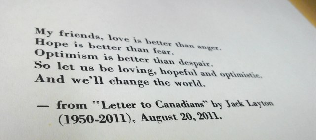
Here’s a detail from the panel that includes a quote from Jack Layton’s Letter to Canadians and another from Adrienne Clarkson:

Jack Layton quote.

It’s not perfect, but then printing can only approach perfection from a distance and never achieve it; but I’m happy with the result, and the Saint-Armand paper was a joy to print on. Today I’m back to the composing room to set passages from J. J. Steinfeld and Milton Acorn.

🗓️

I am chairing my first PEI Home and School Federation meeting tonight. We have a full agenda, and I’m equal parts daunted and excited.

I stand on the shoulders of giants in this new role: both the presidents who have come before me in the 61 years of PEIHSF history, and those Islanders I’ve looked to as mentors in the ways of Roberts Rules of Order over my time on PEI: people like Leonard Russell, Sterling Stratton, Marion Murphy and Hon. Marion Reid, each of whom has taught me so much about how to conduct meetings efficiently and earnestly, and how paying attention to process, even if it might feel like acting in an Edwardian play, is important.

I will never forget Leonard’s stentorian voice when he was chair of the L.M. Montgomery Land Trust putting motions to a vote:

“All those in favour, signify by saying aye,” he would say, and then “contrary-minded, nay.”

So much better than “those in favour, those against.”

And so that will be my clarion call in his honour. Even if it does feel like 1877 all over again.

Wish us luck.

Epilogue: I couldn’t say “signify by saying aye” to save my life and eventually resorted to “those in favour”; and in my drive to keep things moving along smoothly, I ended up speaking about 4x faster than the secretary could reasonably be expected to keep up with. But we had a good turnout and some good discussion and learned some lessons for the next meeting.

🗓️

Our great benefactors – indeed, the great benefactors of the entire dog guide community – the Lions Clubs across Canada each year organize local Purina Walk for Dog Guides events in their local communities on this weekend in May. There are a lot of Lions Clubs in PEI – 22 in total – and a number of those are in the Charlottetown area. We knew we wanted to participate in a walk – but with which club?

Fortunately Easter interceded and answered the question for us: Catherine and Oliver were out at the Charlottetown Mall the weekend before Easter and were flagged down by a couple from the Winsloe Lions Club who saw Ethan. They were operating a “have your picture taken with the Easter Bunny” booth in the mall, fundraising for Dog Guides, and offered to take Oliver and Ethan’s picture. Catherine struck up a conversation with them, and they invited us to walk in the Winsloe walk.

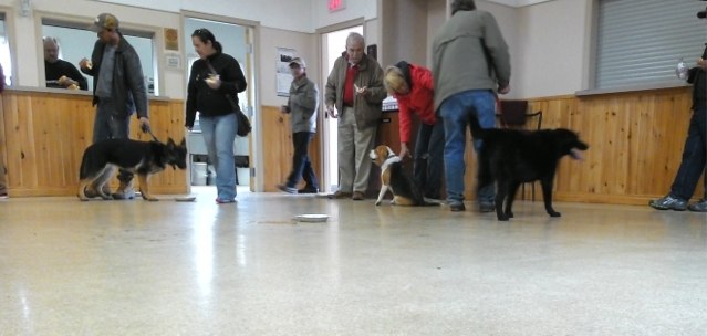
Which is how the Ethan’s eye view this afternoon looked something like this:

Purina Walk for Dog Guides in Winsloe

There were 9 dogs in total who turned out. Ethan was the only service dog in the bunch: the rest were just regular everyday dogs doing their part to raise money for Dog Guides Canada.

For Ethan it was a little bit more than a challenge to be in the midst of a bunch of interesting-smelling dogs while “on the clock” for Oliver, and therefore unable to dive in for some dog-on-dog smelling action (we did give him a little break halfway through to make the acquaintance of his fellow dogs).

We all walked out of the Winsloe Lions Club building (just of Rte. #2 in the heart of Winsloe) and up the handy-by Confederation Trail toward Royalty Junction; halfway out we stopped for a rest (and the aforementioned smelling), and then headed back for a hot dog BBQ.

Ethan got a chance to meet some other dogs; we got a chance to meet some other people, and to talk about Ethan and Oliver and Dog Guides Canada.  It was a good way to spend the afternoon, and we came away with an even warmer feeling about the Lions’ involvement in the dog guides program. The club raised over $2000 for Dog Guides Canada through this event.

We’re back out to Winsloe on June 7th to take the club up on its kind invitation to their “Charter Dinner” where we’ll get another chance to talk about Ethan, this time to the whole club.

🗓️
Lions Club  •  Dog Guides  •  Ethan  •  Winsloe

It’s an open secret that my colleagues at ROW142 are decamping thirty-nine steps down Richmond Street to occupy the space formerly occupied by Ristorante (and before that, Café) Diem. Which brings to an end the ROW142 coffee brand and the coffee bags I’ve been printing since it started.

During this transitionary period, while the coffee’s still roasting and brewing at 142 Richmond Street and the renovations are proceeding down the street at 128 Richmond Street, there was a need for a transitionary coffee bag, and I was left to my own devices to conjure something up.

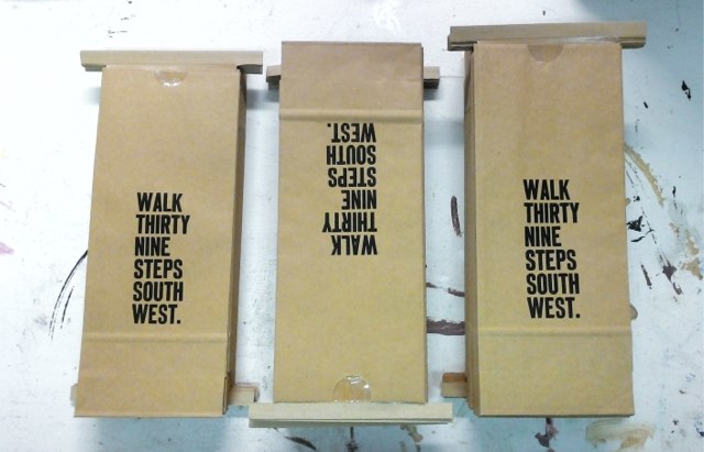
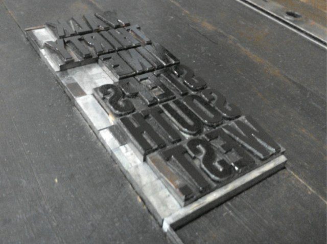
After some orienteering work on Friday afternoon, this is what I came up with:

Walk Thirty Nine Steps South West (piles of printed coffee bags)

Walk Thirty Nine Steps South West (type inked and in chase ready for printing)

I should caution that this isn’t the new name of the coffee shop or the coffee – it’s just an catalyst to tell a story about whatever is to come.

🗓️
Coffee  •  Letterpress  •  ROW142

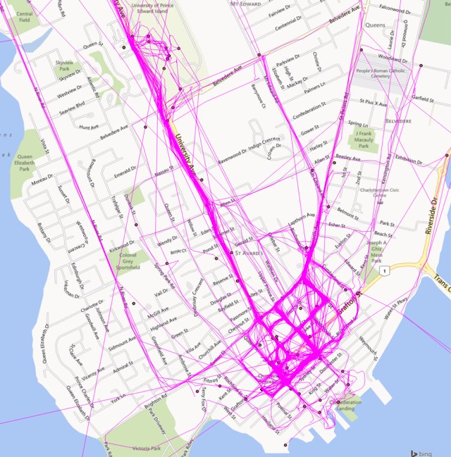
For six months, between October 2013 and April 2014, I walked around Charlottetown with my iPad in my pack running the Moves location-tracking application in the background. It was, and remains, an elegant app, and a great, simple way to track “moving around,” whether by foot, bicycle or otherwise. Alas Moves was acquired by Facebook at the end of April, and I just couldn’t conscience the idea of constantly telling Facebook my whereabouts, so I uninstalled the app and cancelled my account.

Before I did so, however, I requested an archive of my data, and, to the credit of Moves’ developers, what I received in return was an elegantly-structured data dump of everything in formats ranging from iCal to GeoJSON. I took one of the GeoJSON files provided – a record of all of my Moves “activities” over that six months, and loaded into Quantum GIS and the result was a rather accurate (and beautiful) picture of my day to day life in Charlottetown:

MOVES map from October 2013 to April 2014

Between Moves and Foursquare and Plazes and Twitter and Flickr and the late Google Latitude and all of the other applications I run that leave a geotrace, I have almost a decade’s worth of my geolocation archived away in various formats; one of the items on my Hacker in Residence to-do list is to develop a unified visualization tool for all that data so that I can fly through time and explore my whens and wheres.

🗓️
Moves  •  Geolocation  •  GIS

While we’re on the subject of newspaper design and newspaper flags, get a load of this version of The Guardian’s flag from 1919:

The Guardian Flag, 1919

(Did you know that those boxes to the left and right of the flag are called “ears” in newspaper parlance?)

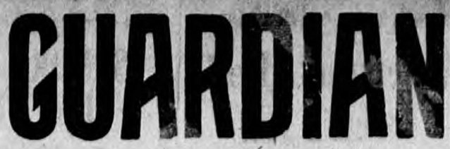
Here’s a look at “Guardian” up close:

Guardian

Is that not a dreamy typeface that makes you want to go back and live in 1919?

Thanks to Isaac L. Stewart for the pointer to 1919.

🗓️
Newspapers  •  Design  •  The Guardian

As someone who used to make up the front page of a daily newspaper using bits of paper and wax, I take more than a usual interest in the design of newspaper front pages. And so it was interesting to see the redesigned Ottawa citizen today.

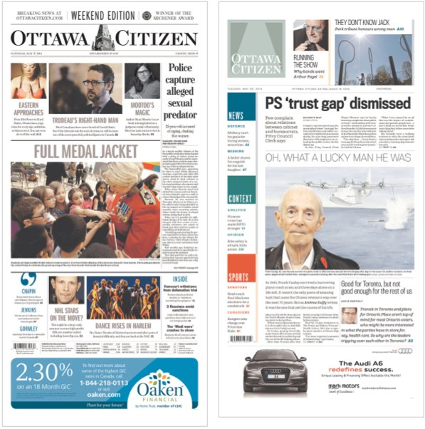
Here’s Saturday’s paper, with the old design, on the left, compared to today’s paper, with the new design, on the right:

Ottawa Citizen Cover: before and after redesign

The new design certainly owes a lot to the USA Today redesign from 2012, albeit using squares rather than circles and a calmer colour palette. I was always a fan of the old flag – the “Ottawa” and “Citizen” separated by a rendering of the clock tower on Parliament Hill – but I admire the newly-conceived “works as an icon” version too. I’d love to get my hands on a paper copy; I’ll have to wait until it arrives at the public library later this week.

🗓️
Design  •  Newspapers

You may recall my “krisis,” written about here last week, wherein I found myself without any capital K in 12 point Bodini, an important gap as I had to set the name Carl F. Klinck as part of the Confederation Country Cabinet project.

I’m happy to report that the krisis has been averted: my typefounder performed yeoman service and quickly cast and shipping sufficient K to keep me going. While he was at it, I had him cast some capital G, some capital B and some quotations marks, the later allowing me to change:

— from Letter to Canadians by Jack Layton (1950-2011), August 20, 2011.

into:

— from ‘Letter to Canadians’ by Jack Layton (1950-2011), August 20, 2011.

The type arrived on Friday, and I sorted it into the type case this morning and in doing so I learned that not all quotation marks are created equal: there are “droopy quotes” and “66/99” quotes.

For my #375 Bodini, the Swamp Press type catalog entry looks like this:
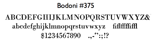
Bodini 375

Notice how the quotation marks in the face look like this (and are “droopy”):
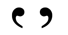
Droopy Quotes

Compare this to the Swamp Press type sample for #137 Caslon Old Style:
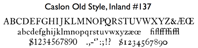
where the quotation marks provided are of the “66/99” style:
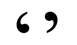
6699

What this means is that there are actually two ways of setting the quotation marks for ‘Letter to Canadians’:
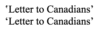
These variants are described in the book Designing Type as follows:

Although modern digital systems now provide a specific key and code for quotation marks, the form of the quote remains the same: a pair of evenly-spaced commas. While some designers prefer a top-heavy orientation (also called ‘droopy quotes’), the normal configuration is ‘66’ and ‘99’.

In my case it will be less “preference” and more “circumstance” that makes me a “droopy quote” man.

I thought it might be useful to print myself a visual aid to help setting quotes droopily, but it turned out that all I need to concern myself with is that the “tails” of the quotation marks point inwards:
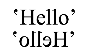
I had no idea about any of this until an hour ago: setting type is a neverending learning experience.

🗓️
Audio file

It’s 24ºC outside as I write, the warmest it’s been all year. And so it’s a good time to revisit this CBC Mainstreet piece I recorded a decade ago in 2004 about iced tea many years ago with host Matthew Rainnie.

It may be my favourite piece of radio of all those I’ve ever produced, and it’s clear that I was channeling both Ann Thurlow and the late, great Marg Meikle, my radio mentors.

Matthew was, and remains, one of the easiest people to do a back-and-forth on the radio with: he’s inveterately curious and has an appreciation for the quirk. I had so much fun doing the research for this piece.

So pour yourself a tall glass of iced tea, sweetened or not as your preference dictates, and have a listen…

(In September of 2004 I went on to do the piece in radio syndication, deliverying a variation of what I did with Matt with 12 CBC radio hosts across the country in the course of a single afternoon; it was both facsinating and mind-numbing).

🗓️
Iced Tea  •  CBC  •  Mainstreet  •  Matthew Rainnie  •  Radio  •  Sounds

About This Blog

Photo of Peter RukavinaI am . I am a writer, letterpress printer, and a curious person.

To learn more about me, read my /now, look at my bio, listen to audio I’ve posted, read presentations and speeches I’ve written, see things I’ve favourited elsewhere, or get in touch (peter@rukavina.net is the quickest way).

I have been writing here since May 1999: you can explore the 25+ years of blog posts in the archive.

You can subscribe to an RSS feed of posts, an RSS feed of comments, an RSS feed of favourites elsewhere, or a podcast RSS feed that just contains audio posts. You can also receive a daily digests of posts by email. I also publish an OPML blogroll.

Instagram • YouTube • Vimeo • ORCID • OpenStreetMap • Internet Archive • PEI.art • Drupal • Github.