
While we’re on the subject of newspaper design and newspaper flags, get a load of this version of The Guardian’s flag from 1919:

The Guardian Flag, 1919

(Did you know that those boxes to the left and right of the flag are called “ears” in newspaper parlance?)

Here’s a look at “Guardian” up close:
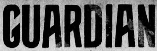
Guardian

Is that not a dreamy typeface that makes you want to go back and live in 1919?

Thanks to Isaac L. Stewart for the pointer to 1919.

Peter Rukavina

Add new comment

The content of this field is kept private and will not be shown publicly.

Plain text

  • Allowed HTML tags: <b> <i> <em> <strong> <blockquote> <code> <ul> <ol> <li>
  • Lines and paragraphs break automatically.

About This Blog

Photo of Peter RukavinaI am . I am a writer, letterpress printer, and a curious person.

To learn more about me, read my /now, look at my bio, listen to audio I’ve posted, read presentations and speeches I’ve written, see things I’ve favourited elsewhere, or get in touch (peter@rukavina.net is the quickest way).

I have been writing here since May 1999: you can explore the 25+ years of blog posts in the archive.

You can subscribe to an RSS feed of posts, an RSS feed of comments, an RSS feed of favourites elsewhere, or a podcast RSS feed that just contains audio posts. You can also receive a daily digests of posts by email. I also publish an OPML blogroll.

InstagramYouTubeVimeoORCIDOpenStreetMapInternet ArchivePEI.artDrupalGithub.