You may recall my “krisis,” written about here last week, wherein I found myself without any capital K in 12 point Bodini, an important gap as I had to set the name Carl F. Klinck as part of the Confederation Country Cabinet project.
I’m happy to report that the krisis has been averted: my typefounder performed yeoman service and quickly cast and shipping sufficient K to keep me going. While he was at it, I had him cast some capital G, some capital B and some quotations marks, the later allowing me to change:
— from Letter to Canadians by Jack Layton (1950-2011), August 20, 2011.
into:
— from ‘Letter to Canadians’ by Jack Layton (1950-2011), August 20, 2011.
The type arrived on Friday, and I sorted it into the type case this morning and in doing so I learned that not all quotation marks are created equal: there are “droopy quotes” and “66/99” quotes.
For my #375 Bodini, the Swamp Press type catalog entry looks like this:

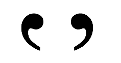
Notice how the quotation marks in the face look like this (and are “droopy”):

Compare this to the Swamp Press type sample for #137 Caslon Old Style:

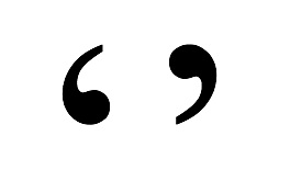
where the quotation marks provided are of the “66/99” style:

What this means is that there are actually two ways of setting the quotation marks for ‘Letter to Canadians’:

These variants are described in the book Designing Type as follows:
Although modern digital systems now provide a specific key and code for quotation marks, the form of the quote remains the same: a pair of evenly-spaced commas. While some designers prefer a top-heavy orientation (also called ‘droopy quotes’), the normal configuration is ‘66’ and ‘99’.
In my case it will be less “preference” and more “circumstance” that makes me a “droopy quote” man.
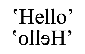
I thought it might be useful to print myself a visual aid to help setting quotes droopily, but it turned out that all I need to concern myself with is that the “tails” of the quotation marks point inwards:

I had no idea about any of this until an hour ago: setting type is a neverending learning experience.
 I am
I am
Add new comment