
After a lot of detailed futzing around – setting the type, justifying the type, proofing, correcting, proofing, aligning the bed of the press, adding a heading – here’s the latest print of the first sentence of Anne of Green Gables I created today:
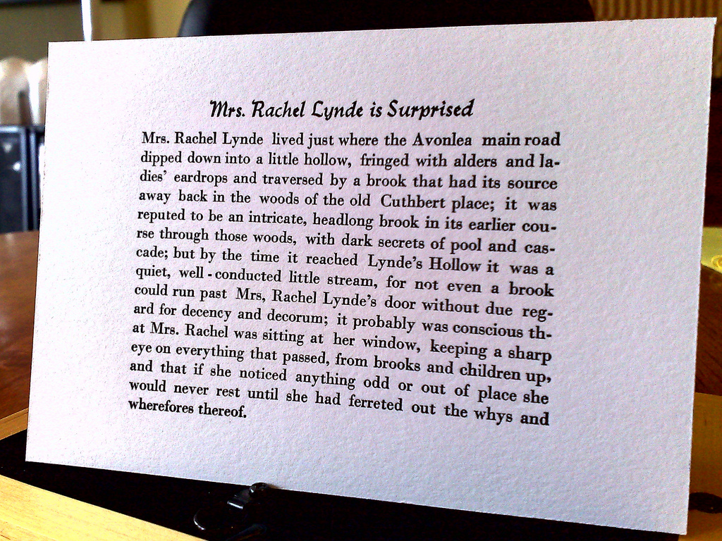
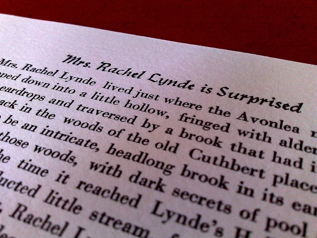
It’s printed in 12 pt. Bodoni on Crane LETTRA Fluorescent White 220 lb. cover stock, part of a sample pack I ordered from Neenah Paper. I ever-so-slightly dampened the paper before printing – I spritzed some water from an old Windex sprayer into the air and wafted the paper through the mist. Here’s what it looks like up close:
I’ve very happy with the way this turned out: I learned an awful lot about letterpress in the process of creating it. And while there’s a lot of room for improvement – to start, I need to learn a lot more about justifying type – that this print came out of a press that just a few months ago was caked with decades of ink and grime, and that I had no idea of the workings of, seems like a minor miracle.
I must admit to complete ignorance of fashion (no doubt you already know this if we’ve ever met in person). When I last paid attention, “rugby pants” were all the rage. I’m still trying to figure out what culottes are. And spaghetti straps?
Here are the rules at Oliver’s school for what students and staff are not allowed to wear:
- Straps must be at least two fingers wide. No spaghetti straps.
- Full length shirts - no low cuts and no belly shirts.
- Shirts must not have sexual comments or inappropriate logos or graphics (ie. alcohol).
- Shorts and skirts need to be at least finger-tip length, when arms are beside the body.
I’m fascinated by lists like this because they seem so arbitrary. And so rooted in the 19th century conception of what’s proper.
It’s not that I’m necessarily opposed to the notion of regulating dress (although the more anarchistic parts of my brain are strongly so, I must admit). It’s just that if you’re going to regulate dress, why not do it with some moxie. Here’s what the rules at Pete’s Academy would be:
- No corporate logos on anything. At all.
- On Wednesday everybody has to wear a tie.
- No velcro shoes allowed.
- Dress shirts, if worn, must have button-down collars and be at least 90% cotton.
- Socks must be worn at all times, and must be lime green, purple, yellow or fuchsia in colour.
- If worn, t-shirts must be printed with slogans that express a strong point of view. About something.
- Yellow rain coats only; no green, no blue.
Back in the mid-1980s when I found myself bored with public school I flirted with the notion of going to Hillfield Strathallan College in Hamilton. While there were plenty of reasons to not do this – I flunked the “religious knowledge” part of the entrance exam, for example; and then there was the whole “cultural snobbery” thing – what pushed me over the edge was the school uniform. The day I attended the school open house happened to be the day of the switch from winter uniforms to spring uniforms, and the reaction of the students to this news – elation would not be too strong a word – told me all I needed to know.
Here’s the dress code at Hillfield Strathallan these days:
Proper school dress is a requirement for attendance and to encourage students to be known and recognized for who they are. It is the responsibility of the students and parents to know what the dress code rules are and to abide by them. If there are parental concerns regarding the suitability of an article of clothing, it is best to inquire of the Principal before the article is purchased and worn, to eliminate unnecessary expense, and to allow replacement of the article, if necessary.
The College standard of acceptable dress is defined
as follows:all clothing must conform to College regulations
it must be clean and in good repair
it must be worn properly as outlined by the PrincipalStudents wearing temporary improper variations of the uniform must have an explanatory note from a parent and the approval of the Principal before attending class. Dress infractions are dealt with by each school under the supervision of the Principal.
School uniforms are required for all students during school hours, for special College occasions and by team members representing the school. Sweaters (Mondays) and blazers (Fridays) must be worn at Chapel except during the ‘summer dress’ seasons in early fall and late spring.
They are to be worn at lunch unless announced otherwise. Uniforms are not required for spectators at games in the evenings or on weekends. The beginning/end of winter dress times will be announced to the students.
Only new College and House ties are acceptable and student blazers, sweaters, polo shirts and golf shirts must feature the new HSC crest (shield and mottos).
Please note that ‘heely’ running shoes are not permitted on the HSC Campus.
Grooming
A general principle with respect to hair style, jewelry and uniform is that their appearance should be subtle and not extend to the point that attention is drawn towards the student’s physical presence. Girls’ hair styles must be tidy and of an acceptable style and length. Boys’ hair styles must be tidy and an acceptable length at or above the collar. Boys of an appropriate age must be cleanly shaven with the exception of Grade 12 boys who may, as a privilege, have neatly kept facial hair. Students will not be allowed on campus with hair styles out of keeping with College policy. Visible neck jewelry and elaborate, multiple bracelets are not permitted, nor are earrings for boys. Girls are limited to two small earrings per ear. Nose rings are not permitted
The dress code goes on from there over several pages to lay out the various uniform requirements of different grades for boys and for girls.
When you read dress codes like this, the Prince Street “stay away from the beer logos” appears positively progressive by compare.
For the record, as I type this I am wearing black jeans by Ralph Lauren, a button-down patterned Eddie Bauer long-sleeved shirt, black socks (by Joe Fresh) and a pair of black leather shoes, well-worn.
A decade and a half ago, when I was keying in data on hundreds and hundreds of crafts suppliers as part of my job at the PEI Crafts Council, I started to have repetitive stress issues in my right wrist.
After a series of failed consultations with general physicians – one simply told me to wolf down Aspirin and I wouldn’t feel the pain – I finally ended up in the occupational therapy department of the Queen Elizabeth Hospital where a cast was made of my wrist and, a few weeks later, I received a custom-molded brace for my wrist.
I’ve been using it to type with ever since, and it’s what has made the intervening years of my career as a professional keyboardist possible.
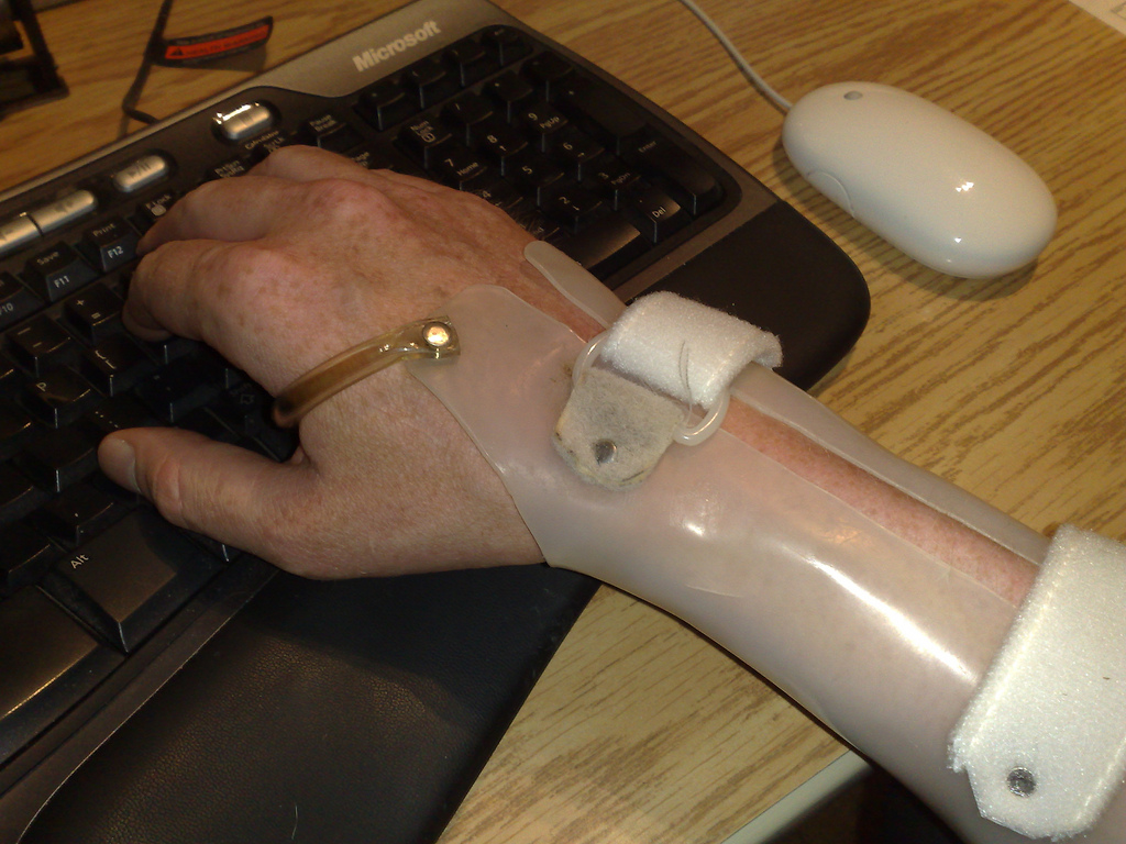
I’ve been back to the QEH a few times for tune-ups on the brace, but finally, after 16 years, it’s starting to wear out – the back velcro gave out a few months back, there’s a crack near the front – and I decided it was a good idea to find a replacement before it finally gave out completely lest I be unable to work at all.
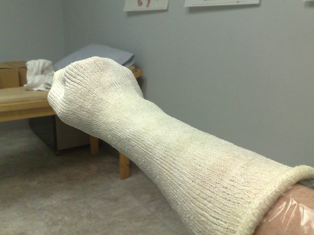
Which led me to Barry MacKinnon at Island Orthotics this morning. Barry took a look at my brace, decided he could keep it working for a while longer but that he could also make me a new one (the snazzy new Velcro you see in the photo above was put on today). And so I was ushered into a side-room and after a few minutes of work my right arm looked like this:
In a week or so I’ll return to pick up my new brace, meaning that my career can continue should I accidentally melt or otherwise destroy my trusty long-time wrist companion.
Barry has a fascinating shop in the basement of the Polyclinic on Grafton Street, filled with grinders and benders and melters and all other manner of machinery that allows him and his staff to make everything from wrist braces to replacement limbs.
Today was the start of Grade Four for Oliver. The first day of Grade One seems like an eternity ago:

Several good friends from previous grades are in Mr. Doucette’s class with Oliver this year; a couple aren’t. Although he’s still in Prince Street School, the jump from Grade Three to Grade Four means moving upstairs, taking French for the first time, a new time for recess, and who knows what else. It’s an exciting time, and Oliver was in fine form, primed and ready for action.
From the Maysville, Kentucky newspaper The Evening Bulletin, October 3, 1896, I’ve come across “PRINCE EDWARD LAND: The Simple Capital of a British Province and Its American Visitors”, which reads as follows:
Charlottetown, PEI, Sept. 10. – This little town is cut off from the world in an aggravating way. The coast of Nova Scotia is in plain view along most of the southern coast of Prince Edward Island, but the transfer by boat from Pictou takes three hours, so it is almost as long a journey from Halifax to Charlottetown as from Halifax to Sidney, twice as far away. This fact and the utter absence of any picturesque feature on the island would make Charlottetown a place unknown to any but commercial travelers or insurance agents if it were not that a Boston steamship line has made this place its terminus. Once a week the big ship from Boston, which has stopped at Halifax and Hawkesbury en route, comes to her wharf at Charlottetown and discharges a shipload of passengers. They are chiefly from Boston and interior Massachusetts. Some of them are from New York and Philadelphia and even cities of the west. All have come for the sail. They don’t care a fig for Charlottetown. The chance to spend six days on the ocean with opportunities at several intervals to “get off and walk” for a change draws from 50 to 200 people from Boston every week. Many would much rather stick to their pleasant berths aboard ship when they reach their destination, but most of the passengers go ashore for the night. So Thursday nights are gala occasions in Charlottetown, and the greater part of the population gathers at the wharf. The people arranged in tiers on a bank that looks down on the landing, and they fight for position near the entrance to the shed through which the travelers must pass. What satisfaction this crowd gathers from gaping uncomfortably in the semidarkness at the string of commonplace men and women, satchel laden, filing out of the shed is comprehensible, I think, to none but a Charlottetown mind. That there must be some satisfaction is plain from the fact that the crowd is as great at the end of the season as it is at the beginning.
They have primitive ways of running a hotel in this country. When you register, the clerk assigns you to a room and waves you toward the stairway. You climb three flights of stairs and find your way along the hall to the room. The door stands hospitably open. The key is in the lock. This at least is an improvement on Halifax, where the keys, having no tags attached, are carried off by the guests, leaving the next occupant of a room no protection but a chair braced against his door.
Charlottetown surrounds Queen’s Square, an oblong strip of parking very prettily laid out. Facing the park are the provincial parliament buildings of graystone. Adjoining are the post office and the city hall. Beyond the post office is a long market, whose odors are an offense against the pretty place. Outside this square Charlottetown suggests nothing so much as a small county seat in Illinois. All the merchants of the town are gathered in two or three streets near the square, and their establishments are very like American country stores. All the sights of Charlottetown can be exhausted in half an hour, and the traveler welcomes the time when a blast from the steamer’s hoarse whistle warns him that it it time to start on the homeward trip. – Grant Hamilton.
After using my Adana Eight Five largely unchanged from the way it arrived on my doorstep, I decided it was time to see about making some adjustments to the press bed to get more even printing. I followed the instructions in the owner’s manual:
Your machine was fully tested before despatch, but should adjustments be needed to even the pressure, or to adjust for a lighter or heavier forme, this is done by the four impression screws. After making a number of such adjustments it may be necessary to square up the type bed. Slacken off all impression screws and renew the padding. A test forme should be set by placing four large pieces of type (24 point or over) one at each comer of the chase. Ink up and print as normal, but hold the handle down on its stops. With the other hand tighten the impression screws until they are touching the bed to the same degree, and the four corners print with the same density. This is not dilïicult to do if you work slowly. Tighten each impression screw a small amount at a time and then tighten the next in sequence.
The effect of doing this adjustment was dramatic: when I started the top two 24 point boxes I used were printed about 50% and the bottom two didn’t print at all. After 15 minutes of adjustement I had nice, clear impressions from all four.
With the press adjusted I decided to try printing the first sentence of Anne of Green Gables to see what the effect would be on a real job. Again, the improvement was rather dramatic: prints I made yesterday were faded and incompletely printed in many places; here’s what the print I made today (on HazelTree straw paper) looked like:
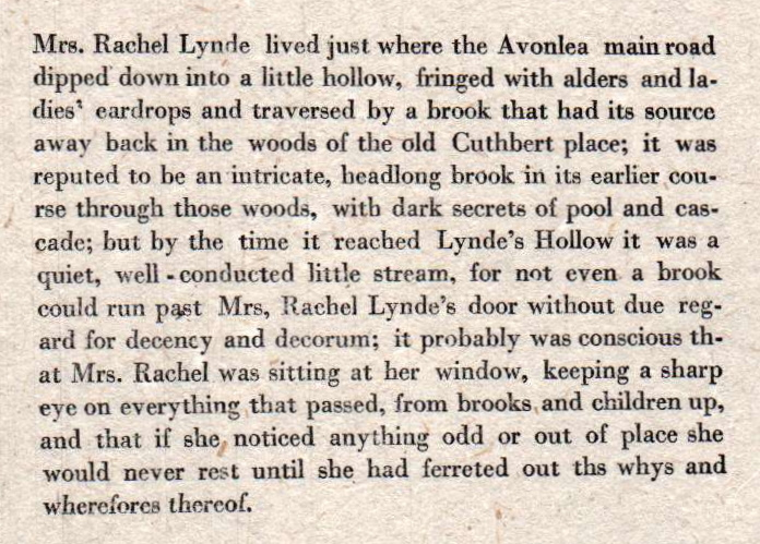
It still needs some work, but at least the work is the same across the breadth of the type. Of course being clear enough to read points out some glaring issues with the setting of the type itself: hyphenating that for example, or adding spaces around the hyphens in well-conducted. Oh, and there’s that ths in the second-last line that needs its ‘s’ swapped out for an ‘e’. I’ll have to work on those.
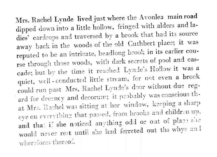
But it’s certainly getting better; here’s a print on the same paper that I took before the entire sentence was set and before I adjusted the press:

I’m getting close enough to “real printed text” that I can see the end.
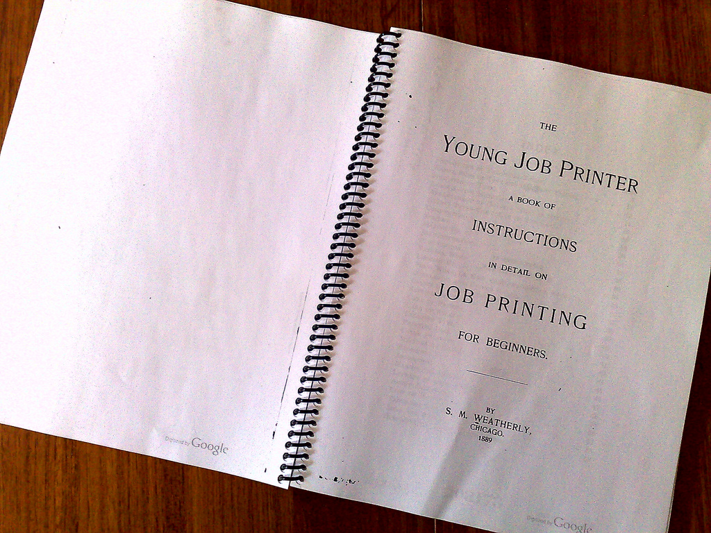
The opening section of The Young Job Printer contain a very useful glossary. In particular, three terms have served me well today:
Planer.—A smooth block of hardwood used for leveling the surface of type-forms after they have been imposed. The planer is laid on the face of the type and then tapped gently with the mallet.
Proof.—An impression taken from a form before it is sent to the press. The proof is read and compared carefully with the copy, the errors marked on it, and then given to the compositor to correct. After the matter or the form has been corrected, a second proof is taken. This is again read by copy, and should there be any errors found, another proof or revise is taken. The last proof, on which there are no errors discovered, is called a revise.
Proof Planer.—A planer covered with felt cloth, used for taking what is called a stone-proof. The form as it lies on the stone is inked and a piece of dampened paper laid carefully on top. Then the proof-planer is laid down carefully and tapped with the mallet, until a good impression is secured.
From these three definitions I was able to concoct a method for pulling a “proof” of the first sentence of Anne of Green Gables without messing about with the press (which saves a lot of cleanup).
First I rolled out some oil-based ink onto a piece of plexiglass with Speedball roller. I then rolled the ink over the type. Next I spritzed a fine mist of water out of an old Windex bottle onto a flat surface; I then laid a sheet of white bond paper into the mist so that it became a “dampened paper.” I took this sheet of paper and placed it, less-wet-side-down, into the inked type. Finally, I placed a piece of think felty fabric over the paper, and over that a piece of plywood – together they formed a makeshift “proof planer” – and rolled a clean roller over the plywood.
The result was this:
It’s not perfect. But then again it’s not supposed to be: it’s only a proof. And it’s just about clear enough for me to actually “proof” the copy before making any corrections and then moving to print on the press.
Our colleague Heidi at The Old Farmer’s Almanac has put together a great little video about the hole that’s in top-left corner of every copy of the book:
More useful insights from the The Young Job Printer from 1889 that foreshadow issues we face every day with web design.
The importance of standards:
Simple is better:
Regular readers will recall that I briefly flirted with a Kindle before selling it due to general discomfort with the physical force required to turn the pages.
Since that time I’ve continued to keep an eye on the “e-book reader” market: I’ve tried out iBooks on the iPad, handled the Kobo and the Sony Readers, and sought the advice of friends who are more seasons e-readers than I. And nothing I learned convinced me that there’s an ebook solution that works for me ergonomically.
And then I discovered Google Books. Or, rather, rediscovered.
I’d known it was there all along, and I’d followed the various legal twists and turns of (insert name of aggrieved party) vs. Google (well-aided by a chance dinner conversation with David Weinberger who nicely summed it all up for me).
But Google Books had never really caught my interest, mostly because its fully-readable books are mostly those out-of-copyright. And gripping though some of those books may be, man cannot get by on The House of the Seven Gables alone.
And then I suddenly became deeply interested in letterpress printing. And the great thing about letterpress printing is that it’s a technology that has its modern technical heart in the 1800s. And so most of the really good books about letterpress printing were written in the 1800s. And a lot of those books have been scanned by Google.
Google handily makes PDF downloads available of their full versions of these books, and so all I needed to profit from the wisdom contained within them was a workable e-reading solution that worked with PDFs.
But, like I said, none of the e-readers I’ve seen are “workable” for me, and I’m just not the kind of guy who can take any pleasure in reading while seated in front of a computer screen.
So I decided to opt, instead, for Shawn.
Shawn Mackenzie runs the local Kwik Kopy, conveniently located a block from my office. And Shawn has been following along with my letterpress adventures since I looked at some gear he was selling back in April (he also happens to own a very sweet Golding Jobber press – you can see it in the front window of the shop – that’s in mint condition, albeit not in use at the moment).
So here’s my e-reading solution:
- Find book in Google Books.
- Download PDF.
- Email PDF to Shawn.
- Pick up printed and bound copy of book at Kwik Kopy a few hours later.
It’s not all that expensive – 10 cents a double-sided page, including cover and coil binding. So this book, for example, cost me $7.36 to have printed.
The end result is way, way better than any e-reader I’ve found:
- the type is large and easy to read;
- I can write notes anywhere in pen or pencil;
- no need to worry about batteries or light conditions or about getting crumbs on the book – I can throw the book in my bicycle basket and carry it to lunch (which is why that first page is a little crinkled);
- I can easy share the book – I just hand it to someone else, or get Shawn to run off another copy;
- And the ergonomics of page turning: well, it just works for me.
I wrote about a similar project I undertook last year which involved getting a modern “open sourced” book printed up at Staples; using Shawn to print my books means I don’t have to get out to Staples, and allows me, in a small way, to support a locally-owned business here in the neighbourhood.
The really great thing about using Google Books as the “library” from which to draw is that while I have my printed book for actual reading, I can take advantage of Google Books’ excellent searching, clipping and organizing tools along with the printed book. The best of all worlds.
About This Blog
 I am Peter Rukavina and this is my blog. I am a writer, letterpress printer, and a curious person.
To learn more about me, read my /now, look at my bio, listen to audio I’ve posted, read presentations and speeches I’ve written, or get in touch (peter@rukavina.net is the quickest way).
I have been writing here since May 1999: you can explore the 25+ years of blog posts in the archive.
You can subscribe to an RSS feed of posts, an RSS feed of comments, or a podcast RSS feed that just contains audio posts. You can also receive a daily digests of posts by email.