
Lucy Dacus has a new album dropping on March 28, 2025. You can listen to select tracks on her Bandcamp page. I particularly like Ankles.
See also The Subversive Love Songs of Lucy Dacus, a New Yorker profile by Amanda Petrusich.
See also Love, Loss and Parenting, an interview with Petrusich on Anderson Cooper’s All There Is podcast.
See also Talking About Grief with Anderson Cooper, a New Yorker profile of Cooper by Petrusich.
New from the print shop today is a broadside I’ve been working on for the last month:
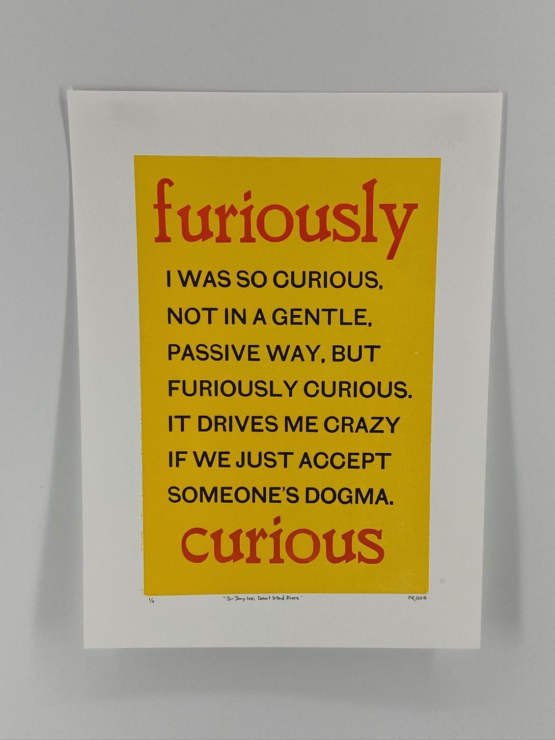
The words are Sir Jony Ive’s, from BBC Radio 4’s Desert Island Discs (you can hear them at 3:50 in the episode):
I was so curious, not in a gentle, passive way, but furiously curious. It drives me crazy if we just accept someone’s dogma.
I just absolutely loved the feeling of that level of curiosity, and felt a drive to capture the words in print.
My original thought was that they could become a This Box is for Good box, to the point where I mocked one up:
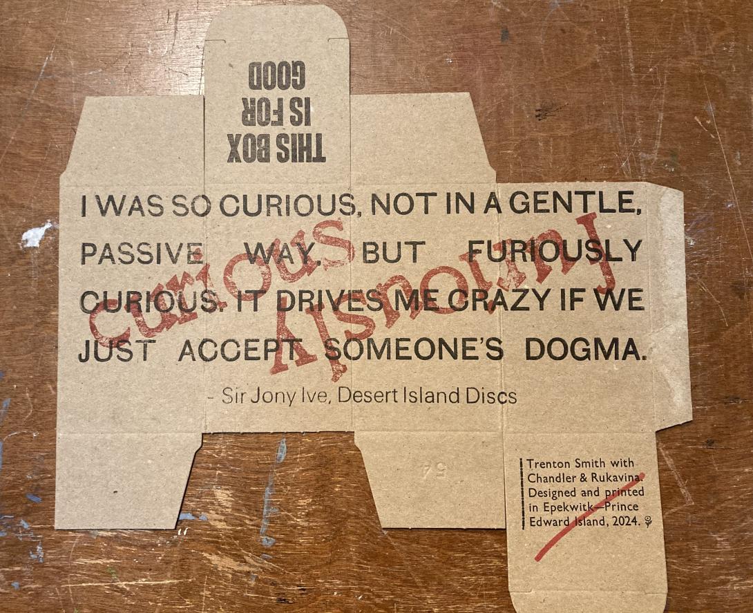
I realized, assembling the mockup into a box, that it didn’t really work: reading around a box isn’t natural, and the impact of the words was diminished rather than amplified. So, instead, I pivoted to printing a broadside.
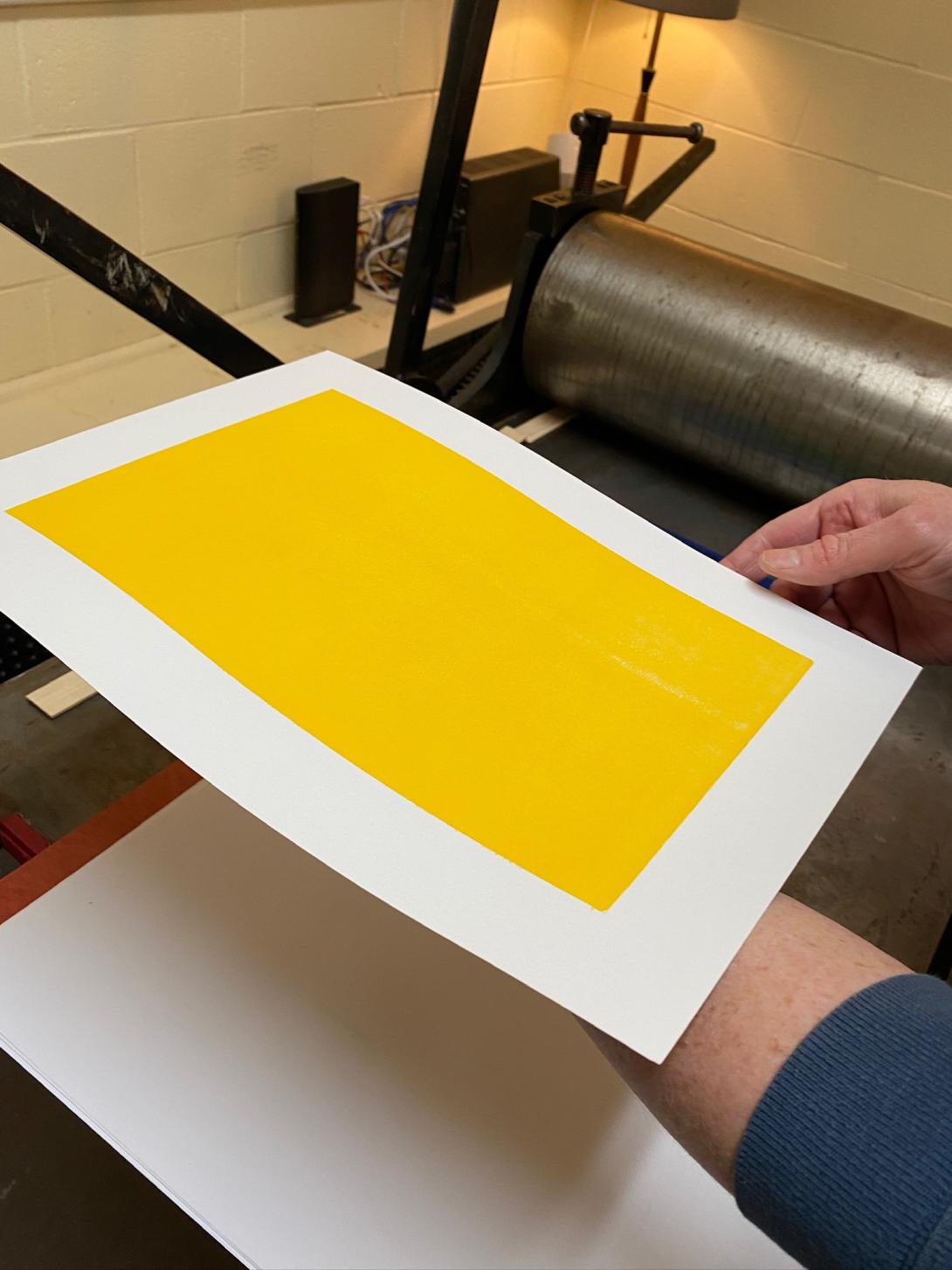
I experimented with many different arrangements of type; the breakthrough came when Lisa suggested encasing the words inside a solid-coloured rectangle. Once I mocked that up, it all fell together for me visually.
I printed the yellow rectangle on our etching press, using an uncarved piece of Japanese vinyl. My yellow-loving heart sang when I saw the result it was possible to achieve with the press, something that would be very difficult to replicate on the letterpress:
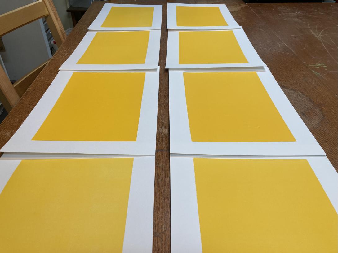
After fiddling with the packing on the press, I was able to produce a solid set of eight:
For the body type, I chose a battered old font of a sans serif typeface that I purchased from Atelier Domino in Montreal years ago. It’s got some quirkiness, including a wonky S, and a very chunky comma:
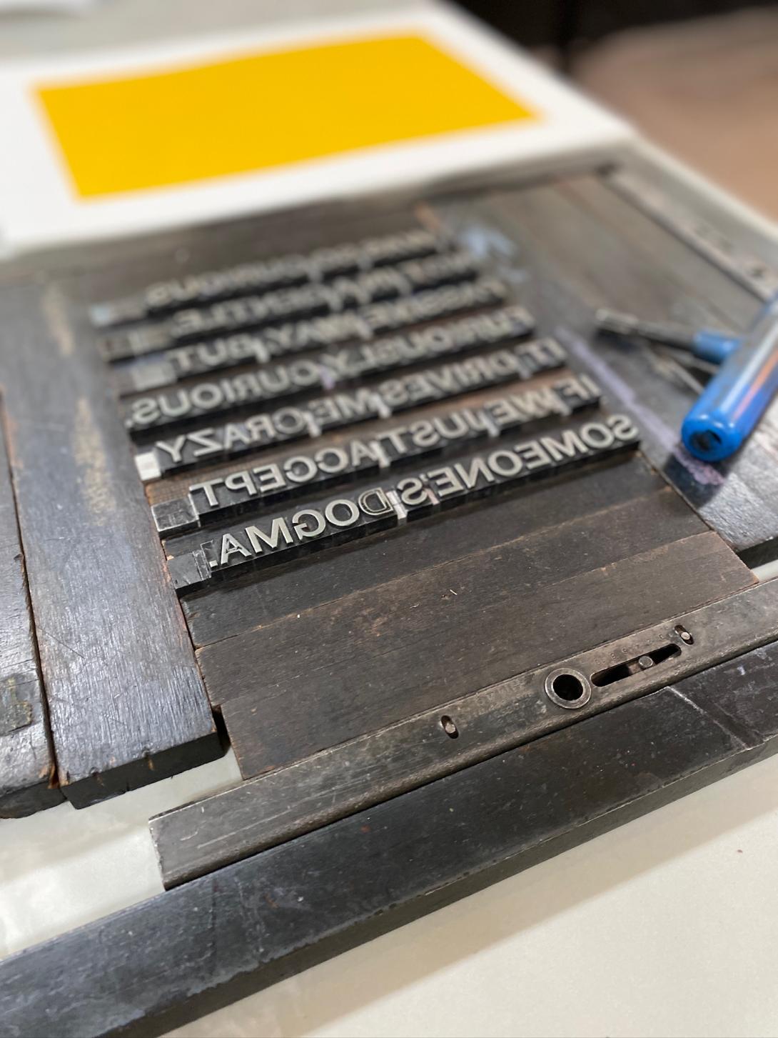
The “furiously” and the “curious” are set in a wooden typeface that I purchased from Letterpress Things in 2022; it has its own jaunty quirkiness, and I think the two typefaces are a good match.
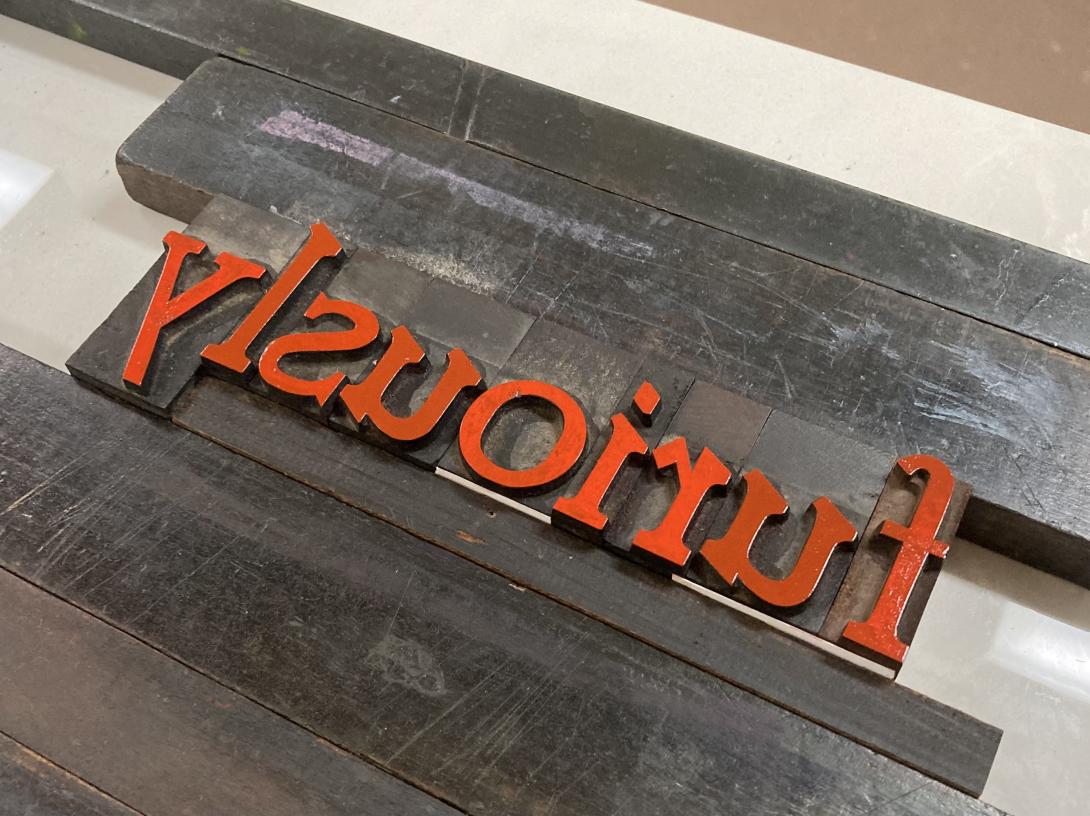
The ink, in both cases, is from the Dutch company Van Son. The red is actually florescent pink, from a tiny sampler I purchased a few years ago, when I decided I needed to print in more than just black and red. When it’s printed over the yellow background it appears more red than pink.
By the time I experimented with layout, packing, and other elements of makeready, the project emerged as a limited edition of 4 prints. I put them on sale in the Queen Square Press shop today.
I’m a regular customer as The Gallery: it’s the closest coffee shop to our house, the coffee and food are good, and the staff are friendly.
The Gallery uses Square as its point of sale terminal. They use it more vigorously that most restaurants, in that they use the “scan this QR code to order from the table,” which is a feature I use to good effect on grumpy mornings when even interactions with friendly staff would be too much.
The restaurant also uses Square to power its customer loyalty program, and, through receiving an SMS notification about my points, I discovered that I have a “Square Profile,” which has recorded every single merchant I’ve been a customer of with a Square payment system.
Many of these businesses are long-gone, and, comparing archived emailed receipts to businesses, it looks like the trail goes back to 2017.
Here’s the entire list, 112 businesses in all, in reverse chronological order by the date of last payment (simply cut-and-pasted from the Square Profile page, under “Preferences and Settings > Receipt Settings”:
- Fritz Foods Inc.
- Foxy Fox Coffee House
- Farmers Fresh Inc.
- Receiver Coffee Company
- The Kettle Black PEI
- Deus Ex Macina
- Ducks Aren’t Real
- The 5th Wave Espresso & Tea Bar
- Gallant Island Food Inc.
- Helen’s Pastry Co
- Advantage Delivery
- PEI Crafts Council Inc
- Indigenous PEI
- Airport Coffee House Ltd
- Buns from home
- Wenever Pastry Inc
- 10713490 Canada Limited
- Confederation Centre of the Arts
- Budleys Restaurant
- Soika
- Oh Hey PEI
- Rick’s Fish and Chips
- Farmacy + Fermentary
- Knead a Brake
- Blackbush
- Truckin’ Roll Ice Cream Ltd
- W.B. Burke & Son Ltd
- Tide & Tales Bistro Inc
- Icy Scoops
- MARRAM Marketing & Productions
- The Naufrage Snack Shack
- Julio’s Seafood Market
- Dreadnaught Eatery
- Island Lavender Distillery
- Tabali Grillz
- Grams Diner & Bakery
- Weird Harbour Espresso Bar
- Red Island Cider
- Bookmark Charlottetown
- Bar Vela Pizzeria & Mercato
- Seven’s Pinballorama
- JMK Fishmart
- Charlottetown Cheese Company
- Lake View Glamping Inc.
- La Factrie (727256 NB Inc.)
- Clover Food Lab
- North End Creamery
- Parker and Sons Coffee Roasting
- Aesop’s Tables
- Cranewood on Main
- Pappy’s BBQ Joint
- Kimchi&sushi
- Micro Espresso Café
- 1010 Delivery
- Coffee Plus
- Caledonia House
- Voluntary Resource Council
- Alex Bevan-Baker Pottery
- MacFarlane’s
- Pretzel, Pint & Pickle
- Lost & Found
- G&L Investments Ltd
- Tastee Bites
- Los Nopales
- Red Bandana Inc
- LUCKY BAKERY
- Habitat for Humanity Restore
- Seaside Fun Foods
- The Knot
- Souris Thai Food
- Cottage Life Boutique
- Venture Stables
- Bao Shack
- P.E.I. Arts Guild Inc.
- C & B Corner Cafe
- Dal’s Potato Bar
- Cloggeroo the Island Folk Festival
- The Dodo
- Seaside Books
- Tamarack: Twigs & Teas
- The Recovery Studio
- Green Eye Designs PEI
- Chatime PEI
- The Funky Robot - Etched Wallet Art
- AJ’s Kitchen and Catering
- Dave’s Lobster
- KZ SQUARE
- Trish juice Burlington
- Vintage Coffee Roasters
- The Old General
- Stir It Up Vegan Cafe and Market
- Sailor Bup’s Barbershop
- rachel’s ginger beer
- Sarah Bellum’s Bakery + Workshop
- Nuvrei Inc
- Boke Bowl
- Lugano coffee express
- Deadstock Coffee and Sneaker Gallery LLC
- Seattle Bagel Bakery LLC
- Pondercast
- Keene Cinemas 6
- La Sazon de Mexico
- Fancy’s Coffee Counter
- Terry’s Berries
- Pure Kitchen Catering
- Stacey Leunes
- The Walrus Foundation
- Fruition
- breadworks
- The Humble Barber
- The Galley By Chef Norman
- Paddles
If there was any doubt that payment processors like Square are actually in the customer profiling business as much as the collecting-money business, here’s what ChatGPT returned when I gave that list to it, with the prompt “Take this list of businesses, and infer from their names some basic customer profiling information about me, who’s been a customer of all of them.”:
You’re someone who values local, high-quality, and independent businesses, with a strong appreciation for good food, arts, and culture. You have quirky and eclectic tastes, enjoy unique experiences, and support small businesses, sustainability, and social initiatives. You likely enjoy traveling, exploring new flavors, and seeking out interesting places wherever you go.
Yes, that’s me in a nutshell.
We are what we buy.
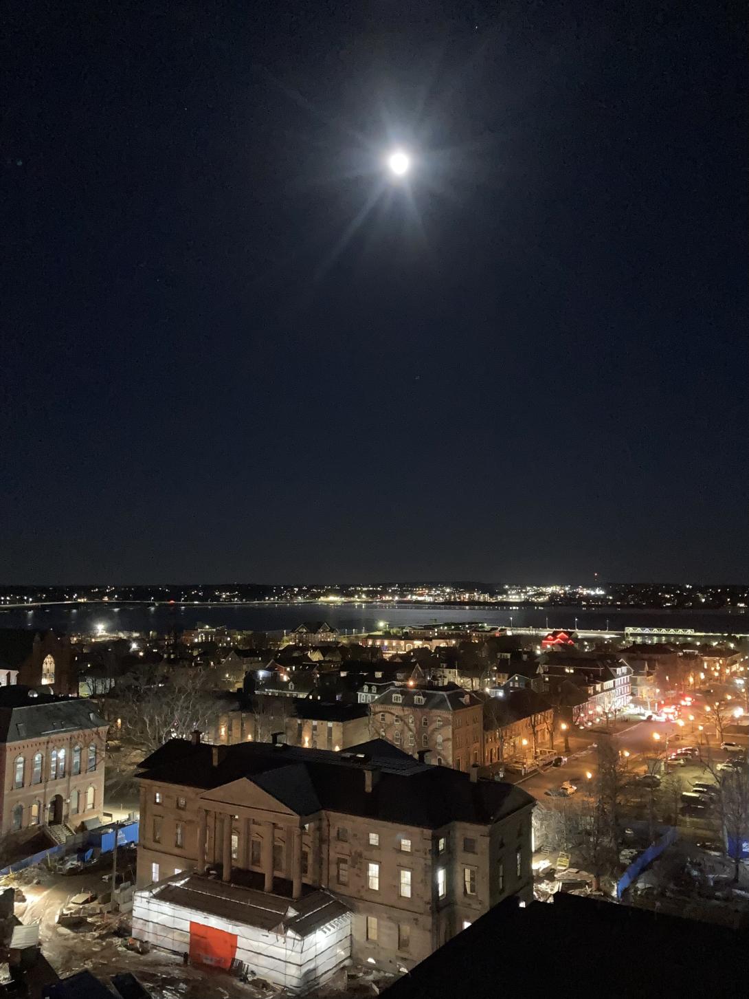
The Moon was almost full tonight—97%—and the sky was crystal clear, so we went on an evening photo walk, looking for views of St. Dunstan’s Basilica to feed Lisa’s series of relief prints from different angles.
Along the way I captured this view of Province House in under the Moon, one of those rare times my old iPhone SE rose to the occasion and performed well in low light.
Five years ago I wrote about covers that were better than the original. I thought of that post when I found my way to the cover of Joni Mitchell’s Both Sides Now by Swedish singer-songwriter The Tallest Man on Earth.
From his introduction:
When the best song in the world has already been written, why do I write?
Well, it gives me some freedom, doesn’t it, to just be in my little place, and write basically the same song over and over, like they’re just verses of this one really long one I’m trying to figure it out.
Like this is the cliff from my 2010 song Little River, and, as you can see, it’s still here, because songs don’t really make cliffs go away. So I’ll probably write about it again.
But what is the best song in the world? It’s Both Sides Now, by Joni Mitchell.
Is his cover better than the original? I don’t know. But what a lovely cover it is.
(I found my way to The Tallest Man on Earth via Patrick Bunston, musician in his own right, and an extraordinary barista to boot).
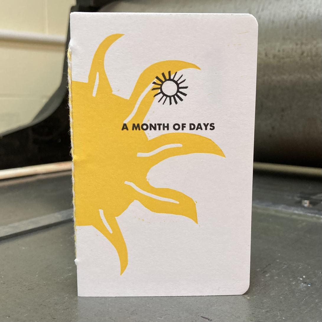
This is A Month of Days, a project I’ve been working on for the last month:
It’s the simplest of all date books: a page per day, numbered in the corner in big bold red Akzidenz Grotesk:
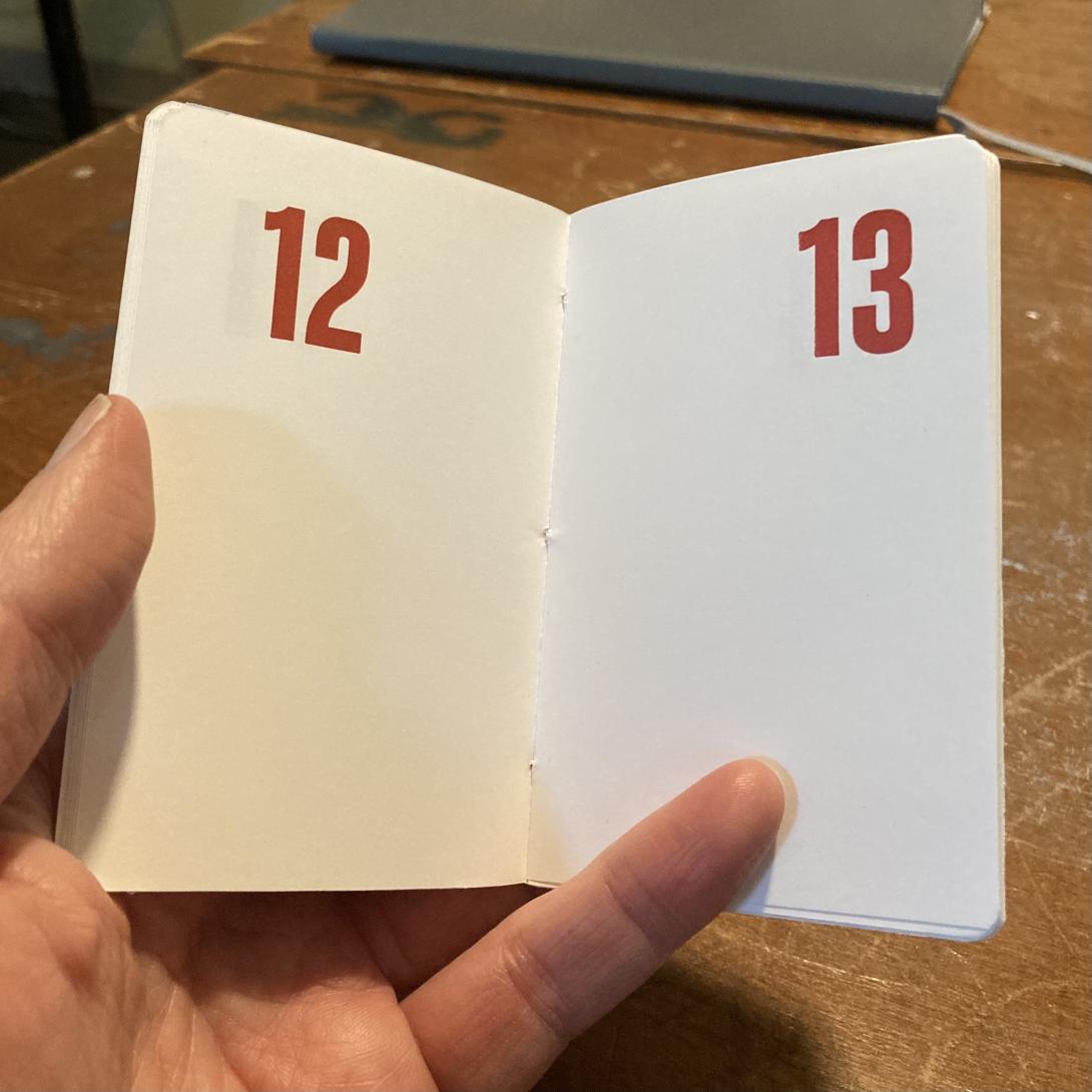
The books are simple; the printing, assembly, and binding were simple steps too, there were just a lot of them.
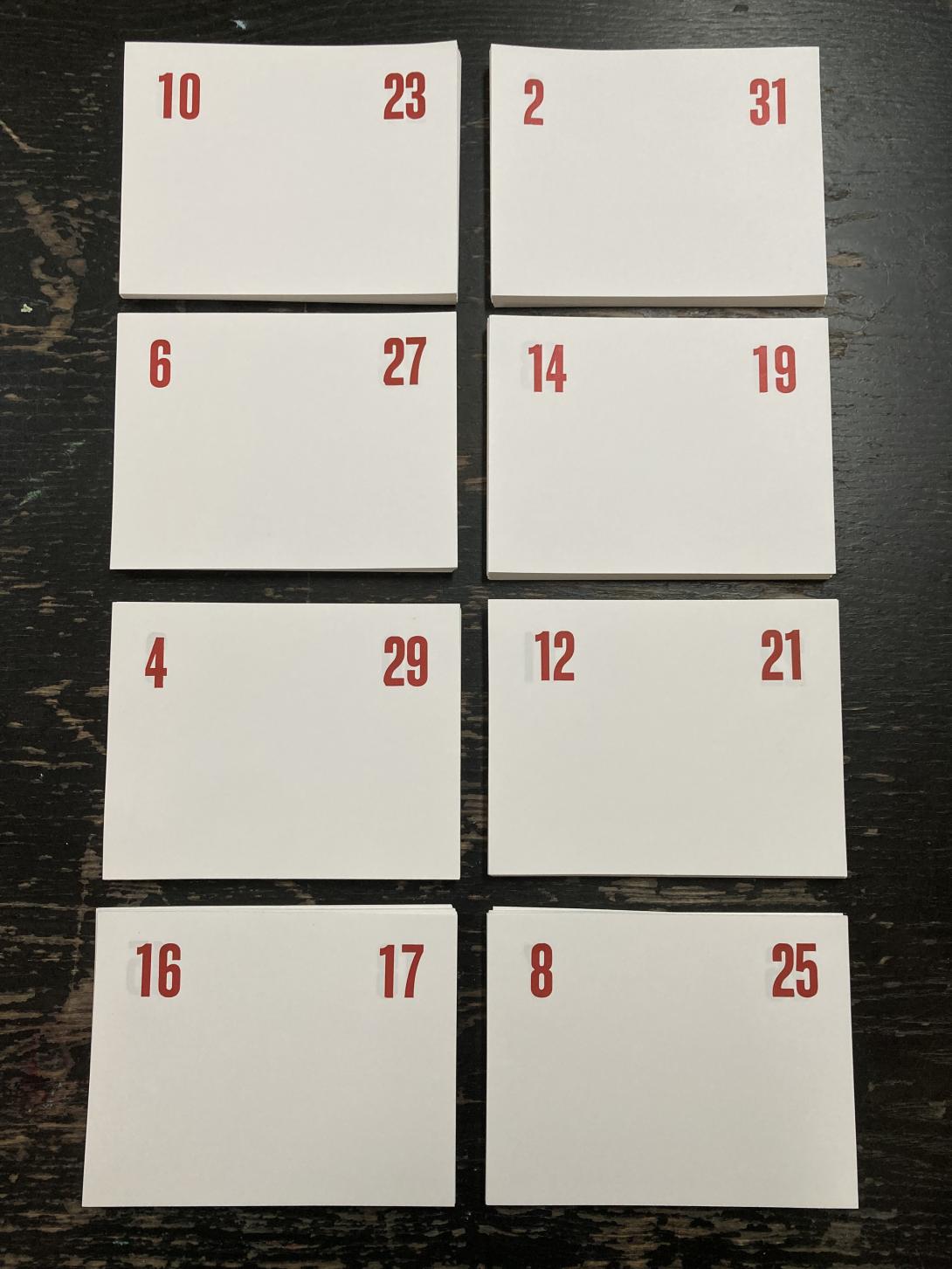
I first had to figure out how to print the numbers on the pages in a way that I could cut and fold larger pages down into signatures that would be paged in the right order.
I made a couple of mock-ups before I got everything sorted, and then set out to set the type for each spread of pages:
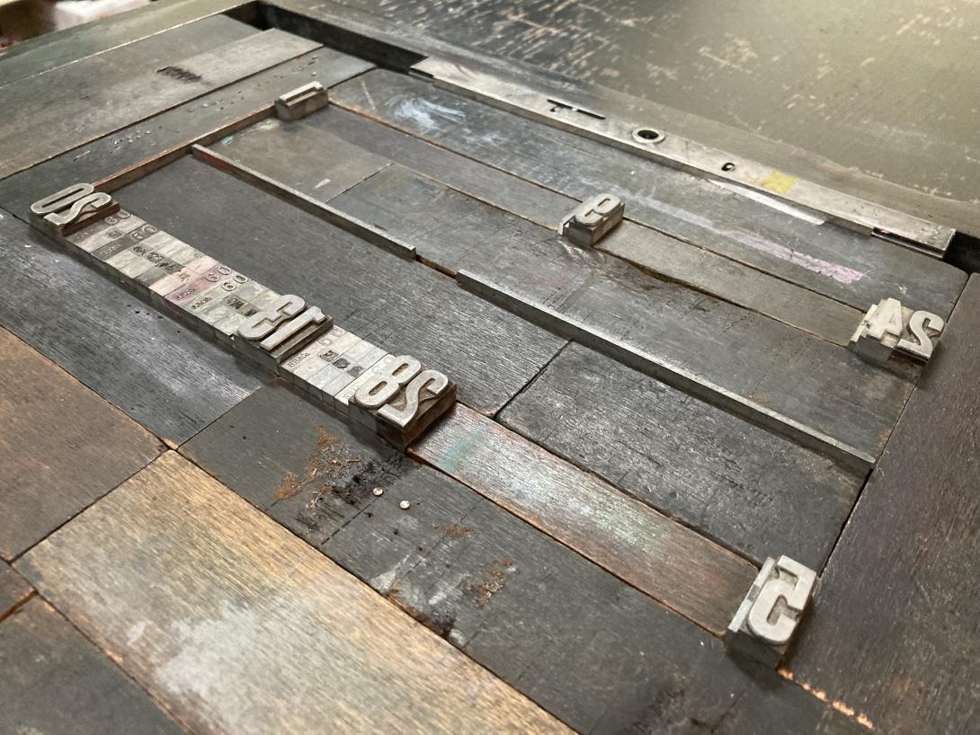
From there it was a lot of printing, setting new numbers for a new spread, and cutting down pages into signatures, a process that resulted in this collection:
With the pages printed, I set out to design and print a cover. We’ve recently come into the loan of an etching press, and I was keen to try it out, so I carved a lino block of an abstract sun:
I chose a rich Akua Diarylide Yellow ink for the printing, and ran the block through the press on notebook-sized pieces of card stock, to produce:
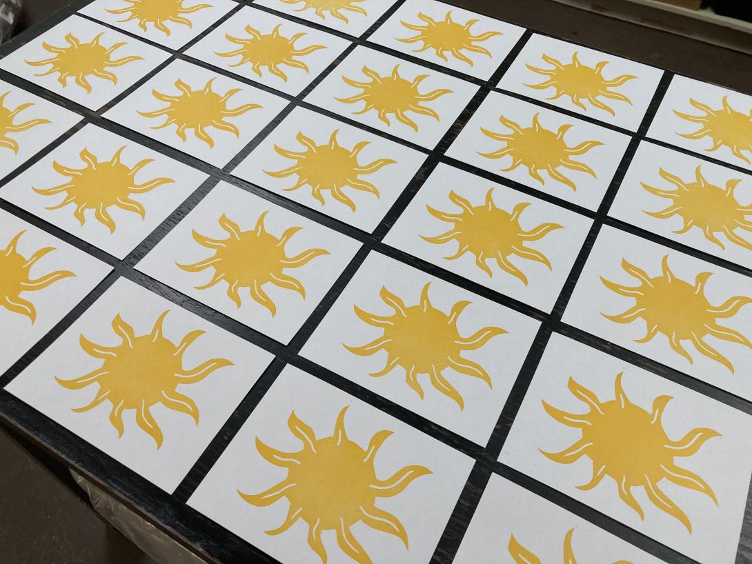
When the suns had dried, I used the letterpress to print the “fronts” and “backs” of each cover:
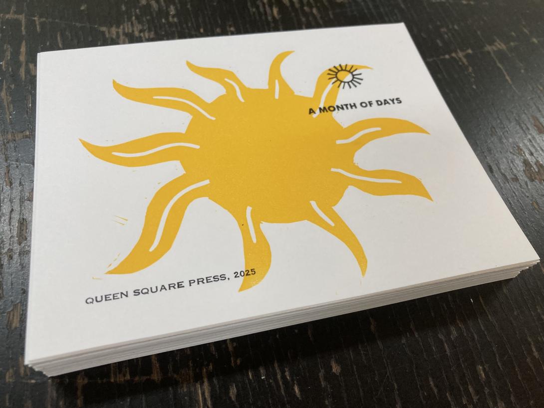
The “A Month of Days” in all caps is from a font of a tiny perfect sans-serif typeface that I acquired somewhere along the way. Above it is an ornament is by Johannes Troyer, circa 1953, cast from the original matrices by Skyline Type Foundry.
On the back is the credit “Queen Square Press, 2025” set in very tiny and fiddly 6 point Spartan, from a font I inherited from Prince County Hospital many years ago.
With the pages and covers printed and dried, all that was left was the assembly: the cover, and each page, got scored and folded, collated into a “book,” and then punch, with an awl, in three places along the spine. I then bound the books together with a simple pamphlet stitch, using bakers twine, and put them overnight in the nipping press to settle.
The final step was to trim the edges, and round the corners:
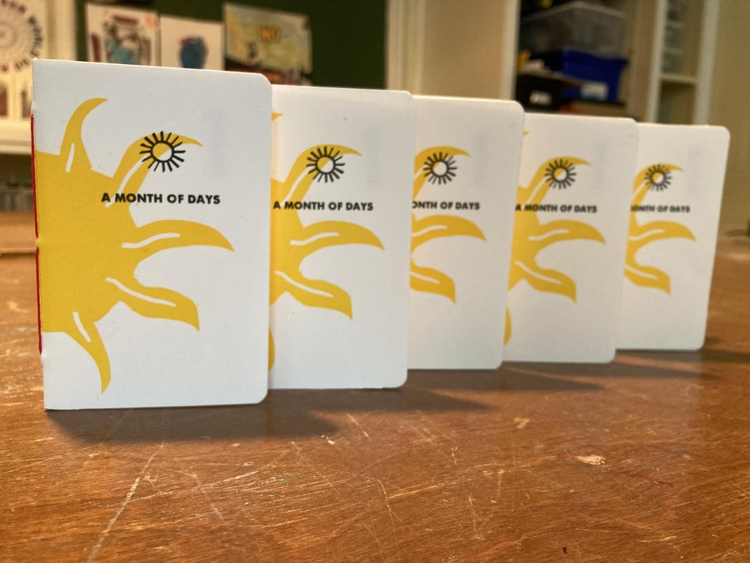
I’ve made a limited edition of 50 notebooks, and they’re available for sale on our online shop now.
When you live on an island, sometimes, in the dead of winter, you need to GET OFF THE ISLAND. It doesn’t really matter where. Just OFF.
So today, with a rare day free from other commitments, Lisa and I took a day trip to Sackville, New Brunswick, the place that’s close enough to us that both qualifies as being off the Island, and “someplace.”
It was a lovely day trip.
We had lunch at Ducks aren’t Real (née The Black Duck), a restaurant I’ve visited many times that has never looked better, with a delightful new solarium at the back (with promise of a garden patio in the summer), a broader menu, and everything grounded in the solid performance that the space has always brought.
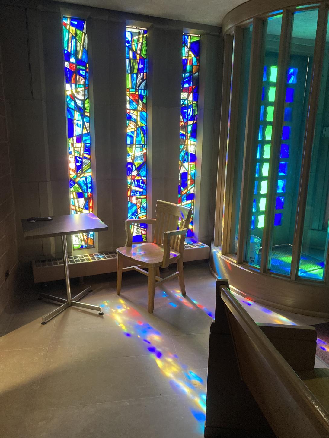
After lunch we went up the hill to Mount Allison University. We took a swing through the chapel—one of my favourite sacred spaces.
Next we walked next door and toured the Owens Art Gallery. The gallery highlight was the exhibition Hidden Blackness: Edward Mitchell Bannister (1828-1901):
Hidden Blackness is the first major exhibition of Edward Mitchell Bannister’s work ever presented in Canada—124 years after the artist’s death. Born in Saint Andrews, New Brunswick, Bannister was a self-taught, nineteenth-century, African American/Canadian painter of the Barbizon school known for pastoral landscapes and seascapes.
My favourite of Bannister’s works was River Scene (which can only really be done justice to when standing in front of it in the flesh):
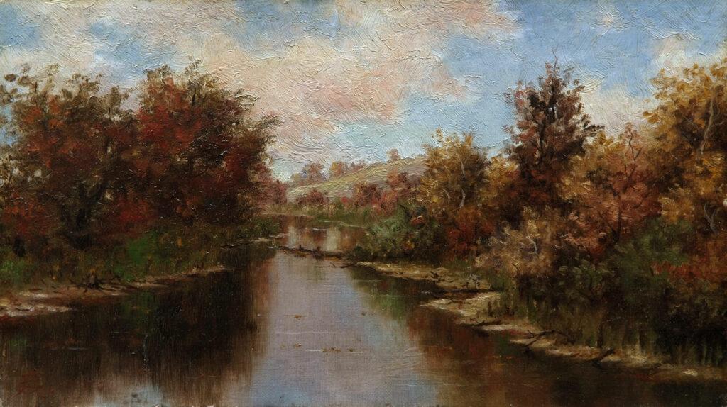
Edward Mitchell Bannister, River Scene, 1885
Art Gallery of Nova Scotia, Halifax.
Photograph by RAW Photography.
From the gallery we walked across campus to the Purdy Crawford Centre for the Arts, where the collegial and generous Erik Edson had agreed to give us an impromptu tour of the printmaking shops with very late notice. What a wonder: the building is interesting and spacious, the printmaking shop well-equipped and, a salve for for we basement printmaking dwellers, filled with light:
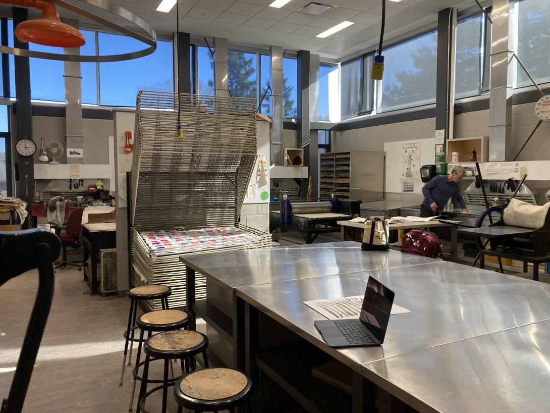
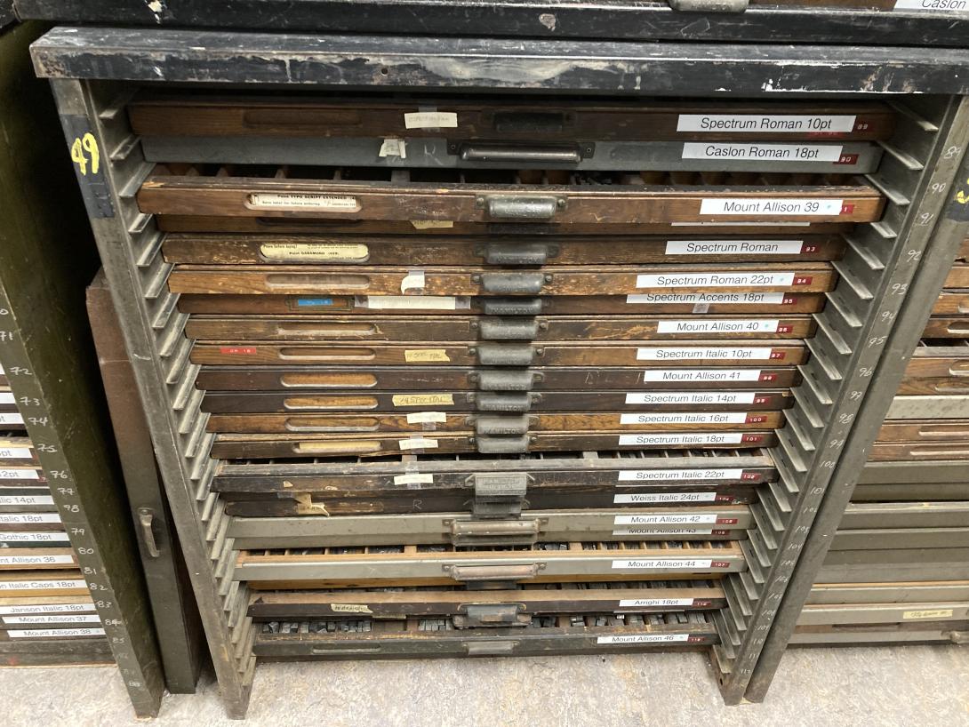
There’s a tiny letterpress shop shoehorned into a hallway, with a generous collection of type:
We said goodbye to Erik just as his 3:00 p.m. printmaking students started to arrive.
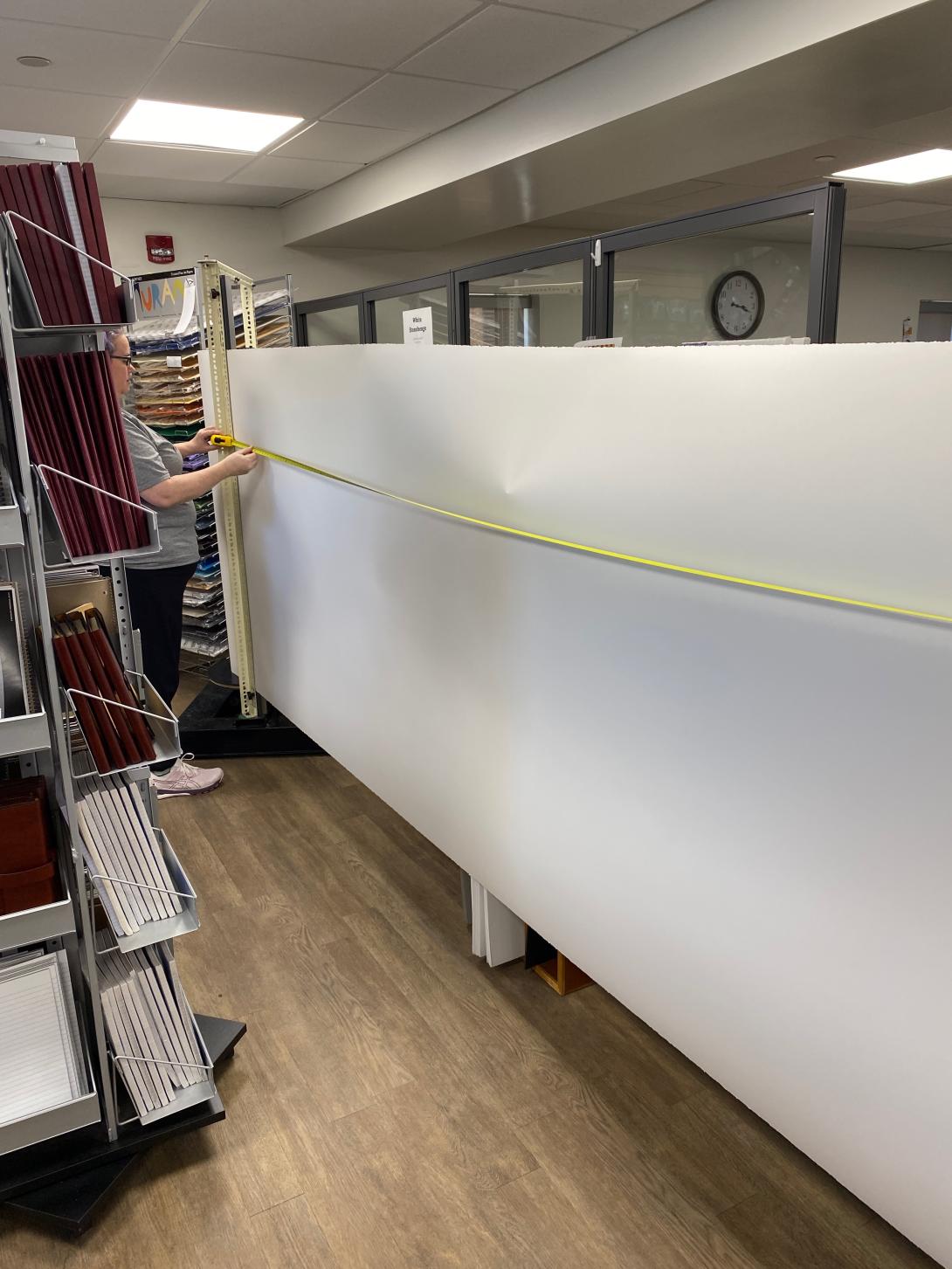
Erik suggested we stop by the Mount Allison bookstore on our way off campus, as they sell paper that might be attractive to us. He was right. They sell 50 inch Legion Stonehenge paper, well-suited for printmaking, for $4.99 a foot. We bought a 15 foot long strip:
Paper in hand, we made a beeline for the car, as we needed to charge it before heading home.
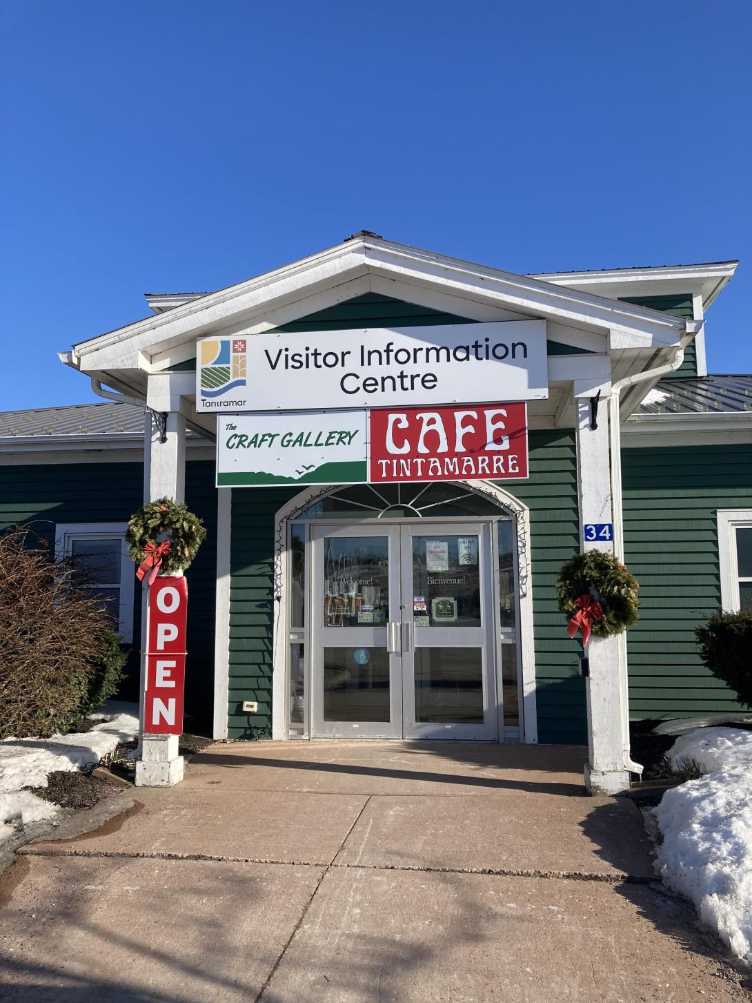
We found a level 3 EV charger in front of the Visitor Information Centre, and were very happy to find that inside there was Café Tintamarre, a new venture from the couple who operate the Deus Ex Macina coffee truck at the Sackville Farmers Market (where Olivia and I had very good coffee back in 2023).
We left Sackville at 4:15, charged again (winter battery life!) in Borden-Carleton, and pulled into the driveway at home at exactly 6:00.
We left the Island. It was much fun: new things! new people! new ideas!
I came to the print shop this afternoon to, well, print something. But in cleaning up around the press I encountered a sheaf of 11”x17” scrap paper, previously used for packing on the press, that cried out for upcycling. So I launched into an epic procrastination.
I started by trimming the paper down to 4”x5½” pieces. I stacked them up and used my cordless electric drill to punch 3 holes along the top.


Next I set up the lettepress with a piece of “perf bar,” hardened steel teeth that can punch a perforation in paper. It’s used on the letterpress just as if you were printing, except there’s piece of steel on the taped to the platen to avoid damaging it:

I stuck two pieces of sproingy white foam behind the perf bar to push the perforated pieces of paper off the teeth after perforation; otherwise they get stuck in the teeth, and I need to stop the press and peel them out.
As a final step, I assembled everything together—two covers made from upcycled tympan paper, the perforated pieces of paper—and bound it all together using three 1” screw posts (I credit Elmine and Ton with turning me on to this way of binding).


It was a two hour project from start to finish, and I never did get to do the printing I’d intended to do. But it was the kind of fanciful procrastination that makes creativity creativitying.
Meanwhile, across the studio, Lisa was engaged in her own flights of creative exploration.
(See also Perforated Notebooks, from 2019, where I covered some of the same terrain).
From Why I Cook, by Tom Colicchio:
Elizabeth is an industrial town nestled into northern New Jersey’s historic manufacturing belt. It’s best known for its shipping container port (one of the eastern seaboard’s largest), the titanic Singer Sewing Machine plant (where Grandpa Felix worked), and (as Lori reminds me) for having produced that totem of young-adult fiction, Judy Blume, who went to school with my mom. Rumor was that Elizabeth had once been lovely, but by the 1970s there were few parks and green spaces, unless you counted the thatch of trees by the Elizabeth River that also grew old tires and retired refrigerators. Maybe that’s why almost every Italian family I knew had a grandparent like mine, patiently coaxing vegetables and plants from small backyard patches of concrete, following the rhythms of their home country. Is that what has me out weeding in the mornings? Is it in my DNA?
This certainly describes my father’s parents, who cultivated a thriving garden in the yard of their house at 97 Mary Street in Brantford, Ontario.
They would have inherited this from my Ukrainian and Croatian great-grandparents, and doubtless didn’t give it a second thought: it’s what you did
If memory serves, it was more a garden they tended in parallel rather than collaboratively, but tend it they did, and the produce they harvested from that postage stamp-sized plot was awe-inspiring.
Here’s a photo of my grandmother holding my 2½ month old father, standing beside my Baba in her garden, in Fort William, Ontario in 1937:

And here’s a photo, one I’ve posted before, from the Brantford Expositor newspaper, of my grandfather in that Brantford garden, holding prized beans:

About This Blog
 I am Peter Rukavina and this is my blog. I am a writer, letterpress printer, and a curious person.
To learn more about me, read my /now, look at my bio, listen to audio I’ve posted, read presentations and speeches I’ve written, or get in touch (peter@rukavina.net is the quickest way).
I have been writing here since May 1999: you can explore the 25+ years of blog posts in the archive.
You can subscribe to an RSS feed of posts, an RSS feed of comments, or a podcast RSS feed that just contains audio posts. You can also receive a daily digests of posts by email.