Public Mobile Update, 6 Years Later

Six years ago I switched my mobile phone provider from Eastlink to Public Mobile

I have been a happy customer ever since.

Public Mobile is a bargain basement “you’re on your own” brand of Telus (one of the big three mobile providers in Canada). The brand uses the same Telus Mobility network as the other Telus brands, it’s just that service and support is entirely online, and primarily self-service (“go look it up in the forum”).

Since I switched in 2018 service has only gotten better and cheaper: I started out paying $40/month for a plan that included unlimited Canada-wide calling and texts, plus 4.5GB of 3G data; I just updated my plan today to one that’s the same price, but now includes 60GB of 5G data:

A screen shot of my current Public Mobile plan features, as described in the post.

I switched plans today (oddly, saving $5/month and gaining 10GB of additional data) because I was doing an audit of our household mobile plans, focusing on Lisa, who had been with Bell Mobility for a long time.

I ended up switching Lisa to a Public Mobile plan that’s $34 for 50GB of 5G data, saving her $52 a month over what she was paying Bell. The switching process, which included porting her old mobile number over to Public Mobile, was painless, and done entirely within the Public Mobile iOS app, taking advantage of her iPhone’s eSIM abilities, which meant we didn’t even need to leave the house to switch. The number porting was completed in less than an hour.

–– THIS IS ADVERTISING ––

Here’s an affiliate link that, if you click, and then follow through and create a Public Mobile account, will chop $1 off my own Public Mobile bill, and give you a $10 credit (thank you to the three people who’ve used that affiliate link over the last 5 years: much appreciated). 

Leapy Ear

After spending the early winter working on This Box is for Good, Lisa and I are turning our attention to new print projects, and part of this includes getting the shop set up with the right tools, inks, and whirligig’s to allow us to print what our imaginations dictate.

Today I wanted to take a new set of Ternes Burton register pins out for a ride: I’d never used them before, and I wanted to see how they worked.

I needed something to print, and the something needed to require registration. Remembering that Olivia used to call the “leap year” the “leapy ear,” I decided to print an ear as a reduction print.

I sketched an ear onto a small lino block, and set aside some areas to be grey and some to be black. I carved away everything that was to not print at all, and then used the block to print a layer of grey. Next  I carved away everything I wanted to leave grey, leaving just want I wanted to overprint in black and printed the black layer.

The job of the register pins is to keep the paper in exactly the same place from print to print, so that the colours “line up” in the right way (here’s a great video that illustrates their utility). The register pins did exactly what they’re supposed to do, and the registration across the edition of five prints was bang-on.

A lino reduction print of an ear.

Google Searches for PEI Levees

For record keeping purposes (and for small insights in to the hive mind), here are the Google searches that led people to the 2024 Levee Schedule post:

  • levee day pei (88)
  • pei levees 2024 (52)
  • pei levee 2024 (22)
  • pei levees 2023 (20)
  • charlottetown levee (20)
  • new year’s levee charlottetown (18)
  • new year’s day levee pei (11)
  • pei levee (9)
  • new year’s levee pei (5)
  • levee pei (4)

These come from Google Search Console.

Welcome to Tabata

Here’s a little JavaScript game I made this morning, coded with the help of ChatGPT. It takes a bunch of exercise movements, things like squat and wall sit, and combines them together at random to make new exercises, randomly prepending a country or state name, and randomly appending os or arinos or andos as a suffixMy favourite so far is Scottish Tricep Dip Kettlebell Swingandos.

Tap the button to make up a random exercise.

What led me down this path of whimsy?

In mid-September I sent this email to Amila Topic, owner of Kinetic Fitness, after Lisa suggested her name as a good person to reach out to about launching a fitness regime:

I was an active YMCA kid from ages 8 to 16, involved in all manner of things (gymnastics, racquetball, swimming, basketball…). I loved moving, being active, and revelled in it.

After that, a long period of sedentary, lasting into my 40s. Still an active walker/cyclist by times, but nothing intentional nor organized.

A year-long stint at the UPEI fitness centre when I was 43, with an intention of achieving some basic fitness goals, guided by a plan that Stan Chaisson put in place. This drew to a close when I experienced an unusual fascia injury in my side that has eluded diagnosis or effective treatment since, but which has gradually receded from being problematic. More significant than the injury itself was the “fitness = bad, risky, boring” attitude I left with.

From age 48 to 54 I supported my late partner through incurable cancer, until her death in 2020. This was a long period of stress, internalized emotions, and little movement.

In 2020 I started cycling more, and began using my bicycle to get around places I used to drive (grocery shopping, etc.). I began to appreciate how, slowly and steadily, I felt my capacity and endurance grow. I haven’t kept this up at the same pace in the 3 summers most recent, but I have continued to cycle.

Since late 2021 Lisa and I have been together, and I’ve seen the benefits in her emotional and physical health that come from working out in a disciplined, regular fashion.

Simultaneously, I learned to ride horses over a stretch of 18 months, and have practised improv for the last two years, and each has instilled in me the re-realization that any practice, entered deliberately and practiced intentionally, can result in growth. In a sense I’ve found the faith that “effort pays off.”

Now I’m 57. I am intrigued by the idea of taking on some kind of regular fitness practice. I don’t seek to run marathons or learn to kite surf, and I’m not looking to pursue fitness religiously, for its own sake. But I do want to build strength, endurance, flexibility, and to prepare my body for a healthier next 50 years.

I’m almost completely naive with regards to all things fitness, so I’m an empty vessel. I don’t know which muscles are called what. My three-dimensional sense is weak, so it takes me longer than typical to figure out the geometry of body movements when they are demonstrated or described to me. The difficulties of the last decade have gifted me a “What’s the worst thing that could happen?!” gusto for trying new things. I suspect my upper limit of capability is somewhat higher than I’ve ever imagined; I’m interested in finding out.

I think it might help to start or with some one-on-one training.

Amila referred me to Cayla Jardine-Hunter, one of the trainers at Kinetic, and a few weeks later, after an exploratory consultation, I signed up for a block of 12 personal training sessions in the gym. My first workout was on September 14, 2023. I’ve been working out twice a week ever since, and I’m about to re-up for another block of 12.

It seemed like a privileged luxury to have a “personal trainer,” one of those sentences that started with “I’m not the kind of person who…” that I’ve been trying hard to wiggle my way out from underneath the weight of. Brian Grazer has a personal trainer, I imagine. I didn’t produce A Beautiful Mind.

And yet Lisa had shown me, by working out twice a week with her own trainer, the benefits of outsourcing some of the rigour. From “just showing up” to formulating the workout, to tracking practice, to something as simple as just doing the movement count. I knew from my last dalliance with exercise, the one I wrote Amila about at UPEI, more than a decade ago, which I tried to self-manage, that I needed help.

And Cayla has proved an ideal helper: she met me where I showed up, she’s excellent at demonstrating movements, at dosing out encouragement and guidance, at helping me understand what we’re up to together, and at (and this seems like a weird thing to outsource, but it’s so, so helpful) counting movements (8, 7, 6, 5… halfway there… 4, 3, 2, 1).

Working out has its own arcane language, a language I’m only just beginning to grasp (I still get dumbbell and barbell confused; for most of my life I thought they were the same thing). Hence the whimsical JavaScript game, a game that produces exercises that, in truth, don’t sound implausible after the 15 weeks I’ve been at this. “We’re going to start with some dead lifts, then do a wave with ring rows and reverse press squats, and end with a Tabata finisher.”

There is method to this madness, I realize: working out can get boring very quickly. After all, it’s purposeless, in the moment: it’s not like I’m helpfully moving crates of cauliflower from ship to shore; I’m doing made up stuff to move my body in helpful ways because I don’t move my body in helpful ways in my regular everyday life. Having a varied program of moving every week, that’s a big help for boredom mitigation. So bring on the Russian Twist Deadliftandos: I need novelty to keep it fresh.

Do I love it?

Not completely. I keep going, week after week. I haven’t faltered. Some mornings I wake up and think “fuck, it’s Tuesday.” Some mornings, though, I think, honestly, “I get to work out today!”

And nothing beats the feeling of just having worked out, no matter how exhausting it is.

When Cayla first introduced the Tabata, I had no idea what she was talking about. I thought she might have said Tabatha. I think I called it the Tabatha for a few weeks.

The Tabata was invented by Izumi Tabata, a Japanese scientist who conjured it up as a particularly efficient way of high-intensity interval training. Basically, you work out hard for 20 seconds, rest for 10, and repeat. Four minutes in total. With a variety of movements. Accompanied by music purpose-built to the task. It’s all another bit of workout arcana. And as much as it’s exhausting, it’s also (kind of) fun.

Yesterday Cayla wasn’t available for a workout, so I worked out with Lisa and her trainer Matt for the first time. We finished up with a Tabata. Afterwards Matt texted that I was welcome to join Lisa whenever Cayla wasn’t available, finishing with:

any fitness is better than no fitness at all in a pinch.

I went through “no fitness at all” for way, way too many years, for reasons myriad. Laziness, fear, procrastination, time claustrophobia. And, maybe most significantly, not sitting inside my body confidently, not seeing it as a machine worthy of, deserving of, capable of, improvement, honing, longevity. 

This fall that changed. And that makes me really happy.

I’ll be back at the Bolivian Flutter Kick Lunges next Tuesday.

Behold Enterprise: PEI’s OPAC gets an upgrade!

Kudos to the staff to the Prince Edward Island Public Library Service for re-launching its online public access catalogue in Dynix Enterprise. The OPAC it replaced was antediluvian; the upgrade is a huge leap in usability. Data migration is never easy, and I’m certain that, behind the scenes, there was a lot of work to get us to this point. 

Screen shot of the new Enterprise-based OPAC for the Public Library Service.

The Making of “This Box is for Good”

Early on in my relationship with Lisa, James, an old friend of hers, on meeting me for the first time, winked at me and said “I hope you like projects.”

He said this, I think, with more than a small touch of “do you know the enormity of what you’re getting yourself into.” Little did he know that, as much as Lisa finds completeness and comfort in projects, I too like biting into a quirky creation quite often. And thus, in this, we are both well-matched, and provided with a canvas upon which to paint our relationship.

The latest manifestation of this was our originally-quite-modest (but never, in truth, quite modest) plan for a holiday gift for friends and family.

It was something we’d been thinking about for awhile, after our collaboration last winter on a letterpress-printed box filled with Christmas candy (a project that, strangely, I wrote about almost not at all here). Without formally agreeing, I think we both went into this holiday season knowing that we were going to up the ante.

It all started innocently enough, on November 25, when I texted Lisa a link to this recipe for Sichuan chilli oil, along with:

Can we make the chilli oil?
Could the chilli oil become a Christmas gift?
Could we label the chilli oil with a Sichuan pepper print?

to which Lisa replied, 30 minutes later:

Sure:)
Sounds lovely. 

And we were off.

We were well-served, in preparing for the project that was emerging out of the mists, by our 4-day relief printing workshop this fall: we knew we wanted to incorporate lino-block printing into the project somehow, and printing labels on spiced oil jars seemed to be as good a way as any.

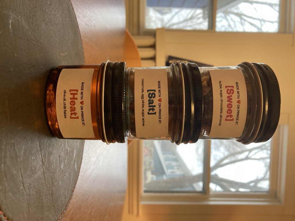
Very quickly “can we make the chilli oil,” in Lisa’s mind-prone-to-scope-broadening, became “let’s make jars of three things—hot oil, sweet candy, and salty nuts—and let’s print separate-but-related labels for each.”

And then we leaped into a ping-pong of I-can’t-remember-whose-idea-was-whose collaboration, an exercise that ended with a decision to, yes, produce three food products from scratch, with labelled jars, but also to package the jars in a custom-printed box.

While we were waiting for boxes to arrive once ordered, Lisa set to managing the food production, and we riffed on different approaches for producing the labels. Now that we were going to relief-print the box, we decided to letterpress-print the labels, and I made some prototypes:

The word SWEET, in rough green type on white paper, stuck to a small jar.

The word SALTY, in rough green print, on a white label, stuck to a small jar.

The words SWEET SWEET SWEET, printed in red, on white paper, stuck on a small jar.

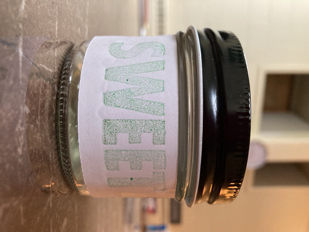
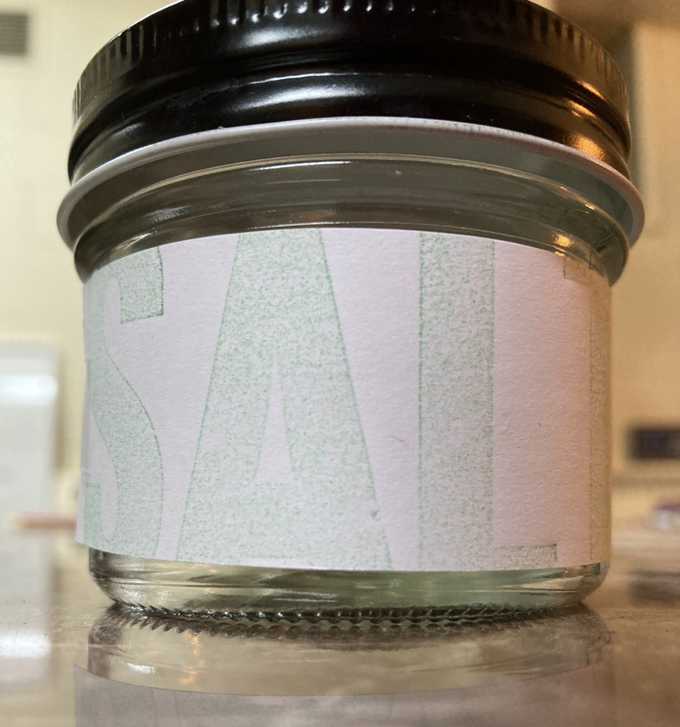
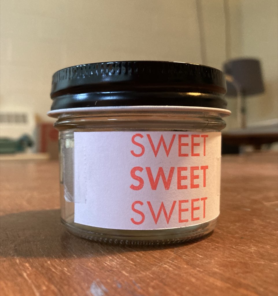
After a lot of back and forth with HOT, SWEET, SALT in various typefaces, we decided to revert to digital means for label printing, purchasing sticky labels from Staples, designing in Pages on my MacBook Air, and printing on an HP inkjet printer, the result of which was:

Three jars, each with its own label--Hot, Sweet, Salt--stacked on top of each other.

At this point we were ready to turn our attention to designing and printing boxes.

We ordered 250 box-board boxes (reverse tuck kraft boxes, 3”x3”x5”), uncoated so as to take well to the Akua water-based intaglio inks we planned to print with.

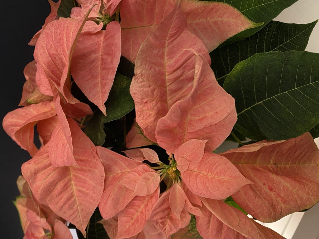
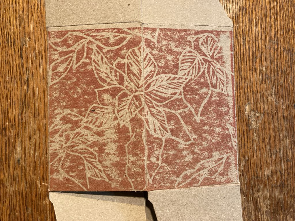
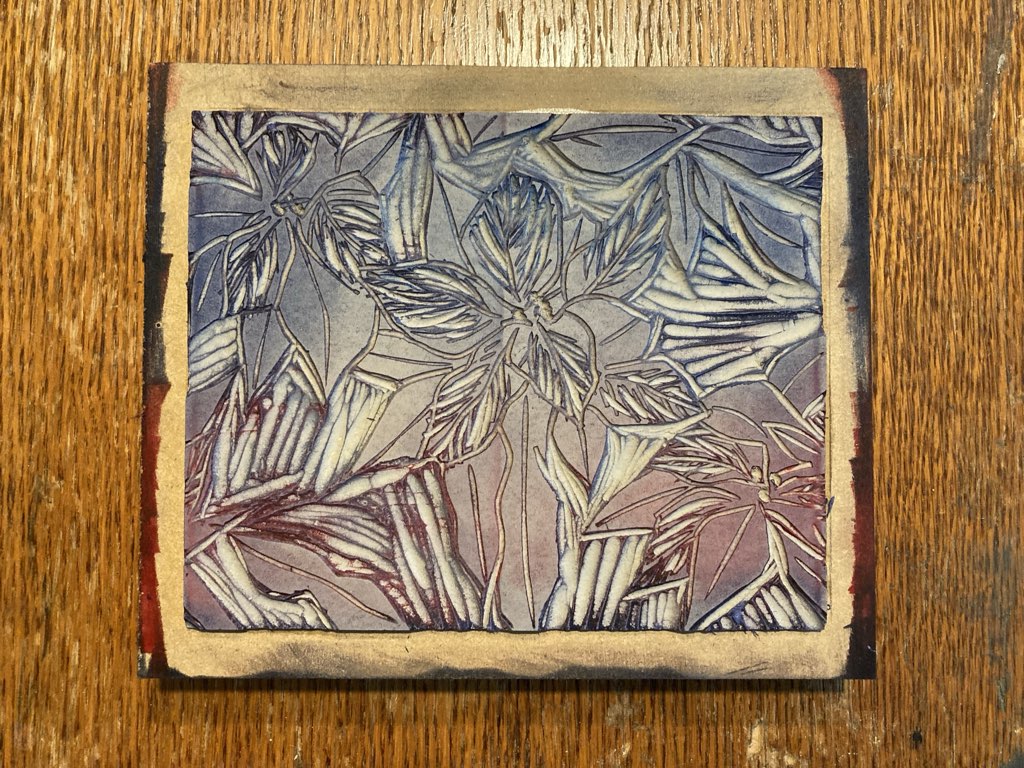
Lisa set out to carve a lino block with a floral pattern, something plausibly holiday, without being specifically Christmas. We’d recently brought some very nice poinsettia plants into the house, and these seemed to fit the bill. Lisa snapped some photos:

A photo of light red poinsettias.

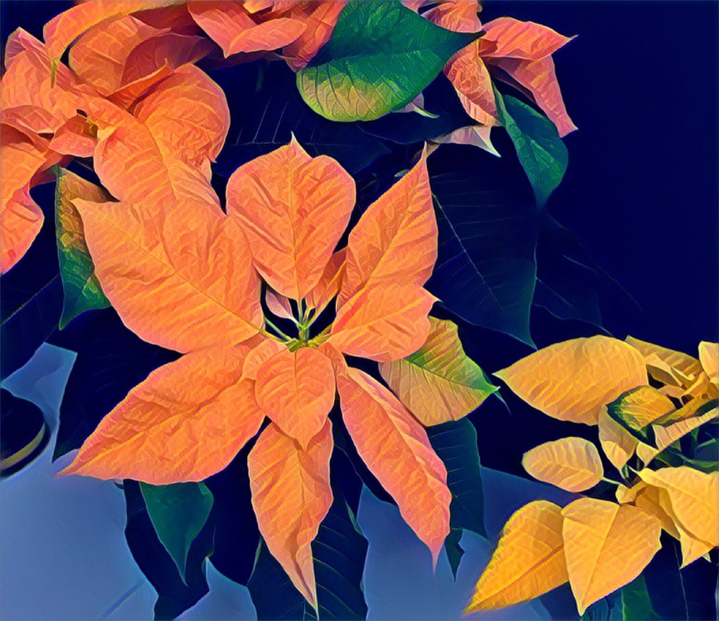
She took one of the photos, and, using the Prisma app on her iPhone, she enhanced the contrast and detail, to result in:

The same photo, cropped and run through Prisma filter.

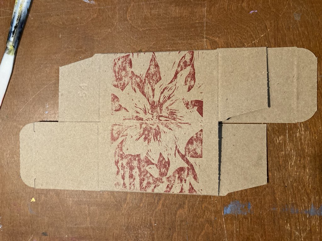
Lisa used that as the starting point for a freehand sketch onto the lino block, which she then carved with a set of wood carving tools we’d purchased earlier from Lee Valley Tools.

The boxes arrived just after Lisa started carving, and we were too eager to wait for her to finish, so I pulled a print from the block-in-progress onto one of the boxes, using simply the back of my hand for pressure:

First draft of hand-printing Lisa's first draft of lino block.

We immediately realized a couple of important things.

From a design perspective, Lisa realized that she wanted to carve a lot more of the lino block, leaving more whitespace than “redspace.”

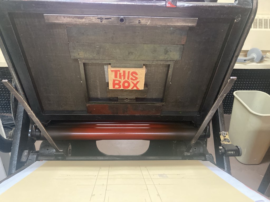
From a printing perspective, we realized that our hands weren’t going to be up to the job of hand-printing ~100 boxes, and so we set out to figure out how to use my letterpress to do the pressuring.

We also realized that we wanted to rotate the lino block 90 degrees, to fill the entire side of the box.

And, in another example of scope-broadening, Lisa set out to carve another lino block, an interlocking yin to the first block’s yang, to print the other side of the box in a way that the floral pattern on one side flowed seamlessly into the floral pattern on the other.

While Lisa kept carving, I knocked out a quick test carving to test the letterpress’ ability to print lino. I carved on a small pre-mounted lino block that, with a bit of supplementary packing, became pretty-well 0.918 inches deep, “type high” in letterpress parlance. The “quick” nature of this resulted in my forgetting (how could I!) the necessity of carving “backwards,” and so this block:

Lino-block of THIS BOX on the Golding Jobber No. 8 letterpress.

Became this box once printed:

The words THIS BOX, backwards, printed on a cardboard box.

Ignoring my ignorance of a fundamental aspect of the geography of printing, a satisfying proof of concept that it was possible to lino block-print on the letterpress.

We tried the same approach using Lisa’s still-in-beta lino block:

Lisa's draft design printed using the letterpress on a cardboard box.

While the box wasn’t entirely satisfying, it was promising: with better precision, and more carving, we had hope for a better result.

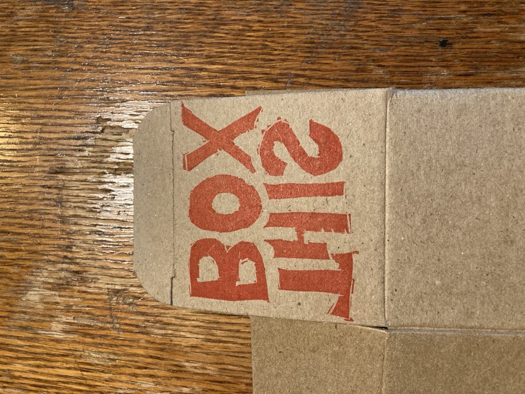
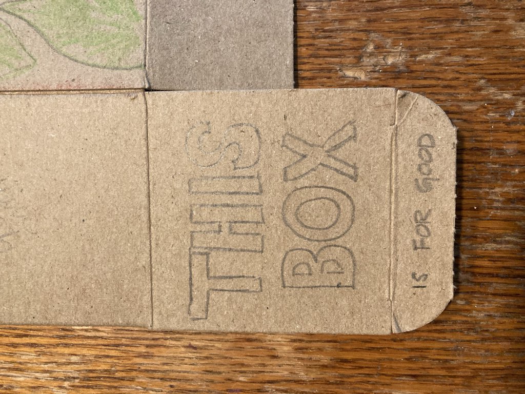
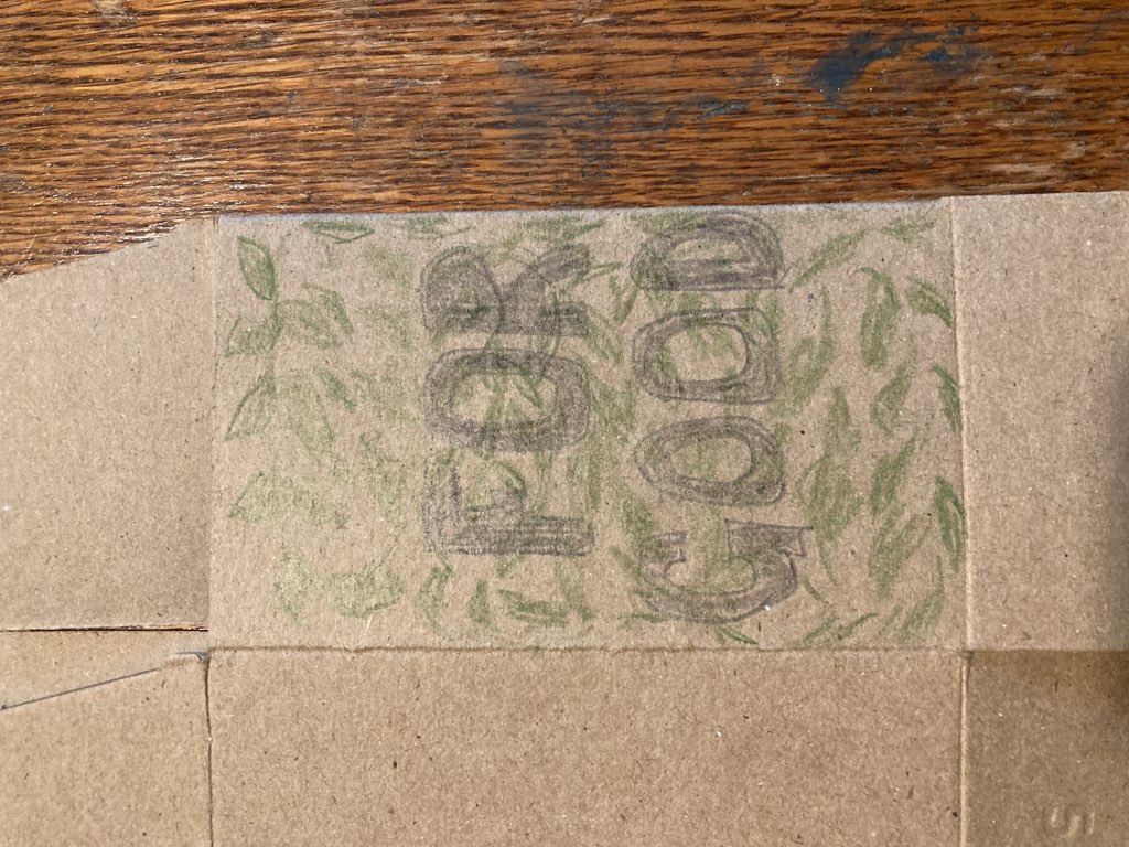
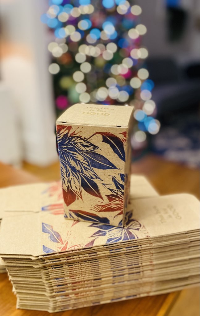
Meanwhile, a larger purpose for the box was starting to emerge between us: we decided that we would give the boxes out, filled with their hot, salt, sweet treats, but with a call to action to the recipients to refill the boxes with something new and pass the “good” along. “This box is for good” became our rallying cry, and we experimented with different approaches to rendering this on the box in type:

"This box is" written in pencil on a cardboard box lid.

The words For Good written in pencil crayon on the side of a cardboard box.

While Lisa carved and carved, I set out to realize our experiments in type; everything changes when the limits of fonts-available comes to play, and so the design evolved. My first idea was to leave ink out entirely, and simply deboss the lid of the box:

This Box is for Good debossed into the lid of a cardboard box.

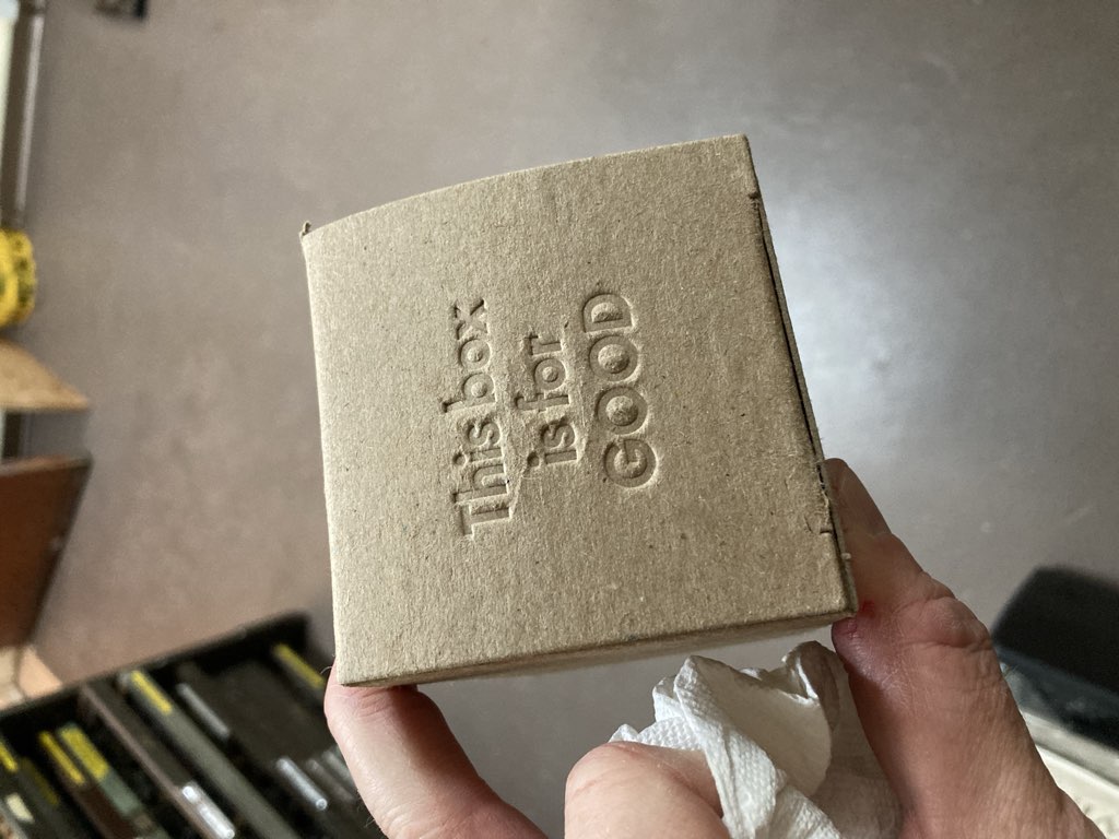
While this was rather satisfying from a tactile perspective, it turned out not to be all that readable in anything other than ideal lighting. And so I added some gold ink, and tried again, with a much more pleasing result:

Side by side comparison of printed boxes, with with ink, one without.

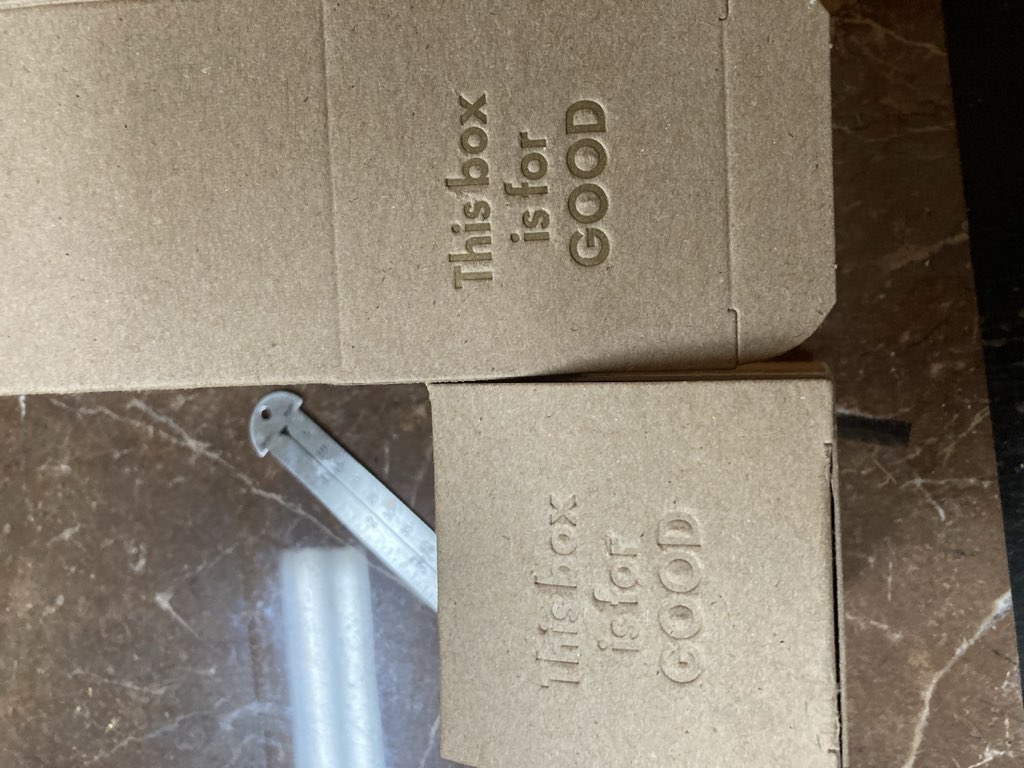
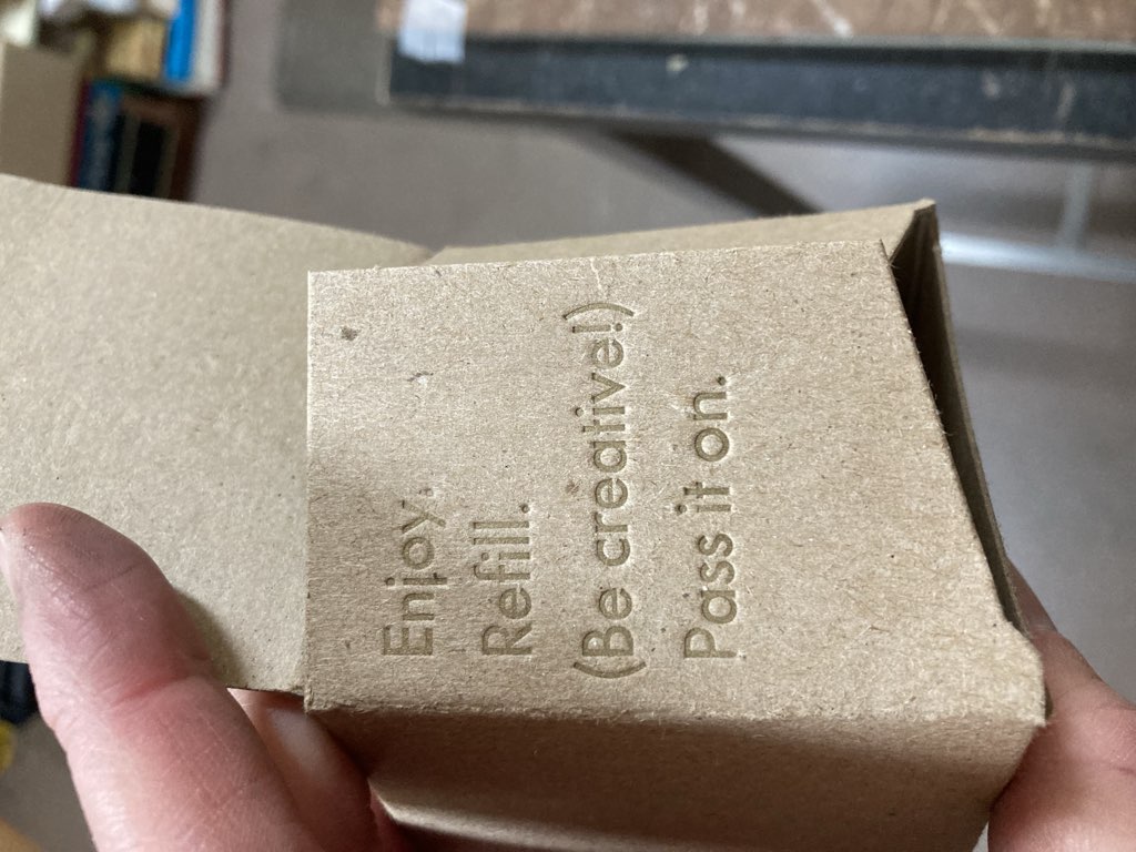
We both really liked the gold-on-cardboard effect, and so I continued that for the inner flaps of the boxes, which explained more about the “for good” part of the concept:

Inside flap of cardboard box printed with words "Enjoy, Refill (Be Creative), Pass It On"

Doing the actual production printing required some fiddling, as various parts of the box were variously one or two layers of cardboard thick, so I had to buttress certain parts with a “shim” taped to the packing.

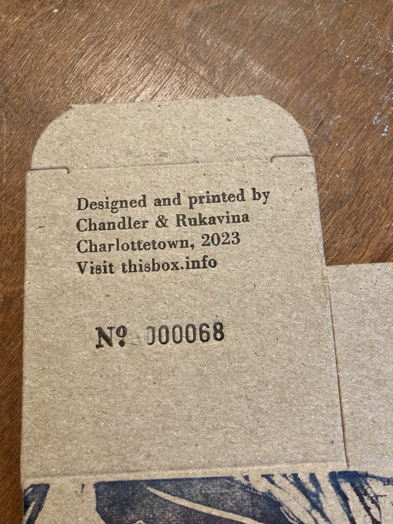
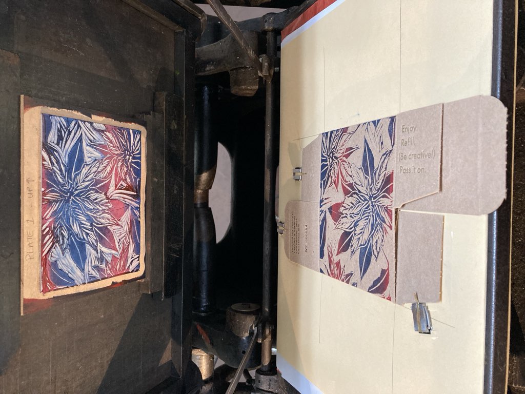
The final letterpress part of the job was to print instructions, with a registration website (yes, another example of scope-broadening) and a unique number for each box. These got printed in black, using an auto-incrementing numbering machine for the numbers:

The bottom of the boxes, with instructions, website thisbox.info, and a unique number.

Meanwhile, the lino blocks! The blocks Lisa carved are in themselves things of beauty:

The carved lino block.

Lisa decided to hand-ink each box, using a “rainbow roll” technique we learned at the relief printing workshop, where two colours of ink are rolled out on glass in parallel, with some overlap:

Rainbow rolling red and blue into together on a sheet of glass.

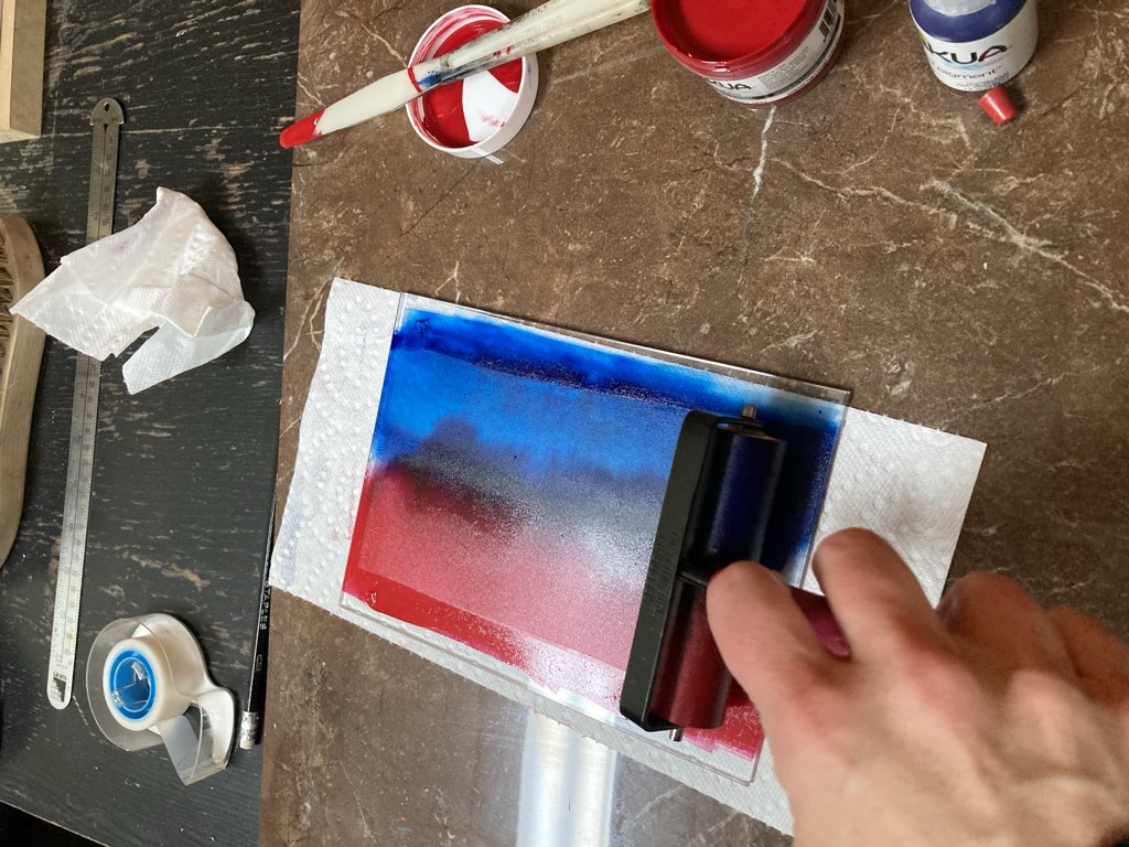
We rolled the ink onto the lino block with the brayer for every print, initially on the table and, one we got rolling, on the press itself:

Inking the lino block with a rainbow roll.

To get the lino block to “type high,” we secured some ¾ inch MDF from Home Depot, cut down (at no charge!) to the right size. This took the block to almost exactly type high, with the difference made up in the packing.

Mounted lino block on the letterpress for printing.

Because we opted to hand-ink each box, and because the lino block was slightly larger than our largest brayer, we needed to roll the block in several passes for each box; eventually Lisa settled on a three-brayer scheme that saw the rainbow roll rolled down the middle, with supplementary blue and red on separate brayers. It was a lot of work, but we got it down to a well-oiled printing dance together.

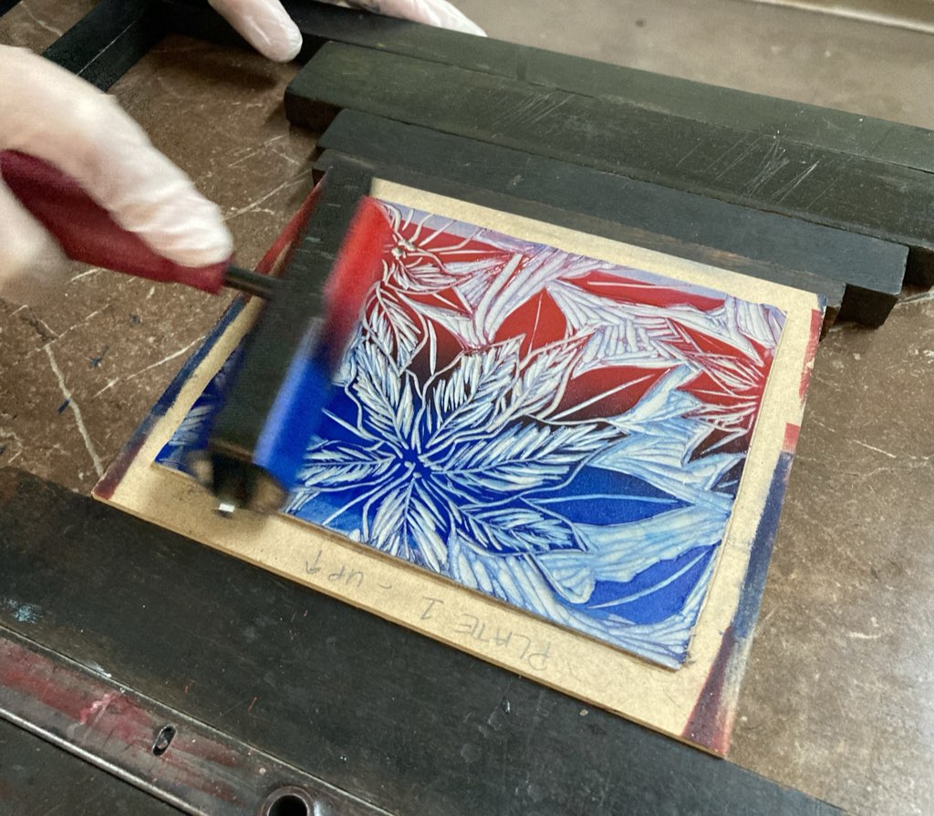
And, of course, every box needed to be printed with two lino blocks, one for each side. It was a process that spread out over almost two weeks.

Lots of boxes, printing with the lino, laying out to dry.

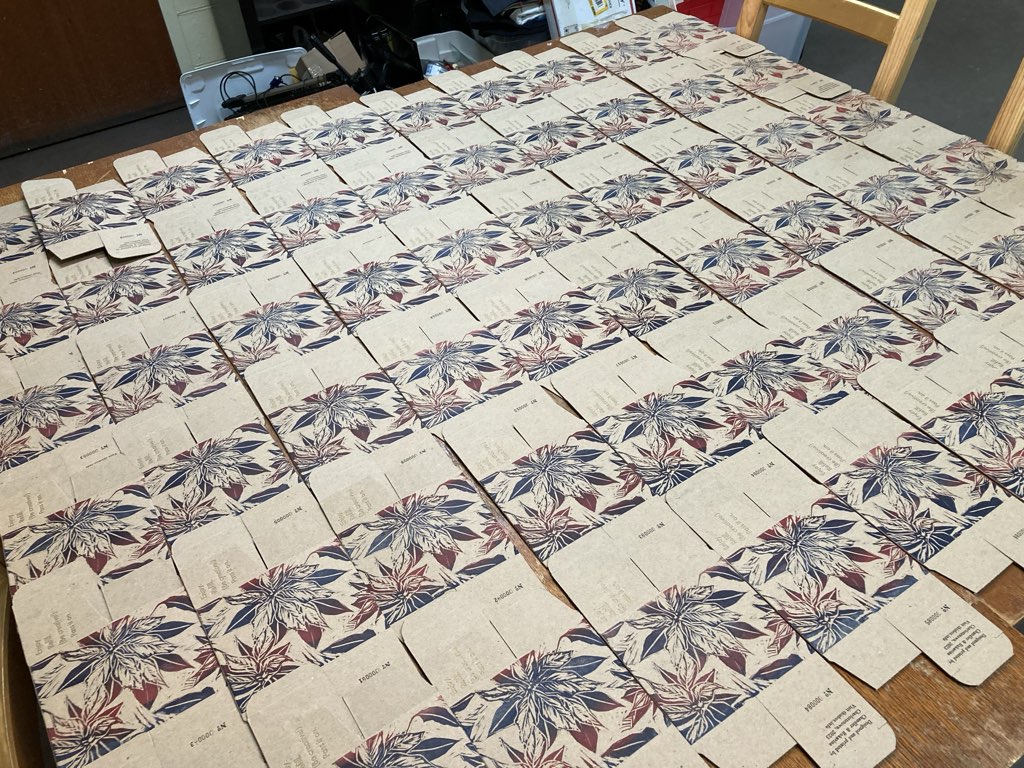
All told, each box was printed seven times: one side each with lino-block, then four separate letterpress-printed messages on different parts of the box, and a final numbering run for the unique box numbers.

The finished box is something we’re both very pleased with:

 The finished box.

With all the boxes printed and the ink dried, all that was left was to assemble each box, fill with two of the three bottles of treats, and then deliver them near and far, explaining the “for good” concept many many times.

Our hope is that boxes get received, refilled, passed on, many times; we built a little website (a Google Form, for now) to allow people to register their box number, so that we can follow their journeys around the world.

I can say with some assurance that I have never been involved in a collaboration—artistic, logistic, design, spirit—as connected as this one was. Lisa and I can both rightfully attest that what emerged from our collaboration was something that neither of us could have arrived at individually. It was a joyful, intimate exercise in creativity. One we hope to repeat over and over.

Yes, James, I like projects.

Pages