
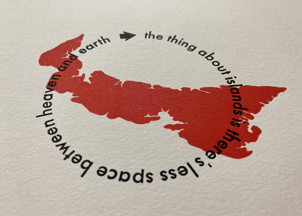
I’ve been unable to shake that quote paraphrasing George MacLeod, from bookbinder Rachel Hazell, “The thing about islands is there’s less space between Heaven and Earth.”, so I asked her permission to commit it to type and paper and she generously consented.
I used my daredevil printing skills to set the type the round; divine intervention, rather than careful planning, meant that, in 24 point Futura Regular, it fit perfectly:
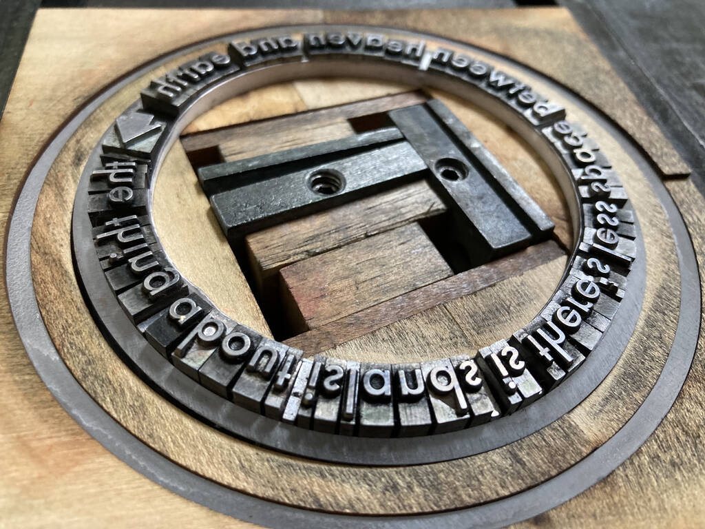
Keeping the type in place was something of a dark art involving multiple quoins plus strategic slips of paper, and significant prayer.
When I realized that the resulting circle was about the same size as my letterpress cut of Prince Edward Island, I conjured up a red-and-black combination of the two, resulting in this:
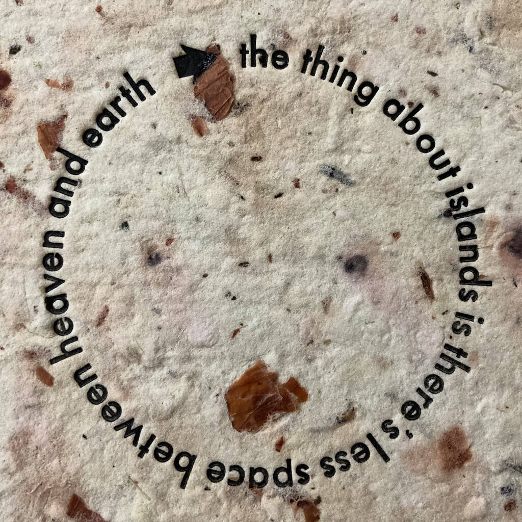
I also printed a few outliers without the background of the Island, including this one, printed on handmade paper made by Catherine many many years ago, which I love:
About This Blog
 I am Peter Rukavina and this is my blog. I am a writer, letterpress printer, and a curious person.
To learn more about me, read my /now, look at my bio, listen to audio I’ve posted, read presentations and speeches I’ve written, see things I’ve favourited elsewhere, or get in touch (peter@rukavina.net is the quickest way).
I have been writing here since May 1999: you can explore the 25+ years of blog posts in the archive.
![]() You can subscribe to an RSS feed of posts, an RSS feed of comments, an RSS feed of favourites elsewhere, or a podcast RSS feed that just contains audio posts. You can also receive a daily digests of posts by email. I also publish an OPML blogroll.
You can subscribe to an RSS feed of posts, an RSS feed of comments, an RSS feed of favourites elsewhere, or a podcast RSS feed that just contains audio posts. You can also receive a daily digests of posts by email. I also publish an OPML blogroll.
Instagram • YouTube • Vimeo • ORCID • OpenStreetMap • Internet Archive • PEI.art • Drupal • Github.
Comments
These are inspired, and
These are inspired, and gorgeous! Hope they will appear in your Etsy shop soon.
NeatO!
NeatO!
❤️
❤️
If you have these for sale I
If you have these for sale I know a whole bunch of us here on Bowen Island that would want them.
At the very least me.
Please let me know if you plan to sell this design. And perhaps I could even commission one with a silhouette of Bowen Island if you’d be willing.
Beautiful, Peter. I
Beautiful, Peter. I especially appreciate that the "and" runs over Unikansuk/Portage, the narrowest part of PEI, like it is holding West Prince to the rest of the island!
You are encircled by the ‘d’.
You are encircled by the ‘d’.
This is awesome!
This is awesome!
Add new comment