
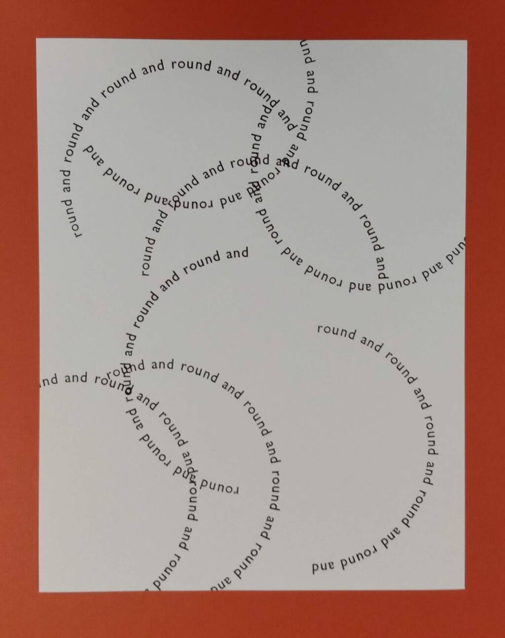
In the shadow of yesterday’s daredevil printing workshop, I was ready to see where I could go with printing in the round.
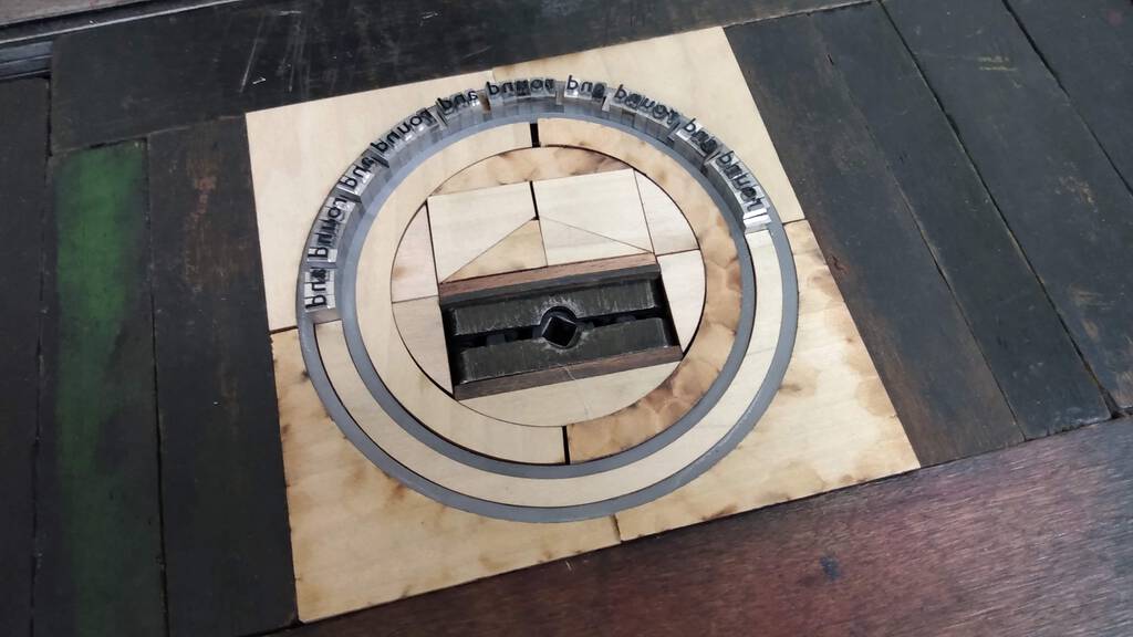
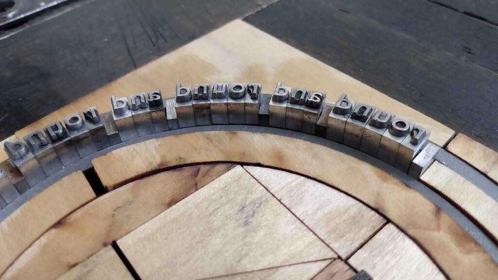
One of the key things I learned yesterday was that 18 point type will fit between the two plexiglass circles in the Big Dog Daredevil set; I only have one font of 18 point type, a Gill Sans I purchased, newly-cast, from M&H Type 10 years ago, so that’s what I used.
If there was one message to take away from the workshop–and, indeed, if there’s one bedrock rule for setting type at all–it’s “always be working toward the rectangle.” So the process of setting type in the round involved sqootching the Gill Sans between the plexiglass circles and then using the daredevil furniture to lock it into place. Putting a quoin in the middle might not adhere strictly to the daredevil religion, but it worked, generating enough outward-facing pressure to keep things locked in place.
Rather than setting out to make 100 of something, as is my habit, I decided to use the opportunity to play, printing on various papers and objects, and experimenting with rotating and overlaying to see what I could discover:
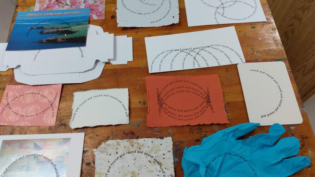
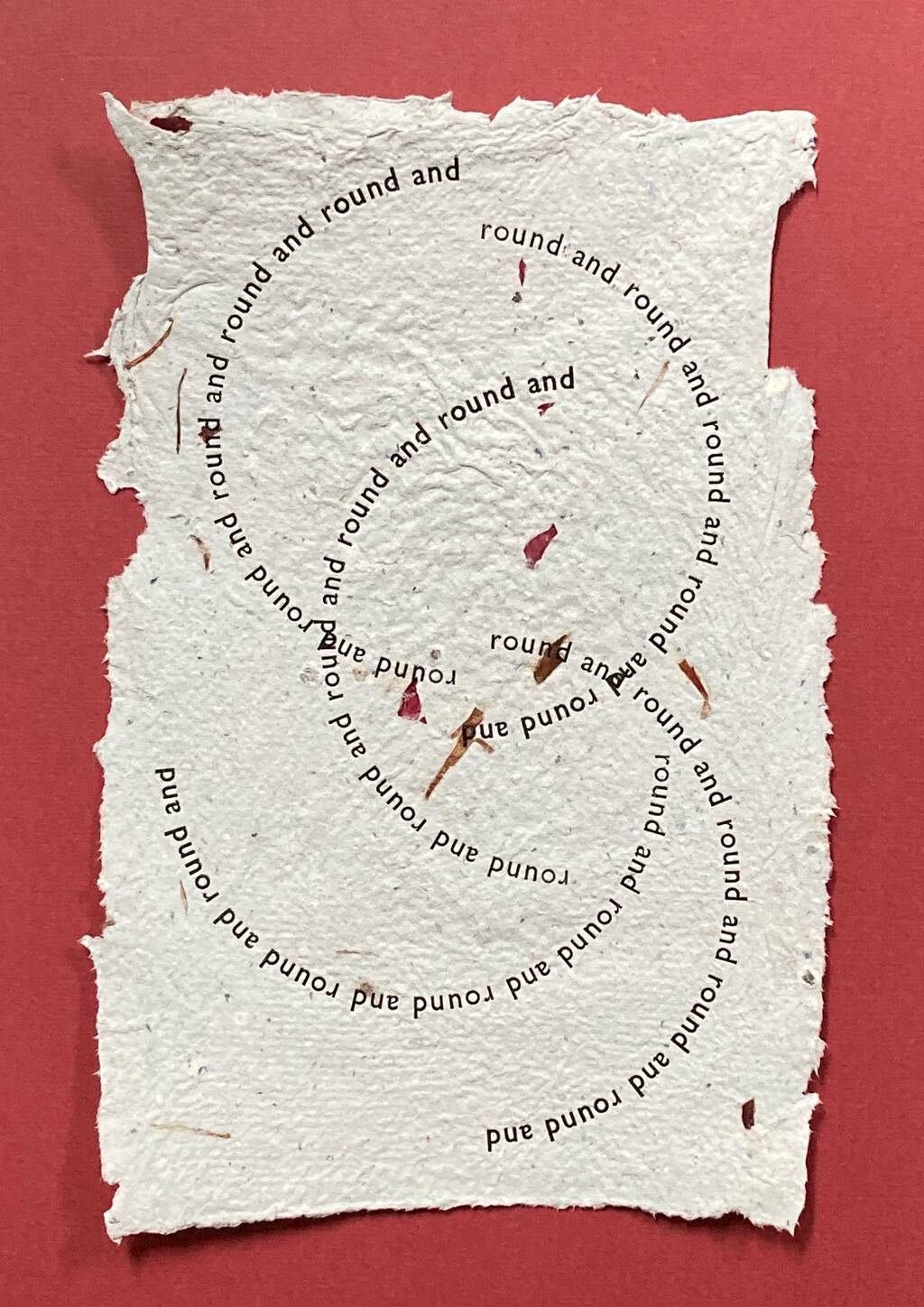
This is my favourite, printed on paper handmade from the cards and letters we received after Catherine died:
This was my first experiment, and I like it too; it’s printed on cardstock that I found buried in Catherine’s studio cupboards:
And finally a try with printing on a chipboard rectangle:
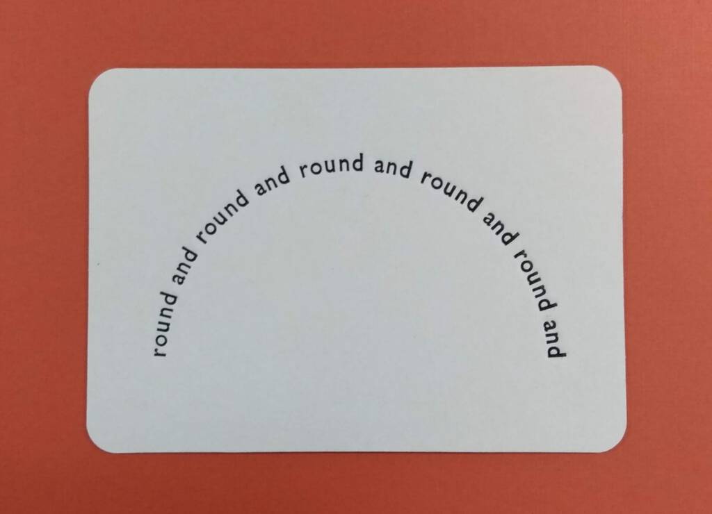
This was more improvisational printing than I’m used to, veering just slightly away from trade into art; I enjoyed it.
More daredevilry to come.
About This Blog
 I am Peter Rukavina and this is my blog. I am a writer, letterpress printer, and a curious person.
To learn more about me, read my /now, look at my bio, listen to audio I’ve posted, read presentations and speeches I’ve written, see things I’ve favourited elsewhere, or get in touch (peter@rukavina.net is the quickest way).
I have been writing here since May 1999: you can explore the 25+ years of blog posts in the archive.
![]() You can subscribe to an RSS feed of posts, an RSS feed of comments, an RSS feed of favourites elsewhere, or a podcast RSS feed that just contains audio posts. You can also receive a daily digests of posts by email. I also publish an OPML blogroll.
You can subscribe to an RSS feed of posts, an RSS feed of comments, an RSS feed of favourites elsewhere, or a podcast RSS feed that just contains audio posts. You can also receive a daily digests of posts by email. I also publish an OPML blogroll.
Instagram • YouTube • Vimeo • ORCID • OpenStreetMap • Internet Archive • PEI.art • Drupal • Github.
Comments
These look amazing. I like
These look amazing. I like seeing how overlapping them creates all kinds of new shapes.
I'm just catching up on posts
I'm just catching up on posts I've missed, including this. Typesetting digitally on a round has always been one of my least favourite things (usually required for campaign buttons and other objects) as it's very hard to get the kerning right. The typesetting of this curve is perfect! Also, I love that you tested printing on a glove. Bravo!
I wish I could claim the
I wish I could claim the mantle of excellent-kerner, but the well-kerned nature of the type is by happenstance alone.
I suspect this is one situation where computers over-complicate this, and actual metal letters, used as God intended, simply do the right thing.
Add new comment