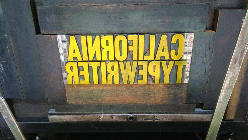
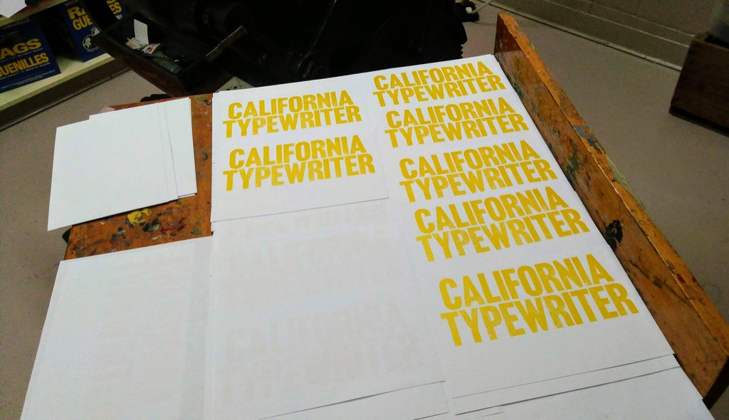
Two years ago I purchased a 5 oz. tube of yellow letterpress ink from NA Graphics. With the exception of a tiny experiment last year, I’d been afraid to use the ink; black and red are easy and substantial, whereas yellow is fickle and mysterious, and I feared that the result would be too light or too dark or just off.
Today, though, I decided to break through this mental logjam.
And to print.
In yellow.
I’m cooking up a skunkworks project for December that I need a poster for (details to follow soon!) and so I pulled out the Akzidenz Grotesk and set to work.


I had nothing to fear: the yellow is throaty and bold and deeply sunshiny. I love it.
 I am
I am
Comments
It really is deep and
It really is deep and satisfying.
Ha! I saw what you did with
Ha! I saw what you did with that blog post title. The song will be in my head all day now. But that's okay. :-)
In the interests of
In the interests of transparency, I should mention that said song was playing while I wrote the post.
Hehe. I missed the title and
Hehe. I missed the title and read the blog first, then thought of the song, and then read your title. Well done sir :)
Cali is where i put my Type
Cali is where i put my Type down :::]]]
Add new comment