I’m working on a tiny part of a 2014 Sesquicentennial Public Art Program piece with artist Brenda Whiteway. Ironically, Brenda and I came together by way of Papeterie Saint-Armand in Montreal, where she went looking for paper and found me in addition, via a reference from owner David Carruthers. I met David back in 2010 and have been a happy customer of his paper ever since; that he could play letterpress matchmaker only adds to his halo of wonder.
Brenda’s piece is titled Confederation Country Cabinet and my small part of it consists of hand-setting the type for, and printing, 6 passages of sesquicentennially-appropriate text selected by Brenda. She’s very kind (and brave) to trust me with this, as it’s by far and away the biggest letterpress job I’ve ever taken on (“biggest” inasmuch as there’s a lot of type to be set; ultimately I’m only printing one of each piece).
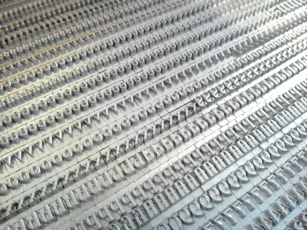
Which is how I came to accept delivery of this in the mail today from Swamp Press in Northfield, Mass.:

Swamp Press is, among other things, a type founder, and what you see here is part of a font of 375 Bodoni 14 pt. that I ordered from Ed the typefounder a couple of weeks ago. It is, in other words, fresh type.
I selected the Bodoni for several reasons: 375 Bodoni 12 pt. was the first face I ever owned; I purchased a job case from Don Black Linecasting four years ago (before I even knew how to spell it!) and then later acquired a font of Bodoni 24 pt. from a printer in Montreal (type I used to set, among other things, raffle tickets, Catherine’s art show poster and Lubricate Often).
It’s a typeface that pre-dates Confederation: Giambattista Bodoni designed it in 1798, 66 years before the Confederation Conference that we’re celebrating this year. Bodoni, writes Robin Dodd
…a best known for bringing the modern typeface to its height of elegance and sophistication. His modern typeface reached its peak of perfection in the late 18th century, and remained popular throughout the 19th century.
Could there be a better typeface for commemorating this occasion?
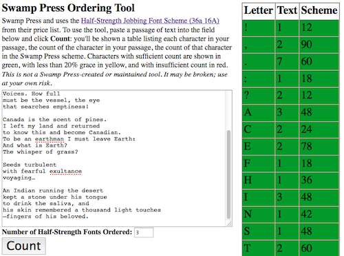
To arrive at 14 point as the size I needed necessitated a lot of futzing and fitzing to arrive at a paper size and type size that would suit pieces that range from a single sentence to multiple paragraphs, and which include both poetry (and thus hard line-lengths) and prose. I even, in a daring fusion of my analog and digital selves, coded up a purpose-built tool for placing the order:

I think this is going to work out; it will all play out, one way or the other, in the next week or two.
Ed at Swamp Press, by the way, has become the caretaker of a collection of Monotype punches that were rescued from the Mount Stewart dump by my friend Heather dump after Gerald Giampa’s left them there following the auction held after he was flooded out. I made Ed’s acquaintance, in turn, via the selfsame Don Black who sold me my original Bodoni: that font was missing upper case K, and Don referred me to Ed as someone who could cast me some. A few years later I met him face-to-face at the Printing Arts Fair north of Boston and it gives me great pleasure both that he’s taken on the punch stewardship and that I’ve had occasion to have him cast type for me.
 I am
I am
Comments
Very excited to see your
Very excited to see your fresh type! Looking forward to seeing it in action and print.
Add new comment