It’s a bad couple of weeks for analog here on Prince Edward Island: first Queen’s Printer stopped printing and then, on Sunday, City Cinema projected its last 35mm film. In both cases the enterprises continue — Queen’s Printer duplicates digitally now, and City Cinema projects digitally — but their analog technologies, more than 100 years old in both cases, are retiring.

City Cinema’s 35mm projector had a rather more honourable retirement than the offset presses up the road: the 7:15 showing of Cloudburst was followed by a Q&A with the film’s writer/director Thom Fitzgerald, producer Doug Pettigrew, and stars Ryan Doucette and Marlane O’Brien, and then a reception at The Haviland Club.

Many years ago I was substitute projectionist at City Cinema for a week, filling in for owner Derek Martin who was traveling. It was, without a doubt, the most harrowing job I’ve ever had: an exhausting film-winding-on-to-big-reels process at the beginning of the week followed by night after night of waiting for the projector bulb to burst or the film to split or some other calamity to befall the operation (as it happens the film did split, delaying the start of the second show by 30 minutes; 30 very stressful minutes).

As with letterpress (and even offset) printing, there was a physicality to film projection, an intimate relationship between person and machine, that is almost completely missing from the digital era. While it’s easy to be needlessly nostalgic about all this, the simple notion that someone is paying attention to the craft is something to give thought to: it’s so easy to be completely absent from a process where media gets created and distributed by pressing “Play” or “Print” on a machine, and I can’t help but think that has an effect on the result.

We’ve survived and thrived in the post-analog world of so many other media — all my TV streams into the house on the Internet now, I haven’t used an analog phone in years — so I expect we’ll survive this to. And this week will be one of the weeks we remember when we’re trying to remember the time before the bits took over.

🗓️

While going through a bag of old VHS video tapes yesterday I came across this recording of Matthew Rainnie reporting for CBC Compass on the then-new website for The Buzz newspaper that I launched as a side-project with Buzz owner Peter Richards and ISN owner Kevin O’Brien. Even though it’s only 17 years ago, the language — “information superhighway” comes up several times — and the technology — it looks like very-early Netscape running on Peter’s Mac — makes it seem like we’re talking about the advent of the telegraph. 

I digitized the video in the Collaboratory at Robertson Library at the University of PEI, which has excellent (and free) facilities for converted VHS videotapes, audio cassettes and vinyl records to digital files:

🗓️
CBC  •  Compass  •  Internet  •  History  •  Matthew Rainnie

For most intents and purposes the camera on my Nokia Lumia 800 is a step down from the one on my old Nokia N95. The Lumia performs much worse on close-up work (like photos of letterpress projects), much worse in lower-light conditions, and it tends to leave a lot of indoor photos with an annoying green cast. This is not to say, however, that it’s not a camera capable of surprising me, like it did last week in Victoria; here’s a photo of The Orient Hotel that really turned out well:

The Orient Hotel in Victoria

I shot the photo late in the day — 4:39 p.m. — and jacked the Lumia’s “saturation” setting to the highest level.

🗓️
Nokia  •  Lumia  •  Mobile Phones

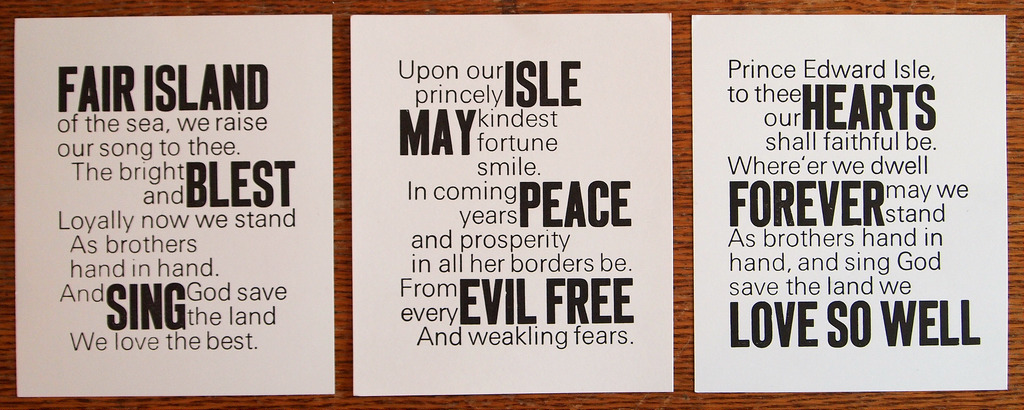
For the past month I’ve been working on a letterpress project to render The Island Hymn, Prince Edward Island’s patriotic song, written by L.M. Montgomery in 1908, in a triptych. Yesterday I finished the third panel, and here’s what the three panels look like together (each is 5 by 6 inches; the photograph isn’t the greatest):

The Island Hymn, 3 Verses

Printing the third panel yesterday was the hardest of the three, mostly because the paper had sucked up a lot of moisture overnight, and it was raining outside while I was printing, so everything was just a little more reluctant to flow together.

This project, like almost all of my letterpress work, was mostly an experiment, another job to stretch my typesetting and printing skills: every time I set time or print something I learn something new.

In this case I want to experiment with setting two typefaces together, and so I used 60 point Akzidenz Grotesk and 30 point “unnamed sans-serif face” together, using 30 point spaces to jigsaw-puzzle everything together. Because everything needed to be a multiple of 30 points, I didn’t use any leading at all, so the lines are spaced closed together than they would be otherwise. I also decided to leave no whitespace in areas where the two faces met each other, which is the only design decision I regret.

The selection of “what gets to be a big word” was informed almost entirely by happenstance and by what would fit where; that this led to “Hearts / Forever / Love So Well” on the last panel was completely (pleastantly) accidental.

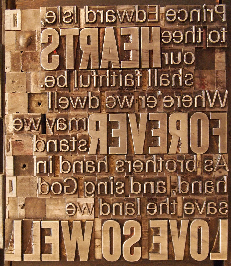
On the last panel, only “Love” was to be set in the larger face, but there were a lot of words containing a lower-case l on that panel, and I ran out of that letter in the small face, so I had to improvise.

The Island Hymn, 3rd verse, in letterpress chase

🗓️

I was at an auction at Royalty Centre in uptown Charlottetown this morning at the offset-printing outpost of Queen’s Printer. While my own purchases were modest — a coat rack and an oily rag can — there was enough equipment on offer to outfit a small offset print shop, and, with only 5 bidders on hand, the equipment went for a steal (presses worth thousands going for $100).

While this small auction — just 17 lots in total — might appear an insignificant disposal of crown assets, it actually represents much more than that, for it marks the end of more than 200 years of history during which Queen’s Printer actually printed, committing ink to paper with a printing press.

With the disposal of this equipment, Queen’s Printer — or the “Document Publishing Centre” as it’s now known in common use — is a 100% digital operation, with large and powerful digital printing machines in the basement of the Shaw Building at its disposal, but nary a printing press in sight.

Under the Queen’s Printer Act, “The Lieutenant Governor in Council may appoint a Queen’s Printer for the province, and fix the salary and prescribe the duties pertaining to the office.” There has been a Queen’s Printer — or a King’s Printer, when we’ve had a King rather than a Queen — back to the earliest days of Prince Edward Island, and it has been their role to oversee the printing of the official documents of the province, documents like the Royal Gazette and the Journal of the Legislative Assembly.

While today the holder of the position is a public servant — currently it’s Mike Fagan, whose official job title is “Manager, Document Publishing Centre, and Queen’s Printer” — in earlier times it would be a local printing company that would be appointed to the role, such as those of James Bagnall and James Douglas Hazard, about whom Eminent Islanders says:

Looking back almost 200 years to the product of King’s Printer of the day, you can see they did beautiful work, work that’s more remarkable still when you consider that it was set by hand (mechanized typesetting was not to be invented for another 66 years when this example was set): every single letter of what you see below was picked out of a type drawer by a printer, assembled into a form, and printed on a letterpress.

While it was perhaps inevitable that Queen’s Printer would stop printing with printing presses (and perhaps, in the not too distant future, they will stop printing altogether and go all-digital), it’s still sad to see the end of this tradition, especially as it came to such an ignominious end, in the suburbs, without any sense of the great and longstanding trade of putting ink to paper in the name of the Queen or King.

🗓️

I have been setting some type in Futura this week, and I noticed, to my surprise, that the lower-case t was much “stumpier” than I thought it should be — about three quarters of the height letter like l, h and f:

Futura Lower Case

Surely this was unusual, and unique to Futura, I thought: when I print a lower-case t with a pen or pencil it’s always the same, full, height as other lower case letters.

But, looking at other typefaces, it turns out that the lower-case t is, quite often, the shortest of the tall letters; indeed, in Typologia, Goudy writes (emphasis mine) “lower-case t may be classed with the first or short letters.”

When people ask me why I’m interested in letterpress printing and working with metal type, I often talk about the “physicality” of it all; this is one example: I’ve been reading for more than 40 years, and working as a designer, of one form or another, for more than 20. But until I had a lower-case t in my hands, I really didn’t know all that much about it.

🗓️

When I first signed up for Twitter back in 2006 it asked for a “bio” and so, on the spur of the moment, I came up with “Psychogeographer & Personal Telemetrist,” based on the interests I happened to have on that particular day. And that bio followed me around the web as I was asked for a pithy tagline for other web services.

When updating my Twitter “header image” (it’s a new Twitter feature: add yours on the Design page of your profile) I decided it was time for a change, and perhaps a change to a bio that more accurately reflects my actual interests.

And so “Psychogeographer & Personal Telemetrist” has given way to “Printer · Developer · Writer.” When I’m not being a partner or father or eating smoked salmon on a bagel, I’m generally printing, developing or writing, so, right now, that’s who I am.

New Twitter Header

New Gogle Plus Header

🗓️
Twitter  •  History

It’s been almost a month since we cut the cable television cord. Save for not being able to watch Compass (why oh why can’t CBC encode Compass for iOS?), I’ve absolutely no regrets. I’ve no desire to see any of the new TV season because I have no idea what’s on the new TV season because TV hasn’t been promoting the new TV season to me. And I’ve fallen completely out of touch with what’s new in the Swiffer space, as I’ve not see a TV commercial for weeks.

Which is not to say we’re not watching television: we’re watching Netflix (via the Wii) and, on occasion, Crackle (on the iPad, albeit frustratedly because it doesn’t support video-out to the TV).

I love Netflix and I hate it: just when I think I’m going to hate it enough to sign off, I find a great documentary like It Might Get Loud or a great drama like Weeds (which I watched four seasons of very quickly and happily). Which makes up for the seemingly endless stream of straight-to-video movies, repackaged TED videos and good movies I’ve already seen.

One of the almost-completely-useful features of Netflix is its “Top 10 for Peter” feature (I wonder if it’s called “Top 10 for Peter” for everyone?): it almost never seems to change, there doesn’t seem to be any way, at least on the Wii, to take things off the list, and it generally recommends things I’ve already seen elsewhere (which I suppose means its taste engine is working) or that I have no interest in at all (which means that it isn’t).

Here’s what the “Top 10 for Peter” list recommends for me right now:

  1. Mad Men (I’ve seen every episode elsewhere)
  2. Arrested Development (I’ve seen every episode, on the CBC)
  3. MI-5 (I’ve seen every episode, including 2 seasons Netflix doesn’t have yet)
  4. Being Human (no interest)
  5. Hell on Wheels (no interest)
  6. Wallander (I tried, I really tried, but, in the end, no)
  7. Torchwood (no interest)
  8. The Forsyth Saga (no interest)
  9. The IT Crowd (no interest)
  10. Numbers (I’ve seen every episode, on broadcast TV)

For interest I turned on a US proxy server and looked at what Netfllx in the US recommends for me; here’s American Peter’s Top 10, which has no overlap with Netflix Canada’s recommendations; most of these shows I’ve never ever heard of:

  1. Wilfred
  2. Warehouse 13
  3. Mythbusters (watched on Discovery channel on cable)
  4. Thor
  5. Alphas
  6. Louie
  7. Battlestar Galactica (and not the old series offered in Canada)
  8. Limitless
  9. Parenthood
  10. Flashpoint

I note also that there are two additional seasons of Weeds available on Netflix US (reason enough, perhaps, to set up a proxy server at home?), along with a much different selection of movies. It’s odd how I have a single international Netflix account, which a single taste profile that adapts to the content available in the jurisdiction my IP address reveals me to be in; much preferred, I suppose, to the usual “sorry, but you’re account can not be used in this country” that other services present.

Update: just after posting this, after not changing for many weeks, my “Top 10 for Peter” on Netflix Canada suddenly rebooted; the new version is:

  1. Being Erica
  2. Leverage
  3. The Glades
  4. Carnage
  5. Californication
  6. Hotel Babylon
  7. Jericho
  8. TED “Head Games”
  9. Luther
  10. Another Earth

More diversity there, and more things I haven’t seen. Let’s see how this goes.

🗓️

Another story about Oliver that makes me an especially-proud father, related to me by his grade 6 teacher when we met on Monday (you’re talking to your child’s teacher, right?).

On the first day of school, the students in Oliver’s class were asked to come up with answers to the question (and I’m paraphrasing from memory) “to be successful, how should students be in grade 6?”.

The question was on the wall, and they were given sticky-notes to stick their answers on the wall.

Other kids came up with answers like “responsible” and “neat” and “on time.”

Oliver’s answer was simply “themselves.”

🗓️

My friend Dave Atkinson maintains a lovely blog filled with everyday tales of his family life; I recommend subscribing. As an homage, here’s a small tale from the bedtime story hour with Oliver.

On Monday night I went looking for a bedtime story. The chilling tale of the young Ukrainian boy who barely escaped the Holocaust hadn’t passed muster the week before (too scary), and I hadn’t found anything to take its place.

So I went down to my own bookshelf and pulled off my copy of The Macintosh Way, Guy Kawasaki’s tale of working at Apple in the 1980s.

The book opens with a tale of Ashton-Tate, Apple, and a database called 4th Dimension that Apple was thinking of acquiring for the Mac. There’s a meeting at the heart of the first chapter involving Ashton-Tate and its desire to thwart the 4th Dimension purchase to avoid being in competition with Apple in the Mac database market.

All of this was interesting to me, but I was concerned that, for Oliver, it was just boring business talk. And that, while not particularly scaring, this book too wouldn’t pass muster. So I considered not even finishing the first chapter.

At this point, though, Oliver chimed in:

“This is just like Bug’s Life and Antz,” he said.

I had to think for a moment.

“You’re right, it is… how do you know about that story?”, I asked.

“From the Steve Jobs biography,” Oliver said.

Is there anything that can make a lateral-thinking father more proud than a sudden outburst of lateral thinking from his son?

🗓️

About This Blog

Photo of Peter RukavinaI am . I am a writer, letterpress printer, and a curious person.

To learn more about me, read my /now, look at my bio, listen to audio I’ve posted, read presentations and speeches I’ve written, see things I’ve favourited elsewhere, or get in touch (peter@rukavina.net is the quickest way).

I have been writing here since May 1999: you can explore the 25+ years of blog posts in the archive.

You can subscribe to an RSS feed of posts, an RSS feed of comments, an RSS feed of favourites elsewhere, or a podcast RSS feed that just contains audio posts. You can also receive a daily digests of posts by email. I also publish an OPML blogroll.

Instagram • YouTube • Vimeo • ORCID • OpenStreetMap • Internet Archive • PEI.art • Drupal • Github.