
My friend Martin returned to Prince Edward Island from his winter nesting grounds this month, and he came bearing the gift of a freshly-cast sample of printing type from the Musée de l’imprimerie in Nantes, France.
Examining the sample this morning, it turned out to be a random selection of type, ruuudl (given that Martin’s last name is Rutte, randomness dealt him a alphabetic coincidence, albeit an incomplete one).
I thought I might try to use Martin’s letters to print something for him, but then I recalled something about European “type high” vs. North American “type high” and thought to compare Martin’s type to a sample of my own. Here’s a capital M from my 14 point Bodoni (left) with Martin’s letters (right):
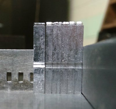
Sure enough, they’re different.
“Type high” is the measure of the height of a single piece of type, and, as you might imagine, it’s important, when you’re setting type for printing, that all the pieces of type are exactly the same height.
The North American standard is 0.918 inches; the French standard is 23.556 mm, or 0.927 inches; a difference of 0.009 inches, or a fraction of a millimetre.
But that’s an important enough fraction to mean that, without some complex gymnastics to raise the height of the North American type, one cannot mix and match.
This post on Briarpress elaborates:
This differs in many countries from the .918” American-British standards, to the .928” used in many countries in Europe and the Medians standard of .934” used in Belgium. What was used around the world was based on what country controlled or influenced that area. For example India and Australia use .918” because of Great Britain. Cuba, and most of Central America use .918” because of America’s influence. The African countries tended to use .928” because at one time they were colonies of European countries. Some countries had multiple type height standards as their politics changed. Some countries developed their own standards such as Russia at .938” and .990”. When I made replacement letters for a printer in Israel, he had to pick since they use both .918” and .928”.
It seems that, like which side of the road you drive on, the height of printing type is a map of our history of colonialism.

Comments
With the advantage of a FAG - Swiss proofing press with adjustable height bed, i relish various heights to print from - though not all at the same time - make-ready would be hell! ;-)
As my earlier rumination on the same topic showed, my Golding Jobber № 8 can print European type high, but not without unintended side-effects.