
Seven years ago (!), a font of Bodoni was my first typeface purchase; I bought it from Don Black after I started printing, looking for a workaday face that I could use to get my hands dirty.
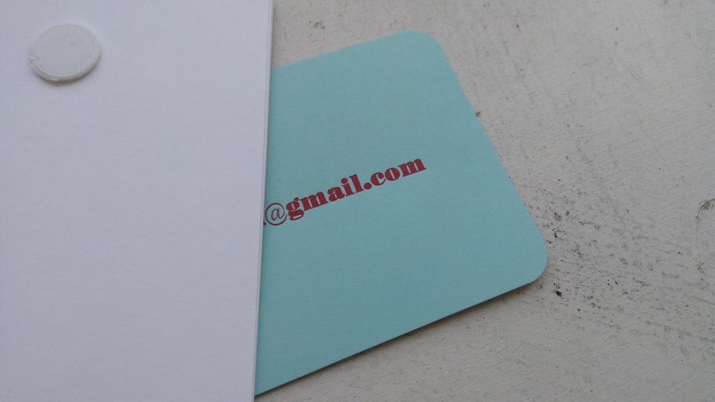
This weekend, I received the lovely gift of a ragtag collection of metal type that had been hiding out in a garage in Crapaud, and face number one, in the first layer of ice cube trays in the box, turned out to be 14 pt. Ultra Bodoni. I printed up some cards for the donor, and here’s a sample:
McGrew’s book says this about it:
Ultra Bodoni and its variations are now well established under the Bodoni name, but historically they hardly belong there, being more closely related to the nineteenth-century English “fat” faces. One reviewer called Ultra Bodoni “an old Bruce face with a few redrawn characters.” Actually it was entirely redrawn, but the resemblance is there. The Ultra Bodonis do not have the long ascenders and descenders of other Bodonis, and the transition from thick to thin is more abrupt.
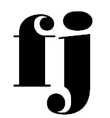
Whether it’s strictly a Bodoni or not, it is an intoxicating typeface, full of lovely details, like the way the lower case ‘f’ and ‘j’ have a little curl in them:
I’d like to think that the typefaces gossip about each other when nobody’s looking, and so one could imagine one typeface saying snootily to another “Oh, they’re from the Ultra Bodonis, and aren’t really Bodonis at all.”
One can dream.

Comments