
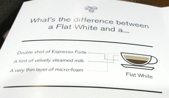
We stopped for coffee at Second Cup in Saint John yesterday. They were promoting their new flat white heavily in the shop, both on the menu, on posters and with a glossy brochure. The brochure goes into some detail to explain what a flat white is, and includes this introductory infographic:
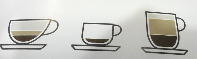
Then, down below, it compares other more-well-known coffees using the same colour scheme:
It’s a good idea, but one that, alas, falls flat because of the decision to use awkward lines to label the flat white’s components, presumably because someone decided that “double shot of espresso forte” had to appear first on the list.
These lines make it much more difficult to parse the infographic and to deduce, at a glance, which colours map to which components. Which, in turn, makes it more difficult to compare the components in the flat white to those in the other coffees.
What could have been an excellent, helpful graphic ends up as something that hurts my head every time I look at it.

Comments