
 Keeping in mind that I would handily win a contest for “person least likely to quote from the Bible in any situation,” here is John 17:21 (King James Version):
That they all may be one; as thou, Father, art in me, and I in thee, that they also may be one in us: that the world may believe that thou hast sent me.
I mention this because it is the biblical citation referenced in the first logo of the World Alliance of YMCAs, in 1878; the reference remained there for almost 70 years.
From the time I was eight until the time I was sixteen, I spent almost every Saturday morning, and a good portion of every summer, at the Hamilton YMCA on James St. In more ways than I can count, the ‘Y’ helped me become the person I am today; I owe the organization a great debt of gratitude for this.
One of those “more ways than I can count” is that the ‘Y’ is where I got my start as a typesetter. In those days the “page” was large rolls of newsprint end-runs from the Hamilton Spectator and the “ink” was thick watercolour paint. And the subject of my “typesetting” was usually large banner for some YMCA function or another. But it’s where I caught the typographical bug that stays with me.
The transition of the YMCA logo from 1878 to the present day represents one of the masterstrokes of graphic design of the last century.
This original logo was a circle overlaid the Greek letters X and P (Chi and Rho, representing Christ), in turn overlaid with the Bible open to John 17:21.
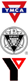
By the 1890s, the use of a red triangle — with each side representing one aspect of the YMCA’s world: Spirit, Mind and Body — came into common use.
By World War One, a simple red triangle, overlaid with a blue bar with YMCA set through it was in use (top right), and by the 1950s, this red triangle was combined with the original logo, with a second ring added (middle right).
The masterstroke comes in the transition, in the mid 1960s, to the logo that is in use to this day (bottom right), with the red triangle set beside a bent solid black bar so that together they form the letter ‘Y’.
This logo takes the best feature of the historical logos — the red triangle, Spirit, Mind, Body — and updates it without diluting it. The result is a potent symbol that, says the YMCA, is recognized by 97 percent of Americans.

Comments
Do you know who designed the most recent incarnation of the ‘Y’ logo?
Thanks for the background on the Y symbol! I remember seeing it when I was in New York in 1974, and the verse really caused some curiosity on my part. It was nice to see how the symbol ties in to the YMCA’s purposes — thanks for posting this!