
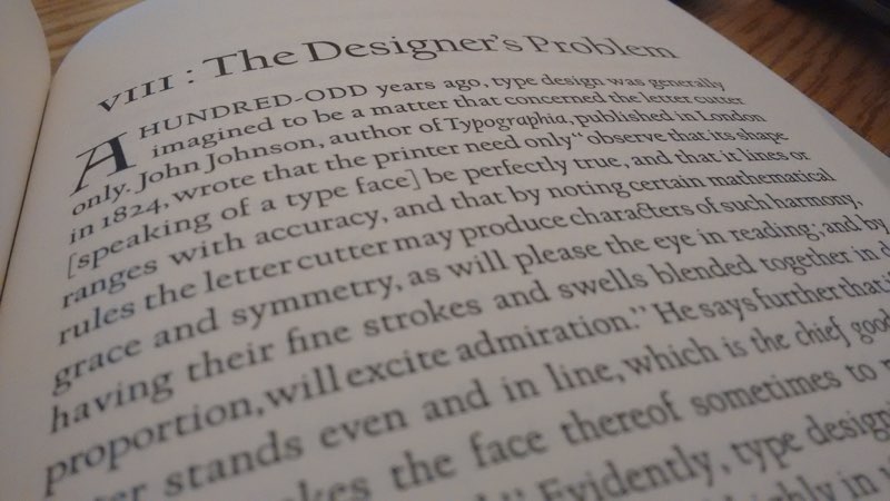
In the fall of 2009 I took a short trip to Copenhagen as part of a climate change blogging project. Once the formal activities were over, I had four days to wander the city as a tourist, and it was during that time that I came across the book Typologia by Frederic Goudy in the Danish Museum of Art & Design.
It is a stunning book, both for its contents and for its design, the distinguishing element of which is that it is set in Goudy’s own University of California Old Style typeface. Indeed, says the colophon, it was the first use of that typeface in print.
I fell in love with that face right there: it has a sense of openness, and a feeling of whimsy, that hit me over the head. When I returned to Canada, I immediately ordered a paperback reprint of the book simply so that I could return to its design as often as I liked. And I have done that frequently.
It turns out that the typeface has a Prince Edward Island connection: as related in this post from P22 Type Foundry in Buffalo, New York, University of California Old Style was originally designed by Goudy for the exclusive use of the University of California at Berkeley. The Lanston Monotype company later released a version for general use. In the 1980s, Gerald Giampa acquired the Lanston company’s assets and moved them to Canada, settling, in 1994, in Mount Stewart, Prince Edward Island.
As P22 goes on to relate:
The lead patterns were part of the very few physical materials that survived the tragic disposition of most of the original Lanston Monotype matrices and patterns. The full story of all that happened has yet to have a fully reliable telling: that is for another time.
The patterns however were the source material from where Gerald Giampa derived his digital versions of Lanston fonts. Most of the Lanston fonts created between 1989-2000 were done this way. When P22 acquired the Lanston Company in 2004, the Californian patterns were already proofed on newsprint.
P22 has released this digital version, dubbed Californian, and today I purchased a license from them to use it as a web font for this website.
I’m still experimenting with the right size and line spacing for this digital format, but I’m quite happy with how the face appears on the screen even now.
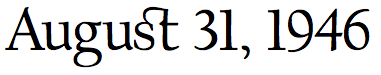
One of my favourite aspects of the face is what I’ve now come to learn are called discretionary ligatures, the marriage of two adjoining letters for decorative rather than purely “functional” reasons. The most obvious one in Californian is the one marrying lower case “s” and “t”, like this:
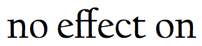
This in contrast to a “standard” or “functional” ligature, like “ff”, designed to deal with the fact that two f’s would otherwise inelegantly collide:
In Typologia, Goudy described the approach he took to creating the original University of California Old Style typeface:
I did not attempt any radical departures from good tradition. I believe, however, that some of the individual characters present a measure of novelty, yet in complete harmony with their more conservative kinsmen in the font. In short, it was my purpose to attempt a type face which would present a new type expression in mass, not by drawing forms of letters radically different from the accepted shapes, but rather by including in them those fine and almost imperceptible qualities of design which mean so much in the massed effect of the type page.
Not only a good expression of what Goudy achieved with his new type face, but also an excellent approximation of the way I strive to live my life.

Comments
You've got what it takes Ruk.
My eyes feel so at home.