
New from the print shop today is a broadside I’ve been working on for the last month:
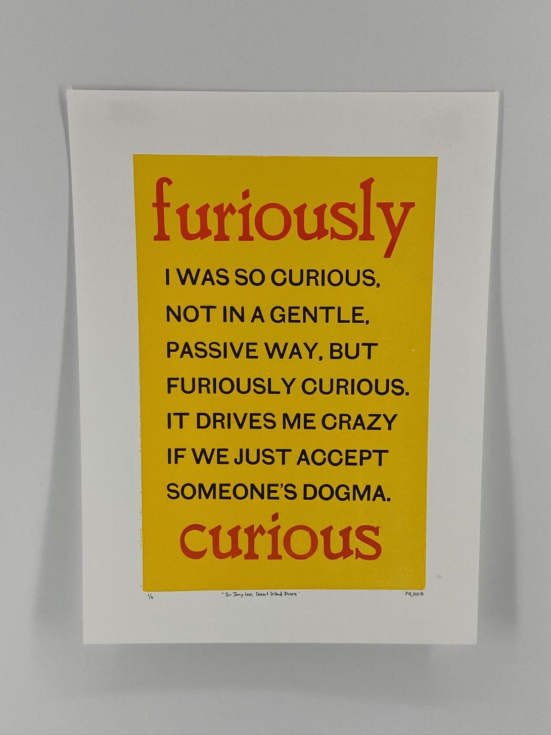
The words are Sir Jony Ive’s, from BBC Radio 4’s Desert Island Discs (you can hear them at 3:50 in the episode):
I was so curious, not in a gentle, passive way, but furiously curious. It drives me crazy if we just accept someone’s dogma.
I just absolutely loved the feeling of that level of curiosity, and felt a drive to capture the words in print.
My original thought was that they could become a This Box is for Good box, to the point where I mocked one up:
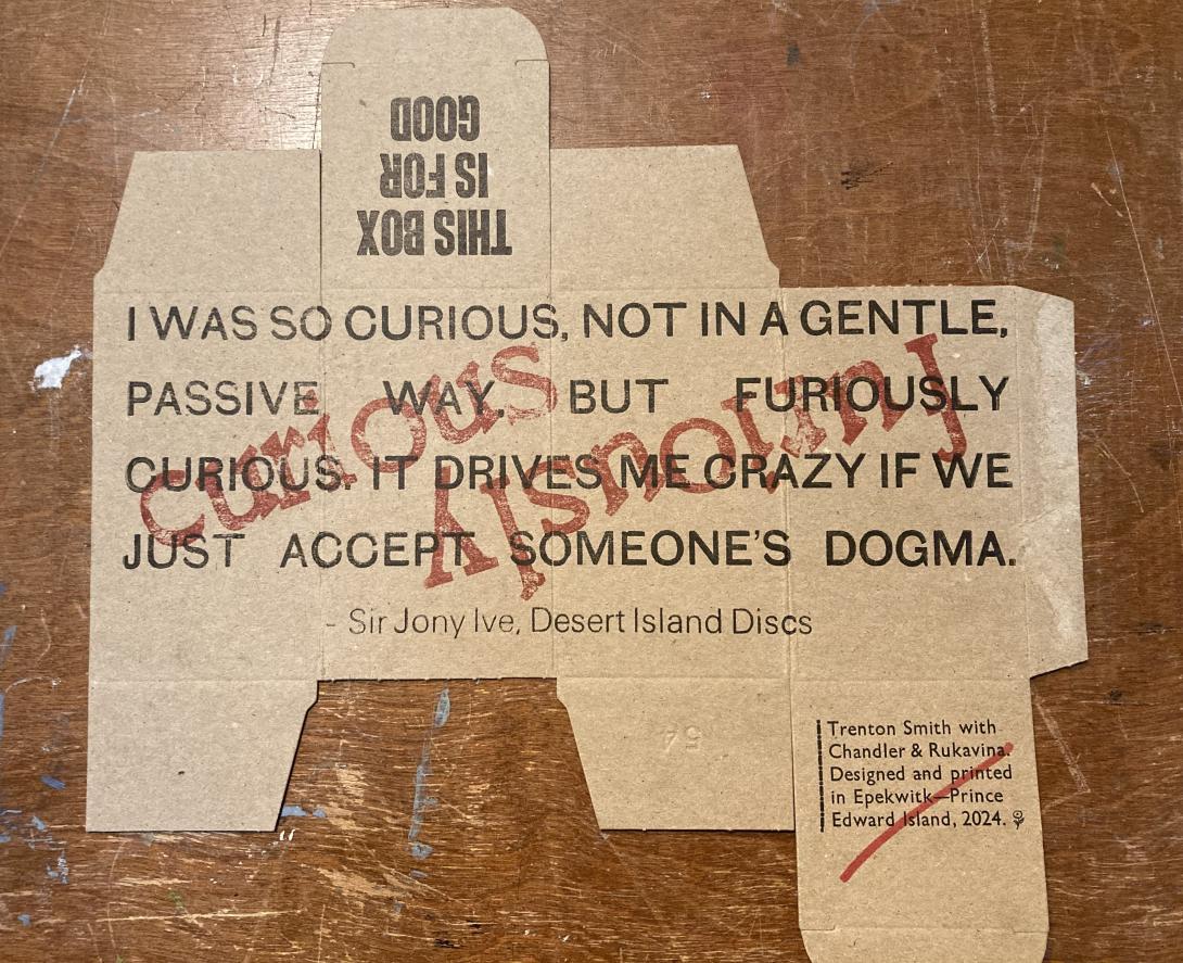
I realized, assembling the mockup into a box, that it didn’t really work: reading around a box isn’t natural, and the impact of the words was diminished rather than amplified. So, instead, I pivoted to printing a broadside.
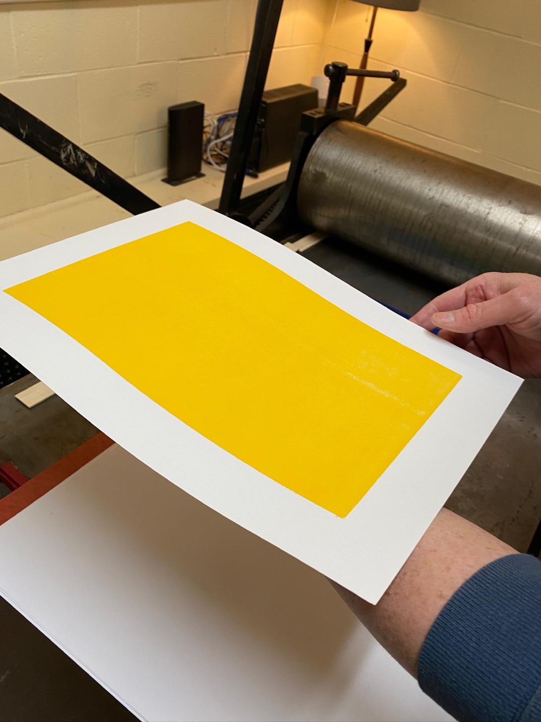
I experimented with many different arrangements of type; the breakthrough came when Lisa suggested encasing the words inside a solid-coloured rectangle. Once I mocked that up, it all fell together for me visually.
I printed the yellow rectangle on our etching press, using an uncarved piece of Japanese vinyl. My yellow-loving heart sang when I saw the result it was possible to achieve with the press, something that would be very difficult to replicate on the letterpress:
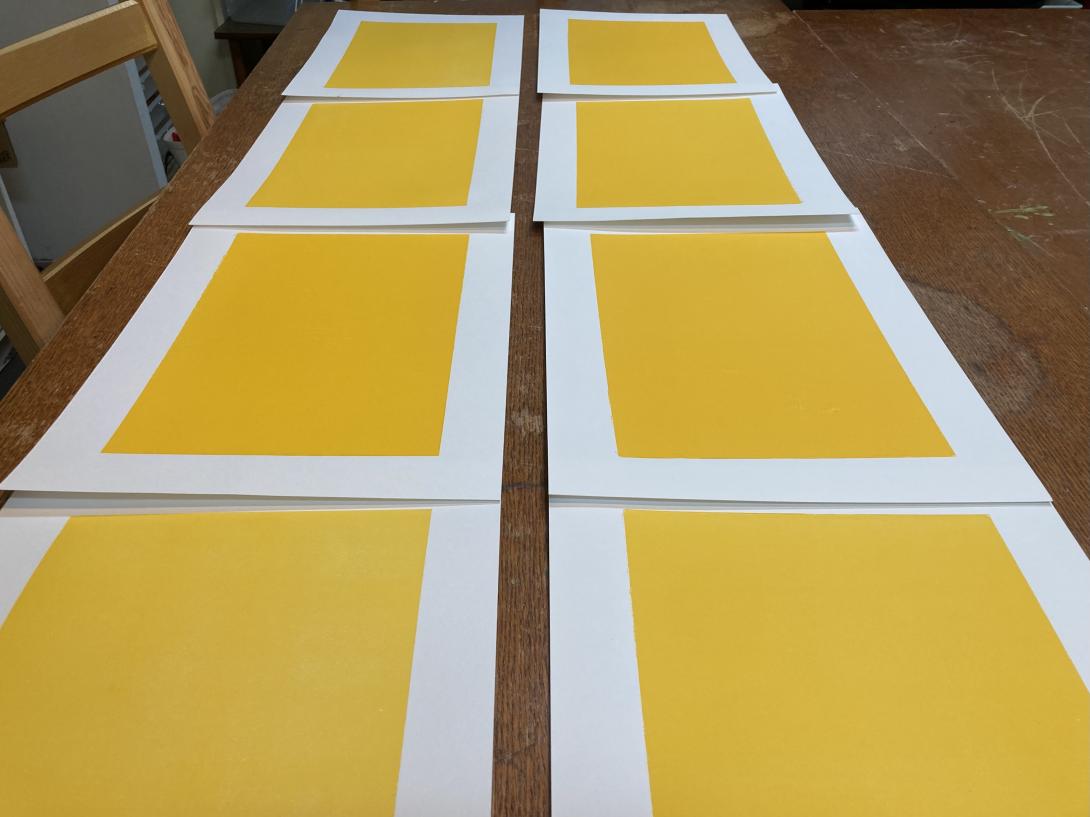
After fiddling with the packing on the press, I was able to produce a solid set of eight:
For the body type, I chose a battered old font of a sans serif typeface that I purchased from Atelier Domino in Montreal years ago. It’s got some quirkiness, including a wonky S, and a very chunky comma:
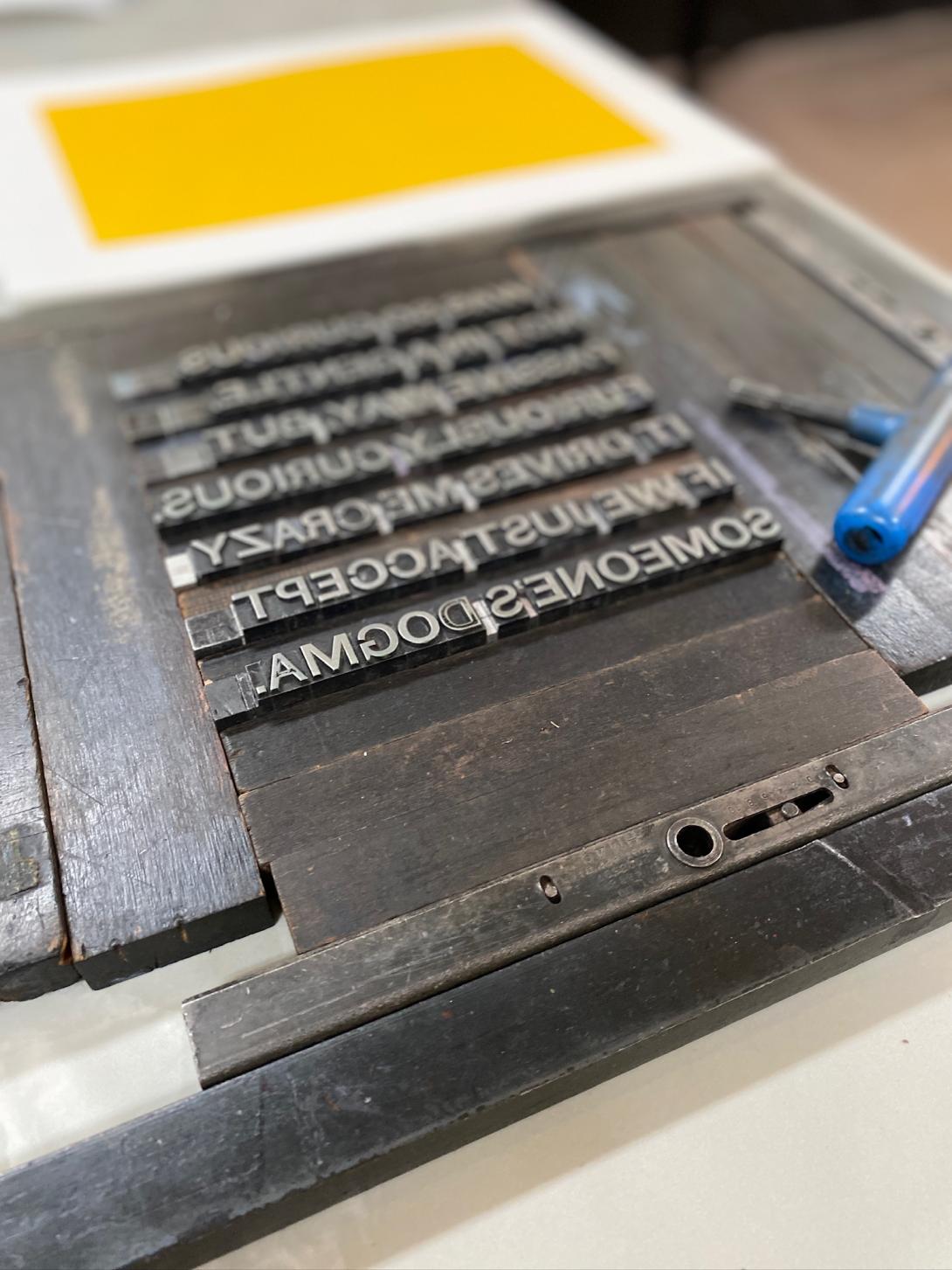
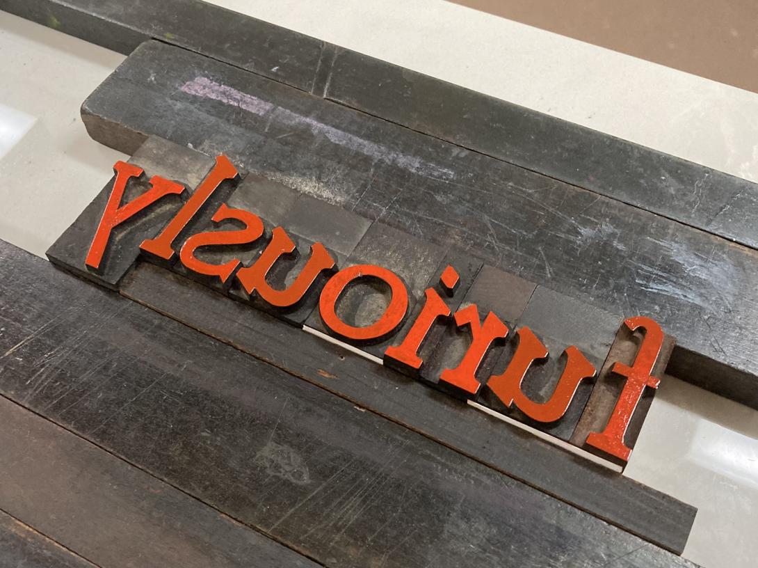
The “furiously” and the “curious” are set in a wooden typeface that I purchased from Letterpress Things in 2022; it has its own jaunty quirkiness, and I think the two typefaces are a good match.
The ink, in both cases, is from the Dutch company Van Son. The red is actually florescent pink, from a tiny sampler I purchased a few years ago, when I decided I needed to print in more than just black and red. When it’s printed over the yellow background it appears more red than pink.
By the time I experimented with layout, packing, and other elements of makeready, the project emerged as a limited edition of 4 prints. I put them on sale in the Queen Square Press shop today.
About This Blog
 I am Peter Rukavina and this is my blog. I am a writer, letterpress printer, and a curious person.
To learn more about me, read my /now, look at my bio, listen to audio I’ve posted, read presentations and speeches I’ve written, see things I’ve favourited elsewhere, or get in touch (peter@rukavina.net is the quickest way).
I have been writing here since May 1999: you can explore the 25+ years of blog posts in the archive.
![]() You can subscribe to an RSS feed of posts, an RSS feed of comments, an RSS feed of favourites elsewhere, or a podcast RSS feed that just contains audio posts. You can also receive a daily digests of posts by email. I also publish an OPML blogroll.
You can subscribe to an RSS feed of posts, an RSS feed of comments, an RSS feed of favourites elsewhere, or a podcast RSS feed that just contains audio posts. You can also receive a daily digests of posts by email. I also publish an OPML blogroll.
Instagram • YouTube • Vimeo • ORCID • OpenStreetMap • Internet Archive • PEI.art • Drupal • Github.
Add new comment