
Jakob Erbar isn’t exactly a household name, even in typography circles. But he designed what I think is the great underappreciated font of the 20th century, Erbar:

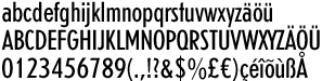
Just get a load of that jaunty lower-case ‘t’.
Comments
Strict orthoganality with no curves does notamount to” jaunty” in my book, but I’ll grant you it’s pleasant as t’s go. But whither the Danish “o” with the slash through it, as in the name
 I am
I am  You can subscribe to an