
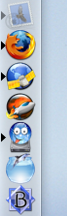
 I’ve got an icon problem. Look at the screen snip here: it shows a section of my Mac OS X dock, with icons for (from top to bottom) Mail, Firefox, NetNewsWire, MarsEdit, YummyFTP, CocoaMySQL and BBEdit.
It’s the five round icons in the middle that are causing me problems: they all look the same. I don’t mean “look the same” in the sense that they are visually identical, but rather in that flick of a second when I’m navigating from one application to the next, or selecting an application from the dock, they’re similar enough so that it’s easy to confuse one for the other.
About half a dozen times a day, I find myself, say, clicking on YummyFTP when I meant to click on CocoaMySQL.
I’m not sure if this is a failure of the OS, or a failure of the icon designers, or a failure of my own visual processor. Or not a failure at all.
But it does seem that a lot of OS X applications use an orby sphere as the superstructure of their icon — perhaps inevitable given the whole “worldwide” part of the www — and that is the basis of the visual confusion.
About This Blog
 I am Peter Rukavina and this is my blog. I am a writer, letterpress printer, and a curious person.
To learn more about me, read my /now, look at my bio, listen to audio I’ve posted, read presentations and speeches I’ve written, see things I’ve favourited elsewhere, or get in touch (peter@rukavina.net is the quickest way).
I have been writing here since May 1999: you can explore the 25+ years of blog posts in the archive.
![]() You can subscribe to an RSS feed of posts, an RSS feed of comments, an RSS feed of favourites elsewhere, or a podcast RSS feed that just contains audio posts. You can also receive a daily digests of posts by email. I also publish an OPML blogroll.
You can subscribe to an RSS feed of posts, an RSS feed of comments, an RSS feed of favourites elsewhere, or a podcast RSS feed that just contains audio posts. You can also receive a daily digests of posts by email. I also publish an OPML blogroll.
Instagram • YouTube • Vimeo • ORCID • OpenStreetMap • Internet Archive • PEI.art • Drupal • Github.
Comments
The solution you are
The solution you are searching for, is the alphanumeric character. With compact icons basically we’re up against one of the limitations of hieroglyphics, which alphabets were invented to solve. The old “N” for Netscape might be worth reconsidering. Other people here would know better than I, but I suppose we went from the era of the “N” to the pictographic icons as increases in PC power enabled better graphics resolution, but the same trend and the explosion of desktop options have made the icons smaller. But since it’s probably hard to trademark anything as simple as a letter, I’m not sure I see the way out of this rut.
Oliver, letters are often
Oliver, letters are often avoided since they pose difficulties in internationalizing applications.
As for the Firefox icon, we did struggle with the cliche of the “globe-as-network”. That said, there aren’t many other items that represent the “web”.
I do think part of the blame for this is the way Mac OS X displays icons with no label (until you mouse-over them) as the primary application management view.
Whether or not you
Whether or not you instinctively connect the name by which you know an application in your language with a particular letter of the Roman alphabet, the fact is (isn’t it?) that most countries use that alphabet and so the brains of people in most countries are highly trained at recognizing those symbols. Also, through the process of cultural natural selection we have inherited alphabetical symbols that I bet you are a lot friendlier to the human visual system than would be a graphic of comperable complexity generated at random by computer—or perhaps even by a human designer off the cuff. So software iconographers would have reason to embrace the symbols of the alphabet even if they didn’t care about the mnemonic value of language and phonetics. But how hard would it be for software people to preserve the phonetic connection? If you are working with people who speak another language, you obviously have access to translation. So you find out what would be the appriate Cyrillic, or Chinese or Arabic character to use for however your foreign friends will be spelling Netscape.
I suppose the unstated element of the small-icon problem is that people want to represent their app with the same icon no matter the size at which it’s being displayed at. But obviously a simpler graphic can strongly remind you of a larger one without being the same.
Ok, an informal experiment. I
Ok, an informal experiment. I currently have 24 icons in my dock. 8 are circular in shape, and 11 are rectilinear in shape. Of the circular, 3 are Mozilla apps, 2 are Apple apps, 1 is a clock, which makes sense to be round. Only a few really break from the circular or rectilinear shape though, like jEdit (the letters ‘je’) The Gimp, TeztWrangler (square tipped 45 degrees with styled rope ‘W’) and StuffIt Expander, are most notable.
The ‘good’ icons are the ones
The ‘good’ icons are the ones that can be identified even when very small. I’d put the Office v.x icons in this category.
I remember an old ad about OS X, I think from Microsoft, where the letters of the application icons in the dock spelled out “WXP ON X” (word, excel, powerpoint, photoshop (circular thing), netscape and X11).
I’m also sick of goofy stupid circles. If your icon is bad at 32x32 then it’s a bad icon.
Excuse my Mac ignorance, but
Excuse my Mac ignorance, but can’t you just change the icon in the doc to something more unique? All the UNIX desktop ship with hundreds of stock icons, and everyong is always saying how OS X is so UNIX like.
Personally, I find it much easier to use keyboard shortcuts than launcher icons on the doc though. And it finally gives me a use for that stupid windows key.
doc = dock. I’ve really got
doc = dock. I’ve really got to get more sleep before surfing…
I use the dock far less since
I use the dock far less since I installed Quicksilver (http://quicksilver.blacktree.c…. Now most applications are launched by a few keyboard strokes.
Add new comment